Implementing OTP Input Fields in React and React Native
react-native-otp-entry and react-otp-input are UI components designed to handle One-Time Password (OTP) or verification code entry in React applications. react-otp-input is primarily built for React web applications, offering a customizable input field that splits characters into separate boxes. react-native-otp-entry is tailored for React Native mobile environments, focusing on native keyboard handling, auto-fill support, and mobile-specific UX patterns. Both aim to simplify the implementation of secure code entry but target different rendering platforms.
Npm Package Weekly Downloads Trend
Github Stars Ranking
Stat Detail
React Native OTP Entry vs React OTP Input: Platform Specifics and Implementation
Both react-native-otp-entry and react-otp-input solve the same user problem: entering a short verification code securely. However, they operate in fundamentally different environments. One targets the mobile native ecosystem, while the other targets the web DOM. Choosing the wrong one for your platform will lead to broken builds or poor user experience. Let's compare how they handle input, styling, and platform features.
📱 Platform Target: Native Mobile vs Web DOM
react-native-otp-entry is built exclusively for React Native.
- It uses native
TextInputcomponents under the hood. - It relies on mobile-specific props like
keyboardTypeandautoFillhints. - It will not work in a standard React web project.
// react-native-otp-entry: Native implementation
import { OTPEntry } from 'react-native-otp-entry';

export default function App() {
  return (
    <OTPEntry
      totalDigits={6}
      onTextChange={(text) => console.log(text)}
    />
  );
}
react-otp-input is built for React web applications.
- It renders standard HTML
<input>elements. - It manages focus and cursor position within the browser DOM.
- It is not designed for React Native's native component tree.
// react-otp-input: Web implementation
import OtpInput from 'react-otp-input';

export default function App() {
  return (
    <OtpInput
      numInputs={6}
      onChange={(text) => console.log(text)}
      renderInput={(props) => <input {...props} />}
    />
  );
}
⌨️ Input Handling and Keyboard Types
react-native-otp-entry configures the mobile keyboard directly.
- You can specify
keyboardType='numeric'to show the number pad. - It handles focus movement between boxes automatically when a digit is typed.
- It supports secure text entry masking if needed.
// react-native-otp-entry: Keyboard config
<OTPEntry
  totalDigits={6}
  keyboardType="number-pad"
  secureTextEntry={false}
  onTextChange={(code) => setCode(code)}
/>
react-otp-input relies on HTML input attributes.
- You must pass
type="tel"orinputMode="numeric"for mobile browsers. - Focus management is handled via JavaScript refs within the component.
- It supports custom rendering of each input box.
// react-otp-input: Input mode config
<OtpInput
  numInputs={6}
  inputType="tel"
  inputMode="numeric"
  onChange={(code) => setCode(code)}
  renderInput={(props) => <input {...props} />}
/>
🎨 Styling and Customization
react-native-otp-entry uses React Native style objects.
- Styles are applied using the
styleprop accepting a StyleSheet. - You can customize the container and individual digit boxes.
- It supports theme props for active and filled states.
// react-native-otp-entry: Styling
<OTPEntry
  totalDigits={6}
  styles={{
    digitBox: { borderWidth: 1, borderColor: '#ccc' },
    filledBox: { borderColor: '#000' }
  }}
  onTextChange={(text) => setText(text)}
/>
react-otp-input uses CSS classes or inline styles.
- You pass
containerStyleorinputStyleprops. - It supports CSS-in-JS or standard class names.
- You have full control over the DOM structure via
renderInput.
// react-otp-input: Styling
<OtpInput
  numInputs={6}
  inputStyle={{ border: '1px solid #ccc' }}
  containerStyle={{ display: 'flex', gap: '10px' }}
  onChange={(text) => setText(text)}
  renderInput={(props) => <input {...props} />}
/>
📋 Clipboard and Auto-Fill Support
react-native-otp-entry integrates with OS auto-fill.
- It supports SMS Retriever API on Android.
- It works with iOS security code auto-fill.
- Paste functionality is handled natively by the TextInput.
// react-native-otp-entry: Auto-fill hints
<OTPEntry
  totalDigits={6}
  textContentType="oneTimeCode"
  onTextChange={(text) => setText(text)}
/>
react-otp-input handles clipboard via browser events.
- It listens for paste events on the input fields.
- It supports
autoComplete="one-time-code"for browser support. - Auto-fill depends on browser and OS integration with the web view.
// react-otp-input: Auto-complete
<OtpInput
  numInputs={6}
  autoComplete="one-time-code"
  onChange={(text) => setText(text)}
  renderInput={(props) => <input {...props} />}
/>
🌱 When Not to Use These
These packages are specialized for OTP flows. Consider alternatives when:
- You need a general purpose form library: Use
formikorreact-hook-formwith standard inputs. - You are building a React Native Web app: Ensure the package you pick supports the target platform, or use a universal library like
react-native-otp-text-input. - Your design requirements are unique: If the OTP UI deviates heavily from standard boxes, building a custom component might be cleaner than overriding library styles.
📌 Summary Table
| Feature | react-native-otp-entry | react-otp-input |
|---|---|---|
| Platform | 📱 React Native (iOS/Android) | 🌐 React Web (DOM) |
| Underlying Element | Native TextInput | HTML <input> |
| Styling | React Native StyleSheet | CSS / Inline Styles |
| Auto-Fill | Native OS SMS/Code Fill | Browser autoComplete |
| Keyboard | keyboardType prop | inputMode / type props |
| Paste Support | Native Clipboard | JS Paste Event |
💡 Final Recommendation
Think in terms of target environment first:
- Building a mobile app? → Use
react-native-otp-entry. It leverages native capabilities for SMS auto-fill and keyboard management that web components cannot access. - Building a website? → Use
react-otp-input. It is optimized for browser behavior, clipboard pasting, and DOM focus management.
Critical Note: Do not attempt to use react-otp-input in a React Native project. It relies on DOM APIs that do not exist in the native runtime. Conversely, react-native-otp-entry will not render in a web browser. Always match the package to your rendering engine.
How to Choose: react-otp-input vs react-native-otp-entry
- react-otp-input:
Choose
react-otp-inputif you are developing a web application using React.js. It provides robust support for desktop and mobile browsers, handling clipboard pasting and character separation effectively in a DOM environment. This package is the standard choice for web-based login flows where React Native specific native modules are not available. - react-native-otp-entry:
Choose
react-native-otp-entryif you are building a mobile application using React Native. It is optimized for touch interfaces, supports native auto-fill APIs on iOS and Android, and handles soft keyboard interactions correctly. This package is essential when you need the OTP field to integrate seamlessly with mobile OS features like SMS retreival.
Popular Comparisons
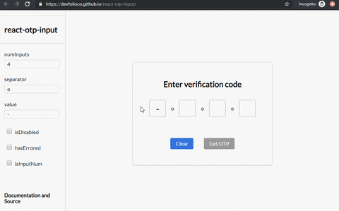
README for react-otp-input
react-otp-input


A fully customizable, one-time password input component for the web built with React.
Installation

To install the latest stable version:
npm install --save react-otp-input
Still using v2?
No problem! You can find the documentation for v2 here
Basic usage:
import React, { useState } from 'react';
import OtpInput from 'react-otp-input';

export default function App() {
  const [otp, setOtp] = useState('');

  return (
    <OtpInput
      value={otp}
      onChange={setOtp}
      numInputs={4}
      renderSeparator={<span>-</span>}
      renderInput={(props) => <input {...props} />}
    />
  );
}
API
You can also pass a function that returns a component, where the function will get the index of the separator being rendered as an argument.| Name | Type | Required | Default | Description |
|---|---|---|---|---|
| numInputs | number | true | 4 | Number of OTP inputs to be rendered. |
| renderInput | function | true | none | A function that returns the input that is supposed to be rendered for each of the input fields.
The function will get two arguments: inputProps and index. inputProps is an object that contains all the props that should be passed to the input being rendered (Overriding these props is not recommended because it might lead to some unexpected behaviour). index is the index of the input being rendered.
|
| onChange | function | true | console.log | Returns OTP code typed in inputs. |
| onPaste | function | false | none | Provide a custom onPaste event handler scoped to the OTP inputs container. Executes when content is pasted into any OTP field.
Example: const handlePaste: React.ClipboardEventHandler |
| value | string / number | true | '' | The value of the OTP passed into the component. |
| placeholder | string | false | none | Specify an expected value of each input. The length of this string should be equal to numInputs. |
| renderSeparator | component / function | false | none | Provide a custom separator between inputs by passing a component. For instance, <span>-</span> would add - between each input. |
| containerStyle | style (object) / className (string) | false | none | Style applied or class passed to container of inputs. |
| inputStyle | style (object) / className (string) | false | none | Style applied or class passed to each input. |
| inputType | <input> type | false | text | The type of the input that will be passed to the input element being rendered. In v2 isInputNum used to set the input type as tel and prevented non numerical entries, so as to avoid the spin buttons added to the inputs with input type number. That behaviour is still supported if you pass tel to the inputType prop. |
| shouldAutoFocus | boolean | false | false | Auto focuses input on initial page load. |
| skipDefaultStyles | boolean | false | false | The component comes with default styles for legacy reasons. Pass true to skip those styles. This prop will be removed in the next major release. |
⚠️ Warning
Do not override the following props on the input component that you return from the renderInput prop. Doing so might lead to unexpected behaviour.
refvalueonChangeonFocusonBluronKeyDownonPasteonInputtypeinputMode
Migrating from v2
The v3 of react-otp-input is a complete rewrite of the library. Apart from making the API more customizable and flexible, this version is a complete rewrite of the library using TypeScript and React Hooks. Here are the breaking changes that you need to be aware of:
-
You now need to pass your own custom input component that will be rendered for each of the input fields via
renderInputprop. This gives you the flexibility to customize the input fields as you desire. This also means that props likefocusStyle,isDisabled,disabledStyle,hasErrored,errorStyle,isInputNum,isInputSecure,data-cyanddata-testidare no longer supported. You can achieve the same functionality and more by passing the relevant props directly to the input component that you return from therenderInputprop. -
The
separatorprop has now been renamed torenderSeparator. This prop now apart from accepting a component that will be rendered as a separator between inputs like it used to, now also accepts a function that returns a component. The function will get the index of the separator being rendered as an argument. -
A new prop called
inputTypehas been added to the component. This prop can be used to specify the type of the input that will be passed to the input element being rendered. The default value of this prop isnumber.
Migrating from v1
react-otp-input is now a controlled component to facilitate functionalities that weren't possible before from the application using it, such as clearing or pre-assigning values. For v1.0.0 and above, a value prop needs to be passed in the component for it to function as expected.
Development
To run the vite example:
cd example
npm run dev
Checklist

- Write tests
- Add actions for lint checks and tests
Contributing


Feel free to open issues and pull requests!
License

Contributors ✨
Thanks goes to these wonderful people (emoji key):
 Abhishek Warokar 💻 🎨 🚧 🤔 👀 |  Aj 💻 🎨 🤔 |  Aromal Anil 💻 🔧 |  Gabriele Corti 💻 ️️️️♿️ |  Anoop 💻 |  Dewansh Rawat 🐛 |  Ishan Chhabra 💻 |
 yaojie 💻 |  Prateek Surana 💻 🚧 🤔 📖 🎨 |  Süleyman Barış Eser 🐛 |  Steve Domino 💻 |
This project follows the all-contributors specification. Contributions of any kind welcome!