Date and Time Picker Components for Vue.js Applications
vue-datetime, vue-flatpickr-component, and vue2-datepicker are Vue.js wrapper components that integrate popular date/time picker libraries into Vue applications. These packages provide reactive, declarative interfaces to underlying JavaScript pickers, enabling developers to collect date and time inputs with rich UI controls while maintaining Vue's reactivity model. Each wraps a different base library — vue-datetime uses a custom implementation based on date-fns, vue-flatpickr-component wraps the lightweight flatpickr, and vue2-datepicker wraps the DatePicker component from the element-ui ecosystem — resulting in distinct feature sets, styling approaches, and integration patterns.
Npm Package Weekly Downloads Trend
Github Stars Ranking
Stat Detail
Date and Time Pickers for Vue: vue-datetime vs vue-flatpickr-component vs vue2-datepicker
When building forms in Vue applications, selecting dates and times is a common requirement. The three packages under review — vue-datetime, vue-flatpickr-component, and vue2-datepicker — each offer Vue-friendly wrappers around date/time picker logic, but they differ significantly in architecture, maintenance status, and real-world usability. Let’s examine how they handle core scenarios.
⚠️ Maintenance Status: Critical First Consideration
Before diving into features, check whether a package is still viable for new projects.
vue-datetime: Officially deprecated. Its npm page states: "This project is no longer maintained." The GitHub repository is archived. Do not use in new projects.vue-flatpickr-component: Actively maintained. Regular releases, Vue 2/3 support via separate versions, and responsive issue handling.vue2-datepicker: Maintained but Vue 2–only. No official Vue 3 version exists; the package name itself signals its scope limitation.
💡 Takeaway: For new Vue 2 projects,
vue-flatpickr-componentorvue2-datepickerare acceptable. For Vue 3, onlyvue-flatpickr-component(via its@vuepic/vue-datepickersuccessor or compatible version) is safe. Avoidvue-datetimeentirely.
🧩 Basic Usage: Setting Up a Date Picker
All three expose a Vue component that binds to a value (or v-model) and emits updates. But their props and event names differ.
vue-datetime (deprecated):
<template>
  <datetime v-model="selectedDate" type="datetime" />
</template>

<script>
import { Datetime } from 'vue-datetime';
export default {
  components: { Datetime },
  data() { return { selectedDate: null }; }
};
</script>
vue-flatpickr-component:
<template>
  <flat-pickr v-model="selectedDate" :config="config" />
</template>

<script>
import flatPickr from 'vue-flatpickr-component';
import 'flatpickr/dist/flatpickr.css';

export default {
  components: { flatPickr },
  data() {
    return {
      selectedDate: null,
      config: { enableTime: true, dateFormat: 'Y-m-d H:i' }
    };
  }
};
</script>
vue2-datepicker:
<template>
  <date-picker v-model="selectedDate" type="datetime" />
</template>

<script>
import DatePicker from 'vue2-datepicker';
import 'vue2-datepicker/index.css';

export default {
  components: { DatePicker },
  data() { return { selectedDate: null }; }
};
</script>
🔍 Note:
vue-flatpickr-componentrequires explicit CSS import and uses aconfigobject for options, while the others bake options into props.
📅 Feature Comparison: Range Selection, Time Support, and Localization
Date + Time Selection
vue-datetime: Supports combined date and time out of the box viatype="datetime".vue-flatpickr-component: Enable time withenableTime: truein config.vue2-datepicker: Usetype="datetime"prop.
Date Ranges
vue-datetime does not support ranges.
vue-flatpickr-component:
config: { mode: 'range', dateFormat: 'Y-m-d' }
vue2-datepicker:
<date-picker v-model="dateRange" range />
Localization
vue-datetime: Limited i18n; requires manual locale injection (not well documented).
vue-flatpickr-component: Full flatpickr locale support:
import { Spanish } from 'flatpickr/dist/l10n/es.js';
config: { locale: Spanish }
vue2-datepicker: Built-in language packs:
import 'vue2-datepicker/locale/zh-cn';
// Then set lang="zh-cn" prop
🎨 Styling and Theming
vue-datetime: Ships its own minimal CSS. Hard to customize without overriding styles.vue-flatpickr-component: Inheritsflatpickr’s clean, themeable CSS. Official themes (dark, material, etc.) available via additional CSS imports.vue2-datepicker: Matches Element UI’s design. Customization requires deep CSS overrides or using Element’s theme variables.
If your app doesn’t use Element UI, vue2-datepicker will look out of place. vue-flatpickr-component offers the most neutral and adaptable appearance.
♿ Accessibility and Keyboard Navigation
vue-datetime: Lacks proper ARIA attributes and keyboard support (confirmed by archived repo issues).vue-flatpickr-component: Inheritsflatpickr’s solid accessibility — full keyboard navigation, screen reader support, and focus management.vue2-datepicker: Generally accessible but tied to Element UI’s accessibility quality, which varies by version.
For public-facing or regulated applications, vue-flatpickr-component is the safest choice.
🔄 Vue 3 Compatibility
vue-datetime: No Vue 3 support; unmaintained.vue-flatpickr-component: Official Vue 3 support viavue-flatpickr-component@^10(uses Vue 3’sdefineComponent).vue2-datepicker: Vue 2 only. Community forks exist for Vue 3, but none are official or widely adopted.
If you’re on Vue 3 or planning to migrate, vue-flatpickr-component is the only future-proof option among these three.
🛠️ Advanced Scenarios: Custom Formatting and Validation
Custom Input Formatting
vue-flatpickr-component excels here via altInput and altFormat:
config: {
  altInput: true,
  altFormat: 'F j, Y',
  dateFormat: 'Y-m-d'
}
// Shows "January 1, 2024" to user, emits "2024-01-01"
vue2-datepicker uses format prop:
<date-picker v-model="d" format="DD/MM/YYYY HH:mm" />
vue-datetime uses phrases and limited format strings — less flexible.
Disabling Dates
All support disabling dates, but with different APIs:
vue-flatpickr-component:
config: { disable: ['2024-12-25', (date) => date.getDay() === 0] }
vue2-datepicker:
<date-picker :disabled-date="d => d.getDay() === 0" />
vue-datetime: Only supports static disabled dates via :disabled-dates array.
📌 Summary Table
| Feature | vue-datetime | vue-flatpickr-component | vue2-datepicker |
|---|---|---|---|
| Maintenance Status | ❌ Deprecated | ✅ Actively maintained | ⚠️ Vue 2 only |
| Vue 3 Support | ❌ | ✅ | ❌ |
| Date + Time | ✅ | ✅ (enableTime) | ✅ (type="datetime") |
| Range Selection | ❌ | ✅ (mode: 'range') | ✅ (range prop) |
| Localization | ⚠️ Limited | ✅ Full flatpickr locales | ✅ Built-in language packs |
| Theming | ⚠️ Fixed style | ✅ Multiple official themes | ⚠️ Tied to Element UI |
| Accessibility | ❌ Poor | ✅ Strong | ⚠️ Moderate |
| Custom Formatting | ⚠️ Basic | ✅ Advanced (altFormat) | ✅ Good |
💡 Final Recommendation
- Avoid
vue-datetime— it’s deprecated and lacks modern features and accessibility. - Use
vue-flatpickr-componentif you need a reliable, flexible, and maintainable date picker that works across Vue versions, supports complex requirements, and follows web standards. - Consider
vue2-datepickeronly if you’re deeply invested in Element UI’s ecosystem and are locked into Vue 2 with no migration plans.
In most professional contexts — especially greenfield projects — vue-flatpickr-component delivers the best balance of power, maintainability, and compatibility.
How to Choose: vue-datetime vs vue-flatpickr-component vs vue2-datepicker
- vue-datetime:
Choose
vue-datetimeif you need a simple, self-contained date and time picker with minimal dependencies and built-in support for both date and time selection in a single control. It’s suitable for projects that prioritize ease of setup and don’t require extensive customization or advanced features like range selection with multiple months. However, note that it is no longer actively maintained and may lack compatibility with newer Vue versions or accessibility standards. - vue-flatpickr-component:
Choose
vue-flatpickr-componentif you want a highly customizable, performant, and well-maintained date picker that supports a wide range of configurations including date ranges, time selection, localization, and theming. Since it wrapsflatpickr— a battle-tested vanilla JS library — it integrates cleanly with Vue while offering robust features and active maintenance. This is the best choice for production applications requiring flexibility, accessibility compliance, and long-term support. - vue2-datepicker:
Choose
vue2-datepickerif you are already using Element UI or need a date picker that closely matches Element’s design language and interaction patterns. It provides rich features like multiple date selection, week numbers, and custom slots, but ties your UI to Element’s aesthetic and assumptions. Be aware that it is specifically designed for Vue 2 and may not work with Vue 3 without migration effort.
Popular Comparisons
README for vue-datetime
vue-datetime


Mobile friendly datetime picker for Vue. Supports date, datetime and time modes, i18n and more.
Demo
Installation
Bundler (Webpack, Rollup...)
yarn add luxon vue-datetime weekstart
Or
npm install --save luxon vue-datetime weekstart
weekstart is optional, is used to get the first day of the week.
Register
import Vue from 'vue'
import { Datetime } from 'vue-datetime'
// You need a specific loader for CSS files
import 'vue-datetime/dist/vue-datetime.css'

Vue.use(Datetime)
Register manually
Global
import { Datetime } from 'vue-datetime';

Vue.component('datetime', Datetime);
Local
import { Datetime } from 'vue-datetime';

Vue.extend({
  template: '...',
  components: {
    datetime: Datetime
  }
});
Browser
Download vue, luxon, weekstart and vue-datetime or use a CDN like unpkg.
<link rel="stylesheet" href="vue-datetime.css"></link>
<script src="vue.js"></script>
<script src="luxon.js"></script>
<script src="weekstart.js"></script>
<script src="vue-datetime.js"></script>
The component registers itself automatically as <datetime>. If you want to use a different name then register it explicitly:
Vue.component('vue-datetime', window.VueDatetime.Datetime);
weekstart is optional, is used to get the first day of the week.
Usage
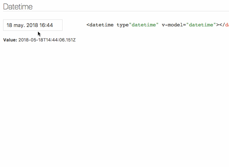
Minimal
<datetime v-model="date"></datetime>
Setup
Parameters
| Parameter | Type | Default | Description |
|---|---|---|---|
| v-model (required) | ISO 8601 String | - | Datetime. |
| type | String | date | Picker type: date, datetime or time. |
| input-id | String | '' | Id for the input. |
| input-class | String, Array or Object | '' | Class for the input. |
| input-style | String, Array or Object | '' | Style for the input. |
| hidden-name | String | null | Name for hidden input with raw value. See #51. |
| value-zone | String | UTC | Time zone for the value. |
| zone | String | local | Time zone for the picker. |
| format | Object or String | DateTime.DATE_MED, DateTime.DATETIME_MED or DateTime.TIME_24_SIMPLE | Input date format. Luxon presets or tokens. |
| phrases | Object | {ok: 'Ok', cancel: 'Cancel'} | Phrases. |
| use12-hour | Boolean | false | Display 12 hour (AM/PM) mode |
| hour-step | Number | 1 | Hour step. |
| minute-step | Number | 1 | Minute step. |
| min-datetime | ISO 8601 String | null | Minimum datetime. |
| max-datetime | ISO 8601 String | null | Maximum datetime. |
| auto | Boolean | false | Auto continue/close on select. |
| week-start | Number | auto from locale if weekstart is available or 1 | First day of the week. 1 is Monday and 7 is Sunday. |
| flow | Array | Depends of type | Customize steps flow, steps available: time, date, month, year. Example: ['year', 'date', 'time'] |
| title | String | '' | Popup title. |
| hide-backdrop | Boolean | false | Show/Hide backdrop. |
| backdrop-click | Boolean | true | Enable/Disable backdrop click to cancel (outside click). |
Input inherits all props not defined above but style and class will be inherited by root element. See inheritAttrs option
The component is based on Luxon, check out documentation to set time zones and format.
Internationalization
Date internationalization depends on luxon. Set the default locale.
import { Settings } from 'luxon'

Settings.defaultLocale = 'es'
Events
Component emits the input event to work with v-model. More info.
close event is emitted when the popup closes.
Also, input text inherits all component events.
Slots
You can customize the component using named slots.
Available slots: before, after, button-cancel and button-confirm
Button customization example:
<datetime v-model="date" input-id="startDate">
  <label for="startDate" slot="before">Field Label</label>
  <span class="description" slot="after">The field description</span>
  <template slot="button-cancel">
    <fa :icon="['far', 'times']"></fa>
    Cancel
  </template>
  <template slot="button-confirm">
    <fa :icon="['fas', 'check-circle']"></fa>
    Confirm
  </template>
</datetime>
You can also use slot-scope to determine which view is currently active:
<template slot="button-confirm" slot-scope="scope">
  <span v-if='scope.step === "date"'>Next <i class='fas fa-arrow-right' /></span>
  <span v-else><i class='fas fa-check-circle' /> Publish</span>
</template>
Theming
Theming is supported by overwriting CSS classes.
Development
Launch lint and tests
yarn test
Launch visual tests
yarn dev
Build
Bundle the js and css to the dist folder:
yarn build