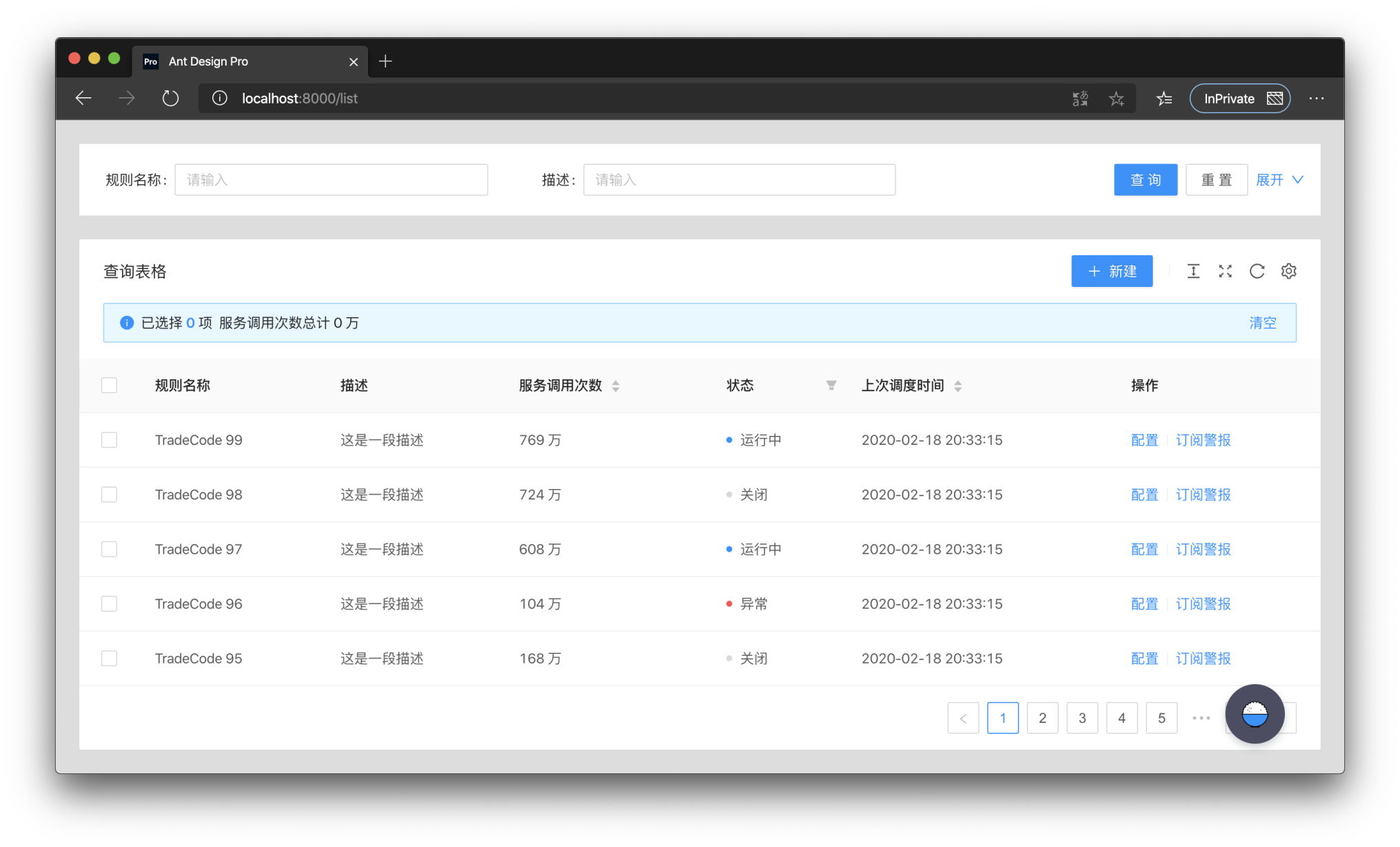
ag-grid-react vs @ant-design/pro-table vs @material-ui/data-grid vs react-table
React Data Grid Libraries
ag-grid-react@ant-design/pro-table@material-ui/data-gridreact-tableSimilar Packages:

React Data Grid Libraries

React data grid libraries provide powerful tools for displaying and manipulating tabular data in web applications. They offer various features such as sorting, filtering, pagination, and editing capabilities, allowing developers to create dynamic and responsive data tables. These libraries are designed to enhance user experience by providing efficient data handling and customizable UI components, making it easier to manage large datasets effectively.

Npm Package Weekly Downloads Trend

3 Years

Github Stars Ranking

Stat Detail

Package
Downloads
Stars
Size
Issues
Publish
License
ag-grid-react1,326,70915,068674 kB15014 days agoMIT
@ant-design/pro-table96,4764,725573 kB7887 months agoMIT
@material-ui/data-grid26,0445,635-1,6895 years agoMIT
react-table027,736940 kB361-MIT

Feature Comparison: ag-grid-react vs @ant-design/pro-table vs @material-ui/data-grid vs react-table

Performance

  • ag-grid-react:

    ag-grid-react is known for its exceptional performance, capable of rendering thousands of rows and columns with minimal lag. It supports features like row virtualization and server-side pagination to enhance performance further.

  • @ant-design/pro-table:

    @ant-design/pro-table is optimized for performance with features like lazy loading and virtual scrolling, allowing it to handle large datasets efficiently without compromising user experience.

  • @material-ui/data-grid:

    @material-ui/data-grid is designed for high performance with features like virtualization and efficient rendering, making it suitable for applications with large amounts of data.

  • react-table:

    react-table is lightweight and focuses on performance by allowing developers to implement only the features they need. It does not impose any styling, which can lead to faster rendering times.

Customization

  • ag-grid-react:

    ag-grid-react is highly customizable, offering a wide range of APIs and configuration options to create complex grid behaviors and styles, making it suitable for enterprise-level applications.

  • @ant-design/pro-table:

    @ant-design/pro-table offers extensive customization options, allowing developers to create tailored table layouts and functionalities, including custom cell rendering and editing capabilities.

  • @material-ui/data-grid:

    @material-ui/data-grid provides a variety of customization options that align with Material Design, enabling developers to modify styles, themes, and component behavior easily.

  • react-table:

    react-table is extremely flexible and allows developers to customize every aspect of the table, from rendering to state management, providing complete control over the UI.

Ease of Use

  • ag-grid-react:

    ag-grid-react has a steeper learning curve due to its extensive feature set, but once mastered, it offers powerful capabilities for building complex data grids.

  • @ant-design/pro-table:

    @ant-design/pro-table is user-friendly with a straightforward API, making it easy for developers to integrate and use within Ant Design projects without a steep learning curve.

  • @material-ui/data-grid:

    @material-ui/data-grid is designed to be intuitive and easy to use, especially for developers familiar with Material-UI, providing a familiar API and consistent design patterns.

  • react-table:

    react-table has a simple API that is easy to learn, especially for those who are comfortable with React. However, its headless nature may require more initial setup for custom implementations.

Community and Support

  • ag-grid-react:

    ag-grid-react has a robust community and commercial support options, making it a reliable choice for enterprise applications that may require dedicated assistance.

  • @ant-design/pro-table:

    @ant-design/pro-table benefits from the strong Ant Design community, providing ample resources, documentation, and community support for developers.

  • @material-ui/data-grid:

    @material-ui/data-grid is backed by the Material-UI community, which is large and active, offering extensive documentation and support for developers.

  • react-table:

    react-table has a growing community with good documentation, but being a headless library, it may require more community-driven examples and resources for complex implementations.

Integration

  • ag-grid-react:

    ag-grid-react can be integrated with various frameworks and libraries, including Angular and Vue, providing flexibility for developers working in mixed environments.

  • @ant-design/pro-table:

    @ant-design/pro-table integrates seamlessly with other Ant Design components, making it an ideal choice for applications built on the Ant Design framework.

  • @material-ui/data-grid:

    @material-ui/data-grid integrates well with other Material-UI components, ensuring a consistent look and feel across applications that use Material Design.

  • react-table:

    react-table is framework-agnostic and can be integrated into any React application, allowing for maximum flexibility in how it is used alongside other libraries.

How to Choose: ag-grid-react vs @ant-design/pro-table vs @material-ui/data-grid vs react-table

  • ag-grid-react:

    Opt for ag-grid-react if you need a highly customizable and performant grid solution that can handle large datasets. It offers extensive features such as server-side operations, row grouping, and advanced filtering, making it perfect for applications that demand high performance and flexibility.

  • @ant-design/pro-table:

    Choose @ant-design/pro-table if you are looking for a feature-rich table component that integrates seamlessly with Ant Design. It offers advanced features like editable cells, custom rendering, and built-in support for internationalization, making it ideal for enterprise applications.

  • @material-ui/data-grid:

    Select @material-ui/data-grid if you are already using Material-UI and want a grid that adheres to Material Design principles. It provides a robust set of features, including virtual scrolling, data grouping, and customizable columns, making it suitable for applications that require a modern look and feel.

  • react-table:

    Use react-table if you prefer a lightweight and flexible solution that allows for complete control over the rendering of your tables. It is headless, meaning it provides the logic and state management while you define the UI, making it suitable for projects that require custom styling and behavior.

README for ag-grid-react

React Data Grid | React Table

AG Grid Logo
GitHub Release NPM Downloads GitHub Repo stars GitHub forks

Quality Gate Status npms.io Maintenance Score GitHub commit activity Dependents

AG Grid is a fully-featured and highly customizable React Data Grid. It delivers outstanding performance and has no third-party dependencies.


High Performance Demo

📖 Overview

Table of Contents

AG Grid is available in two versions: Community & Enterprise.

Features

FeatureAG Grid CommunityAG Grid Enterprise
MCP Server✅ (Advanced)
Filtering✅ (Advanced)
Sorting
Cell Editing
CSV Export
Drag & Drop
Themes and Styling
Selection
Accessibility
Infinite Scrolling
Pagination
Server-Side Data✅ (Advanced)
Custom Components
AI Toolkit
Integrated Charting
Formulas
Find
Range Selection
Row Grouping and Aggregation
Pivoting
Excel Export
Clipboard Operations
Master/Detail
Tree Data
Column Menu
Context Menu
Tool Panels
Support

ℹ️ Note:

Visit the Pricing page for a full comparison.

Examples

We've created several demos to showcase AG Grid's rich feature set across different use cases. See them in action below, or interact with them on our Demo page.

🏦 Financial Demo

Financial data example featuring live updates and sparklines:

Finance

📦 Inventory Demo

Inventory data example to view and manage products:

Finance
🧑‍💼 HR Demo

HR data example showing hierarchical employee data:

Finance

⚡️ Quick Start

AG Grid is easy to set up - all you need to do is provide your data and define your column structure.

Installation

$ npm install --save ag-grid-react

Setup

1. Register Modules

Register the AllCommunityModule to access all Community features:

import { AllCommunityModule, ModuleRegistry } from 'ag-grid-community';

// Register all Community features
ModuleRegistry.registerModules([AllCommunityModule]);

ℹ️ Note:

To minimize bundle size, only register the modules you want to use. See the Modules page for more information.

2. Import the React Data Grid

// React Data Grid Component
import { AgGridReact } from 'ag-grid-react';

3. Define Rows and Columns

const GridExample = () => {
    // Row Data: The data to be displayed.
    const [rowData, setRowData] = useState([
        { make: 'Tesla', model: 'Model Y', price: 64950, electric: true },
        { make: 'Ford', model: 'F-Series', price: 33850, electric: false },
        { make: 'Toyota', model: 'Corolla', price: 29600, electric: false },
    ]);

    // Column Definitions: Defines the columns to be displayed.
    const [colDefs, setColDefs] = useState([
        { field: 'make' },
        { field: 'model' },
        { field: 'price' },
        { field: 'electric' },
    ]);

    // ...
};

4. React Data Grid Component

return (
    // set a height on the parent div because the grid fills the available space
    <div style={{ height: 500 }}>
        <AgGridReact rowData={rowData} columnDefs={colDefs} />
    </div>
);

ℹ️ Note:

For more information on building Data Grids with AG Grid, refer to our Documentation.

Seed Projects

We also provide Seed Projects to help you get started with common configurations:

EnvironmentFramework
Create React App (CRA)React Logo
ViteReact Logo
Create Next AppReact Logo
Vite - TypeScriptTypeScript Logo
Webpack 5 - TypeScriptTypeScript Logo
Webpack 5 - ReactReact Logo
Angular CLIAngular Logo
NuxtVue3 Logo
ViteVue3 Logo

🛠️ Customisations

AG Grid is fully customisable, both in terms of appearance and functionality. There are many ways in which the grid can be customised and we provide a selection of tools to help create those customisations.

Custom Components

You can create your own Custom Components to customise the behaviour of the grid. For example, you can customise how cells are rendered, how values are edited and also create your own filters.

There are a number of different Component Types that you can provide to the grid, including:

To supply a custom cell renderer and filter components to the Grid, create a direct reference to your component within the gridOptions.columnDefs property:

gridOptions = {
    columnDefs: [
        {
            field: 'country', // The column to add the component to
            cellRenderer: CountryCellRenderer, // Your custom cell component
            filter: CountryFilter, // Your custom filter component
        },
    ],
};

Themes

AG Grid has 4 themes, each available in light & dark modes:

QuartzMaterial
Quartz Theme Material Theme
AlpineBalham
Alpine Theme Balham Theme

Custom Themes

All AG Grid themes can be customised using the Theming API, or you can create a new theme from scratch with the help of our Theme Builder or Figma Design System.

🌍 Community

Tools & Extensions

AG Grid has a large and active community who have created an ecosystem of 3rd party tools, extensions and utilities to help you build your next project with AG Grid, no matter which language or framework you use:

Showcase

AG Grid is used by 100,000's of developers across the world, from almost every industry. Whilst most of these projects are private, we've curated a selection of open-source projects from different industries where household names use AG Grid, including J.P.Morgan, MongoDB and NASA. Visit our Community Showcase page to learn more.

Stargazers

Founded in 2016, AG Grid has seen a steady rise in popularity and is now the market leader for Data Grids:

The AG Grid star history chart

🤝 Support

Enterprise Support

AG Grid Enterprise customers have access to dedicated support via ZenDesk, which is monitored by our engineering teams.

Bug Reports

If you have found a bug, please report it in this repository's issues section.

GitHub Issues

Questions

Look for similar problems on StackOverflow using the ag-grid tag. If nothing seems related, post a new message there. Please do not use GitHub issues to ask questions.

Stack Exchange questions

Contributing

AG Grid is developed by a team of co-located developers in London. If you want to join the team send your application to info@ag-grid.com.

⚠️ License

ag-grid-community is licensed under the MIT license.

ag-grid-enterprise has a Commercial license.

See the LICENSE file for more info.

AG ChartsLogoAG Charts

If you've made it this far, you may be interested in our latest project: AG Charts - The best React Charting library in the world.

Initially built to power Integrated Charts in AG Grid, we open-sourced this project in 2018. Having seen the steady rise in popularity since then, we have decided to invest in AG Charts with a dedicated Enterprise version (ag-charts-enterprise) in addition to our continued support of ag-charts-community.

Preview of AG Charts React Charting Examples

Follow us to keep up to date with all the latest news from AG Grid:

Twitter Badge LinkedIn Badge YouTube Badge Blog Badge