Architecting Calendar Views: List Layouts vs. Interactive Grids
@fullcalendar/list and react-big-calendar address distinct visualization needs within the React ecosystem. @fullcalendar/list is a specialized plugin for the FullCalendar suite that renders events in a vertical, time-ordered list format, ideal for mobile views or agenda-style summaries where spatial grid mapping is unnecessary. In contrast, react-big-calendar is a standalone, comprehensive calendar component designed primarily for interactive month, week, and day grid views, offering deep customization for enterprise scheduling applications but lacking a native, high-fidelity list view mode.
Npm Package Weekly Downloads Trend
Github Stars Ranking
Stat Detail


FullCalendar List vs. React Big Calendar: Specialized Lists vs. Interactive Grids
When building scheduling interfaces in React, developers often face a choice between specialized view components and comprehensive grid systems. @fullcalendar/list and react-big-calendar represent two different architectural philosophies: one focuses on a specific, high-quality list visualization as part of a larger suite, while the other provides a robust, all-in-one grid solution for complex date manipulation.
📋 Core Visualization Philosophy
@fullcalendar/list is not a standalone calendar; it is a plugin that extends the core FullCalendar engine to render events in a vertical list.
- It strips away the spatial grid (rows/columns) entirely.
- Events are sorted strictly by start time and displayed as cards with titles and times.
- It excels in mobile-first designs or "Agenda" tabs where scanning a timeline is more important than seeing a monthly overview.
// fullcalendar/list: Rendering a pure list view
import FullCalendar from '@fullcalendar/react';
import listPlugin from '@fullcalendar/list';

function EventList() {
  return (
    <FullCalendar
      plugins={[listPlugin]}
      initialView="listWeek"
      events={[
        { title: 'Meeting', start: '2023-10-25T10:00:00' },
        { title: 'Lunch', start: '2023-10-25T12:00:00' }
      ]}
      // No grid slots, just a scrollable list of time blocks
    />
  );
}
react-big-calendar is built around the concept of a spatial grid.
- It maps events to specific coordinates based on time and date.
- The primary value proposition is the ability to switch between Month, Week, Day, and Agenda views, all sharing the same underlying data model.
- It is designed for desktop-heavy applications where users need to see conflicts and gaps visually.
// react-big-calendar: Rendering a grid-based calendar
import { Calendar, dateFnsLocalizer } from 'react-big-calendar';
import format from 'date-fns/format';
import parse from 'date-fns/parse';
import startOfWeek from 'date-fns/startOfWeek';
import getDay from 'date-fns/getDay';
import enUS from 'date-fns/locale/en-US';

const locales = { 'en-US': enUS };
const localizer = dateFnsLocalizer({ format, parse, startOfWeek, getDay, locales });

function EventGrid({ events }) {
  return (
    <div style={{ height: 500 }}>
      <Calendar
        localizer={localizer}
        events={events}
        startAccessor="start"
        endAccessor="end"
        views={['month', 'week', 'day']} // Grid views are the default strength
        // Renders events positioned absolutely within grid cells
      />
    </div>
  );
}
🛠️ Customization and Rendering Control
@fullcalendar/list offers customization through specific list-oriented props.
- You can control how dates are grouped (by day, week, or month) using
listDayFormat. - Event content is customized via
eventContent, allowing you to inject custom React components into the list item. - The styling is heavily opinionated; overriding the core CSS to make it look "non-calendar-like" can be challenging.
// fullcalendar/list: Customizing list item content
<FullCalendar
  plugins={[listPlugin]}
  initialView="listWeek"
  eventContent={(arg) => (
    <div className="custom-list-item">
      <b>{arg.timeText}</b>
      <i>{arg.event.title}</i>
      {/* Custom badges or icons specific to list layout */}
      <span className="priority-badge">{arg.event.extendedProps.priority}</span>
    </div>
  )}
  listDayFormat={{ month: 'long', day: 'numeric', weekday: 'long' }}
/>
react-big-calendar provides deep control over grid rendering via component injection.
- You can replace the entire event node, the date cell header, or even the time slot gutter.
- The
componentsprop allows you to swap out internal logic for your own React components, making it highly adaptable for enterprise branding. - However, this power comes with complexity; you must manage styles for grid alignment manually if you deviate from defaults.
// react-big-calendar: Injecting custom event components
function CustomEvent({ event }) {
  return (
    <div className="rbc-event-custom">
      <strong>{event.title}</strong>
      <span>{event.location}</span>
    </div>
  );
}

<Calendar
  localizer={localizer}
  events={events}
  components={{
    event: CustomEvent, // Swaps the internal event renderer
    // You can also override 'dateCellWrapper' or 'timeSlotWrapper'
  }}
  eventPropGetter={(event) => ({
    className: event.type === 'holiday' ? 'holiday-event' : ''
  })}
/>
🔄 State Management and Data Flow
@fullcalendar/list manages its own internal state for view rendering.
- While you pass
eventsas props, the library handles sorting, grouping, and virtualization of the list internally. - Interaction handlers like
eventClickare passed as callbacks, but complex state updates (like dragging an event to a new time) require the core FullCalendar package and may feel heavy if you only need a read-only list. - It is less "React-like" in terms of controlled components; it acts more as a wrapper around a robust JS engine.
// fullcalendar/list: Handling interactions
<FullCalendar
  plugins={[listPlugin]}
  initialView="listWeek"
  events={events}
  eventClick={(info) => {
    // info.event contains the full event object
    alert(`Clicked: ${info.event.title}`);
    // State updates often require forcing a re-render or using the API
  }}
  // Limited support for pure React state driving every pixel
/>
react-big-calendar attempts to follow React patterns more closely.
- It relies on you to provide sorted events, though it can handle basic sorting internally.
- Drag-and-drop functionality requires importing separate addons (
react-big-calendar/lib/addons/dragAndDrop), which then injects handlers back into your state management. - It feels more like a standard React component where props drive the view, making it easier to integrate with Redux or Context for complex app states.
// react-big-calendar: Integrating with React State
const [events, setEvents] = useState(initialEvents);

const handleSelectSlot = ({ start, end }) => {
  const title = window.prompt('New Event Name');
  if (title) {
    setEvents([...events, { start, end, title }]);
  }
};

<Calendar
  localizer={localizer}
  events={events}
  selectable={true}
  onSelectSlot={handleSelectSlot}
  // The component reflects the 'events' array directly
/>
📱 Responsiveness and Mobile Experience
@fullcalendar/list is inherently responsive.
- Since it is a vertical list, it naturally adapts to narrow screens without breaking layout.
- No horizontal scrolling is required, making it the superior choice for mobile-native experiences or embedded widgets.
- The touch targets are generally larger and easier to hit on small screens compared to grid cells.
// fullcalendar/list: Naturally fits mobile containers
<div style={{ width: '100%', maxWidth: '400px' }}>
  <FullCalendar
    plugins={[listPlugin]}
    initialView="listWeek"
    // The list shrinks gracefully to fit the parent container
    // No horizontal scrollbars needed
  />
</div>
react-big-calendar struggles on small screens without significant CSS overrides.
- The grid layout assumes a minimum width to display days and times legibly.
- On mobile, it often requires a horizontal scroll container or a complete switch to a custom mobile view (which the library does not provide out of the box).
- Developers often have to hide the calendar on mobile and render a custom list component instead, duplicating logic.
// react-big-calendar: Requires manual mobile handling
<div style={{ width: '100%', overflowX: 'auto' }}>
  <Calendar
    localizer={localizer}
    events={events}
    // On small screens, this will likely clip or require horizontal scrolling
    // Developers often use CSS media queries to hide this and show a custom list
  />
</div>
🤝 Similarities: Shared Ground
Despite their different focuses, both libraries solve the same fundamental problem: displaying time-series data.
1. 📅 Date Handling Dependencies
Both libraries do not bundle a date manipulation library. You must choose one (like date-fns, moment, or dayjs) and configure it.
@fullcalendar/listuses adapters (e.g.,@fullcalendar/moment).react-big-calendaruses localizers (e.g.,dateFnsLocalizer).
// Both require explicit date library setup
// FullCalendar
import { MomentPlugin } from '@fullcalendar/moment';

// React Big Calendar
import { dateFnsLocalizer } from 'react-big-calendar';
2. 🎨 Event Data Structure
Both expect a similar array of objects for events, typically requiring start, end, and title fields.
- They both allow extending these objects with custom properties via
extendedProps(FullCalendar) or direct property access (RBC).
// Common data shape for both
const events = [
  {
    id: 1,
    title: 'Project Review',
    start: new Date(2023, 9, 25, 10, 0),
    end: new Date(2023, 9, 25, 11, 0),
    resourceId: 5 // Custom field supported by both
  }
];
3. 🔌 Extensibility via Plugins/Addons
Neither library is truly "complete" without additional modules for advanced features.
- FullCalendar requires plugins for interaction, timegrid, or list.
- React Big Calendar requires addons for drag-and-drop or resizing.
// Both rely on modular imports for advanced features
// FullCalendar
import interactionPlugin from '@fullcalendar/interaction';

// React Big Calendar
import withDragAndDrop from 'react-big-calendar/lib/addons/dragAndDrop';
📊 Summary: Key Differences
| Feature | @fullcalendar/list | react-big-calendar |
|---|---|---|
| Primary Layout | Vertical List (Time-ordered) | Spatial Grid (Month/Week/Day) |
| Mobile Readiness | ✅ Excellent (Native responsive list) | ⚠️ Poor (Requires horizontal scroll or custom view) |
| Integration | Plugin for FullCalendar Core | Standalone Component |
| Customization | Moderate (Content injection) | High (Component swapping, CSS control) |
| Learning Curve | Low (Simple props) | Medium/High (Complex localizer/setup) |
| Best Use Case | Agendas, Mobile Feeds, Timelines | Enterprise Schedulers, Resource Booking |
💡 The Big Picture
@fullcalendar/list is the specialist 🎯. If your user story says "I need to see what's happening today in a clean list," or if you are building a mobile app where screen real estate is premium, this is your tool. It removes the cognitive load of interpreting a grid and presents data linearly. It shines when paired with other FullCalendar views to offer a "Toggle View" experience.
react-big-calendar is the workhorse 🏗️. If you are building an admin panel, a doctor's scheduling system, or a conference room booking tool where users need to visualize gaps, overlaps, and monthly trends, this is the industry standard. It provides the complex grid logic that is incredibly hard to build from scratch. However, if you only need a list, using this library is over-engineering and will result in a subpar mobile experience unless you invest heavily in custom CSS.
Final Thought: Do not try to force react-big-calendar to be a list, and do not expect @fullcalendar/list to provide a complex monthly grid. Choose the tool that matches your primary view requirement, or combine FullCalendar's core with its list plugin if you need both worlds in one package.
How to Choose: react-big-calendar vs @fullcalendar/list
- react-big-calendar:
Choose
react-big-calendarif your application demands a highly interactive, feature-rich grid calendar (Month, Week, Day, Agenda) with extensive control over cell rendering, event positioning, and drag-and-drop interactions. This library is the standard for complex scheduling tools, resource management dashboards, and admin panels where the grid layout is the primary interface. Avoid this package if your sole requirement is a simple list view, as it does not provide a dedicated list component comparable to FullCalendar's specialized plugin. - @fullcalendar/list:
Choose
@fullcalendar/listif your primary requirement is a clean, scrollable list of events (agenda view) rather than a traditional grid calendar. This package is the optimal choice when you need tight integration with other FullCalendar views (like Month or Week) to allow users to toggle between grid and list modes seamlessly. It is best suited for projects where consistency in event rendering logic across different view types is critical, and where you prefer a managed, plugin-based architecture over building custom list logic.
Popular Comparisons
README for react-big-calendar
react-big-calendar
An events calendar component built for React and designed for modern browsers (read: not IE) and uses flexbox over the classic tables-caption approach.
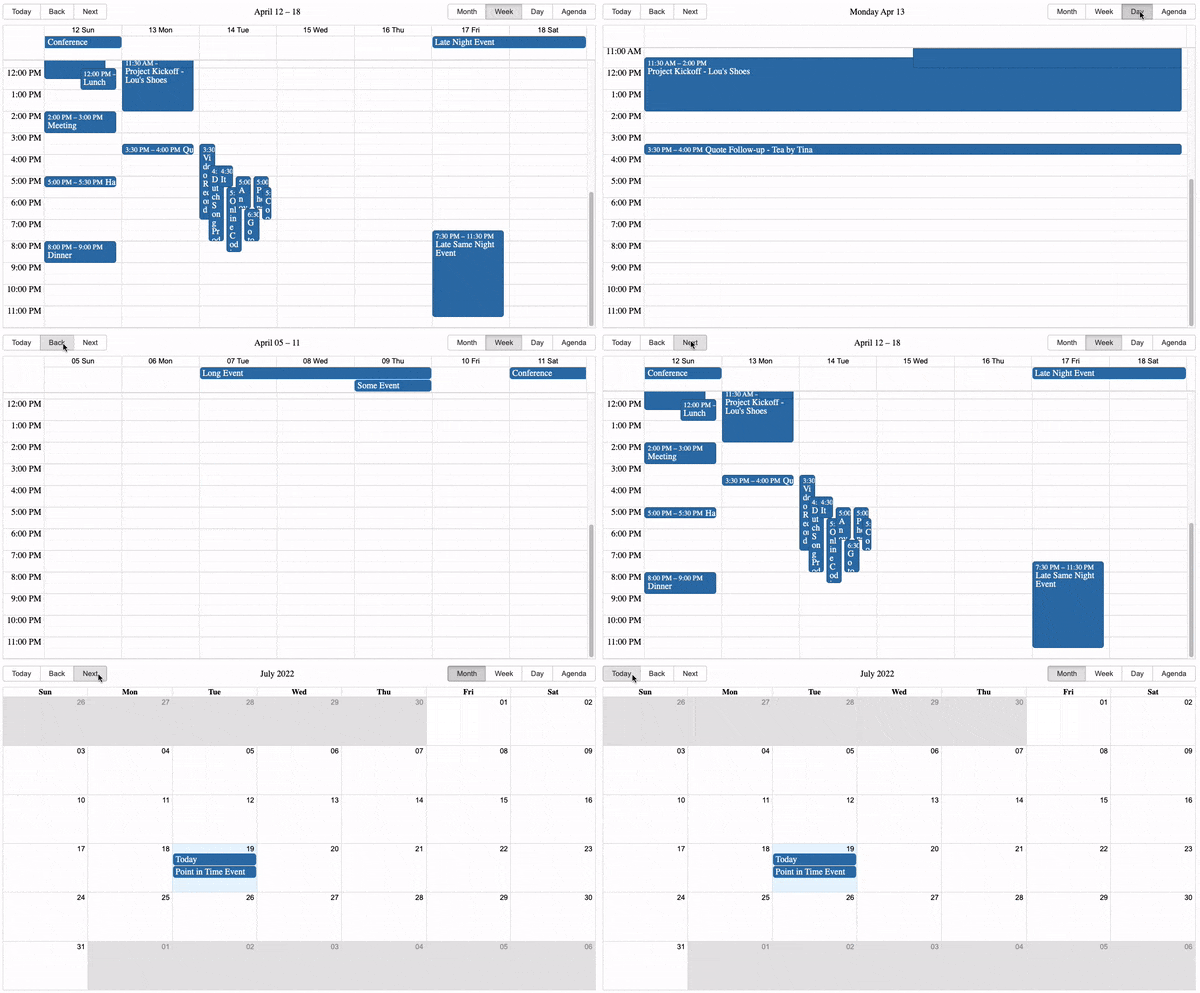
Inspired by Full Calendar.
Use and Setup
yarn add react-big-calendar or npm install --save react-big-calendar
Include react-big-calendar/lib/css/react-big-calendar.css for styles, and make sure your calendar's container
element has a height, or the calendar won't be visible. To provide your own custom styling, see the Custom Styling topic.
Starters
- react-big-calendar
- react-big-calendar with drag and drop
- react-big-calendar with TypeScript and React hooks bundled with Vite
Run examples locally
$ git clone git@github.com:bigcalendar/react-big-calendar.git
$ cd react-big-calendar
$ yarn
$ yarn storybook
- Open localhost:9002.
Localization and Date Formatting
react-big-calendar includes four options for handling the date formatting and culture localization, depending
on your preference of DateTime libraries. You can use either the Moment.js, Globalize.js, date-fns, Day.js localizers.
Regardless of your choice, you must choose a localizer to use this library:
Moment.js
import { Calendar, momentLocalizer } from 'react-big-calendar'
import moment from 'moment'

const localizer = momentLocalizer(moment)

const MyCalendar = (props) => (
  <div>
    <Calendar
      localizer={localizer}
      events={myEventsList}
      startAccessor="start"
      endAccessor="end"
      style={{ height: 500 }}
    />
  </div>
)
Globalize.js v0.1.1
import { Calendar, globalizeLocalizer } from 'react-big-calendar'
import globalize from 'globalize'

const localizer = globalizeLocalizer(globalize)

const MyCalendar = (props) => (
  <div>
    <Calendar
      localizer={localizer}
      events={myEventsList}
      startAccessor="start"
      endAccessor="end"
      style={{ height: 500 }}
    />
  </div>
)
date-fns v2
import { Calendar, dateFnsLocalizer } from 'react-big-calendar'
import format from 'date-fns/format'
import parse from 'date-fns/parse'
import startOfWeek from 'date-fns/startOfWeek'
import getDay from 'date-fns/getDay'
import enUS from 'date-fns/locale/en-US'

const locales = {
  'en-US': enUS,
}

const localizer = dateFnsLocalizer({
  format,
  parse,
  startOfWeek,
  getDay,
  locales,
})

const MyCalendar = (props) => (
  <div>
    <Calendar
      localizer={localizer}
      events={myEventsList}
      startAccessor="start"
      endAccessor="end"
      style={{ height: 500 }}
    />
  </div>
)
Day.js
Note that the dayjsLocalizer extends Day.js with the following plugins:
import { Calendar, dayjsLocalizer } from 'react-big-calendar'
import dayjs from 'dayjs'

const localizer = dayjsLocalizer(dayjs)

const MyCalendar = (props) => (
  <div>
    <Calendar
      localizer={localizer}
      events={myEventsList}
      startAccessor="start"
      endAccessor="end"
      style={{ height: 500 }}
    />
  </div>
)
Custom Styling
Out of the box, you can include the compiled CSS files and be up and running. But, sometimes, you may want to style Big Calendar to match your application styling. For this reason, SASS files are included with Big Calendar.
  @import 'react-big-calendar/lib/sass/styles';
  @import 'react-big-calendar/lib/addons/dragAndDrop/styles'; // if using DnD
SASS implementation provides a variables file containing color and sizing variables that you can
update to fit your application. Note: Changing and/or overriding styles can cause rendering issues with your
Big Calendar. Carefully test each change accordingly.
Join The Community
Help us improve Big Calendar! Join us on Slack. (Slack invite links do expire. If you can't get in, just file an issue and we'll get a new link.)