Npm Package Weekly Downloads Trend
🌟 Show real-time usage chart on @radix-ui/react-dialog's README.md, just copy the code below.## Usage Trend
[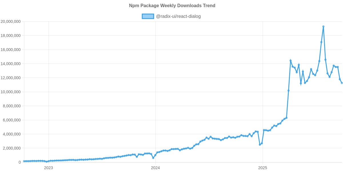](https://npm-compare.com/@radix-ui/react-dialog#timeRange=THREE_YEARS)
Cumulative GitHub Star Trend
🌟 Show GitHub stars trend chart on @radix-ui/react-dialog's README.md, just copy the code below.## GitHub Stars Trend
[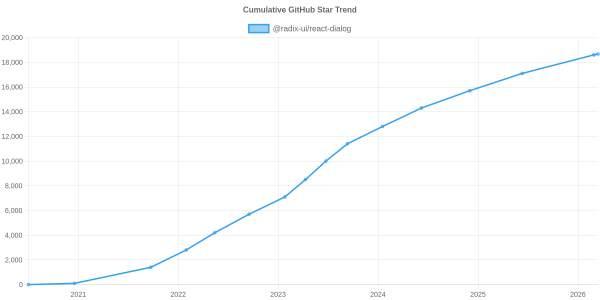](https://npm-compare.com/@radix-ui/react-dialog)


