Design Style
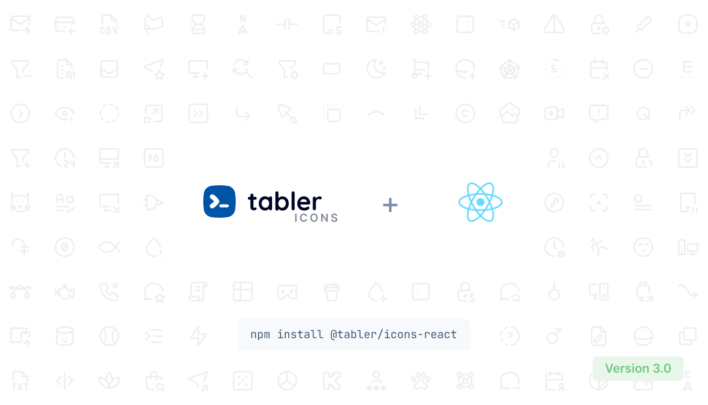
- @tabler/icons-react:
@tabler/icons-react features a modern and flat design aesthetic, which is perfect for contemporary web applications. The icons are designed with a consistent style that enhances the overall user interface, making it visually appealing and easy to integrate into various layouts.
- feather-icons-react:
Feather-icons-react offers a minimalist design approach, focusing on simplicity and clarity. The icons are outlined and lightweight, making them suitable for applications that prioritize a clean and unobtrusive user experience.
- react-icons:
React-icons provides a diverse range of icon styles by aggregating various libraries, including Font Awesome, Material Icons, and more. This allows developers to choose from a wide array of designs, catering to different project requirements and personal preferences.
Customization
- @tabler/icons-react:
@tabler/icons-react allows for easy customization of icons, enabling developers to modify colors, sizes, and other properties directly through props. This flexibility makes it suitable for projects that require a tailored visual identity.
- feather-icons-react:
Feather-icons-react supports customization by allowing developers to adjust the stroke width and color of the icons, making it easy to fit the icons into different design contexts without compromising their minimalist style.
- react-icons:
React-icons offers a straightforward way to customize icons by providing a unified API for all included libraries. Developers can easily change sizes and colors, making it a flexible choice for projects needing various icon styles.
Performance
- @tabler/icons-react:
@tabler/icons-react is optimized for performance, ensuring that icons are rendered efficiently without impacting the load time of the application. The SVG format used allows for scalability without loss of quality, making it suitable for responsive designs.
- feather-icons-react:
Feather-icons-react is lightweight and designed to minimize the impact on application performance. The minimalist design ensures that the icons do not bloat the application size, which is crucial for maintaining fast load times.
- react-icons:
React-icons can introduce some overhead due to its aggregation of multiple libraries, but it is still optimized for performance. Developers should be mindful of the specific icons used to avoid unnecessary bloat.
Ease of Use
- @tabler/icons-react:
@tabler/icons-react is user-friendly, with a straightforward API that allows for quick integration into React applications. The documentation is clear, making it easy for developers to get started and find the icons they need.
- feather-icons-react:
Feather-icons-react is designed for simplicity, with an intuitive API that makes it easy to implement icons in projects. The minimalistic approach means less complexity, which is beneficial for developers looking for quick solutions.
- react-icons:
React-icons is highly accessible, providing a familiar interface for developers who have used various icon libraries. Its ability to integrate multiple libraries into one package simplifies the process of selecting and using icons.
Community and Support
- @tabler/icons-react:
@tabler/icons-react has a growing community and is actively maintained, ensuring that developers can find support and updates. The library's popularity is increasing, which is beneficial for long-term projects.
- feather-icons-react:
Feather-icons-react is part of the Feather icon set, which has a strong following and community support. This ensures that developers can access resources and assistance when needed.
- react-icons:
React-icons enjoys widespread popularity and community support, making it easy to find tutorials, examples, and help from other developers. Its extensive use in the React ecosystem ensures ongoing maintenance and updates.

