angular-notifier
A well designed, fully animated, highly customizable, and easy-to-use notification library for your Angular 2+ application.
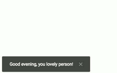
Demo
You can play around with this library with this Stackblitz right here.
How to install
You can get angular-notifier via npm by either adding it as a new dependency to your package.json file and running npm install,
or running the following command:
npm install angular-notifier
Angular versions
The following list describes the compatibility with Angular:
| Angular Notifier | Angular | Compilation |
|---|
1.x | 2.x | View Engine |
2.x | 4.x | View Engine |
3.x | 5.x | View Engine |
4.x | 6.x | View Engine |
5.x | 7.x | View Engine |
6.x | 8.x | View Engine |
7.x | 9.x | View Engine |
8.x | 10.x | View Engine |
9.x | 11.x | View Engine |
10.x | 12.x | View Engine |
11.x | 13.x | Ivy (partial mode) |
12.x | 14.x | Ivy (partial mode) |
13.x | 15.x | Ivy (partial mode) |
14.x | 16.x | Ivy (partial mode) |
How to setup
Before actually being able to use the angular-notifier library within our code, we have to first set it up within Angular, and also
bring the styles into our project.
1. Import the NotifierModule
First of all, make angular-notifier globally available to your Angular application by importing (and optionally also configuring) the
NotifierModule the your root Angular module. For example:
import { NotifierModule } from 'angular-notifier';

@NgModule({
  imports: [NotifierModule],
})
export class AppModule {}
But wait -- your probably might want to customize your notifications' look and behaviour according to your requirements and needs. To do so,
call the withConfig method on the NotifierModule, and pass in the options. For example:
import { NotifierModule } from 'angular-notifier';

@NgModule({
  imports: [
    NotifierModule.withConfig({
      // Custom options in here
    }),
  ],
})
export class AppModule {}
2. Use the notifier-container component
In addition, you have to place the notifier-container component somewhere in your application, best at the last element of your
root (app) component. For example:
@Component({
  selector: 'my-app',
  template: `
    <h1>Hello World</h1>
    <notifier-container></notifier-container>
  `,
})
export class AppComponent {}
Later on, this component will contain and manage all your applications' notifications.
3. Import the styles
Of course we also need to import the angular-notifier styles into our application. Depending on the architecture of your Angular
application, you want to either import the original SASS files, or the already compiled CSS files instead - or none of them if you wish to
write your own styles from scratch.
The easy way: Import all the styles
To import all the styles, simple include either the ~/angular-notifier/styles.(scss|css) file. It contains the core styles as well as all
the themes and notification types.
The advanced way: Only import the styles actually needed
To keep the size if your styles as small as possible (improving performance for the perfect UX), your might instead decide to only import
the styles actually needed by our application. The angular-notifier styles are modular:
- The
~/angular-notifier/styles/core.(scss|css) file is always required, it defines the basic styles (such as the layout)
- Themes can be imported from the
~/angular-notifier/styles/theme folder
- The different notification types, then, can be imported from the
~/angular-notifier/styles/types folder
How to use
Using angular-notifier is as simple as it can get -- simple import and inject the NotifierService into every component (directive,
service, ...) you want to use in. For example:
import { NotifierService } from 'angular-notifier';

@Component({
  // ...
})
export class MyAwesomeComponent {
  private readonly notifier: NotifierService;

  constructor(notifierService: NotifierService) {
    this.notifier = notifierService;
  }
}
Show notifications
Showing a notification is simple - all your need is a type, and a message to be displayed. For example:
this.notifier.notify('success', 'You are awesome! I mean it!');
You can further pass in a notification ID as the third (optional) argument. Essentially, such a notification ID is nothing more but a
unique string tha can be used later on to gain access (and thus control) to this specific notification. For example:
this.notifier.notify('success', 'You are awesome! I mean it!', 'THAT_NOTIFICATION_ID');
For example, you might want to define a notification ID if you know that, at some point in the future, you will need to remove this
exact notification.
The syntax above is actually just a shorthand version of the following:
this.notifier.show({
  type: 'success',
  message: 'You are awesome! I mean it!',
  id: 'THAT_NOTIFICATION_ID', // Again, this is optional
});
Hide notifications
You can also hide notifications. To hide a specific notification - assuming you've defined a notification ID when creating it, simply
call:
this.notifier.hide('THAT_NOTIFICATION_ID');
Furthermore, your can hide the newest notification by calling:
this.notifier.hideNewest();
Or, your could hide the oldest notification:
this.notifier.hideOldest();
And, of course, it's also possible to hide all visible notifications at once:
this.notifier.hideAll();
How to customize
From the beginning, the angular-notifier library has been written with customizability in mind. The idea is that angular-notifier
works the way your want it to, so that you can make it blend perfectly into the rest of your application. Still, the default configuration
should already provide a great User Experience.
Keep in mind that angular-notifier can be configured only once - which is at the time you import the NotifierModule into your root
(app) module.
Position
With the position property you can define where exactly notifications will appear on the screen:
position: {

  horizontal: {

    /**
     * Defines the horizontal position on the screen
     * @type {'left' | 'middle' | 'right'}
     */
    position: 'left',

    /**
     * Defines the horizontal distance to the screen edge (in px)
     * @type {number}
     */
    distance: 12

  },

  vertical: {

    /**
     * Defines the vertical position on the screen
     * @type {'top' | 'bottom'}
     */
    position: 'bottom',

    /**
     * Defines the vertical distance to the screen edge (in px)
     * @type {number}
     */
    distance: 12

    /**
     * Defines the vertical gap, existing between multiple notifications (in px)
     * @type {number}
     */
    gap: 10

  }

}
Theme
With the theme property you can change the overall look and feel of your notifications:
/**
 * Defines the notification theme, responsible for the Visual Design of notifications
 * @type {string}
 */
theme: 'material';
Theming in detail
Well, how does theming actually work? In the end, the value set for the theme property will be part of a class added to each notification
when being created. For example, using material as the theme results in all notifications getting a class assigned named x-notifier__notification--material.
Everyone - yes, I'm looking at you - can use this mechanism to write custom notification themes and apply them via the theme property.
For example on how to create a theme from scratch, just take a look at the themes coming along with this library (as for now only the
material theme).
Behaviour
With the behaviour property you can define how notifications will behave in different situations:
behaviour: {

  /**
   * Defines whether each notification will hide itself automatically after a timeout passes
   * @type {number | false}
   */
  autoHide: 5000,

  /**
   * Defines what happens when someone clicks on a notification
   * @type {'hide' | false}
   */
  onClick: false,

  /**
   * Defines what happens when someone hovers over a notification
   * @type {'pauseAutoHide' | 'resetAutoHide' | false}
   */
  onMouseover: 'pauseAutoHide',

  /**
   * Defines whether the dismiss button is visible or not
   * @type {boolean}
   */
  showDismissButton: true,

  /**
   * Defines whether multiple notification will be stacked, and how high the stack limit is
   * @type {number | false}
   */
  stacking: 4

}
Custom Templates
If you need more control over how the inner HTML part of the notification looks like, either because your style-guide requires it, or for being able to add icons etc, then you can define a custom <ng-template> which you pass to the NotifierService.
You can define a custom ng-template as follows:
<ng-template #customNotification let-notificationData="notification">
  <my-custom-alert type="notificationData.type"> {{ notificationData.message }} </my-custom-alert>
</ng-template>
In this case you could wrap your own HTML, even a <my-custom-alert> component which you might use in your application. The notification data is passed in as a notification object, which you can reference inside the <ng-template> using the let- syntax.
Inside your component, you can then reference the <ng-template> by its template variable #customNotification using Angular's ViewChild:
import { ViewChild } from '@angular/core';

@Component({
  // ...
})
export class SomeComponent {
  @ViewChild('customNotification', { static: true }) customNotificationTmpl;

  constructor(private notifierService: NotifierService) {}

  showNotification() {
    this.notifier.show({
      message: 'Hi there!',
      type: 'info',
      template: this.customNotificationTmpl,
    });
  }
}
Animations
With the animations property your can define whether and how exactly notification will be animated:
animations: {

  /**
   * Defines whether all (!) animations are enabled or disabled
   * @type {boolean}
   */
  enabled: true,

  show: {

    /**
     * Defines the animation preset that will be used to animate a new notification in
     * @type {'fade' | 'slide'}
     */
    preset: 'slide',

    /**
     * Defines how long it will take to animate a new notification in (in ms)
     * @type {number}
     */
    speed: 300,

    /**
     * Defines which easing method will be used when animating a new notification in
     * @type {'linear' | 'ease' | 'ease-in' | 'ease-out' | 'ease-in-out'}
     */
    easing: 'ease'

  },

  hide: {

    /**
     * Defines the animation preset that will be used to animate a new notification out
     * @type {'fade' | 'slide'}
     */
    preset: 'fade',

    /**
     * Defines how long it will take to animate a new notification out (in ms)
     * @type {number}
     */
    speed: 300,

    /**
     * Defines which easing method will be used when animating a new notification out
     * @type {'linear' | 'ease' | 'ease-in' | 'ease-out' | 'ease-in-out'}
     */
    easing: 'ease',

    /**
     * Defines the animation offset used when hiding multiple notifications at once (in ms)
     * @type {number | false}
     */
    offset: 50

  },

  shift: {

    /**
     * Defines how long it will take to shift a notification around (in ms)
     * @type {number}
     */
    speed: 300,

    /**
     * Defines which easing method will be used when shifting a notification around
     * @type {string}
     */
    easing: 'ease' // All standard CSS easing methods work

  },

  /**
   * Defines the overall animation overlap, allowing for much smoother looking animations (in ms)
   * @type {number | false}
   */
  overlap: 150

}
In short -- the default configuration
To sum it up, the following is the default configuration (copy-paste-friendly):
const notifierDefaultOptions: NotifierOptions = {
  position: {
    horizontal: {
      position: 'left',
      distance: 12,
    },
    vertical: {
      position: 'bottom',
      distance: 12,
      gap: 10,
    },
  },
  theme: 'material',
  behaviour: {
    autoHide: 5000,
    onClick: false,
    onMouseover: 'pauseAutoHide',
    showDismissButton: true,
    stacking: 4,
  },
  animations: {
    enabled: true,
    show: {
      preset: 'slide',
      speed: 300,
      easing: 'ease',
    },
    hide: {
      preset: 'fade',
      speed: 300,
      easing: 'ease',
      offset: 50,
    },
    shift: {
      speed: 300,
      easing: 'ease',
    },
    overlap: 150,
  },
};