Architectural Strategies for Emoji Integration in React Applications
emoji-mart, emoji-picker-react, and react-emoji-render address distinct phases of the emoji lifecycle within a React application. emoji-mart serves as a comprehensive data source and UI component library, offering a highly customizable picker and robust metadata management for diverse emoji sets. emoji-picker-react focuses exclusively on the user interface, providing a lightweight, drop-in component for selecting emojis with minimal configuration overhead. In contrast, react-emoji-render operates as a rendering engine, designed to parse text strings containing shortcodes (e.g., :smile:) or native unicode and transform them into styled SVG or image elements for display. Understanding the separation between selection (picker) and presentation (renderer) is critical for architects deciding whether to adopt a single all-in-one solution or a decoupled architecture.
Npm Package Weekly Downloads Trend
Github Stars Ranking
Stat Detail


Emoji Architecture in React: Selection vs. Rendering
Building robust emoji support in React applications requires a clear distinction between two fundamental operations: selection (letting users choose an emoji) and rendering (displaying that emoji consistently in the UI). The packages emoji-mart, emoji-picker-react, and react-emoji-render solve different parts of this puzzle. Choosing the right tool depends on whether you need a data-rich picker, a simple UI component, or a specialized rendering engine for shortcode conversion.
🎨 The Picker Experience: Customization vs. Simplicity
When implementing an emoji selector, architects often face a trade-off between flexibility and ease of use. emoji-mart and emoji-picker-react represent opposite ends of this spectrum.
emoji-mart provides a highly modular architecture. It separates the emoji data from the UI components, allowing you to swap out entire emoji sets (e.g., switching from Apple to Google emojis) without changing your component logic. This is crucial for applications that need to respect user platform preferences or brand guidelines.
// emoji-mart: High customization with custom emoji set
import { Picker } from '@emoji-mart/react';
import data from '@emoji-mart/data';

function CustomPicker({ onEmojiSelect }) {
  return (
    <Picker
      data={data}
      onEmojiSelect={onEmojiSelect}
      theme="dark"
      set="google" // Explicitly choose the emoji set
      previewPosition="none" // Hide preview bar for compact UI
    />
  );
}
emoji-picker-react, conversely, prioritizes immediate usability. It bundles the necessary data and logic into a single component that works out of the box. While it supports theming, it lacks the granular control over emoji datasets found in emoji-mart. This makes it ideal for rapid prototyping or features where the native look of emojis is acceptable.
// emoji-picker-react: Drop-in simplicity
import EmojiPicker from 'emoji-picker-react';

function SimplePicker({ onEmojiSelect }) {
  return (
    <EmojiPicker
      onEmojiClick={(event, emojiObject) => onEmojiSelect(emojiObject.emoji)}
      searchDisabled={false}
      skinTonesDisabled={true} // Simplify UI by disabling skin tone selection
    />
  );
}
🔄 Data Flow: Objects vs. Strings
A critical architectural decision is how emoji data flows through your application. The packages differ significantly in what they return upon selection, which impacts how you store and process this data in your backend or state management layer.
emoji-mart returns a rich object containing metadata. This includes the unicode character, shortcodes, skin tone variations, and the specific set identifier. This approach is powerful if you need to store semantic data rather than just the visual character.
// emoji-mart: Returns a comprehensive data object
const handleEmojiSelect = (emojiData) => {
  // emojiData looks like:
  // { id: "smile", skins: [{ src: "..." }], shortcodes: ":smile:", unicode: "😄" }
  console.log("Selected Unicode:", emojiData.unicode);
  console.log("Shortcode:", emojiData.shortcodes);
};
emoji-picker-react simplifies this by focusing on the visual character. The callback provides an object, but the primary payload is the emoji string itself. This reduces the complexity of your state model if you only intend to store the unicode character in your database.
// emoji-picker-react: Focuses on the emoji string
const handleEmojiClick = (event, emojiObject) => {
  // emojiObject looks like: { emoji: "😄", activeSkinTone: "neutral", ... }
  const selectedChar = emojiObject.emoji;
  console.log("Selected Character:", selectedChar);
};
🖼️ Rendering Shortcodes: The Specialized Role of react-emoji-render
While pickers handle selection, react-emoji-render addresses a specific display challenge: converting text-based shortcodes (common in markdown or legacy systems) into visual emojis. Neither emoji-mart nor emoji-picker-react is designed to parse and render strings automatically; they are input components. react-emoji-render fills this gap by acting as a transformer.
react-emoji-render scans text for patterns like :smile: and replaces them with SVG or image tags. This ensures that emojis look identical across all devices, bypassing the inconsistency of native OS fonts. This is essential for platforms where brand consistency is more important than native integration.
// react-emoji-render: Transforming shortcodes to visuals
import Emoji from 'react-emoji-render';

function CommentBody({ text }) {
  // Input: "Great job! :tada: Keep it up :+1:"
  // Output: "Great job! 🎉 Keep it up 👍" (rendered as SVGs/Images)
  return (
    <div className="comment-text">
      <Emoji text={text} options={{ className: "custom-emoji-class" }} />
    </div>
  );
}
In contrast, using emoji-mart or emoji-picker-react for display would require you to manually map unicode characters to images, a task react-emoji-render automates. If your database stores shortcodes, this package is indispensable; if you store unicode, native text rendering is usually sufficient unless you require strict visual uniformity.
🏗️ Architectural Patterns: Coupled vs. Decoupled
How you combine these tools defines your application's maintenance burden and flexibility.
Pattern A: The Decoupled Approach (Recommended for Scale)
Use emoji-mart for selection and react-emoji-render for display. This separates concerns cleanly. You store shortcodes in your database (using emoji-mart's metadata), ensuring data stability even if emoji standards change. You then use react-emoji-render to display them consistently.
// Selection Phase
import { Picker } from '@emoji-mart/react';
// Storage: Save emojiData.shortcodes (e.g., ":smile:") to DB

// Display Phase
import Emoji from 'react-emoji-render';
// Rendering: Parse stored shortcodes back to visuals
<Emoji text={storedShortcodeString} />
Pattern B: The Lightweight Approach
Use emoji-picker-react for selection and rely on native unicode rendering for display. This minimizes dependencies and bundle size. It is suitable for internal tools or applications where slight visual differences between iOS and Android are acceptable.
// Selection Phase
import EmojiPicker from 'emoji-picker-react';
// Storage: Save emojiObject.emoji (e.g., "😄") to DB

// Display Phase
// No extra library needed; standard text rendering works
<div>{storedUnicodeString}</div>
⚠️ Critical Considerations for Production
Deprecation and Versioning
Developers must be aware that emoji-mart underwent a significant breaking change between version 5 and version 6 (often imported as @emoji-mart/react). The older emoji-mart (v5 and below) is effectively deprecated for new React projects due to its heavy reliance on legacy lifecycle methods and larger bundle size. Always verify you are installing the modern, modular packages (@emoji-mart/react, @emoji-mart/data) rather than the legacy monolith. react-emoji-render remains stable but sees infrequent updates; ensure it supports the specific shortcode format your backend produces.
Bundle Size and Performance
emoji-mart is data-heavy. Loading the entire emoji dataset on initial page load can severely impact performance. Architects should implement dynamic imports or load the data only when the user triggers the picker. emoji-picker-react handles data loading more internally but still represents a significant chunk of JavaScript if not code-split. react-emoji-render is lightweight but adds a processing step to every text render, which should be considered for long lists of comments or messages.
📊 Summary of Capabilities
| Feature | emoji-mart | emoji-picker-react | react-emoji-render |
|---|---|---|---|
| Primary Role | Data-rich Picker | Simple Picker | Text Renderer |
| Customization | High (Themes, Sets, Categories) | Medium (Basic Theming) | Low (Style props only) |
| Output Format | Rich Object (Unicode + Shortcode) | Object (Primary: Unicode) | Rendered Component (SVG/Img) |
| Data Source | External (@emoji-mart/data) | Bundled Internal | Internal Mapping |
| Best Use Case | Enterprise Chat, Design Systems | Forms, Quick Inputs | Displaying Shortcode Text |
💡 Final Architectural Recommendation
For most professional applications, a hybrid strategy yields the best results. Use emoji-mart (specifically the modern @emoji-mart/react implementation) to capture user input, leveraging its ability to provide both unicode and shortcodes. Store the shortcode in your database to ensure data longevity and independence from platform-specific unicode updates. Finally, employ react-emoji-render on the frontend to display these shortcodes as consistent, brand-aligned SVGs.
Reserve emoji-picker-react for scenarios where development speed is the absolute priority and the application does not require strict cross-platform visual consistency or complex data handling. Avoid using react-emoji-render for input selection; it is strictly a display utility. By decoupling selection and rendering, you build a system that is resilient to emoji standard changes and easier to maintain over time.
How to Choose: emoji-mart vs emoji-picker-react vs react-emoji-render
- emoji-mart:
Choose
emoji-martwhen you require deep customization of the emoji picker UI, need support for multiple emoji sets (Apple, Google, Twitter), or require precise control over emoji data and categories. It is the ideal choice for complex chat applications or design systems where the picker must match a specific brand aesthetic, though it demands more initial setup and state management compared to simpler alternatives. - emoji-picker-react:
Select
emoji-picker-reactif your primary goal is to integrate a functional, zero-config emoji selector quickly with minimal bundle impact. This package is best suited for standard forms, comment sections, or internal tools where developer speed and simplicity outweigh the need for extensive theme customization or multi-set support. It excels in scenarios where you need a reliable picker without the overhead of managing external data sets. - react-emoji-render:
Opt for
react-emoji-renderspecifically for the display layer when your application stores or transmits emojis as shortcodes (like:joy:) rather than unicode characters. Use this when you need to ensure consistent visual rendering of emojis across different platforms by converting text tokens into SVGs or images, but note that this package does not provide a selection interface and must be paired with a separate picker solution.
Popular Comparisons
README for emoji-mart
Emoji Mart is a customizable
emoji picker HTML component for the web
Demo
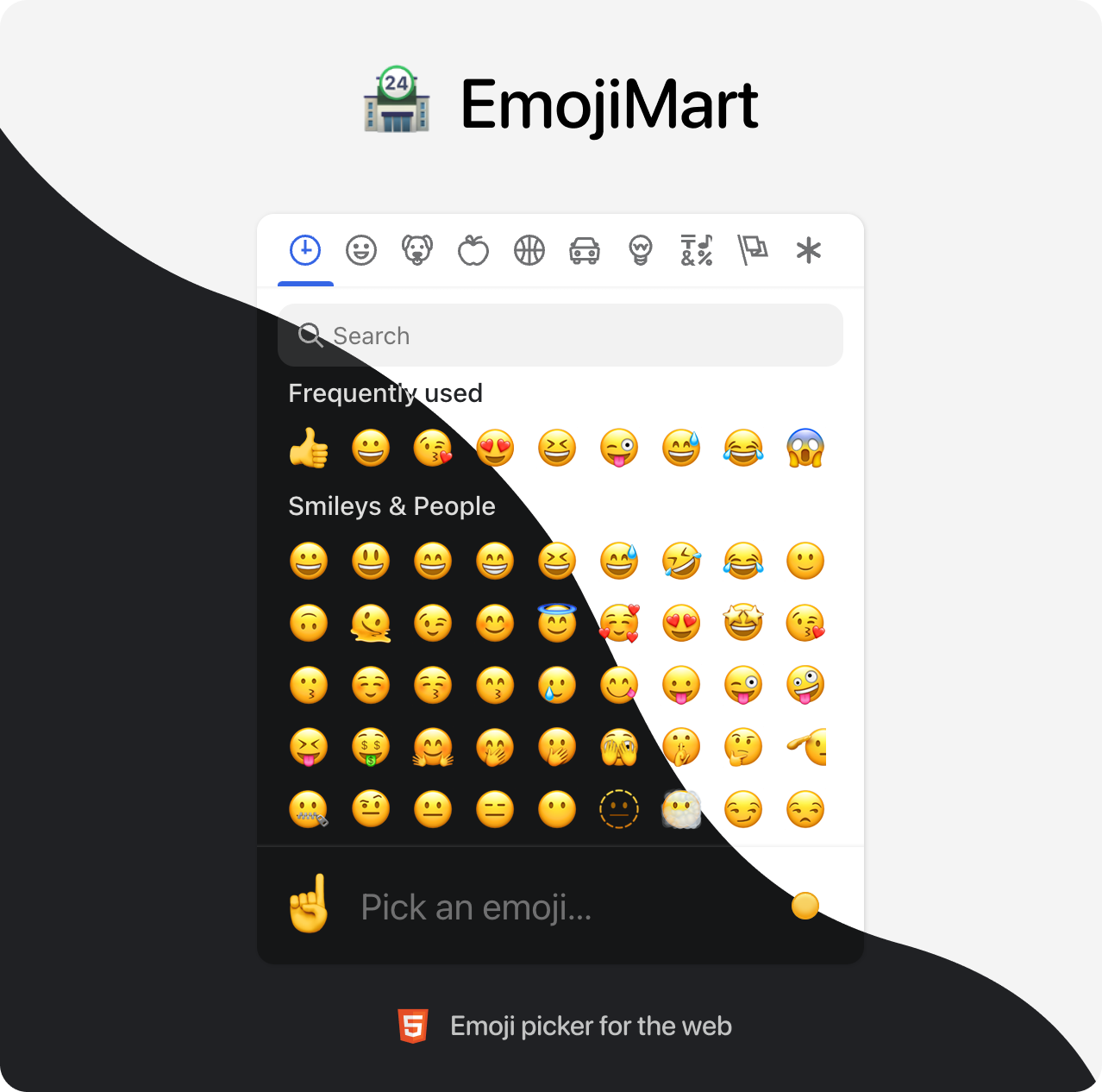

Brought to you by the Missive team
📖 Table of Contents
- 💾 Data
- 🏪 Picker
- 🙃 Emoji component
- 🕵️♀️ Headless search
- 🔬 Get emoji data from native
- 🗺 Internationalization
- 📚 Examples
- 🤓 Built for modern browsers
- 🛠 Development
💾 Data
Data required for the picker to work has been completely decoupled from the library. That gives developers the flexibility to better control their app bundle size and let them choose how and when this data is loaded. Data can be:
Bundled directly into your codebase
- Pros: Picker renders instantly, data is available offline
- Cons: Slower initial page load (bigger file to load)
yarn add @emoji-mart/data
import data from '@emoji-mart/data'
import { Picker } from 'emoji-mart'

new Picker({ data })
Fetched remotely
- Pros: Data fetched only when needed, does not affect your app bundle size
- Cons: Network latency, doesn’t work offline (unless you configure a ServiceWorker)
import { Picker } from 'emoji-mart'
new Picker({
  data: async () => {
    const response = await fetch(
      'https://cdn.jsdelivr.net/npm/@emoji-mart/data',
    )

    return response.json()
  }
})
In this example data is fetched from a content delivery network, but it could also be fetched from your own domain if you want to host the data.
🏪 Picker
React
npm install --save emoji-mart @emoji-mart/data @emoji-mart/react
import data from '@emoji-mart/data'
import Picker from '@emoji-mart/react'

function App() {
  return (
    <Picker data={data} onEmojiSelect={console.log} />
  )
}
Browser
<script src="https://cdn.jsdelivr.net/npm/emoji-mart@latest/dist/browser.js"></script>
<script>
  const pickerOptions = { onEmojiSelect: console.log }
  const picker = new EmojiMart.Picker(pickerOptions)

  document.body.appendChild(picker)
</script>
Options / Props
| Option | Default | Choices | Description |
|---|---|---|---|
| data | {} | Data to use for the picker | |
| i18n | {} | Localization data to use for the picker | |
| categories | [] | frequent, people, nature, foods, activity, places, objects, symbols, flags | Categories to show in the picker. Order is respected. |
| custom | [] | Custom emojis | |
| onEmojiSelect | null | Callback when an emoji is selected | |
| onClickOutside | null | Callback when a click outside of the picker happens | |
| onAddCustomEmoji | null | Callback when the Add custom emoji button is clicked. The button will only be displayed if this callback is provided. It is displayed when search returns no results. | |
| autoFocus | false | Whether the picker should automatically focus on the search input | |
| categoryIcons | {} | Custom category icons | |
| dynamicWidth | false | Whether the picker should calculate perLine dynamically based on the width of <em-emoji-picker>. When enabled, perLine is ignored | |
| emojiButtonColors | [] | i.e. #f00, pink, rgba(155,223,88,.7) | An array of color that affects the hover background color |
| emojiButtonRadius | 100% | i.e. 6px, 1em, 100% | The radius of the emoji buttons |
| emojiButtonSize | 36 | The size of the emoji buttons | |
| emojiSize | 24 | The size of the emojis (inside the buttons) | |
| emojiVersion | 14 | 1, 2, 3, 4, 5, 11, 12, 12.1, 13, 13.1, 14 | The version of the emoji data to use. Latest version supported in @emoji-mart/data is currently 14 |
| exceptEmojis | [] | List of emoji IDs that will be excluded from the picker | |
| icons | auto | auto, outline, solid | The type of icons to use for the picker. outline with light theme and solid with dark theme. |
| locale | en | en, ar, be, cs, de, es, fa, fi, fr, hi, it, ja, ko, nl, pl, pt, ru, sa, tr, uk, vi, zh | The locale to use for the picker |
| maxFrequentRows | 4 | The maximum number of frequent rows to show. 0 will disable frequent category | |
| navPosition | top | top, bottom, none | The position of the navigation bar |
| noCountryFlags | false | Whether to show country flags or not. If not provided, tbhis is handled automatically (Windows doesn’t support country flags) | |
| noResultsEmoji | cry | The id of the emoji to use for the no results emoji | |
| perLine | 9 | The number of emojis to show per line | |
| previewEmoji | point_up | The id of the emoji to use for the preview when not hovering any emoji. point_up when preview position is bottom and point_down when preview position is top. | |
| previewPosition | bottom | top, bottom, none | The position of the preview |
| searchPosition | sticky | sticky, static, none | The position of the search input |
| set | native | native, apple, facebook, google, twitter | The set of emojis to use for the picker. native being the most performant, others rely on spritesheets. |
| skin | 1 | 1, 2, 3, 4, 5, 6 | The emojis skin tone |
| skinTonePosition | preview | preview, search, none | The position of the skin tone selector |
| theme | auto | auto, light, dark | The color theme of the picker |
| getSpritesheetURL | null | A function that returns the URL of the spritesheet to use for the picker. It should be compatible with the data provided. |
Custom emojis
You can use custom emojis by providing an array of categories and their emojis. Emojis also support multiple skin tones and can be GIFs or SVGs.
import data from '@emoji-mart/data'
import Picker from '@emoji-mart/react'

const custom = [
  {
    id: 'github',
    name: 'GitHub',
    emojis: [
      {
        id: 'octocat',
        name: 'Octocat',
        keywords: ['github'],
        skins: [{ src: './octocat.png' }],
      },
      {
        id: 'shipit',
        name: 'Squirrel',
        keywords: ['github'],
        skins: [
          { src: './shipit-1.png' }, { src: './shipit-2.png' }, { src: './shipit-3.png' },
          { src: './shipit-4.png' }, { src: './shipit-5.png' }, { src: './shipit-6.png' },
        ],
      },
    ],
  },
  {
    id: 'gifs',
    name: 'GIFs',
    emojis: [
      {
        id: 'party_parrot',
        name: 'Party Parrot',
        keywords: ['dance', 'dancing'],
        skins: [{ src: './party_parrot.gif' }],
      },
    ],
  },
]

function App() {
  return (
    <Picker data={data} custom={custom} />
  )
}
Custom category icons
You can use custom category icons by providing an object with the category name as key and the icon as value. Currently supported formats are svg string and src. See example.
const customCategoryIcons = {
  categoryIcons: {
    activity: {
      svg: '<svg xmlns="http://www.w3.org/2000/svg" viewBox="0 0 640 512"><path d="M57.89 397.2c-6.262-8.616-16.02-13.19-25.92-13.19c-23.33 0-31.98 20.68-31.98 32.03c0 6.522 1.987 13.1 6.115 18.78l46.52 64C58.89 507.4 68.64 512 78.55 512c23.29 0 31.97-20.66 31.97-32.03c0-6.522-1.988-13.1-6.115-18.78L57.89 397.2zM496.1 352c-44.13 0-79.72 35.75-79.72 80s35.59 80 79.72 80s79.91-35.75 79.91-80S540.2 352 496.1 352zM640 99.38c0-13.61-4.133-27.34-12.72-39.2l-23.63-32.5c-13.44-18.5-33.77-27.68-54.12-27.68c-13.89 0-27.79 4.281-39.51 12.8L307.8 159.7C262.2 192.8 220.4 230.9 183.4 273.4c-24.22 27.88-59.18 63.99-103.5 99.63l56.34 77.52c53.79-35.39 99.15-55.3 127.1-67.27c51.88-22 101.3-49.87 146.9-82.1l202.3-146.7C630.5 140.4 640 120 640 99.38z"/></svg>',
    },
    people: {
      src: './people.png',
    },
  },
}
🙃 Emoji component
The emoji web component usage is the same no matter what library you use.
First, you need to make sure data has been initialized. You need to call this only once per page load. Note that if you call init like this, you don’t necessarily need to include data in your Picker props. It doesn’t hurt either, it will noop.
import data from '@emoji-mart/data'
import { init } from 'emoji-mart'

init({ data })
Then you can use the emoji component in your HTML / JSX.
<em-emoji id="+1" size="2em"></em-emoji>
<em-emoji id="+1" skin="2"></em-emoji>
<em-emoji shortcodes=":+1::skin-tone-1:"></em-emoji>
<em-emoji shortcodes=":+1::skin-tone-2:"></em-emoji>
Attributes / Props
| Attribute | Example | Description |
|---|---|---|
| id | +1 | An emoji ID |
| shortcodes | :+1::skin-tone-2: | An emoji shortcode |
| native | 👍 | A native emoji |
| size | 2em | The inline element size |
| fallback | :shrug: | A string to be rendered in case the emoji can’t be found |
| set | native | The emoji set: native, apple, facebook, google, twitter |
| skin | 1 | The emoji skin tone: 1, 2, 3, 4, 5, 6 |
🕵️♀️ Headless search
You can search without the Picker. Just like the emoji component, data needs to be initialized first in order to use the search index.
import data from '@emoji-mart/data'
import { init, SearchIndex } from 'emoji-mart'
init({ data })
async function search(value) {
const emojis = await SearchIndex.search(value)
const results = emojis.map((emoji) => {
return emoji.skins[0].native
})
console.log(results)
}
search('christmas') // => ['🎄', '🇨🇽', '🧑🎄', '🔔', '🤶', '🎁', '☃️', '❄️', '🎅', '⛄']
🔬 Get emoji data from native
You can get emoji data from a native emoji. This is useful if you want to get the emoji ID from a native emoji. Just like the emoji component, data needs to be initialized first in order to retrieve the emoji data.
import data from '@emoji-mart/data'
import { init, getEmojiDataFromNative } from 'emoji-mart'

init({ data })

getEmojiDataFromNative('🤞🏿').then(console.log)
/* {
  aliases: ['hand_with_index_and_middle_fingers_crossed'],
  id: 'crossed_fingers',
  keywords: ['hand', 'with', 'index', 'and', 'middle', 'good', 'lucky'],
  name: 'Crossed Fingers',
  native: '🤞🏿',
  shortcodes: ':crossed_fingers::skin-tone-6:',
  skin: 6,
  unified: '1f91e-1f3ff',
} */
🗺 Internationalization
EmojiMart UI supports multiple languages, feel free to open a PR if yours is missing.
import i18n from '@emoji-mart/data/i18n/fr.json'
i18n.search_no_results_1 = 'Aucun emoji'

new Picker({ i18n })
Given the small file size, English is built-in and doesn’t need to be provided.
📚 Examples
🤓 Built for modern browsers
EmojiMart relies on these APIs, you may need to include polyfills if you need to support older browsers:
🛠 Development
yarn install
yarn dev