Architectural Choices for Dynamic Grid and Dashboard Layouts
gridstack, muuri, packery, and vue-grid-layout are all JavaScript libraries designed to solve complex layout problems, but they target different architectural needs. gridstack is a framework-agnostic library built specifically for draggable, resizable grid dashboards, offering deep customization and framework wrappers. muuri is a powerful, framework-agnostic layout engine that excels at sorting, filtering, and arranging items with smooth animations, treating layout as a dynamic flow rather than a rigid grid. packery is a lightweight, vanilla JavaScript library focused purely on gap-free masonry layouts, originally by MetaFizzy. vue-grid-layout is a Vue.js-specific implementation of a draggable and resizable grid system, tightly coupled to the Vue reactivity system to provide a native developer experience for Vue applications.
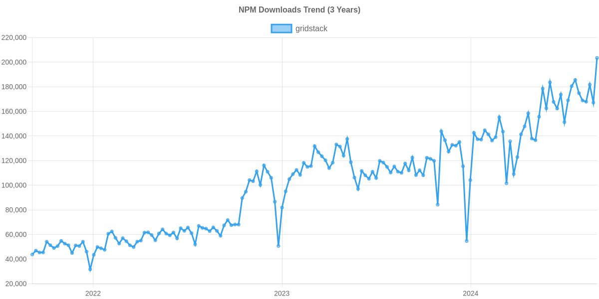
Npm Package Weekly Downloads Trend
Github Stars Ranking
Stat Detail


Architectural Choices for Dynamic Grid and Dashboard Layouts
Building interactive dashboards, masonry galleries, or drag-and-drop interfaces requires more than just CSS Grid. While CSS handles static layouts well, dynamic scenarios—where users resize widgets, filter items, or reorder content on the fly—demand JavaScript engines that manage DOM geometry and state. gridstack, muuri, packery, and vue-grid-layout are the leading solutions in this space, but they solve fundamentally different problems. Let's break down their architectures, strengths, and trade-offs.
🏗️ Core Philosophy: Rigid Grids vs. Fluid Masonry
The first decision is whether your layout needs a strict coordinate system or a fluid packing algorithm.
gridstack enforces a strict grid system. Every widget occupies specific x, y, width, and height coordinates. It prevents overlaps and snaps items to the nearest grid cell. This is essential for dashboards where alignment matters.
// gridstack: Initializing a strict grid
const grid = GridStack.init({
  cellHeight: 100,
  column: 12,
  draggable: { handle: '.card-header' }
});

// Adding a widget at specific coordinates
grid.addWidget({ x: 0, y: 0, w: 4, h: 2, content: 'Widget A' });
muuri treats layout as a fluid process. It calculates positions based on available space, allowing for masonry (gap-free) layouts, horizontal flows, or strict grids depending on configuration. It excels when item heights vary dynamically.
// muuri: Initializing a fluid layout
const grid = new Muuri('.grid', {
  layout: {
    fillGaps: true, // Enables masonry-style packing
    horizontal: false
  },
  dragEnabled: true
});

// Items are automatically positioned based on content size
packery is purely a masonry engine. Its sole purpose is to fill vertical gaps between items of varying heights. It does not natively support the complex resizing logic found in gridstack.
// packery: Simple masonry initialization
const pckry = new Packery('.grid', {
  itemSelector: '.grid-item',
  gutter: 10
});

// Layout is calculated once; dragging requires separate logic or is limited
vue-grid-layout mirrors gridstack's rigid coordinate philosophy but binds it directly to Vue's reactivity system. The layout state is a reactive array of objects, making it feel native to Vue developers.
<!-- vue-grid-layout: Reactive grid definition -->
<template>
  <grid-layout v-model="layout" :col-num="12">
    <grid-item v-for="item in layout" :key="item.i" :x="item.x" :y="item.y">
      {{ item.content }}
    </grid-item>
  </grid-layout>
</template>

<script>
export default {
  data() {
    return {
      layout: [
        { x: 0, y: 0, w: 4, h: 2, i: '0', content: 'Widget A' }
      ]
    };
  }
};
</script>
🖱️ Interaction Models: Resize, Drag, and Filter
How the library handles user interaction defines its suitability for your project.
gridstack provides built-in, robust support for both dragging and resizing out of the box. It handles collision detection intelligently, pushing other widgets out of the way or preventing movement if locked.
// gridstack: Enabling resizing and collision handling
grid.enableMove(true);
grid.enableResize(true);

// Event: Listen for changes to update backend state
grid.on('change', (items) => {
  items.forEach((item) => {
    console.log(`Widget ${item.id} moved to ${item.x},${item.y}`);
  });
});
muuri separates layout logic from interaction logic. It offers best-in-class sorting and filtering animations. You can filter items by category, and Muuri will animate the remaining items to fill the gaps smoothly.
// muuri: Filtering with animation
grid.filter(item => item.getElement().dataset.category === 'design');

// Sorting items based on a custom criterion
grid.sort((itemA, itemB) => {
  return itemA.getElement().dataset.priority - itemB.getElement().dataset.priority;
});
packery focuses on layout calculation. While it has a sibling library (draggabilly) for dragging, it lacks the integrated resize-and-collision ecosystem of gridstack. It is best for read-heavy layouts with occasional reordering.
// packery: Layout shift after image load
img.onload = () => {
  pckry.layout(); // Recalculates positions to fill gaps
};
vue-grid-layout offers dragging and resizing similar to gridstack but relies on Vue's event system. It is less configurable than raw gridstack but requires significantly less boilerplate code in a Vue app.
<!-- vue-grid-layout: Handling layout updates via v-model -->
<grid-layout v-model="layout" @layout-updated="onLayoutUpdated">
  <!-- Items automatically sync with the 'layout' array -->
</grid-layout>

<script>
export default {
  methods: {
    onLayoutUpdated(newLayout) {
      // newLayout is the updated array of coordinates
      this.saveToDatabase(newLayout);
    }
  }
};
</script>
⚠️ Maintenance and Framework Integration
A critical architectural consideration is the long-term viability of the library and its fit with your stack.
packery is currently in maintenance mode. The original creators (MetaFizzy) have shifted focus, and no major feature updates are expected. For new projects, relying on packery introduces risk. Modern CSS Grid with grid-template-rows: masonry (emerging standard) or engines like muuri are safer bets for masonry layouts.
vue-grid-layout is tightly coupled to Vue. While this is a benefit for Vue shops, it creates a migration trap. If you ever move to React or Svelte, you cannot reuse the layout logic. Additionally, ensure you select the correct version for Vue 2 vs. Vue 3, as they are distinct packages.
gridstack is framework-agnostic. It maintains official wrappers for Angular, React, and Vue. This means your core layout logic remains portable. If you switch frameworks, you only change the wrapper, not the underlying grid engine.
// gridstack: Works in vanilla JS, React, Vue, or Angular
// The core API remains identical across frameworks
grid.update(widget, { x: 5, y: 5, w: 2, h: 2 });
muuri is also framework-agnostic and highly modular. It works well with any build system and does not impose a specific component structure, giving you full control over the DOM.
📊 Summary: Key Differences
| Feature | gridstack | muuri | packery | vue-grid-layout |
|---|---|---|---|---|
| Layout Type | Strict Grid (Coordinates) | Fluid / Masonry / Grid | Masonry Only | Strict Grid (Coordinates) |
| Resize Support | ✅ Native & Robust | ❌ (Layout only) | ❌ | ✅ Native |
| Filtering/Sorting | ⚠️ Basic | ✅ Advanced with Animations | ❌ | ⚠️ Basic (via Vue) |
| Framework | Agnostic (Wrappers available) | Agnostic | Agnostic | Vue Only |
| Maintenance | ✅ Active | ✅ Active | ⚠️ Maintenance Mode | ✅ Active |
💡 The Big Picture
gridstack is the industry standard for dashboards. If your users need to resize widgets, lock them in place, or arrange a complex workspace, this is the only serious choice. Its framework-agnostic core ensures your architecture remains flexible.
muuri is the master of dynamic galleries. If you are building a portfolio, a filterable product list, or a kanban board where items flow and animate beautifully, muuri offers capabilities that rigid grids cannot match.
packery is a legacy solution for simple masonry. While it still works, its maintenance status makes it a risky choice for new, long-term projects. Consider muuri or native CSS solutions instead.
vue-grid-layout is the quick start for Vue developers. It sacrifices some cross-framework portability for developer speed and native reactivity. Use it for internal tools or Vue-exclusive products where rapid development is key.
Final Thought: Don't choose based on "popularity." Choose based on the interaction model your users need. If they need to resize, go with gridstack or vue-grid-layout. If they need to filter and flow, go with muuri.
How to Choose: gridstack vs muuri vs packery vs vue-grid-layout
- gridstack:
Choose
gridstackif you are building a complex, enterprise-grade dashboard where users need to resize and drag widgets across a strict grid. It is the best fit for framework-agnostic projects or when you need official wrappers for Angular, React, or Vue, ensuring long-term maintainability and extensive API control over grid behavior. - muuri:
Choose
muuriif your primary requirement is a highly interactive list or grid that needs sophisticated sorting, filtering, and layout animations without being constrained to fixed grid cells. It is ideal for portfolios, image galleries, or kanban boards where items of varying sizes need to flow naturally while maintaining performant transitions. - packery:
Choose
packeryonly if you need a simple, dependency-free solution for a static or lightly interactive masonry layout (gap-free packing) and do not require complex dragging or resizing logic. Be aware that this library is in maintenance mode; for new projects requiring masonry, consider modern CSS alternatives or more actively maintained engines like Muuri. - vue-grid-layout:
Choose
vue-grid-layoutif you are working exclusively within a Vue.js 2 or 3 codebase and need a quick, native-feeling implementation of a draggable grid without the overhead of integrating a framework-agnostic library. It is suitable for internal tools or prototypes where tight Vue integration is preferred over cross-framework portability.
Popular Comparisons
README for gridstack
gridstack.js



Mobile-friendly modern Typescript library for dashboard layout and creation. Making a drag-and-drop, multi-column responsive dashboard has never been easier. Has multiple bindings and works great with Angular (included), React (included), Vue (included), Knockout.js, Ember and others (see frameworks section).
Inspired by no-longer maintained gridster, built with love.
Check http://gridstackjs.com and these demos.
If you find this lib useful, please donate PayPal (use “send to a friend” to avoid 3% fee) or Venmo (adumesny) and help support it!


Join us on Slack: https://gridstackjs.slack.com
Table of Contents generated with DocToc
Demo and API Documentation
Please visit http://gridstackjs.com and these demos, and complete API documentation (markdown)
Usage
Install
yarn add gridstack
// or
npm install --save gridstack
Include
ES6 or Typescript
import 'gridstack/dist/gridstack.min.css';
import { GridStack } from 'gridstack';
Alternatively (single combined file, notice the -all.js) in html
<link href="node_modules/gridstack/dist/gridstack.min.css" rel="stylesheet"/>
<script src="node_modules/gridstack/dist/gridstack-all.js"></script>
Note: IE support was dropped in v2, but restored in v4.4 by an external contributor (I have no interest in testing+supporting obsolete browser so this likely will break again in the future) and DROPPED again in v12 (css variable needed). You can use the es5 files and polyfill (larger) for older browser instead. For example:
<link href="node_modules/gridstack/dist/gridstack.min.css" rel="stylesheet"/>
<script src="node_modules/gridstack/dist/es5/gridstack-poly.js"></script>
<script src="node_modules/gridstack/dist/es5/gridstack-all.js"></script>
Basic usage
creating items dynamically...
// ...in your HTML
<div class="grid-stack"></div>

// ...in your script
var grid = GridStack.init();
grid.addWidget({w: 2, content: 'item 1'});
... or creating from list
// using serialize data instead of .addWidget()
const serializedData = [
  {x: 0, y: 0, w: 2, h: 2},
  {x: 2, y: 3, w: 3, content: 'item 2'},
  {x: 1, y: 3}
];

grid.load(serializedData);
... or DOM created items
// ...in your HTML
<div class="grid-stack">
  <div class="grid-stack-item">
    <div class="grid-stack-item-content">Item 1</div>
  </div>
  <div class="grid-stack-item" gs-w="2">
    <div class="grid-stack-item-content">Item 2 wider</div>
  </div>
</div>

// ...in your script
GridStack.init();
...or see list of all API and options available.
see stackblitz sample as running example too.
Requirements
GridStack no longer requires external dependencies as of v1 (lodash was removed in v0.5 and jquery API in v1). v3 is a complete HTML5 re-write removing need for jquery. v6 is native mouse and touch event for mobile support, and no longer have jquery-ui version. All you need to include now is gridstack-all.js and gridstack.min.css (layouts are done using CSS column based %).
Specific frameworks
search for 'gridstack' under NPM for latest, more to come...
- Angular: we ship out of the box an Angular wrapper - see Angular Component.
- Angular9: lb-gridstack Note: very old v0.3 gridstack instance so recommend for concept ONLY if you wish to use directive instead. Code has not been vented at as I use components.
- AngularJS: gridstack-angular
- Ember: ember-gridstack
- knockout: see demo using component, but check custom bindings ticket which is likely better approach.
- Rails: gridstack-js-rails
- React: we ship out of the box a React wrapper - see React Component.
- Vue: we ship out of the box a Vue 3 wrapper - see Vue Component.
- Aurelia: aurelia-gridstack, see demo
Extend Library
You can easily extend or patch gridstack with code like this:
// extend gridstack with our own custom method
GridStack.prototype.printCount = function() {
  console.log('grid has ' + this.engine.nodes.length + ' items');
};

let grid = GridStack.init();

// you can now call
grid.printCount();
Extend Engine
You can now (5.1+) easily create your own layout engine to further customize your usage. Here is a typescript example
import { GridStack, GridStackEngine, GridStackNode, GridStackMoveOpts } from 'gridstack';

class CustomEngine extends GridStackEngine {

  /** refined this to move the node to the given new location */
  public override moveNode(node: GridStackNode, o: GridStackMoveOpts): boolean {
    // keep the same original X and Width and let base do it all...
    o.x = node.x;
    o.w = node.w;
    return super.moveNode(node, o);
  }
}

GridStack.registerEngine(CustomEngine); // globally set our custom class
Change grid columns
GridStack makes it very easy if you need [1-12] columns out of the box (default is 12), but you always need 2 things if you need to customize this:
- Change the
columngrid option when creating a grid to your number N
GridStack.init( {column: N} );
NOTE: step 2 is OLD and not needed with v12+ which uses CSS variables instead of classes
- also include
gridstack-extra.cssif N < 12 (else custom CSS - see next). Without these, things will not render/work correctly.
<link href="node_modules/gridstack/dist/gridstack.min.css" rel="stylesheet"/>
<link href="node_modules/gridstack/dist/gridstack-extra.min.css" rel="stylesheet"/>

<div class="grid-stack">...</div>
Note: class .grid-stack-N will automatically be added and we include gridstack-extra.min.css which defines CSS for grids with custom [2-11] columns. Anything more and you'll need to generate the SASS/CSS yourself (see next).
See example: 2 grids demo with 6 columns
Custom columns CSS (OLD, not needed with v12+)
NOTE: step is OLD and not needed with v12+ which uses CSS variables instead of classes
If you need > 12 columns or want to generate the CSS manually you will need to generate CSS rules for .grid-stack-item[gs-w="X"] and .grid-stack-item[gs-x="X"].
For instance for 4-column grid you need CSS to be:
.gs-4 > .grid-stack-item[gs-x="1"]  { left: 25% }
.gs-4 > .grid-stack-item[gs-x="2"]  { left: 50% }
.gs-4 > .grid-stack-item[gs-x="3"]  { left: 75% }

.gs-4 > .grid-stack-item { width: 25% }
.gs-4 > .grid-stack-item[gs-w="2"]  { width: 50% }
.gs-4 > .grid-stack-item[gs-w="3"]  { width: 75% }
.gs-4 > .grid-stack-item[gs-w="4"]  { width: 100% }
Better yet, here is a SCSS code snippet, you can use sites like sassmeister.com to generate the CSS for you instead:
$columns: 20;
@function fixed($float) {
  @return round($float * 1000) / 1000; // total 2+3 digits being %
}
.gs-#{$columns} > .grid-stack-item {

  width: fixed(100% / $columns);

  @for $i from 1 through $columns - 1 {
    &[gs-x='#{$i}'] { left: fixed((100% / $columns) * $i); }
    &[gs-w='#{$i+1}'] { width: fixed((100% / $columns) * ($i+1)); }
  }
}
you can also use the SCSS src/gridstack-extra.scss included in NPM package and modify to add more columns.
Sample gulp command for 30 columns:
gulp.src('node_modules/gridstack/dist/src/gridstack-extra.scss')
        .pipe(replace('$start: 2 !default;','$start: 30;'))
        .pipe(replace('$end: 11 !default;','$end: 30;'))
        .pipe(sass({outputStyle: 'compressed'}))
        .pipe(rename({extname: '.min.css'}))
        .pipe(gulp.dest('dist/css'))
Override resizable/draggable options
You can override default resizable/draggable options. For instance to enable other then bottom right resizing handle
you can init gridstack like:
GridStack.init({
  resizable: {
    handles: 'e,se,s,sw,w'
  }
});
Touch devices support
gridstack v6+ now support mobile out of the box, with the addition of native touch event (along with mouse event) for drag&drop and resize. Older versions (3.2+) required the jq version with added touch punch, but doesn't work well with nested grids.
This option is now the default:
let options = {
  alwaysShowResizeHandle: 'mobile' // true if we're on mobile devices
};
GridStack.init(options);
See example.
Printing Support
GridStack v13.1+ introduces native printing support. Widgets auto-size to their content and flow naturally
across pages without being sliced in half, and a hidden widget (print.hide) leaves no gap behind. Per-widget
PrintOptions let you force a page break, switch a widget's page to landscape/portrait, or let a widget taller
than a page (like a long table) fragment across pages instead of leaving a blank gap.
See print_README.md for full details, examples, and how to use widget PrintOptions (like pageBreak, orientation, and breakInside).
Migrating
Migrating to v0.6
starting in 0.6.x change event are no longer sent (for pretty much most nodes!) when an item is just added/deleted unless it also changes other nodes (was incorrect and causing inefficiencies). You may need to track added|removed events if you didn't and relied on the old broken behavior.
Migrating to v1
v1.0.0 removed Jquery from the API and external dependencies, which will require some code changes. Here is a list of the changes:
-
see previous step if not on v0.6 already
-
your code only needs to
import GridStack from 'gridstack'or includegridstack.all.jsandgristack.css(don't include other JS) and is recommended you do that as internal dependencies will change over time. If you are jquery based, see jquery app section. -
code change:
OLD initializing code + adding a widget + adding an event:
// initialization returned Jquery element, requiring second call to get GridStack var
var grid = $('.grid-stack').gridstack(opts?).data('gridstack');

// returned Jquery element
grid.addWidget($('<div><div class="grid-stack-item-content"> test </div></div>'), undefined, undefined, 2, undefined, true);

// jquery event handler
$('.grid-stack').on('added', function(e, items) {/* items contains info */});

// grid access after init
var grid = $('.grid-stack').data('gridstack');
NEW
// element identifier defaults to '.grid-stack', returns the grid
// Note: for Typescript use window.GridStack.init() until next native 2.x TS version
var grid = GridStack.init(opts?, element?);

// returns DOM element
grid.addWidget('<div><div class="grid-stack-item-content"> test </div></div>', {width: 2});
// Note: in 3.x it's ever simpler
// grid.addWidget({w:2, content: 'test'})

// event handler
grid.on('added', function(e, items) {/* items contains info */});

// grid access after init
var grid = el.gridstack; // where el = document.querySelector('.grid-stack') or other ways...
Other rename changes
`GridStackUI` --> `GridStack`
`GridStackUI.GridStackEngine` --> `GridStack.Engine`
`grid.container` (jquery grid wrapper) --> `grid.el` // (grid DOM element)
`grid.grid` (GridStackEngine) --> `grid.engine`
`grid.setColumn(N)` --> `grid.column(N)` and `grid.column()` // to get value, old API still supported though
Recommend looking at the many samples for more code examples.
Migrating to v2
make sure to read v1 migration first!
v2 is a Typescript rewrite of 1.x, removing all jquery events, using classes and overall code cleanup to support ES6 modules. Your code might need to change from 1.x
- In general methods that used no args (getter) vs setter can't be used in TS when the arguments differ (set/get are also not function calls so API would have changed). Instead we decided to have all set methods return
GridStackto they can be chain-able (ex:grid.float(true).cellHeight(10).column(6)). Also legacy methods that used to take many parameters will now take a single object (typicallyGridStackOptionsorGridStackWidget).
`addWidget(el, x, y, width, height)` --> `addWidget(el, {with: 2})`
// Note: in 2.1.x you can now just do addWidget({with: 2, content: "text"})
`float()` --> `getFloat()` // to get value
`cellHeight()` --> `getCellHeight()` // to get value
`verticalMargin` --> `margin` // grid options and API that applies to all 4 sides.
`verticalMargin()` --> `getMargin()` // to get value
-
event signatures are generic and not jquery-ui dependent anymore.
gsresizestophas been removed asresizestop|dragstopare now called after the DOM attributes have been updated. -
oneColumnModewould trigger whenwindow.width< 768px by default. We now check for grid width instead (more correct and supports nesting). You might need to adjust gridoneColumnSizeordisableOneColumnMode.
Note: 2.x no longer support legacy IE11 and older due to using more compact ES6 output and typecsript native code. You will need to stay at 1.x
Migrating to v3
make sure to read v2 migration first!
v3 has a new HTML5 drag&drop plugging (63k total, all native code), while still allowing you to use the legacy jquery-ui version instead (188k), or a new static grid version (34k, no user drag&drop but full API support). You will need to decide which version to use as gridstack.all.js no longer exist (same is now gridstack-jq.js) - see include info.
NOTE: HTML5 version is almost on parity with the old jquery-ui based drag&drop. the containment (prevent a child from being dragged outside it's parent) and revert (not clear what it is for yet) are not yet implemented in initial release of v3.0.0.
Also mobile devices don't support h5 drag events (will need to handle touch) whereas v3.2 jq version now now supports out of the box (see v3.2 release)
Breaking changes:
-
include (as mentioned) need to change
-
GridStack.update(el, opt)now takes singleGridStackWidgetoptions instead of only supporting (x,y,w,h) BUT legacy call in JS will continue working the same for now. That method is a complete re-write and does the right constrain and updates now for all the available params. -
locked(),move(),resize(),minWidth(),minHeight(),maxWidth(),maxHeight()methods are hidden from Typescript (JS can still call for now) as they are just 1 liner wrapper aroundupdate(el, opt)anyway and will go away soon. (ex:move(el, x, y)=>update(el, {x, y})) -
item attribute like
data-gs-min-widthis nowgs-min-w. We removed 'data-' from all attributes, and shorten 'width|height' to just 'w|h' to require less typing and more efficient (2k saved in .js alone!). -
GridStackWidgetused in most APIwidth|height|minWidth|minHeight|maxWidth|maxHeightare now shorterw|h|minW|minH|maxW|maxHas well
Migrating to v4
make sure to read v3 migration first!
v4 is a complete re-write of the collision and drag in/out heuristics to fix some very long standing request & bugs. It also greatly improved usability. Read the release notes for more detail.
Unlikely Breaking Changes (internal usage):
-
removeTimeoutwas removed (feedback over trash will be immediate - actual removal still on mouse up) -
the following
GridStackEnginemethods changed (used internally, doesn't affectGridStackpublic API)
// moved to 3 methods with new option params to support new code and pixel coverage check
`collision()` -> `collide(), collideAll(), collideCoverage()`
`moveNodeCheck(node, x, y, w, h)` -> `moveNodeCheck(node, opt: GridStackMoveOpts)`
`isNodeChangedPosition(node, x, y, w, h)` -> `changedPosConstrain(node, opt: GridStackMoveOpts)`
`moveNode(node, x, y, w, h, noPack)` -> `moveNode(node, opt: GridStackMoveOpts)`
- removed old obsolete (v0.6-v1 methods/attrs)
getGridHeight(),verticalMargin,data-gs-current-height,locked(),maxWidth(),minWidth(),maxHeight(),minHeight(),move(),resize()
Migrating to v5
make sure to read v4 migration first!
v5 does not have any breaking changes from v4, but a focus on nested grids in h5 mode: You can now drag in/out of parent into nested child, with new API parameters values. See the release notes.
Migrating to v6
the API did not really change from v5, but a complete re-write of Drag&Drop to use native mouseevent (instead of HTML draggable=true which is buggy on Mac Safari, and doesn't work on mobile devices) and touchevent (mobile), and we no longer have jquery ui option (wasn't working well for nested grids, didn't want to maintain legacy lib).
The main difference is you only need to include gridstack.js and get D&D (desktop and mobile) out of the box for the same size as h5 version.
Migrating to v7
New addition, no API breakage per say. See release notes about creating sub-grids on the fly.
Migrating to v8
Possible breaking change if you use nested grid JSON format, or original Angular wrapper, or relied on specific CSS paths. Also target is now ES2020 (see release notes).
GridStackOptions.subGrid->GridStackOptions.subGridOptsrename. We now haveGridStackWidget.subGridOptsvsGridStackNode.subGrid(was both types which is error prone)GridStackOptions.addRemoveCB->GridStack.addRemoveCBis now global instead of grid option- removed
GridStackOptions.dragInOptionssinceGridStack.setupDragIn()has it replaced since 4.0 - remove
GridStackOptions.minWidthobsolete since 5.1, useoneColumnSizeinstead - CSS rules removed
.grid-stackprefix for anything already gs based, 12 column (default) now uses.gs-12, extra.css is less than 1/4th it original size!,gs-min|max_w|hattribute no longer written (but read)
Migrating to v9
New addition - see release notes about sizeToContent feature.
Possible break:
GridStack.onParentResize()is now calledonResize()as grid now directly track size change, no longer involving parent per say to tell us anything. Note sure why it was public.
Migrating to v10
we now support much richer responsive behavior with GridStackOptions.columnOpts including any breakpoint width:column pairs, or automatic column sizing.
breaking change:
disableOneColumnMode,oneColumnSizehave been removed (thought we temporary convert if you have them). usecolumnOpts: { breakpoints: [{w:768, c:1}] }for the same behavior.- 1 column mode switch is no longer by default (
columnOptsis not defined) as too many new users had issues. Instead set it explicitly (see above). oneColumnModeDomSorthas been removed. Planning to support per column layouts at some future times. TBD
Migrating to v11
-
All instances of
el.innerHTML = 'some content'have been removed for security reason as it opens up some potential for accidental XSS. -
Side panel drag&drop complete rewrite.
-
new lazy loading option
Breaking change:
- V11 add new
GridStack.renderCBthat is called for you to create the widget content (entire GridStackWidget is passed so you can use id or some other field as logic) while GS creates the 2 needed parent divs + classes, unlikeGridStack.addRemoveCBwhich doesn't create anything for you. Both can be handy for Angular/React/Vue frameworks. addWidget(w: GridStackWidget)is now the only supported format, no more string content passing. You will need to create content yourself as shown below, OR useGridStack.createWidgetDivs()to create parent divs, do the innerHtml, then callmakeWidget(el)instead.- if your code relies on
GridStackWidget.contentwith real HTML (like a few demos) it is up to you to do this:
// NOTE: REAL apps would sanitize-html or DOMPurify before blinding setting innerHTML. see #2736
GridStack.renderCB = function(el: HTMLElement, w: GridStackNode) {
  el.innerHTML = w.content;
};

// now you can create widgets like this again
let gridWidget = grid.addWidget({x, y, w, h, content: '<div>My html content</div>'});
Potential breaking change:
- BIG overall to how sidepanel helper drag&drop is done:
clone()helper is now passed full HTML element dragged, not an event ongrid-stack-item-contentso you can clone or set attr at the top.- use any class/structure you want for side panel items (see two.html)
GridStack.setupDragIn()now support associating aGridStackWidgetfor each sidepanel that will be used to define what to create on drop!- if no
GridStackWidgetis defined, the helper will now be inserted as is, and NOT original sidepanel item. - support DOM gs- attr as well as gridstacknode JSON (see two.html) alternatives.
Migrating to v12
- column and cell height code has been re-writen to use browser CSS variables, and we no longer need a tons of custom CSS classes! this fixes a long standing issue where people forget to include the right CSS for non 12 columns layouts, and a big speedup in many cases (many columns, or small cellHeight values).
Potential breaking change:
gridstack-extra.min.cssno longer exist, nor is custom column CSS classes needed. API/options hasn't changed.- (v12.1)
ES5folder content has been removed - was for IE support, which has been dropped. - (v12.1) nested grid events are now sent to the main grid. You might have to adjust your workaround of this missing feature. nested.html demo has been adjusted.
Migrating to v13
No breaking changes in the base library, but NEW React and Vue wrapper now being shipped!
Breaking changes: Angular wrapper only (gridstack/dist/angular)
Widget JSON fields are renamed to match the React/Vue convention, making layouts portable across all three frameworks:
- { selector: 'app-chart', input: { title: 'Revenue' } }
+ { component: 'app-chart', props: { title: 'Revenue' } }
The registration call is also renamed:
- GridstackComponent.addComponentToSelectorType([ChartComponent, TableComponent]);
+ GridstackComponent.registerComponents([ChartComponent, TableComponent]);
The static map and its type are renamed accordingly (selectorToType → componentMap, SelectorToType → ComponentMap). If you subclass BaseWidget and override deserialize(), replace any direct reads of w.input with w.props.
jQuery Application
This is old and no longer apply to v6+. You'll need to use v5.1.1 and before
import 'gridstack/dist/gridstack.min.css';
import { GridStack } from 'gridstack';
import 'gridstack/dist/jq/gridstack-dd-jqueryui';
Note: jquery & jquery-ui are imported by name, so you will have to specify their location in your webpack (or equivalent) config file,
which means you can possibly bring your own version
  alias: {
    'jquery': 'gridstack/dist/jq/jquery.js',
    'jquery-ui': 'gridstack/dist/jq/jquery-ui.js',
    'jquery.ui': 'gridstack/dist/jq/jquery-ui.js',
    'jquery.ui.touch-punch': 'gridstack/dist/jq/jquery.ui.touch-punch.js',
  },
Alternatively (single combined file) in html
<link href="node_modules/gridstack/dist/gridstack.min.css" rel="stylesheet"/>
<!-- HTML5 drag&drop (70k) -->
<script src="node_modules/gridstack/dist/gridstack-h5.js"></script>
<!-- OR jquery-ui drag&drop (195k) -->
<script src="node_modules/gridstack/dist/gridstack-jq.js"></script>
<!-- OR static grid (40k) -->
<script src="node_modules/gridstack/dist/gridstack-static.js"></script>
We have a native HTML5 drag'n'drop through the plugin system (default), but the jquery-ui version can be used instead. It will bundle jquery (3.5.1) + jquery-ui (1.13.1 minimal drag|drop|resize) + jquery-ui-touch-punch (1.0.8 for mobile support) in gridstack-jq.js.
NOTE: in v4, v3: we ES6 module import jquery & jquery-ui by name, so you need to specify location of those .js files, which means you might be able to bring your own version as well. See the include instructions.
NOTE: in v1.x IFF you want to use gridstack-jq instead and your app needs to bring your own JQ version, you should instead include gridstack-poly.min.js (optional IE support) + gridstack.min.js + gridstack.jQueryUI.min.js after you import your JQ libs. But note that there are issue with jQuery and ES6 import (see 1306).
As for events, you can still use $(".grid-stack").on(...) for the version that uses jquery-ui for things we don't support.
Changes
View our change log here.
Usage Trend
The Team
gridstack.js is currently maintained by Alain Dumesny, before that Dylan Weiss, originally created by Pavel Reznikov. We appreciate all contributors for help.