Color Picker Components for Angular, React, and Vue
ngx-color-picker, react-color, and vue-color are UI component libraries that provide color selection interfaces for their respective frontend frameworks. These packages enable developers to integrate interactive color pickers into forms, design tools, theme editors, and other applications where users need to choose or manipulate colors. Each is built specifically for its ecosystem — Angular, React, or Vue — and follows framework-specific patterns for state management, event handling, and styling.
Npm Package Weekly Downloads Trend
Github Stars Ranking
Stat Detail
Color Pickers Compared: ngx-color-picker vs react-color vs vue-color
Choosing the right color picker isn’t just about aesthetics — it’s about how well the component fits your framework’s data flow, change detection, and developer ergonomics. Let’s compare these three framework-specific solutions in real-world engineering contexts.
🧩 Framework Integration: How Each Package Talks to Your App
ngx-color-picker is built as an Angular directive and component, using @Input(), @Output(), and ControlValueAccessor to plug into Angular’s forms system.
// Angular: Reactive Forms + Two-way binding
@Component({
  template: `
    <input [(colorPicker)]="color" [cpOutputFormat]="'hex'" />
    <div [style.background-color]="color"></div>
  `
})
export class ColorComponent {
  color = '#ff0000';
}
It supports both template-driven ([(ngModel)]) and reactive forms (formControlName), and emits events like colorPickerChange for fine-grained control.
react-color exposes React components that follow standard React patterns — props for configuration, callbacks for updates, and optional internal state.
// React: Controlled component
import { ChromePicker } from 'react-color';

function ColorPicker() {
  const [color, setColor] = useState('#fff');
  return (
    <ChromePicker
      color={color}
      onChange={(newColor) => setColor(newColor.hex)}
    />
  );
}
Components like SketchPicker, HuePicker, and BlockPicker are standalone and composable. You decide whether to manage color state externally (controlled) or let the picker handle it (uncontrolled via defaultColor).
vue-color provides Vue single-file components that use v-model for two-way binding, consistent with Vue 2 conventions.
<!-- Vue 2: v-model integration -->
<template>
  <div>
    <chrome-picker v-model="colors" />
    <div :style="{ backgroundColor: colors.hex }"></div>
  </div>
</template>

<script>
import { Chrome } from 'vue-color';
export default {
  components: { 'chrome-picker': Chrome },
  data() {
    return { colors: { hex: '#194d33' } };
  }
};
</script>
Note: The package expects an object with hex, rgb, or hsl properties, not just a string. Also, vue-color has no official Vue 3 support — its last major update targets Vue 2, and using it in Vue 3 requires workarounds like createApp().use(Vue2Compatibility) or community forks.
🎨 Supported Color Formats and Customization
All three support common formats (HEX, RGB, HSL), but differ in flexibility.
ngx-color-picker lets you specify output format globally or per instance:
<input [(colorPicker)]="color" [cpOutputFormat]="'rgba'" />
It also supports alpha transparency and can toggle UI elements like the hue slider or preview box via inputs like [cpUseRootViewContainer] or [cpPresetColors].
react-color returns a consistent color object regardless of picker type:
// onChange gives you:
{
  hex: '#fff',
  rgb: { r: 255, g: 255, b: 255, a: 1 },
  hsl: { h: 0, s: 0, l: 100, a: 1 }
}
You extract the format you need (e.g., color.hex). Customization is done via props like disableAlpha, presetColors, or by composing sub-components (e.g., using Hue and Saturation separately).
vue-color mirrors react-color’s API closely (it was originally a port), so it also returns a full color object:
// v-model binds to:
{ hex: '#194d33', rgb: { r: 25, g: 77, b: 51, a: 1 }, ... }
But customization options are more limited — you can’t easily hide individual sliders or swap layout components without forking.
⚙️ Event Handling and Change Detection
ngx-color-picker emits multiple granular events:
colorPickerSelect: final confirmed colorcolorPickerChange: live updates while draggingcolorPickerCancel: when user cancels
This aligns with Angular’s emphasis on explicit event streams and works well with RxJS if needed.
onColorChange(color: string) { /* live preview */ }
onColorSelect(color: string) { /* commit to state */ }
react-color uses two main callbacks:
onChange: fires continuously during interactiononChangeComplete: fires once when user releases mouse
<ChromePicker
  onChange={(color) => livePreview(color.hex)}
  onChangeComplete={(color) => saveFinalColor(color.hex)}
/>
This matches React’s typical pattern of separating “draft” and “committed” states.
vue-color only provides v-model (which updates continuously) and a @change event that behaves like onChangeComplete:
<chrome-picker v-model="color" @change="onColorChosen" />
But there’s no built-in way to get live drag updates without watching the model, which may trigger excessive re-renders in complex apps.
🧪 Maintenance and Framework Compatibility
ngx-color-picker: Actively maintained, supports Angular v14+ (as of 2023), and publishes Ivy-compatible builds. No deprecation notices.react-color: Widely used, stable API, and compatible with React 16–18. Still maintained, though updates are infrequent due to maturity.vue-color: Not recommended for new Vue 3 projects. The official npm package and GitHub repo show no Vue 3 support, and the last meaningful update was in 2020. For Vue 3, consider alternatives likeprimevue/colorpickerorelement-plus’s color picker.
🔁 Real-World Usage Scenarios
Scenario: Theme Editor in a Design Tool
You need live preview, alpha support, and Photoshop-like UI.
- ✅ React: Use
react-color’sPhotoshopPicker. - ✅ Angular: Use
ngx-color-pickerwith[cpDialogDisplay]="'popup'"and custom presets. - ❌ Vue: Avoid
vue-colorin Vue 3; use a different library.
Scenario: Simple Brand Color Selector in a CMS
Just need HEX input with a popup picker.
- All three work, but
ngx-color-pickerandreact-coloroffer cleaner integration with form validation.
Scenario: Mobile-Optimized Inline Picker
Need compact, touch-friendly UI without modals.
react-color’sCompactPickerorSwatcheswork well.ngx-color-pickersupports inline mode via[cpPosition]="'inline'".vue-colorhas inline variants but lacks responsive tuning options.
📊 Summary Table
| Feature | ngx-color-picker | react-color | vue-color |
|---|---|---|---|
| Framework | Angular | React | Vue 2 only |
| Vue 3 Support | N/A | N/A | ❌ No |
| Two-way Binding | ✅ [(colorPicker)] | ✅ Controlled props | ✅ v-model |
| Live + Final Events | ✅ Separate events | ✅ onChange / onChangeComplete | ⚠️ Only v-model + @change |
| Alpha Support | ✅ | ✅ | ✅ |
| Custom Layout | ⚠️ Limited via inputs | ✅ Compose sub-components | ❌ Minimal |
| Maintenance Status | ✅ Active | ✅ Stable | ⚠️ Dormant (Vue 2 only) |
💡 Final Recommendation
- Angular teams:
ngx-color-pickeris your best bet — it’s idiomatic, well-maintained, and deeply integrated. - React teams:
react-colorremains the gold standard for flexibility and UI fidelity. - Vue teams: If you’re on Vue 2,
vue-colorworks fine. But if you’re on Vue 3, look elsewhere — this package is effectively deprecated for modern Vue.
Don’t force cross-framework components. A color picker might seem simple, but the devil’s in the details: change detection timing, event granularity, and framework lifecycle alignment matter more than you’d think in production apps.
How to Choose: react-color vs ngx-color-picker vs vue-color
- react-color:
Choose
react-colorif you're working in a React project and want a mature, flexible set of color picker components with strong customization options. It provides multiple picker variants (Chrome, Sketch, Photoshop-style) out of the box and uses React’s uncontrolled or controlled component patterns effectively. Best suited for apps needing pixel-perfect UI replication of popular design tool interfaces. - ngx-color-picker:
Choose
ngx-color-pickerif you're building an Angular application and need a native, well-integrated color picker that supports reactive forms, two-way binding via[(ngModel)], and Angular's change detection strategy. It’s ideal when you require features like alpha channel support, format switching (HEX, RGB, HSL), and minimal external dependencies within the Angular ecosystem. - vue-color:
Choose
vue-colorif you're developing a Vue 2 application and need a straightforward, component-based color picker that aligns with Vue’s reactivity model. It offers familiar picker styles and integrates cleanly withv-model. However, note that it is not actively maintained for Vue 3, so avoid it in new Vue 3 projects unless you’re willing to manage compatibility layers or fork maintenance.
Popular Comparisons
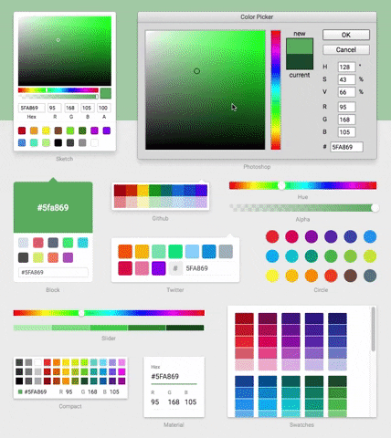
README for react-color
React Color


-
13 Different Pickers - Sketch, Photoshop, Chrome and many more
-
Make Your Own - Use the building block components to make your own
Demo
Installation & Usage
npm install react-color --save
Include the Component
import React from 'react'
import { SketchPicker } from 'react-color'

class Component extends React.Component {

  render() {
    return <SketchPicker />
  }
}
You can import AlphaPicker BlockPicker ChromePicker CirclePicker CompactPicker GithubPicker HuePicker MaterialPicker PhotoshopPicker SketchPicker SliderPicker SwatchesPicker TwitterPicker respectively.
100% inline styles via ReactCSS