react-datepicker vs react-calendar vs react-big-calendar vs react-date-picker
React Date and Time Libraries Comparison
1 Year
react-datepickerreact-calendarreact-big-calendarreact-date-pickerSimilar Packages:
What's React Date and Time Libraries?

These libraries provide various functionalities for handling date and time selection in React applications. They cater to different use cases, from simple date picking to complex calendar views, allowing developers to integrate time-related features seamlessly into their applications. Each library has its unique strengths, making them suitable for different scenarios depending on the complexity and requirements of the project.

Package Weekly Downloads Trend
Github Stars Ranking
Stat Detail
Package
Downloads
Stars
Size
Issues
Publish
License
react-datepicker2,613,6788,2331.99 MB2472 days agoMIT
react-calendar806,7553,684580 kB426 months agoMIT
react-big-calendar448,8448,2352.59 MB3972 months agoMIT
react-date-picker262,5731,307299 kB21a year agoMIT
Feature Comparison: react-datepicker vs react-calendar vs react-big-calendar vs react-date-picker

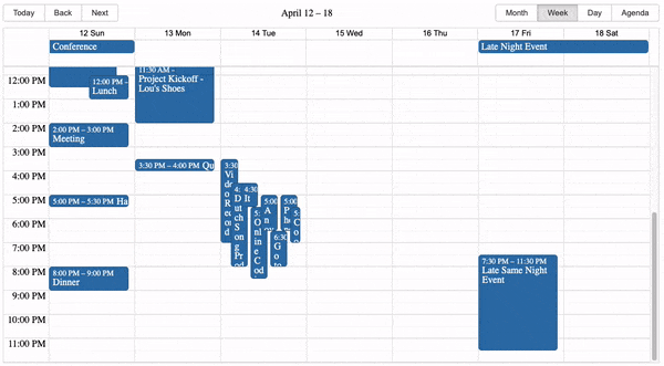
Complexity and Use Case

  • react-datepicker:

    react-datepicker is a versatile date and time picker that offers extensive customization options. It is suitable for applications requiring detailed date and time inputs, such as event scheduling or booking applications.

  • react-calendar:

    react-calendar is a simple calendar component that focuses on basic date selection. It is ideal for applications that need a straightforward way to select dates without additional features or complexity.

  • react-big-calendar:

    react-big-calendar is designed for applications that require a full-featured calendar interface. It supports multiple views (month, week, day) and allows for event management, making it suitable for scheduling applications and event planners.

  • react-date-picker:

    react-date-picker provides a flexible date input that can handle both single and range selections. It is suitable for forms where users need to select dates easily, making it a good choice for booking systems or filters.

Customization

  • react-datepicker:

    react-datepicker is highly customizable, offering options for styling, localization, and various input formats. It allows for detailed configurations, making it suitable for complex applications.

  • react-calendar:

    react-calendar offers limited customization options, focusing on a clean and simple design. It allows for some styling but does not support advanced features like event management or drag-and-drop.

  • react-big-calendar:

    react-big-calendar allows for extensive customization of event rendering and calendar views. Developers can define how events are displayed, customize tooltips, and even implement drag-and-drop functionality for event management.

  • react-date-picker:

    react-date-picker provides a good level of customization, allowing developers to style the input and calendar popup. It supports various date formats and can be easily integrated into forms.

Localization Support

  • react-datepicker:

    react-datepicker provides extensive localization support, allowing developers to customize date formats, translations, and more. It is well-suited for applications that need to cater to users from different regions.

  • react-calendar:

    react-calendar supports basic localization features, enabling developers to adjust the language and format of the calendar. However, it may require additional work for full localization support.

  • react-big-calendar:

    react-big-calendar has built-in support for localization, allowing developers to customize the calendar's language and format according to user preferences. This is crucial for applications targeting international users.

  • react-date-picker:

    react-date-picker offers localization options, allowing developers to customize date formats and language settings easily. This is beneficial for applications with diverse user bases.

Learning Curve

  • react-datepicker:

    react-datepicker has a slightly steeper learning curve due to its extensive features and customization options. However, once familiar with its API, developers can leverage its full potential.

  • react-calendar:

    react-calendar is easy to learn and integrate, making it suitable for developers looking for a quick solution for date selection without complex features.

  • react-big-calendar:

    react-big-calendar has a moderate learning curve due to its comprehensive features and customization options. Developers may need to invest time in understanding its API and event management capabilities.

  • react-date-picker:

    react-date-picker is relatively easy to use, with a straightforward API that allows developers to implement date selection quickly. Its flexibility makes it accessible for various use cases.

Performance

  • react-datepicker:

    react-datepicker is designed for performance, with optimizations for rendering and user interactions. It handles complex date and time inputs efficiently, making it suitable for applications with high user interaction.

  • react-calendar:

    react-calendar is lightweight and performs well for simple date selection tasks. Its minimalistic design contributes to fast rendering and responsiveness.

  • react-big-calendar:

    react-big-calendar is optimized for performance, especially when handling large datasets of events. It efficiently renders only the visible parts of the calendar, ensuring smooth interactions even with many events.

  • react-date-picker:

    react-date-picker performs well for typical use cases, but performance may vary with complex configurations or large datasets. It is generally efficient for standard date selection.

How to Choose: react-datepicker vs react-calendar vs react-big-calendar vs react-date-picker
  • react-datepicker:

    Use react-datepicker when you need a highly customizable date and time picker with extensive features, including date ranges, time selection, and localization support. It is perfect for applications that require detailed date and time inputs.

  • react-calendar:

    Select react-calendar for a lightweight and simple calendar component that provides basic date selection capabilities. It is best suited for applications that need a straightforward date picker without additional complexities.

  • react-big-calendar:

    Choose react-big-calendar if you need a comprehensive calendar interface that supports event management and scheduling. It is ideal for applications requiring a full calendar view with drag-and-drop functionality and customizable event rendering.

  • react-date-picker:

    Opt for react-date-picker if you require a flexible date input component that supports both single and range date selection. It is useful for forms where users need to select dates easily and intuitively.

README for react-datepicker

React Date Picker

npm version Test suite codecov Downloads

A simple and reusable Datepicker component for React (Demo)

Installation

The package can be installed via npm:

npm install react-datepicker --save

Or via yarn:

yarn add react-datepicker

You’ll need to install React and PropTypes separately since those dependencies aren’t included in the package. If you need to use a locale other than the default en-US, you'll also need to import that into your project from date-fns (see Localization section below). Below is a simple example of how to use the Datepicker in a React view. You will also need to require the CSS file from this package (or provide your own). The example below shows how to include the CSS from this package if your build system supports requiring CSS files (Webpack is one that does).

import React, { useState } from "react";
import DatePicker from "react-datepicker";

import "react-datepicker/dist/react-datepicker.css";

// CSS Modules, react-datepicker-cssmodules.css
// import 'react-datepicker/dist/react-datepicker-cssmodules.css';

const Example = () => {
  const [startDate, setStartDate] = useState(new Date());
  return <DatePicker selected={startDate} onChange={(date) => setStartDate(date)} />;
};

Configuration

The most basic use of the DatePicker can be described with:

<DatePicker selected={startdate} onChange={(date) => setStartDate(date)} />

You can use onSelect event handler which fires each time some calendar date has been selected

<DatePicker
  selected={date}
  onSelect={handleDateSelect} //when day is clicked
  onChange={handleDateChange} //only when value has changed
/>

onClickOutside handler may be useful to close datepicker in inline mode

See here for a full list of props that may be passed to the component. Examples are given on the main website.

Time picker

You can also include a time picker by adding the showTimeSelect prop

<DatePicker selected={date} onChange={handleDateChange} showTimeSelect dateFormat="Pp" />

Times will be displayed at 30-minute intervals by default (default configurable via timeIntervals prop)

More examples of how to use the time picker are given on the main website

Localization

The date picker relies on date-fns internationalization to localize its display components. By default, the date picker will use the locale globally set, which is English. Provided are 3 helper methods to set the locale:

  • registerLocale (string, object): loads an imported locale object from date-fns
  • setDefaultLocale (string): sets a registered locale as the default for all datepicker instances
  • getDefaultLocale: returns a string showing the currently set default locale
import { registerLocale, setDefaultLocale } from  "react-datepicker";
import { es } from 'date-fns/locale/es';
registerLocale('es', es)

<DatePicker
  locale="es"
/>

Locales can be changed in the following way:

  • Globally - setDefaultLocale('es');

Compatibility

React

We're always trying to stay compatible with the latest version of React. We can't support all older versions of React.

Latest compatible versions:

  • React 16 or newer: React-datepicker v2.9.4 and newer
  • React 15.5: React-datepicker v2.9.3
  • React 15.4.1: needs React-datepicker v0.40.0, newer won't work (due to react-onclickoutside dependencies)
  • React 0.14 or newer: All above React-datepicker v0.13.0
  • React 0.13: React-datepicker v0.13.0
  • pre React 0.13: React-datepicker v0.6.2

Moment.js

Up until version 1.8.0, this package was using Moment.js. Starting v2.0.0, we switched to using date-fns, which uses native Date objects, to reduce the size of the package. If you're switching from 1.8.0 to 2.0.0 or higher, please see the updated example above of check out the examples site for up to date examples.

Browser Support

The date picker is compatible with the latest versions of Chrome, Firefox, and IE10+.

Unfortunately, it is difficult to support legacy browsers while maintaining our ability to develop new features in the future. For IE9 support, it is known that the classlist polyfill is needed, but this may change or break at any point in the future.

Local Development

The main branch contains the latest version of the Datepicker component.

To begin local development:

  1. Run yarn install from project root
  2. Run yarn build from project root
  3. Run yarn start from project root

The last step starts documentation app as a simple webserver on http://localhost:5173.

You can run yarn test to execute the test suite and linters. To help you develop the component we’ve set up some tests that cover the basic functionality (can be found in /tests). Even though we’re big fans of testing, this only covers a small piece of the component. We highly recommend you add tests when you’re adding new functionality.

Please refer to CONTRIBUTING.md file for more details about getting set up.

The examples

The examples are hosted within the docs folder and are ran in the simple app that loads the Datepicker. To extend the examples with a new example, you can simply duplicate one of the existing examples and change the unique properties of your example.

Accessibility

Keyboard support

  • Left: Move to the previous day.
  • Right: Move to the next day.
  • Up: Move to the previous week.
  • Down: Move to the next week.
  • PgUp: Move to the previous month.
  • Shift+PgUp: Move to the same day and month of the previous year. If that day does not exist, moves focus to the last day of the month.
  • PgDn: Move to the next month.
  • Shift+PgDn: Move to the same day and month of the next year. If that day does not exist, moves focus to the last day of the month.
  • Home: Move to the first day (e.g Sunday) of the current week.
  • End: Move to the last day (e.g. Saturday) of the current week.
  • Enter/Esc/Tab: close the calendar. (Enter & Esc calls preventDefault)

For month picker

  • Left: Move to the previous month.
  • Right: Move to the next month.
  • Enter: Select date and close the calendar

License

Copyright (c) 2014-2025 HackerOne Inc. and individual contributors. Licensed under MIT license, see LICENSE for the full license.