A simple and elegant checkbox tree for React.



Npm Package Weekly Downloads Trend
Cumulative GitHub Star Trend
Stat Detail


Popular Comparisons
README for react-checkbox-tree
react-checkbox-tree


A simple and elegant checkbox tree for React.
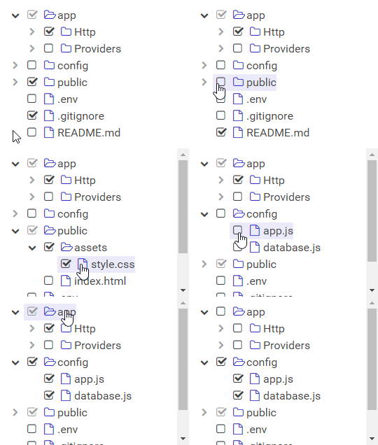
Usage
Installation
Install the library using your favorite dependency manager:
yarn add react-checkbox-tree
Using npm:
npm install react-checkbox-tree --save
Note – By default, this library makes use of Font Awesome styles and expects them to be loaded in the browser.
Include CSS
The library's styles are available through one of the following files:
node_modules/react-checkbox-tree/lib/react-checkbox-tree.cssnode_modules/react-checkbox-tree/src/scss/react-checkbox-tree.scss
Either include one of these files in your stylesheets or utilize a CSS loader:
import 'react-checkbox-tree/lib/react-checkbox-tree.css';
Render Component
Below is a minimal example using state hooks. Note that CheckboxTree is a controlled component, so you must update its checked and expanded properties whenever a change occurs.
import React, { useState } from 'react';
import CheckboxTree from 'react-checkbox-tree';
import 'react-checkbox-tree/lib/react-checkbox-tree.css';

const nodes = [{
  value: 'mars',
  label: 'Mars',
  children: [
    { value: 'phobos', label: 'Phobos' },
    { value: 'deimos', label: 'Deimos' },
  ],
}];

function Widget() {
  const [checked, setChecked] = useState([]);
  const [expanded, setExpanded] = useState([]);

  return (
    <CheckboxTree
      nodes={nodes}
      checked={checked}
      expanded={expanded}
      onCheck={(checked) => setChecked(checked)}
      onExpand={(expanded) => setExpanded(expanded)}
    />
  );
}
Note – All node objects must have a unique
value. This component serializes the values into thecheckedandexpandedarray for performance optimizations.
Changing the Default Icons
By default, react-checkbox-tree uses Font Awesome 5/6 for the various icons that appear in the tree. To utilize Font Awesome 4 icons, simply pass in iconsClass="fa4":
<CheckboxTree
    ...
    iconsClass="fa4"
/>
To change the rendered icons entirely, simply pass in the icons property and override the defaults. Note that you can override as many or as little icons as you like:
<CheckboxTree
    ...
    icons={{
        check: <span className="rct-icon rct-icon-check" />,
        uncheck: <span className="rct-icon rct-icon-uncheck" />,
        halfCheck: <span className="rct-icon rct-icon-half-check" />,
        expandClose: <span className="rct-icon rct-icon-expand-close" />,
        expandOpen: <span className="rct-icon rct-icon-expand-open" />,
        expandAll: <span className="rct-icon rct-icon-expand-all" />,
        collapseAll: <span className="rct-icon rct-icon-collapse-all" />,
        parentClose: <span className="rct-icon rct-icon-parent-close" />,
        parentOpen: <span className="rct-icon rct-icon-parent-open" />,
        leaf: <span className="rct-icon rct-icon-leaf" />,
    }}
/>
If you are using the react-fontawesome library, you can also directly substitute those icons:
import { FontAwesomeIcon } from '@fortawesome/react-fontawesome'

...

<CheckboxTree
    ...
    icons={{
        check: <FontAwesomeIcon className="rct-icon rct-icon-check" icon="check-square" />,
        uncheck: <FontAwesomeIcon className="rct-icon rct-icon-uncheck" icon={['fas', 'square']} />,
        halfCheck: <FontAwesomeIcon className="rct-icon rct-icon-half-check" icon="check-square" />,
        expandClose: <FontAwesomeIcon className="rct-icon rct-icon-expand-close" icon="chevron-right" />,
        expandOpen: <FontAwesomeIcon className="rct-icon rct-icon-expand-open" icon="chevron-down" />,
        expandAll: <FontAwesomeIcon className="rct-icon rct-icon-expand-all" icon="plus-square" />,
        collapseAll: <FontAwesomeIcon className="rct-icon rct-icon-collapse-all" icon="minus-square" />,
        parentClose: <FontAwesomeIcon className="rct-icon rct-icon-parent-close" icon="folder" />,
        parentOpen: <FontAwesomeIcon className="rct-icon rct-icon-parent-open" icon="folder-open" />,
        leaf: <FontAwesomeIcon className="rct-icon rct-icon-leaf-close" icon="file" />
    }}
/>
Utility Functions
In addition to the CheckboxTree component, additional utility functions are available to set the initial state of the tree.
expandNodesToLevel(nodes, targetLevel)
Creates a list of all parent node keys until targetLevel.
Arguments:
nodes(Array): The same array of nodes passed into the mainCheckboxTreecomponenttargetLevel(number): The maximum expansion depth. UseInfinityfor maximum depth.
Returns:
Array: A list of node keys.
Properties
| Property | Type | Description | Default |
|---|---|---|---|
nodes | array | Required. Specifies the tree nodes and their children. | |
checkKeys | array | A list of keyboard keys that will trigger a toggle of the check status of a node. | [' ', 'Enter'] |
checkModel | string | Specifies which checked nodes should be stored in the checked array. Accepts 'leaf' or 'all'. | 'leaf' |
checked | array | An array of checked node values. | [] |
direction | string | A string that specify whether the direction of the component is left-to-right ('ltr') or right-to-left ('rtl'). | 'ltr' |
disabled | bool | If true, the component will be disabled and nodes cannot be checked. | false |
expandDisabled | bool | If true, the ability to expand nodes will be disabled. | false |
expandOnClick | bool | If true, nodes will be expanded by clicking on labels. Requires a non-empty onClick function. | false |
expanded | array | An array of expanded node values. | [] |
icons | object | An object containing the mappings for the various icons and their components. See Changing the Default Icons. | { ... } |
iconsClass | string | A string that specifies which icons class to utilize. Currently, 'fa4' and 'fa5' are supported. | 'fa5' |
id | string | A string to be used for the HTML ID of the rendered tree and its nodes. | null |
lang | object | A key-value pairing of localized text. See src/js/lang/default.js for a list of keys. | { ... } |
name | string | Optional name for the hidden <input> element. | undefined |
nameAsArray | bool | If true, the hidden <input> will encode its values as an array rather than a joined string. | false |
nativeCheckboxes | bool | If true, native browser checkboxes will be used instead of pseudo-checkbox icons. | false |
noCascade | bool | If true, toggling a parent node will not cascade its check state to its children. | false |
onlyLeafCheckboxes | bool | If true, checkboxes will only be shown for leaf nodes. | false |
optimisticToggle | bool | If true, toggling a partially-checked node will select all children. If false, it will deselect. | true |
showExpandAll | bool | If true, buttons for expanding and collapsing all parent nodes will appear in the tree. | false |
showNodeIcon | bool | If true, each node will show a parent or leaf icon. | true |
showNodeTitle | bool | If true, the label of each node will become the title of the resulting DOM node. Overridden by node.title. | false |
onCheck | function | onCheck handler: function(checked, targetNode) {} | () => {} |
onClick | function | onClick handler: function(targetNode) {}. If set, onClick will be called when a node's label has been clicked. | null |
onContextMenu | function | onContextMenu handler: function(event, targetNode) {}. Triggers when right-clicking a node element. | null |
onExpand | function | onExpand handler: function(expanded, targetNode) {} | () => {} |
onCheck and onExpand
Node Properties
Individual nodes within the nodes property can have the following structure:
| Property | Type | Description | Default |
|---|---|---|---|
label | mixed | Required. The node's label. | |
value | mixed | Required. The node's value. | |
children | array | An array of child nodes. | null |
className | string | A className to add to the node. | null |
disabled | bool | Whether the node should be disabled. | false |
icon | mixed | A custom icon for the node. | null |
showCheckbox | bool | Whether the node should show a checkbox. | true |
title | string | A custom title attribute for the node. | null |