React Color Picker Libraries for Professional Applications
react-color and react-colorful are both React libraries that provide color picker components for web applications. They enable users to select colors through various UI controls like sliders, hue pickers, and swatches. react-color is a mature, feature-rich library offering multiple built-in picker variants (e.g., Chrome, Photoshop, Sketch). react-colorful, by contrast, is a lightweight, dependency-free alternative focused on performance, bundle size, and modern React patterns like hooks and functional components.
Npm Package Weekly Downloads Trend
Github Stars Ranking
Stat Detail
react-color vs react-colorful: A Practical Comparison for Frontend Architects
When integrating a color picker into a React application, two prominent choices emerge: react-color and react-colorful. Both solve the same core problem — letting users select colors — but they differ significantly in philosophy, implementation, and trade-offs. Let’s break down how they stack up in real-world development scenarios.
🧱 Architecture & Design Philosophy
react-color follows a “batteries-included” approach. It ships with several complete, opinionated picker UIs (e.g., ChromePicker, SketchPicker, PhotoshopPicker) as ready-to-use components. These are class-based and rely on internal state management, making them harder to customize deeply without forking or wrapping.
// react-color: Using a pre-built picker
import { ChromePicker } from 'react-color';

function ColorSelector() {
  const [color, setColor] = useState('#fff');
  return <ChromePicker color={color} onChange={(c) => setColor(c.hex)} />;
}
react-colorful takes a composable, primitive-first stance. Instead of full UIs, it provides small, focused hooks and components (HexColorPicker, Hue, Saturation) that you assemble yourself. Everything is functional, hook-driven, and tree-shakable.
// react-colorful: Building a custom picker
import { HexColorPicker } from 'react-colorful';

function ColorSelector() {
  const [color, setColor] = useState('#fff');
  return <HexColorPicker color={color} onChange={setColor} />;
}
💡 Key insight:
react-colorgives you finished widgets;react-colorfulgives you LEGO bricks.
🎨 Customization & Flexibility
If you need to match a specific design system or create a unique interaction flow, react-colorful wins hands-down. Because it exposes low-level controls, you can rearrange, style, or extend behavior without fighting against baked-in assumptions.
For example, building a compact inline picker with just hue and hex input:
// react-colorful: Custom layout
import { useHSL, Hue } from 'react-colorful';

function CompactPicker({ color, onChange }) {
  const hsl = useHSL(color);
  return (
    <div>
      <Hue hsl={hsl} onChange={onChange} />
      <input value={color} onChange={(e) => onChange(e.target.value)} />
    </div>
  );
}
In react-color, achieving this would require either heavy CSS overrides or copying and modifying internal component code — neither is sustainable long-term.
// react-color: Limited customization
// You’re stuck with the full ChromePicker layout unless you fork it
<ChromePicker
  color={color}
  onChange={handleChange}
  // No clean way to remove the alpha slider or hex input
/>
⚙️ Performance & Bundle Impact
react-colorful is built for performance. It uses requestAnimationFrame for smooth dragging, avoids unnecessary re-renders, and has zero dependencies. Its modular design means you only import what you use.
react-color, while functional, includes redundant logic across its many picker variants and relies on older React patterns (like componentDidUpdate for syncing props), which can cause extra renders. It also bundles lodash and other utilities, increasing payload size even if you only use one picker.
📱 Touch & Accessibility
Both libraries support touch devices, but react-colorful handles pointer events more efficiently by using a single unified handler for mouse, touch, and pen inputs. This leads to smoother interactions on mobile.
Neither package fully implements WAI-ARIA guidelines out of the box, so you’ll need to add roles, labels, and keyboard navigation manually in either case. However, react-colorful’s simpler DOM structure makes this easier to layer on.
🔌 Integration with Modern React
react-colorful embraces modern React:
- Uses hooks internally and externally
- Fully compatible with Concurrent Mode and Strict Mode
- No deprecated lifecycle methods
react-color still uses class components and legacy lifecycles in several pickers, which may trigger warnings in Strict Mode and could pose issues in future React versions.
// react-colorful works seamlessly with modern patterns
function App() {
  const [color, setColor] = useLocalStorage('themeColor', '#333');
  return <HexColorPicker color={color} onChange={setColor} />;
}
🛠️ Error Handling & Type Safety
Both packages offer TypeScript definitions. However, react-color’s types sometimes lag behind its API changes, and its onChange callback returns inconsistent shapes depending on the picker used (e.g., { hex, rgb, hsl } vs just string).
react-colorful maintains consistent, predictable APIs: onChange always receives a string (e.g., #aabbcc), and separate hooks (useHEX, useHSL) let you convert formats as needed.
// react-colorful: Predictable typing
const [color, setColor] = useState('#ff0000');
// setColor accepts only string → fewer runtime surprises
🧪 Testing & Maintainability
Because react-colorful components are pure functions with minimal side effects, they’re easier to unit test. You can render a HexColorPicker in isolation and simulate pointer events cleanly.
react-color’s class-based internals and global event listeners (attached during drag operations) can complicate testing and occasionally lead to memory leaks if not unmounted properly.
📦 When to Avoid Each
- Avoid
react-colorin public-facing apps where bundle size matters, or when you need pixel-perfect design alignment. Also avoid it if you’re building a design system — its monolithic components don’t compose well. - Avoid
react-colorfulif you urgently need a Photoshop-style picker with layers, eyedroppers, or preset swatches. It doesn’t provide those complex UIs out of the box (though you could build them).
✅ Summary Table
| Aspect | react-color | react-colorful |
|---|---|---|
| Bundle Size | Larger (includes multiple full UIs) | Tiny (only what you import) |
| Customization | Limited (pre-built UIs) | Full (composable primitives) |
| React Patterns | Class components, legacy lifecycles | Hooks, functional components |
| Performance | Acceptable for internal tools | Optimized for public apps |
| Touch Support | Basic | Smooth, unified pointer handling |
| Type Safety | Inconsistent return shapes | Predictable string-only API |
| Best For | Admin panels, quick prototypes | Design systems, production apps |
💡 Final Recommendation
For new projects in 2024 and beyond, react-colorful is the stronger default choice. It aligns with modern React best practices, offers superior performance, and gives you the flexibility to build exactly the UX you need without paying for unused features.
Reach for react-color only if you’re maintaining a legacy codebase that already uses it, or if you genuinely need one of its niche pre-built pickers (like the Photoshop variant) and can’t justify the effort to rebuild it.
Remember: a color picker might seem like a small UI detail, but in design tools, theme editors, or creative apps, it’s often a high-engagement component. Choosing the right foundation pays dividends in maintainability, performance, and user experience.
How to Choose: react-color vs react-colorful
- react-color:
Choose
react-colorif you need a wide variety of pre-built, fully-featured color picker UIs (like Chrome or Photoshop-style pickers) out of the box and your project can accommodate its larger footprint and legacy class-based architecture. It’s suitable for internal tools or admin dashboards where bundle size is less critical and rich UI options are valued. - react-colorful:
Choose
react-colorfulif you prioritize small bundle size, modern React practices (hooks, functional components), and fine-grained control over composition. It’s ideal for public-facing applications, design systems, or performance-sensitive contexts where you’re willing to build custom layouts from modular primitives.
Popular Comparisons
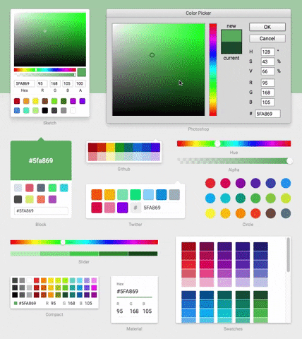
README for react-color
React Color


-
13 Different Pickers - Sketch, Photoshop, Chrome and many more
-
Make Your Own - Use the building block components to make your own
Demo
Installation & Usage
npm install react-color --save
Include the Component
import React from 'react'
import { SketchPicker } from 'react-color'

class Component extends React.Component {

  render() {
    return <SketchPicker />
  }
}
You can import AlphaPicker BlockPicker ChromePicker CirclePicker CompactPicker GithubPicker HuePicker MaterialPicker PhotoshopPicker SketchPicker SliderPicker SwatchesPicker TwitterPicker respectively.
100% inline styles via ReactCSS