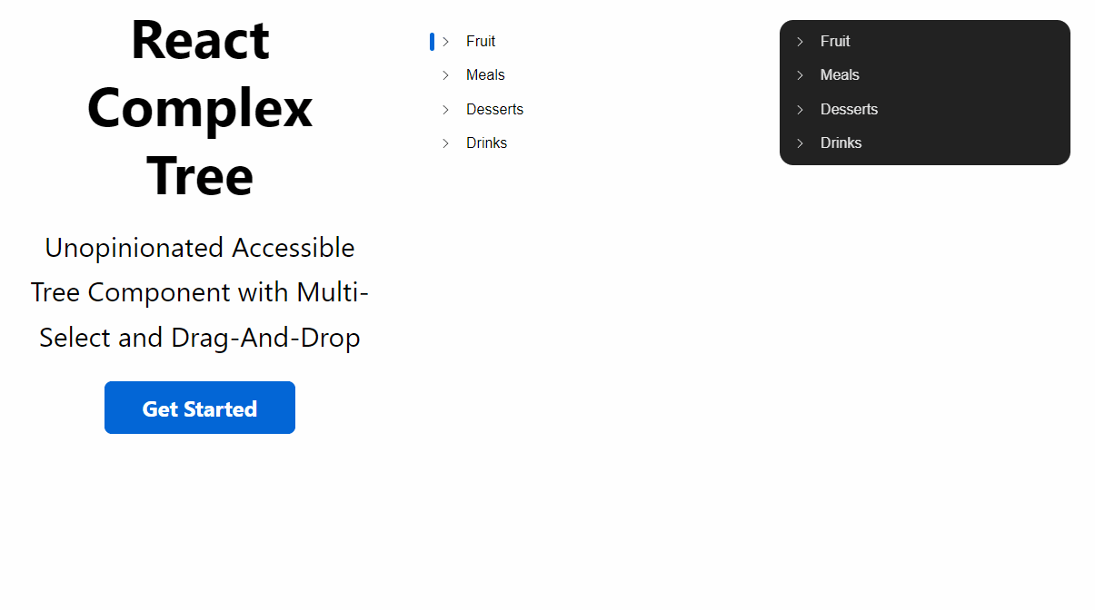
react-treebeard vs react-sortable-tree vs react-complex-tree
React Tree View Libraries Comparison
1 Year
react-treebeardreact-sortable-treereact-complex-treeSimilar Packages:
What's React Tree View Libraries?

Tree view libraries in React provide a way to display hierarchical data structures in a visually appealing and interactive manner. These libraries enable developers to create expandable and collapsible tree structures, allowing users to navigate through complex datasets intuitively. They often come with features such as drag-and-drop support, customizable nodes, and various rendering options to enhance user experience. Choosing the right tree view library depends on specific project requirements such as complexity, performance needs, and customization capabilities.

Package Weekly Downloads Trend
Github Stars Ranking
Stat Detail
Package
Downloads
Stars
Size
Issues
Publish
License
react-treebeard95,8991,689-726 years agoMIT
react-sortable-tree64,3364,957-3445 years agoMIT
react-complex-tree33,1971,2331.33 MB344 months agoMIT
Feature Comparison: react-treebeard vs react-sortable-tree vs react-complex-tree

Customization

  • react-treebeard:

    react-treebeard is designed for simplicity and ease of use, offering basic customization options. It allows developers to style nodes and manage their appearance but does not provide as many advanced customization features as the other libraries.

  • react-sortable-tree:

    react-sortable-tree provides moderate customization capabilities, focusing on drag-and-drop functionality. While it allows for some customization of node rendering, its primary strength lies in its ease of use and built-in features for sorting and rearranging nodes.

  • react-complex-tree:

    react-complex-tree offers extensive customization options, allowing developers to define their own node rendering logic, styles, and behaviors. This flexibility makes it suitable for applications that require a unique look and feel or specific interactions that are not provided out-of-the-box.

Performance

  • react-treebeard:

    react-treebeard is lightweight and performs well with smaller to medium-sized trees. Its minimalistic design helps maintain performance, but it may not be as efficient with very large datasets compared to more complex libraries.

  • react-sortable-tree:

    react-sortable-tree performs well with moderate-sized trees but may experience performance issues with very large datasets due to its rendering approach. It is best used in scenarios where the tree size is manageable and user interaction is a priority.

  • react-complex-tree:

    react-complex-tree is optimized for handling large datasets efficiently, using virtualization techniques to render only the visible nodes. This ensures smooth performance even with deep and complex tree structures, making it suitable for applications with extensive data.

Ease of Use

  • react-treebeard:

    react-treebeard is very easy to use and implement, making it ideal for developers who prefer a simple solution for displaying tree structures without needing to dive deep into complex configurations.

  • react-sortable-tree:

    react-sortable-tree is user-friendly and easy to integrate, making it a great choice for developers who want to implement drag-and-drop functionality quickly. Its straightforward API allows for rapid development without a steep learning curve.

  • react-complex-tree:

    react-complex-tree has a steeper learning curve due to its extensive features and customization options. Developers may need to invest time in understanding its API and capabilities to fully leverage its potential.

Features

  • react-treebeard:

    react-treebeard offers basic tree functionalities with a clean design. It supports expandable nodes and simple customization but lacks some of the advanced features found in the other libraries.

  • react-sortable-tree:

    react-sortable-tree excels in providing drag-and-drop capabilities and sorting features, allowing users to rearrange nodes easily. It also supports customizable node rendering but is primarily focused on sorting functionality.

  • react-complex-tree:

    react-complex-tree supports advanced features such as multi-selection, custom node rendering, and drag-and-drop functionality, making it suitable for applications that require rich interactions and complex data handling.

Community and Support

  • react-treebeard:

    react-treebeard has a smaller community compared to the others, but it is still maintained and offers sufficient documentation for basic usage and customization.

  • react-sortable-tree:

    react-sortable-tree has a solid community and is well-documented, making it easy for developers to find resources and support for implementation issues.

  • react-complex-tree:

    react-complex-tree has a growing community and is actively maintained, providing good documentation and support for developers looking to implement complex tree structures.

How to Choose: react-treebeard vs react-sortable-tree vs react-complex-tree
  • react-treebeard:

    Select react-treebeard if you are looking for a lightweight and simple tree view solution that provides a clean and minimalistic design. It is perfect for projects where performance is crucial and you want a straightforward implementation without the overhead of complex features.

  • react-sortable-tree:

    Opt for react-sortable-tree if your primary requirement is to implement a sortable tree structure with built-in drag-and-drop capabilities. This library is well-suited for applications that need to allow users to rearrange tree nodes easily and offers a straightforward API for quick integration.

  • react-complex-tree:

    Choose react-complex-tree if you need a highly customizable tree component that supports complex data structures and offers advanced features like multi-selection and drag-and-drop functionality. It is ideal for applications that require a rich interaction model and detailed customization options.

README for react-treebeard

react-treebeard

Build Status Coverage Status

React Tree View Component. Data-Driven, Fast, Efficient and Customisable.

Install

npm install react-treebeard --save

Example

An online example from the /example directory can be found here: Here

Quick Start

import React, {PureComponent} from 'react';
import ReactDOM from 'react-dom';
import {Treebeard} from 'react-treebeard';

const data = {
    name: 'root',
    toggled: true,
    children: [
        {
            name: 'parent',
            children: [
                { name: 'child1' },
                { name: 'child2' }
            ]
        },
        {
            name: 'loading parent',
            loading: true,
            children: []
        },
        {
            name: 'parent',
            children: [
                {
                    name: 'nested parent',
                    children: [
                        { name: 'nested child 1' },
                        { name: 'nested child 2' }
                    ]
                }
            ]
        }
    ]
};

class TreeExample extends PureComponent {
    constructor(props){
        super(props);
        this.state = {data};
    }
    
    onToggle(node, toggled){
        const {cursor, data} = this.state;
        if (cursor) {
            this.setState(() => ({cursor, active: false}));
        }
        node.active = true;
        if (node.children) { 
            node.toggled = toggled; 
        }
        this.setState(() => ({cursor: node, data: Object.assign({}, data)}));
    }
    
    render(){
        const {data} = this.state;
        return (
            <Treebeard
                data={data}
                onToggle={this.onToggle}
            />
        );
    }
}

const content = document.getElementById('content');
ReactDOM.render(<TreeExample/>, content);

If you use react-hooks you should do something like this:

import React, {useState} from 'react';
const TreeExample = () => {
    const [data, setData] = useState(data);
    const [cursor, setCursor] = useState(false);
    
    const onToggle = (node, toggled) => {
        if (cursor) {
            cursor.active = false;
        }
        node.active = true;
        if (node.children) {
            node.toggled = toggled;
        }
        setCursor(node);
        setData(Object.assign({}, data))
    }
    
    return (
       <Treebeard data={data} onToggle={onToggle}/>
    )
}

const content = document.getElementById('content');
ReactDOM.render(<TreeExample/>, content);

Prop Values

data

PropTypes.oneOfType([PropTypes.object,PropTypes.array]).isRequired

Data that drives the tree view. State-driven effects can be built by manipulating the attributes in this object. Also supports an array for multiple nodes at the root level. An example can be found in example/data.js

onToggle

PropTypes.func

Callback function when a node is toggled / clicked. Passes 2 attributes: the data node and it's toggled boolean state.

style

PropTypes.object

Sets the treeview styling. Defaults to src/themes/default.

animations

PropTypes.oneOfType([PropTypes.object, PropTypes.bool])

Sets the treeview animations. Set to false if you want to turn off animations. See velocity-react for more details. Defaults to src/themes/animations.

decorators

PropTypes.object

Decorates the treeview. Here you can use your own Container, Header, Toggle and Loading components. Defaults to src/decorators. See example below:

const decorators = {
    Loading: (props) => {
        return (
            <div style={props.style}>
                loading...
            </div>
        );
    },
    Toggle: (props) => {
        return (
            <div style={props.style}>
                <svg height={props.height} width={props.width}>
                    // Vector Toggle Here
                </svg>
            </div>
        );
    },
    Header: (props) => {
        return (
            <div style={props.style}>
                {props.node.name}
            </div>
        );
    },
    Container: (props) => {
        return (
            <div onClick={this.props.onClick}>
                // Hide Toggle When Terminal Here
                <this.props.decorators.Toggle/>
                <this.props.decorators.Header/>
            </div>
        );
    }
};

<Treebeard data={...} decorators={decorators}/>

Data Attributes

{
    id: '[optional] string',
    name: 'string',
    children: '[optional] array',
    toggled: '[optional] boolean',
    active: '[optional] boolean',
    loading: '[optional] boolean',
    decorators: '[optional] object',
    animations: '[optional] object'
},

id

The component key. If not defined, an auto-generated index is used.

name

The name prop passed into the Header component.

children

The children attached to the node. This value populates the subtree at the specific node. Each child is built from the same basic data structure. Tip: Make this an empty array, if you want to asynchronously load a potential parent.

toggled

Toggled flag. Sets the visibility of a node's children. It also sets the state for the toggle decorator.

active

Active flag. If active, the node will be highlighted. The highlight is derived from the node.activeLink style object in the theme.

loading

Loading flag. It will populate the treeview with the loading component. Useful when asynchronously pulling the data into the treeview.

decorators / animations

Attach specific decorators / animations to a node. Provides the low level functionality to create visuals on a node-by-node basis. These structures are the same as the top level props, described above.