


A configurable React component wrapper around CountUp.js.
Click here to view on CodeSandbox.
Previous docs
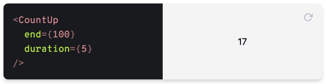
Table of Contents
- Installation
- Usage
- API
- Props
className: stringdecimal: stringdecimals: numberdelay: ?numberduration: numberend: numberprefix: stringredraw: booleanpreserveValue: booleanseparator: stringstart: numberplugin: CountUpPluginstartOnMount: booleansuffix: stringuseEasing: booleanuseGrouping: booleanuseIndianSeparators: booleaneasingFn: (t: number, b: number, c: number, d: number) => numberformattingFn: (value: number) => stringenableScrollSpy: booleanscrollSpyDelay: numberscrollSpyOnce: booleanonEnd: ({ pauseResume, reset, start, update }) => voidonStart: ({ pauseResume, reset, update }) => voidonPauseResume: ({ reset, start, update }) => voidonReset: ({ pauseResume, start, update }) => voidonUpdate: ({ pauseResume, reset, start }) => void
- Render props
- Protips
- License
Installation
yarn add react-countup
Usage
import CountUp from 'react-countup';
Simple example
<CountUp end={100} />
This will start a count up transition from 0 to 100 on render.
Render prop example
<CountUp
  start={-875.039}
  end={160527.012}
  duration={2.75}
  separator=" "
  decimals={4}
  decimal=","
  prefix="EUR "
  suffix=" left"
  onEnd={() => console.log('Ended! 👏')}
  onStart={() => console.log('Started! 💨')}
>
  {({ countUpRef, start }) => (
    <div>
      <span ref={countUpRef} />
      <button onClick={start}>Start</button>
    </div>
  )}
</CountUp>
The transition won't start on initial render as it needs to be triggered manually here.
Tip: If you need to start the render prop component immediately, you can set delay={0}.
More examples
Manually start with render prop
<CountUp start={0} end={100}>
  {({ countUpRef, start }) => (
    <div>
      <span ref={countUpRef} />
      <button onClick={start}>Start</button>
    </div>
  )}
</CountUp>
Autostart with render prop
Render start value but start transition on first render:
<CountUp start={0} end={100} delay={0}>
  {({ countUpRef }) => (
    <div>
      <span ref={countUpRef} />
    </div>
  )}
</CountUp>
Note that delay={0} will automatically start the count up.
Delay start
<CountUp delay={2} end={100} />
Hook
Simple example
import { useCountUp } from 'react-countup';

const SimpleHook = () => {
  useCountUp({ ref: 'counter', end: 1234567 });
  return <span id="counter" />;
};
Complete example
import { useCountUp } from 'react-countup';

const CompleteHook = () => {
  const countUpRef = React.useRef(null);
  const { start, pauseResume, reset, update } = useCountUp({
    ref: countUpRef,
    start: 0,
    end: 1234567,
    delay: 1000,
    duration: 5,
    onReset: () => console.log('Resetted!'),
    onUpdate: () => console.log('Updated!'),
    onPauseResume: () => console.log('Paused or resumed!'),
    onStart: ({ pauseResume }) => console.log(pauseResume),
    onEnd: ({ pauseResume }) => console.log(pauseResume),
  });
  return (
    <div>
      <div ref={countUpRef} />
      <button onClick={start}>Start</button>
      <button onClick={reset}>Reset</button>
      <button onClick={pauseResume}>Pause/Resume</button>
      <button onClick={() => update(2000)}>Update to 2000</button>
    </div>
  );
};
API
Props
className: string
CSS class name of the span element.
Note: This won't be applied when using CountUp with render props.
decimal: string
Specifies decimal character.
Default: .
decimals: number
Amount of decimals to display.
Default: 0
delay: number
Delay in seconds before starting the transition.
Default: null
Note: delay={0} will automatically start the count up.
duration: number
Duration in seconds.
Default: 2
end: number
Target value.
prefix: string
Static text before the transitioning value.
redraw: boolean
Forces count up transition on every component update.
Default: false
preserveValue: boolean
Save previously ended number to start every new animation from it.
Default: false
separator: string
Specifies character of thousands separator.
start: number
Initial value.
Default: 0
plugin: CountUpPlugin
Define plugin for alternate animations
startOnMount: boolean
Use for start counter on mount for hook usage.
Default: true
suffix: string
Static text after the transitioning value.
useEasing: boolean
Enables easing. Set to false for a linear transition.
Default: true
useGrouping: boolean
Enables grouping with separator.
Default: true
useIndianSeparators: boolean
Enables grouping using indian separation, f.e. 1,00,000 vs 100,000
Default: false
easingFn: (t: number, b: number, c: number, d: number) => number
Easing function. Click here for more details.
Default: easeInExpo
formattingFn: (value: number) => string
Function to customize the formatting of the number.
To prevent component from unnecessary updates this function should be memoized with useCallback
enableScrollSpy: boolean
Enables start animation when target is in view.
scrollSpyDelay: number
Delay (ms) after target comes into view
scrollSpyOnce: boolean
Run scroll spy only once
onEnd: ({ pauseResume, reset, start, update }) => void
Callback function on transition end.
onStart: ({ pauseResume, reset, update }) => void
Callback function on transition start.
onPauseResume: ({ reset, start, update }) => void
Callback function on pause or resume.
onReset: ({ pauseResume, start, update }) => void
Callback function on reset.
onUpdate: ({ pauseResume, reset, start }) => void
Callback function on update.
Render props
countUpRef: () => void
Ref to hook the countUp instance to
pauseResume: () => void
Pauses or resumes the transition
reset: () => void
Resets to initial value
start: () => void
Starts or restarts the transition
update: (newEnd: number?) => void
Updates transition to the new end value (if given)
Protips
Trigger of transition
By default, the animation is triggered if any of the following props has changed:
If redraw is set to true your component will start the transition on every component update.
Run if in focus
You need to check if your counter in viewport, react-visibility-sensor can be used for this purpose.
import React from 'react';
import CountUp from 'react-countup';
import VisibilitySensor from 'react-visibility-sensor';
import './styles.css';

export default function App() {
  return (
    <div className="App">
      <div className="content" />
      <VisibilitySensor partialVisibility offset={{ bottom: 200 }}>
        {({ isVisible }) => (
          <div style={{ height: 100 }}>
            {isVisible ? <CountUp end={1000} /> : null}
          </div>
        )}
      </VisibilitySensor>
    </div>
  );
}
Note: For latest react-countup releases there are new options enableScrollSpy and scrollSpyDelay which enable scroll spy, so that as user scrolls to the target element, it begins counting animation automatically once it has scrolled into view.
import './styles.css';
import CountUp, { useCountUp } from 'react-countup';

export default function App() {
  useCountUp({
    ref: 'counter',
    end: 1234567,
    enableScrollSpy: true,
    scrollSpyDelay: 1000,
  });

  return (
    <div className="App">
      <div className="content" />
      <CountUp end={100} enableScrollSpy />
      <br />
      <span id="counter" />
    </div>
  );
}
Set accessibility properties for occupation period
You can use callback properties to control accessibility:
import React from 'react';
import CountUp, { useCountUp } from 'react-countup';

export default function App() {
  useCountUp({ ref: 'counter', end: 10, duration: 2 });
  const [loading, setLoading] = React.useState(false);

  const onStart = () => {
    setLoading(true);
  };

  const onEnd = () => {
    setLoading(false);
  };

  const containerProps = {
    'aria-busy': loading,
  };

  return (
    <>
      <CountUp
        end={123457}
        duration="3"
        onStart={onStart}
        onEnd={onEnd}
        containerProps={containerProps}
      />
      <div id="counter" aria-busy={loading} />
    </>
  );
}
Plugin usage
import { CountUp } from 'countup.js';
import { Odometer } from 'odometer_countup';

export default function App() {
  useCountUp({
    ref: 'counter',
    end: 1234567,
    enableScrollSpy: true,
    scrollSpyDelay: 1000,
    plugin: Odometer,
  });

  return (
    <div className="App">
      <span id="counter" />
    </div>
  );
}
License
MIT