React Native Splash Screen Libraries
react-native-bootsplash and react-native-splash-screen are both libraries designed to manage native splash screens in React Native applications. They enable developers to display a branded launch screen while the app initializes and then programmatically hide it once the JavaScript bundle is ready. This improves perceived performance and user experience during app startup by replacing the default blank screen with a custom visual.
Npm Package Weekly Downloads Trend
Github Stars Ranking
Stat Detail
React Native Splash Screen Solutions: react-native-bootsplash vs react-native-splash-screen
Both react-native-bootsplash and react-native-splash-screen aim to solve the same core problem in React Native apps: showing a native splash screen during app startup and hiding it programmatically once your JavaScript bundle is ready. However, their implementation approaches, maintenance status, and developer experience differ significantly. Let’s break down what you need to know before choosing one for your project.
⚠️ Maintenance Status: Critical First Consideration
react-native-splash-screen is no longer actively maintained. Its GitHub repository (https://github.com/crazycodeboy/react-native-splash-screen) shows no meaningful updates since 2020, and the npm page includes a clear deprecation notice recommending users migrate to alternatives like react-native-bootsplash. Using unmaintained packages in production carries real risks — compatibility issues with newer React Native versions, unpatched bugs, and lack of support for modern platform requirements (like Android 12+ splash screen APIs).
react-native-bootsplash, by contrast, is actively maintained with regular updates, comprehensive documentation, and explicit support for the latest iOS and Android splash screen standards. It even provides a CLI tool to automate native configuration.
🛑 Bottom line: Do not use
react-native-splash-screenin new projects. If you’re on an existing project using it, plan a migration.
🔧 Native Integration Approach
react-native-splash-screen requires manual native code setup:
- iOS: You must edit
AppDelegate.mto initialize the module and set up the splash view. - Android: You need to create custom layout XML files and modify
MainActivity.java.
Example Android setup (MainActivity.java):
import android.os.Bundle;
import com.crazycodeboy.RNSplashScreen.RNSplashScreen;

public class MainActivity extends ReactActivity {
  @Override
  protected void onCreate(Bundle savedInstanceState) {
    RNSplashScreen.show(this); // Add this line
    super.onCreate(savedInstanceState);
  }
}
react-native-bootsplash simplifies this with automated tooling:
- Run
npx react-native generate-bootsplashto auto-generate native assets and config. - Uses modern native patterns (e.g., Android’s
SplashScreenAPI via Jetpack).
Example iOS setup (AppDelegate.mm):
#import "RNBootSplash.h"

// Inside didFinishLaunchingWithOptions
[RNBootSplash initWithStoryboard:@"BootSplash" rootView:rootView];
The CLI handles creating the BootSplash.storyboard file automatically.
📱 Platform Compliance and Modern Standards
react-native-splash-screen uses legacy splash screen patterns:
- On Android, it relies on custom
FrameLayoutoverlays, which can cause flickering or layout issues on newer OS versions. - Doesn’t comply with Android 12+’s official SplashScreen API requirements.
react-native-bootsplash embraces platform-specific best practices:
- On Android 12+, it uses the official
android.window.SplashScreenAPI when available. - On older Android versions, it falls back to a clean theme-based approach without overlay hacks.
- On iOS, it leverages storyboard-based launch screens (Apple’s recommended method since iOS 8).
This means better compliance with App Store/Play Store guidelines and fewer visual glitches during startup.
🧪 Hiding the Splash Screen: API Differences
Both packages provide a JavaScript method to hide the splash screen, but with different ergonomics:
react-native-splash-screen:
import SplashScreen from 'react-native-splash-screen';

// Hide after app is ready
SplashScreen.hide();
react-native-bootsplash:
import BootSplash from 'react-native-bootsplash';

// Hide with optional fade animation
BootSplash.hide({ fade: true });
react-native-bootsplash also offers additional utilities like getVisibilityStatus() to check if the splash is still visible — useful for debugging timing issues.
🎨 Customization and Asset Management
react-native-splash-screen requires you to manually:
- Create splash screen images at multiple resolutions
- Configure them in Xcode (iOS) and drawable folders (Android)
- Handle dark mode support yourself
react-native-bootsplash automates asset generation:
- Provide a single high-res logo image
- The CLI generates all required sizes for iOS/Android
- Supports dark mode out of the box via separate light/dark assets
Example CLI command:
npx react-native generate-bootsplash assets/logo.png \
  --background-color=ffffff \
  --logo-width=100 \
  --assets-path=assets
This reduces human error and saves significant setup time.
🔄 Migration Path
If you’re stuck with react-native-splash-screen in an existing app, migrating to react-native-bootsplash involves:
- Removing old native configurations
- Running the
generate-bootsplashCLI - Replacing
SplashScreen.hide()calls withBootSplash.hide()
The official docs include a detailed migration guide.
📌 Summary Table
| Feature | react-native-splash-screen | react-native-bootsplash |
|---|---|---|
| Maintenance Status | ❌ Deprecated | ✅ Actively maintained |
| Native Setup | Manual code edits | CLI automation + clean integration |
| Android 12+ Support | ❌ No | ✅ Yes (official API) |
| iOS Storyboard Support | ⚠️ Partial | ✅ Full |
| Dark Mode | ❌ Manual implementation | ✅ Built-in |
| Asset Generation | ❌ Manual | ✅ Automated |
| Error Handling | Minimal | Detailed debug logs |
💡 Final Recommendation
Use react-native-bootsplash for all new projects. Its active maintenance, modern platform compliance, and developer-friendly tooling make it the clear choice. The initial setup is faster, it avoids deprecated patterns, and you’ll benefit from ongoing updates as mobile platforms evolve.
Avoid react-native-splash-screen entirely unless you’re maintaining a legacy app with no migration budget — and even then, prioritize upgrading.
How to Choose: react-native-bootsplash vs react-native-splash-screen
- react-native-bootsplash:
Choose
react-native-bootsplashfor all new React Native projects. It's actively maintained, supports modern iOS and Android splash screen standards (including Android 12+), provides CLI tooling for automated setup, handles dark mode out of the box, and avoids the flickering issues common with older approaches. Its comprehensive documentation and regular updates ensure compatibility with current and future React Native versions. - react-native-splash-screen:
Do not choose
react-native-splash-screenfor new projects — it's officially deprecated with no active maintenance since 2020. Only consider it if you're maintaining a legacy application where migration isn't immediately feasible, but plan to upgrade to a supported alternative likereact-native-bootsplashas soon as possible to avoid compatibility issues and security risks.
Popular Comparisons
README for react-native-bootsplash
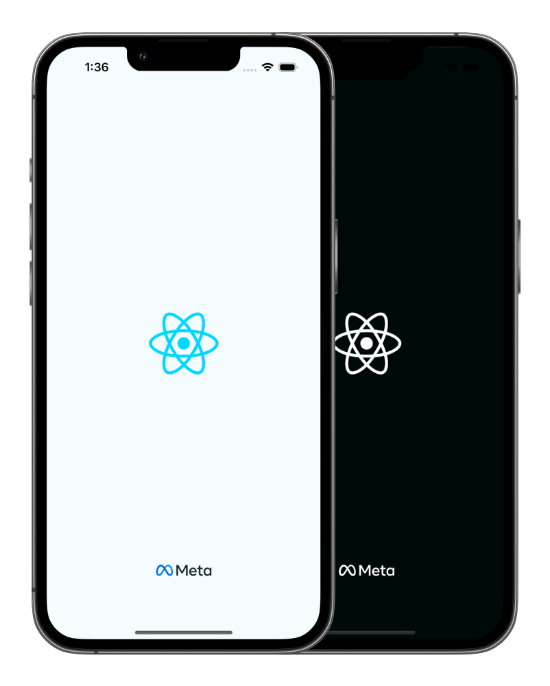
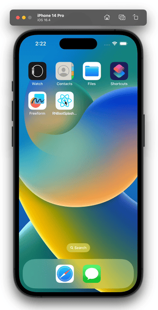
🚀 react-native-bootsplash
Show a splash screen during app startup. Hide it when you are ready.
For migration from the v6, check the MIGRATION.md guide.
Support
This library follows the React Native releases support policy.
It is supporting the latest version, and the two previous minor series.
Installation
$ npm install --save react-native-bootsplash
# --- or ---
$ yarn add react-native-bootsplash
⚠️ Don't forget going into the ios directory to execute a pod install.
Setup
Assets generation
In order to speed up the setup, we provide a CLI to generate assets, update config files, create the Android Drawable XML file and the iOS Storyboard file automatically ✨.
$ npx react-native-bootsplash generate --help
# --- or ---
$ yarn react-native-bootsplash generate --help
The command can take multiple arguments:
Usage: react-native-bootsplash generate [options] <logo>

Generate a launch screen using a logo file path (PNG or SVG)

Arguments:
  logo                        Logo file path (PNG or SVG)

Options:
  --platforms <list>          Platforms to generate for, separated by a comma (default: "android,ios,web")
  --background <string>       Background color (in hexadecimal format) (default: "#fff")
  --logo-width <number>       Logo width at @1x (in dp - we recommend approximately ~100) (default: 100)
  --assets-output <string>    Assets output directory path (default: "assets/bootsplash")
  --flavor <string>           Android flavor build variant (where your resource directory is) (default: "main")
  --html <string>             HTML template file path (your web app entry point) (default: "public/index.html")
  --plist <string>            Custom Info.plist file path
  --license-key <string>      License key to enable brand and dark mode assets generation
  --brand <string>            Brand file path (PNG or SVG)
  --brand-width <number>      Brand width at @1x (in dp - we recommend approximately ~80) (default: 80)
  --dark-background <string>  [dark mode] Background color (in hexadecimal format)
  --dark-logo <string>        [dark mode] Logo file path (PNG or SVG)
  --dark-brand <string>       [dark mode] Brand file path (PNG or SVG)
  -h, --help                  display help for command
💪 Unlock the CLI full potential
In order to use the --brand, --brand-width and --dark-* options, you must specify a --license-key.
With it, the generator is able to output over 50 files (logo and brand images generated in all pixel densities, dark mode versions, etc.), saving you (and your company!) a massive amount of time not only at creation, but also at each adjustment ⏱️
📍 This license key grants unlimited and unrestricted usage of the generator for the buyer's purposes (meaning you can execute the assets generation as much as you want).

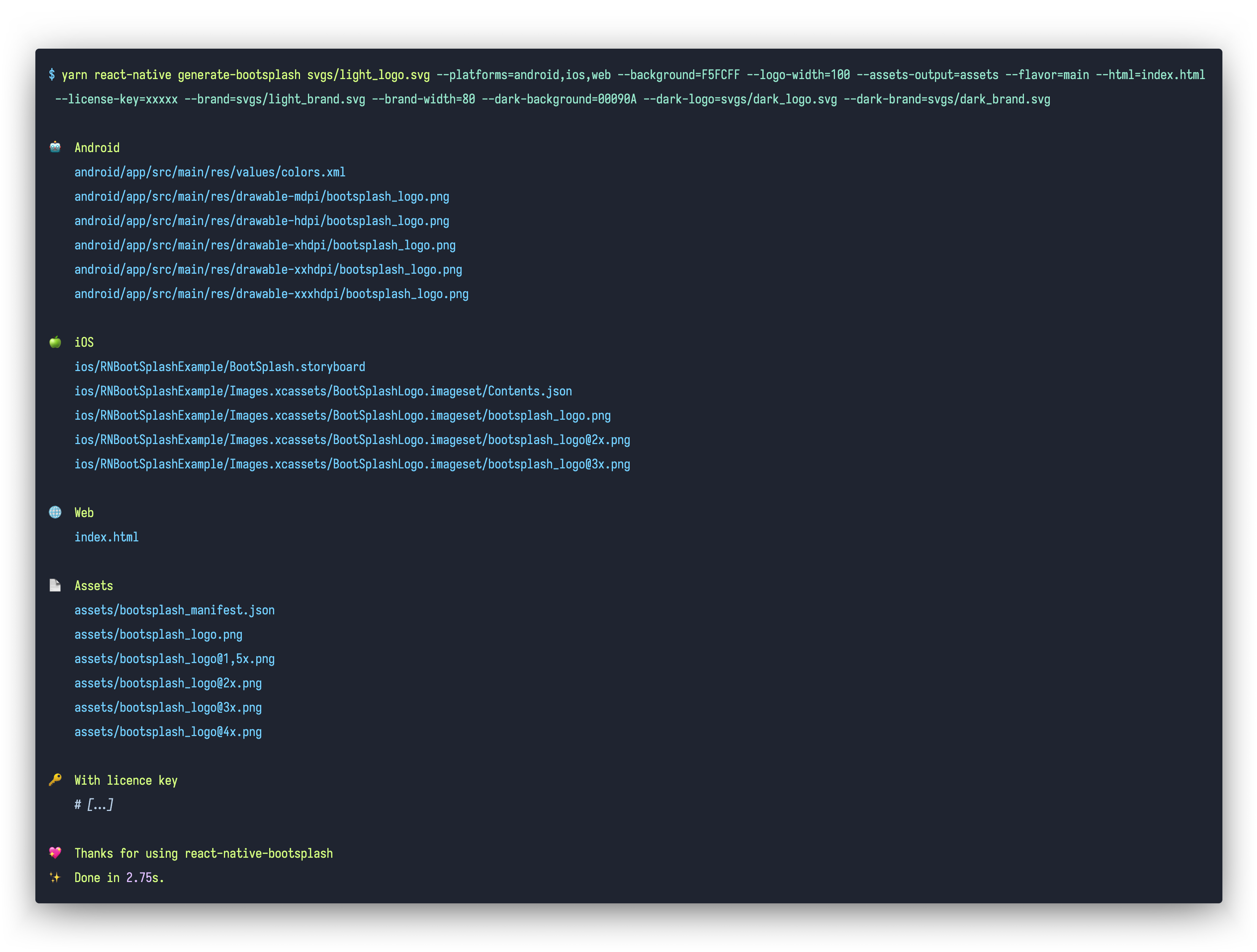
Full command usage example
# Without license key
yarn react-native-bootsplash generate svgs/light-logo.svg \
  --platforms=android,ios,web \
  --background=F5FCFF \
  --logo-width=100 \
  --assets-output=assets/bootsplash \
  --flavor=main \
  --html=public/index.html

# With license key 🔑
yarn react-native-bootsplash generate svgs/light-logo.svg \
  --platforms=android,ios,web \
  --background=F5FCFF \
  --logo-width=100 \
  --assets-output=assets/bootsplash \
  --flavor=main \
  --html=public/index.html \
  --license-key=xxxxx \
  --brand=svgs/light-brand.svg \
  --brand-width=80 \
  --dark-background=00090A \
  --dark-logo=svgs/dark-logo.svg \
  --dark-brand=svgs/dark-brand.svg
With Expo
- First, uninstall
expo-splash-screen:
$ npm uninstall expo-splash-screen
# --- or ---
$ yarn remove expo-splash-screen
{
  "expo": {
    "plugins": [
-     [
-       "expo-splash-screen",
-       {
-         "image": "./assets/images/splash-icon.png",
-         "imageWidth": 200,
-         "resizeMode": "contain",
-         "backgroundColor": "#ffffff"
-       }
-     ],
    ]
  }
}
- Add the plugin in your app config (if you have a license key, pass it via the
BOOTSPLASH_LICENSE_KEYenvironment variable):
Dynamic configuration (app.config.js, app.config.ts)
import type { ConfigContext, ExpoConfig } from "expo/config";
import bootsplash from "react-native-bootsplash/expo"; // use `require` in app.config.js

export default ({ config }: ConfigContext): ExpoConfig => ({
  // …
  platforms: ["android", "ios", "web"], // must be explicit
  plugins: [
    bootsplash({
      logo: "./assets/logo.png",
      logoWidth: 100,
      background: "#f5fcff",
      // …
    }),
  ],
});
Static configuration (app.json)
{
  "expo": {
    // …
    "platforms": ["android", "ios", "web"], // must be explicit
    "plugins": [
      [
        "react-native-bootsplash",
        {
          "logo": "./assets/logo.png",
          "logoWidth": 100,
          "background": "#f5fcff",
          // …
        },
      ],
    ],
  },
}
📌 The available plugins options are:
type PluginOptions = {
  android?: {
    darkContentBarsStyle?: boolean; // Enforce system bars style (default: undefined)
  };

  logo: string; // Logo file path (PNG or SVG) - required
  background?: string; // Background color (in hexadecimal format) (default: "#fff")
  logoWidth?: number; // Logo width at @1x (in dp - we recommend approximately ~100) (default: 100)
  assetsOutput?: string; // Assets output directory path (default: "assets/bootsplash")

  // Addon options
  brand?: string; // Brand file path (PNG or SVG)
  brandWidth?: number; // Brand width at @1x (in dp - we recommend approximately ~80) (default: 80)
  darkBackground?: string; // [dark mode] Background color (in hexadecimal format)
  darkLogo?: string; // [dark mode] Logo file path (PNG or SVG)
  darkBrand?: string; // [dark mode] Brand file path (PNG or SVG)
};
With bare React Native
iOS
Edit your ios/YourApp/AppDelegate.swift file:
import ReactAppDependencyProvider
import RNBootSplash // ⬅️ add this import

// …

class ReactNativeDelegate: RCTDefaultReactNativeFactoryDelegate {

  // …

  // ⬇️ override this method
  override func customize(_ rootView: RCTRootView) {
    super.customize(rootView)
    RNBootSplash.initWithStoryboard("BootSplash", rootView: rootView) // ⬅️ initialize the splash screen
  }
}
Android
Edit your android/app/src/main/java/com/yourapp/MainActivity.kt file:
Without react-native-screens
// ⬇️ add these required imports
import android.os.Bundle
import com.zoontek.rnbootsplash.RNBootSplash

// …

class MainActivity : ReactActivity() {

  // …

  override fun onCreate(savedInstanceState: Bundle?) {
    RNBootSplash.init(this, R.style.BootTheme) // ⬅️ initialize the splash screen
    super.onCreate(savedInstanceState)
  }
}
With react-native-screens >= v4.16.0
// ⬇️ add these required imports
import android.os.Bundle
import com.swmansion.rnscreens.fragment.restoration.RNScreensFragmentFactory
import com.zoontek.rnbootsplash.RNBootSplash

// …

class MainActivity : ReactActivity() {

  // …

  override fun onCreate(savedInstanceState: Bundle?) {
    supportFragmentManager.fragmentFactory = RNScreensFragmentFactory()
    RNBootSplash.init(this, R.style.BootTheme) // ⬅️ initialize the splash screen
    super.onCreate(savedInstanceState)
  }
}
With react-native-screens < v4.16.0
// ⬇️ add these required imports
import android.os.Bundle
import com.zoontek.rnbootsplash.RNBootSplash

// …

class MainActivity : ReactActivity() {

  // …

  override fun onCreate(savedInstanceState: Bundle?) {
    RNBootSplash.init(this, R.style.BootTheme) // ⬅️ initialize the splash screen
    super.onCreate(null)
  }
}
ℹ️ Refer to previous package documentation for setup steps with React Native < 0.80.
API
hide()
Hide the splash screen (immediately, or with a fade out).
Method type
type hide = (config?: { fade?: boolean }) => Promise<void>;
Usage
import { useEffect } from "react";
import { Text } from "react-native";
import BootSplash from "react-native-bootsplash";

const App = () => {
  useEffect(() => {
    const init = async () => {
      // …do multiple sync or async tasks
    };

    init().finally(async () => {
      await BootSplash.hide({ fade: true });
      console.log("BootSplash has been hidden successfully");
    });
  }, []);

  return <Text>My awesome app</Text>;
};
isVisible()
Return the current visibility status of the native splash screen.
Method type
type isVisible = () => boolean;
Usage
import BootSplash from "react-native-bootsplash";

if (BootSplash.isVisible()) {
  // Do something
}
useHideAnimation()
A hook to easily create a custom hide animation by animating all splash screen elements using Animated, react-native-reanimated or else (similar as the video on top of this documentation).
Method type
type useHideAnimation = (config: {
  ready?: boolean; // a boolean flag to delay the animate execution (default: true)

  // the required generated assets
  manifest: Manifest; // the manifest file is generated in your assets directory
  logo?: ImageRequireSource;
  darkLogo?: ImageRequireSource;
  brand?: ImageRequireSource;
  darkBrand?: ImageRequireSource;

  // specify if you are using translucent status / navigation bars
  // in order to avoid a shift between the native and JS splash screen
  statusBarTranslucent?: boolean;
  navigationBarTranslucent?: boolean;

  animate: () => void;
}) => {
  container: ContainerProps;
  logo: LogoProps;
  brand: BrandProps;
};
Usage
import { useState } from "react";
import { Animated, Image } from "react-native";
import BootSplash from "react-native-bootsplash";

type Props = {
  onAnimationEnd: () => void;
};

const AnimatedBootSplash = ({ onAnimationEnd }: Props) => {
  const [opacity] = useState(() => new Animated.Value(1));

  const { container, logo /*, brand */ } = BootSplash.useHideAnimation({
    manifest: require("../assets/bootsplash/manifest.json"),

    logo: require("../assets/bootsplash/logo.png"),
    // darkLogo: require("../assets/bootsplash/dark-logo.png"),
    // brand: require("../assets/bootsplash/brand.png"),
    // darkBrand: require("../assets/bootsplash/dark-brand.png"),

    animate: () => {
      // Perform animations and call onAnimationEnd
      Animated.timing(opacity, {
        useNativeDriver: true,
        toValue: 0,
        duration: 500,
      }).start(() => {
        onAnimationEnd();
      });
    },
  });

  return (
    <Animated.View {...container} style={[container.style, { opacity }]}>
      <Image {...logo} />
      {/* <Image {...brand} /> */}
    </Animated.View>
  );
};

const App = () => {
  const [visible, setVisible] = useState(true);

  return (
    <View style={{ flex: 1 }}>
      {/* content */}

      {visible && (
        <AnimatedBootSplash
          onAnimationEnd={() => {
            setVisible(false);
          }}
        />
      )}
    </View>
  );
};
This example is simple for documentation purpose (we only animate the container).
🤙 A more complex example is available in the /example folder.
FAQ
How can I enforce the splash screen system bar colors?
By default, the system bars uses dark-content in light mode and light-content in dark mode. To enforce a specific value, edit your values/styles.xml file:
<resources>
  <!-- … -->

  <style name="BootTheme" parent="Theme.BootSplash">
    <item name="darkContentBarsStyle">true</item>
    <!-- … -->
  </style>
</resources>
Why are both light and dark assets inlined in my index.html?
For the sake of simplicity. Since the light and dark versions of your assets are likely identical (except for the colors), if your index.html file is compressed with gzip, the size difference will be negligible.
How should I use it with React Navigation?
If you are using React Navigation, you can hide the splash screen once the navigation container and all children have finished mounting by using the onReady function.
import { NavigationContainer } from "@react-navigation/native";
import BootSplash from "react-native-bootsplash";

const App = () => (
  <NavigationContainer
    onReady={() => {
      BootSplash.hide();
    }}
  >
    {/* content */}
  </NavigationContainer>
);
How can I mock the module in my tests?
Testing code which uses this library requires some setup since we need to mock the native methods.
To add the mocks, create a file jest/setup.js (or any other file name) containing the following code:
jest.mock("react-native-bootsplash", () => {
  return {
    hide: jest.fn().mockResolvedValue(),
    isVisible: jest.fn(),
    useHideAnimation: jest.fn().mockReturnValue({
      container: {},
      logo: { source: 0 },
      brand: { source: 0 },
    }),
  };
});
After that, we need to add the setup file in the jest config. You can add it under setupFiles option in your jest config file:
{
  "setupFiles": ["<rootDir>/jest/setup.js"]
}
Sponsors
This module is provided as is, I work on it in my free time.
If you or your company uses it in a production app, consider sponsoring this project 💰. You also can contact me for premium enterprise support: help with issues, prioritize bugfixes, feature requests, etc.
