react-simple-star-rating
A simple react component for adding a star rating to your project.


Search packages..
react-simple-star-ratingSimilar Packages:
Npm Package Weekly Downloads Trend
3 Years
Cumulative GitHub Star Trend
Stat Detail
Popular Comparisons
react-simple-star-rating
README for react-simple-star-rating
React Simple Rating
A simple react component for adding a star rating to your project.


Install
npm
npm i react-simple-star-rating
Yarn
yarn add react-simple-star-rating
Usage
import React, { useState } from 'react'
import { Rating } from 'react-simple-star-rating'

export function MyComponent() {
  const [rating, setRating] = useState(0)

  // Catch Rating value
  const handleRating = (rate: number) => {
    setRating(rate)

    // other logic
  }
  // Optinal callback functions
  const onPointerEnter = () => console.log('Enter')
  const onPointerLeave = () => console.log('Leave')
  const onPointerMove = (value: number, index: number) => console.log(value, index)

  return (
    <div className='App'>
      <Rating
        onClick={handleRating}
        onPointerEnter={onPointerEnter}
        onPointerLeave={onPointerLeave}
        onPointerMove={onPointerMove}
        /* Available Props */
      />
    </div>
  )
}
Reset Rating Value
import React, { useState } from 'react'
import { Rating } from 'react-simple-star-rating'

export function MyComponent() {
  const [rating, setRating] = useState(0)

  // Catch Rating value
  const handleRating = (rate: number) => {
    setRating(rate)
  }

  const handleReset = () => {
    // Set the initial value
    setRating(0)
  }

  return (
    <div className='App'>
      {/* set initial value */}
      <Rating onClick={handleRating} initialValue={rating} />

      <button onClick={handleReset}>reset</button>
    </div>
  )
}
Available Props
| Prop | Type | Options | Description | Default |
|---|---|---|---|---|
onClick | function | Optional | callback with hover, index and event values passed | - |
onPointerMove | function | Optional | callback with hover, index and event values passed | - |
onPointerEnter | function | Optional | callback with event passed | - |
onPointerLeave | function | Optional | callback with event passed | - |
initialValue | number | Optional | Set initial value | 0 |
iconsCount | number | Optional | Number of the icons | 5 |
readonly | boolean | Optional | Readonly mode | false |
rtl | boolean | Optional | RTL mode | false |
transition | boolean | Optional | Adds a smooth transition effect on mouse hover | false |
allowFraction | boolean | Optional | Enable a fractional icon (half icon) | false |
className | string | Optional | Applied to the main span | react-simple-star-rating |
style | CSSProperties | Optional | Inline style applied to the main span | basic style |
size | number | Optional | SVG Icon width / height in px | 25 |
SVGstrokeColor | string | Optional | SVG Icon stroke color | currentColor |
SVGstorkeWidth | string | number | Optional | SVG Icon storke width | 0 |
SVGclassName | string | Optional | SVG Icon css class | star-svg |
SVGstyle | CSSProperties | Optional | SVG inline style | - |
fillIcon | ReactNode | Optional | Custom fill icon SVG | null |
fillColor | string | Optional | Fill icons color | #f1a545 |
fillColorArray | array | Optional | Array of string to add color range | [] |
fillStyle | CSSProperties | Optional | Inline style applied to filled icon span | basic style |
fillClassName | string | Optional | Applied to the filled icon span | filled-icons |
emptyIcon | ReactNode | Optional | Custom empty icon SVG | null |
emptyColor | string | Optional | Empty icons color | #cccccc |
emptyStyle | CSSProperties | Optional | Inline style applied to empty icon span | basic style |
emptyClassName | string | Optional | Applied to the empty icon span | empty-icons |
customIcons | array of object | Optional | Add a group of icons | [] |
allowHover | boolean | Optional | Enable / Disable hover effect | true |
disableFillHover | boolean | Optional | Enable / Disable hover effect on filled stars | false |
showTooltip | string | Optional | Show a tooltip with live values | false |
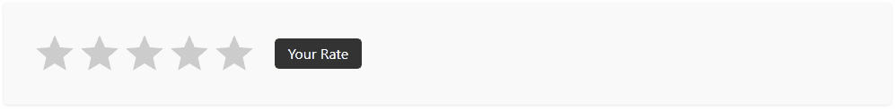
tooltipDefaultText | string | Optional | Initial tooltip text if no rating value | Your Rate |
tooltipArray | array | Optional | Array of strings to show inside tooltip | [] |
tooltipClassName | string | Optional | Tooltip CSS class | rating-tooltip |
tooltipStyle | CSSProperties | Optional | Inline style applied to the tooltip span | basic style |
titleSeparator | string | Optional | Separator word in a title of a rating star (1 out of 5) | out of |
BREAKING CHANGES: version 4.1.0 (2022-10-03)
| old | new | changes |
|---|---|---|
allowHalfIcon | allowFraction | Renamed |
fullIcon | fillIcon | Renamed |
fullStyle | fillStyle | Renamed |
fullClassName | fillClassName | Renamed |
ratingValue | - | Removed |
Demos
See all demos and usage examples in action.

License
MIT © awran5