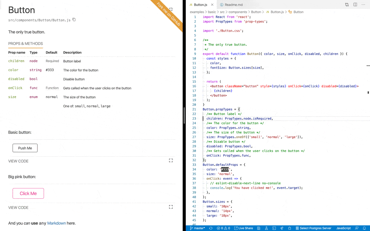
Documentation
- react-styleguidist:
React Styleguidist automatically generates a style guide from your components, allowing you to document props, usage examples, and interactive demos directly alongside your code. This makes it easier for developers to understand how to use components and for designers to see how components behave in different states.
- storybook:
Storybook also provides documentation capabilities but focuses more on interactive component development. It allows you to create stories for each component, showcasing different states and variations, which can be more dynamic and visually engaging for users.
Framework Support
- react-styleguidist:
React Styleguidist is specifically designed for React applications, making it a great choice if your project is solely based on React. It leverages React's capabilities to provide a seamless experience for building and documenting components.
- storybook:
Storybook supports multiple frameworks, including React, Vue, Angular, and more. This makes it a versatile choice for teams working with different technologies or planning to adopt a multi-framework approach in the future.
Add-ons and Extensibility
- react-styleguidist:
React Styleguidist has a more limited ecosystem of add-ons compared to Storybook. While it allows for some customization, it may not offer the same level of extensibility or community-driven plugins that enhance functionality.
- storybook:
Storybook boasts a rich ecosystem of add-ons that can enhance its capabilities, such as accessibility checks, performance monitoring, and design system integration. This extensibility makes it a powerful tool for larger teams and projects.
User Interface
- react-styleguidist:
React Styleguidist provides a clean and straightforward user interface focused on component documentation. It emphasizes simplicity and ease of use, making it accessible for teams that prioritize quick setup and minimal configuration.
- storybook:
Storybook offers a more sophisticated user interface with a sidebar for navigation and a canvas for viewing components. This layout allows for a more organized exploration of components and their variations, which can be beneficial for larger projects.
Testing Capabilities
- react-styleguidist:
React Styleguidist does not have built-in testing capabilities but can be integrated with existing testing frameworks. It focuses primarily on documentation rather than testing components in isolation.
- storybook:
Storybook provides a testing environment where you can visually test components in isolation. It integrates well with testing libraries, allowing for snapshot testing and interaction testing, which can improve the reliability of your UI components.


