Choosing the Right React Tooltip Library for Production Apps
react-tippy, react-tooltip, and react-tooltip-lite are all React components designed to display contextual information when users hover over or focus on elements. react-tippy is a React wrapper around the popular tippy.js library, offering rich features but has seen reduced maintenance. react-tooltip (often referred to as react-tooltip by the ReactTooltip organization) is a widely adopted solution with strong accessibility support and active development. react-tooltip-lite is a lightweight alternative focused on simplicity and smaller bundle size, sacrificing some advanced configuration for ease of use. All three solve the same core problem but differ in maintenance status, API design, and feature depth.
Npm Package Weekly Downloads Trend
Github Stars Ranking
Stat Detail
React Tooltip Libraries: Architecture, Maintenance, and API Compared
When adding tooltips to a React application, the choice of library impacts accessibility, bundle size, and long-term maintainability. react-tippy, react-tooltip, and react-tooltip-lite all provide tooltip functionality, but they differ significantly in their underlying architecture and maintenance status. Let's compare how they handle common implementation scenarios.
⚠️ Maintenance Status: Active vs Legacy
react-tooltip is actively maintained with regular updates to support modern React versions (including React 18).
- It follows current best practices for hooks and functional components.
- Security patches and feature requests are addressed promptly.
// react-tooltip: Modern maintenance status
// npm install react-tooltip
// Actively updated for React 18+ compatibility
import { Tooltip } from 'react-tooltip';
react-tippy is considered legacy and is no longer actively maintained.
- It wraps an older version of
tippy.js. - Using it in new projects introduces technical debt and potential compatibility issues.
// react-tippy: Legacy status
// npm install react-tippy
// Last major updates were years ago; use with caution
import { Tooltip } from 'react-tippy';
react-tooltip-lite is in maintenance mode with infrequent updates.
- It focuses on stability rather than new features.
- Suitable for static sites but may lag behind React ecosystem changes.
// react-tooltip-lite: Maintenance mode
// npm install react-tooltip-lite
// Stable but feature-complete; rarely adds new capabilities
import Tooltip from 'react-tooltip-lite';
🎨 Styling and Customization: CSS vs Inline
react-tooltip uses CSS classes for styling, allowing global themes and easy overrides.
- You define a class name and target it in your CSS files.
- Supports CSS modules and styled-components naturally.
// react-tooltip: Class-based styling
<Tooltip id="my-tooltip" className="custom-tooltip-class" />
<a data-tooltip-id="my-tooltip">Hover me</a>

/* CSS */
.custom-tooltip-class {
  background-color: #333;
  color: #fff;
}
react-tippy allows inline styles and theme props from tippy.js.
- You can pass theme names like 'light' or 'translucent'.
- Inline styles can override defaults directly in the component.
// react-tippy: Theme and inline styles
<Tooltip
  content="Info"
  theme="light"
  styles={{ backgroundColor: '#fff' }}
>
  <button>Hover me</button>
</Tooltip>
react-tooltip-lite relies heavily on inline styles for customization.
- You pass a style object to the component props.
- Less flexible for global theming compared to class-based approaches.
// react-tooltip-lite: Inline style objects
<Tooltip
  content="Info"
  styles={{
    backgroundColor: '#333',
    color: '#fff',
    padding: '10px'
  }}
>
  <button>Hover me</button>
</Tooltip>
♿ Accessibility: Aria Support and Keyboard Navigation
react-tooltip has built-in ARIA support and focuses on WCAG compliance.
- It manages
aria-describedbyattributes automatically. - Supports keyboard focus triggers out of the box.
// react-tooltip: Accessibility props
<Tooltip id="accessible-tooltip" />
<button aria-describedby="accessible-tooltip">Info</button>
// Handles focus and screen readers automatically
react-tippy has limited accessibility features in its React wrapper.
- You often need to manually manage ARIA attributes.
- Keyboard navigation support depends on the underlying
tippy.jsversion.
// react-tippy: Manual accessibility
<Tooltip
  content="Info"
  aria="aria-describedby"
  interactive={true}
>
  <button tabIndex={0}>Info</button>
</Tooltip>
// Requires manual setup for full compliance
react-tooltip-lite offers basic accessibility but lacks advanced ARIA management.
- It renders simple DOM structures that screen readers can pick up.
- Does not enforce strict accessibility standards automatically.
// react-tooltip-lite: Basic accessibility
<Tooltip content="Info">
  <button>Info</button>
</Tooltip>
// Simple structure, but verify with screen readers
🧩 Content Rendering: Text vs Complex JSX
react-tooltip supports complex JSX content easily via the content prop or children.
- You can render other React components inside the tooltip.
- State management inside tooltip content works as expected.
// react-tooltip: Complex JSX content
<Tooltip id="jsx-tooltip" />
<button data-tooltip-id="jsx-tooltip">Hover</button>

<Tooltip id="jsx-tooltip" place="top">
  <span>Count: {count}</span>
  <button onClick={handleClick}>Click</button>
</Tooltip>
react-tippy supports HTML content but requires careful handling of React elements.
- You can pass React nodes as children or content.
- Event handlers inside tooltips work but may need
interactivemode.
// react-tippy: HTML and React nodes
<Tooltip
  content={<span>Count: {count}</span>}
  interactive={true}
>
  <button>Hover</button>
</Tooltip>
react-tooltip-lite handles text and simple JSX well but struggles with complex state.
- Best for static content or simple dynamic text.
- Complex interactions inside the tooltip may behave inconsistently.
// react-tooltip-lite: Simple JSX
<Tooltip
  content={<span>Count: {count}</span>}
>
  <button>Hover</button>
</Tooltip>
// Keep content simple for best results
📍 Positioning and Placement Logic
react-tooltip uses a declarative place prop with smart fallbacks.
- You specify
top,bottom,left, orright. - It automatically adjusts if space is unavailable near the viewport edge.
// react-tooltip: Declarative placement
<Tooltip id="pos-tooltip" place="top" />
<button data-tooltip-id="pos-tooltip">Top</button>

<Tooltip id="pos-tooltip" place="right" />
<button data-tooltip-id="pos-tooltip">Right</button>
react-tippy uses position props similar to tippy.js.
- Supports variations like
top-start,top-end. - Highly configurable via popper.js settings underneath.
// react-tippy: Detailed positioning
<Tooltip position="top-start">
  <button>Top Start</button>
</Tooltip>

<Tooltip position="bottom-end">
  <button>Bottom End</button>
</Tooltip>
react-tooltip-lite supports basic directions with less automatic adjustment.
- You set
directionprops simply. - May overflow viewport edges more often than the others.
// react-tooltip-lite: Basic direction
<Tooltip direction="top">
  <button>Top</button>
</Tooltip>

<Tooltip direction="right">
  <button>Right</button>
</Tooltip>
🤝 Similarities: Shared Ground Between Libraries
While the differences are clear, all three libraries share core tooltip functionality.
1. 🖱️ Hover and Focus Triggers
- All support showing tooltips on mouse hover.
- Most support focus triggers for keyboard users.
// All libraries support basic hover
// react-tooltip
<Tooltip id="hover" />
<button data-tooltip-id="hover">Hover</button>

// react-tippy
<Tooltip content="Hover"><button>Hover</button></Tooltip>

// react-tooltip-lite
<Tooltip content="Hover"><button>Hover</button></Tooltip>
2. 📱 Mobile Touch Support
- All attempt to handle touch events on mobile devices.
- Typically show on tap rather than hover.
// All handle touch implicitly
// Tapping the element triggers the tooltip
// Behavior varies slightly by implementation
3. ⚛️ React Component Structure
- All are distributed as npm packages.
- All import as standard React components.
// Standard import pattern
import { Tooltip } from 'react-tooltip';
import { Tooltip } from 'react-tippy';
import Tooltip from 'react-tooltip-lite';
📊 Summary: Key Similarities
| Feature | Shared by All Three |
|---|---|
| Core Trigger | 🖱️ Hover, Focus, Tap |
| Installation | 📦 npm install |
| React Integration | ⚛️ Standard Components |
| Basic Content | 📝 Text and Simple JSX |
| Positioning | 📍 Top, Bottom, Left, Right |
🆚 Summary: Key Differences
| Feature | react-tooltip | react-tippy | react-tooltip-lite |
|---|---|---|---|
| Maintenance | ✅ Active | ❌ Legacy / Unmaintained | ⚠️ Maintenance Mode |
| Styling | 🎨 CSS Classes | 🎨 Themes + Inline | 🎨 Inline Styles |
| Accessibility | ♿ High (ARIA built-in) | ⚠️ Medium (Manual setup) | ⚠️ Basic |
| Bundle Size | 📦 Medium | 📦 Large | 📦 Small |
| Complex Content | ✅ Excellent | ✅ Good | ⚠️ Limited |
| React 18 Support | ✅ Yes | ⚠️ Partial / Legacy | ⚠️ Partial |
💡 The Big Picture
react-tooltip is the safe, professional choice 🛡️ for modern applications. It balances features, accessibility, and maintenance. Use this for dashboards, admin panels, and public-facing apps where compliance matters.
react-tippy is a legacy option 🕰️ that should be avoided in new work. Only use it if you are stuck maintaining an older codebase that depends on it. Plan to migrate away from it.
react-tooltip-lite is the lightweight contender 🪶 for simple needs. Use it for small tools, prototypes, or marketing pages where bundle size is the top priority and advanced features are not needed.
Final Thought: Tooltips seem simple, but they touch accessibility, mobile UX, and styling systems. Picking the right one early saves refactoring time later. For most professional teams, react-tooltip offers the best balance of risk and capability.
How to Choose: react-tippy vs react-tooltip vs react-tooltip-lite
- react-tippy:
Choose
react-tippyonly if you are maintaining a legacy project that already depends on it or require specifictippy.jsv4 features not present in newer wrappers. Do not use this for new projects as it is no longer actively maintained and may have security or compatibility risks with modern React versions. Consider migrating totippy.jsdirectly orreact-tooltipfor long-term stability. - react-tooltip:
Choose
react-tooltipif you need a robust, actively maintained solution with strong accessibility features (Aria support) and extensive customization options. It is ideal for enterprise applications where compliance, keyboard navigation, and long-term support are critical. The API is declarative and fits well with modern React patterns. - react-tooltip-lite:
Choose
react-tooltip-liteif your priority is minimizing bundle size and you need a simple, no-frills tooltip for basic use cases. It is suitable for small projects, marketing sites, or components where advanced features like complex HTML content or strict accessibility compliance are not required. Avoid it for complex dashboards or data-heavy applications.
Popular Comparisons
README for react-tippy
React Tippy
A lightweight tooltip for React. Demo at Demo page here...
Based on tippy.js and powered by Popper.js
Why you should use it?
It is designed to work friendly with React, it provides <Tooltip> element or a higher-order component.
It uses React DOM to render tooltip content. Therefore, you can fully use it in your React project without doubt.
It is an enhancement of Tippy.js for using in React.
Getting Started
yarn add react-tippy
How to use
First, you need import css
import 'react-tippy/dist/tippy.css'
There are 2 ways for you to use react Tippy
Tooltip Component
import {
  Tooltip,
} from 'react-tippy';


<Tooltip
  // options
  title="Welcome to React"
  position="bottom"
  trigger="click"
>
  <p>
    Click here to show popup
  </p>
</Tooltip>
High Order Component
withTooltip(Component, options)
import {
  withTooltip,
} from 'react-tippy';


const Header = () => (
  <h2>Header here</h2>
);

const HeaderWithTooltip = withTooltip(Header, {
  title: 'Welcome to React with tooltip',
});
Props
| Setting | Default | Options | Role |
|---|---|---|---|
| disabled | false | true false | Show or not show tooltip |
| open | undefined | true false | Just only use it if you want to show/hide it manually. Usually, you don't need it |
| useContext | undefined | true false | Define that you're using context in your tooltip content (or html props). It's useful when you want your tooltip content can connect to redux store |
| onRequestClose | noop function | Function | Just only use it if you want to show/hide it manually. This event is fired when you click outside of your tooltip, should be used with the prop interaction to keep your tooltip showing |
| position | top | top bottom left right | Specifies which direction to position the tooltip on the element. Add the suffix -start or -end to shift the position. top-end is an example. |
| trigger | mouseenter focus | mouseenter focus click manual | Specifies which type of events will trigger a tooltip to show. Separate each by a space. mouseenter is for hovering and touch on mobile, and focus is for keyboard navigation. Use manual if you want to show/hide the tooltip manually/programmatically (see below). |
| tabIndex | undefined | number | set tabIndex so element can receive focus |
| interactive | false | true false | Makes a tooltip interactive, i.e. will not close when the user hovers over or clicks on the tooltip. This lets you create a popover (similar to Bootstrap) when used in conjunction with a click trigger. |
| interactiveBorder | 2 | Any number (pixels) | Specifies the size of the invisible border around an interactive tooltip that will prevent it from closing. Only applies to mouseenter triggered tooltips. |
| delay | 0 | Any integer >= 0 (milliseconds) | Specifies how long it takes after a trigger event is fired for a tooltip to show. |
| hideDelay | 0 | Any integer >= 0 (milliseconds) | Specifies how long it takes after a leave event is fired for a tooltip to hide. Not applicable when clicking on the document to hide tooltips. |
| animation | shift | shift perspective fade scale none | Specifies the type of transition animation a tooltip has. |
| arrow | false | true false | Adds an arrow pointing to the tooltipped element. Setting this to true disables animateFill. |
| arrowSize | regular | small regular big | Specifies how big the tooltip's arrow is. |
| animateFill | true | true false | Adds a material design-esque filling animation. This is disabled if you have arrow set to true. |
| duration | 375 | Any integer >= 0 (milliseconds) | Specifies how long the transition animation takes to complete when showing a tooltip. |
| distance | 10 | Any number (pixels) | Specifies how far away the tooltip is from its element. |
| offset | 0 | Any number (pixels) | Offsets the tooltip on its opposite axis. For position top and bottom, it acts as offsetX. For position left and right, it acts as offsetY. |
| hideOnClick | true | true false 'persistent' | Specifies whether to hide a tooltip upon clicking its element after hovering over. |
| multiple | false | true false | Specifies whether to allow multiple tooltips open on the page (click trigger only). |
| followCursor | false | true false | Specifies whether to follow the user's mouse cursor (mouse devices only). |
| inertia | false | true false | Modifies the transition-timing-function with a cubic bezier to create a "slingshot" intertial effect. |
| transitionFlip | true | true false | Specifies whether to transition between flips or not. Uses the same transition timing as duration |
| popperOptions | {} | Object | Allows more control over tooltip positioning and behavior. See right below. |
| html | null | react element | Tooltip content. If you don't define html, the title will be used |
| rawTemplate | undefined | template id or dom element | USED WITH CAUTION. Support creating html templates from tippyjs. But IMO, it's not good to render raw html in React, it's a way to work around if you want to render some complex html generated by 3rd party such as SVG chart(in case you can not find React lib to render chart) |
| unmountHTMLWhenHide | false | true false | By default, html component will be mounted at first show and unmount only when your tooltip component is unmounted. When you set unmountHTMLWhenHide is true, it will be unmounted whenever tooltip is hidden. |
| size | regular | small regular big | Specifies how big the tooltip is. |
| sticky | false | true false | Specifies whether the tooltip should stick to its element reference when it's showing (for example, if the element is animated/moves). |
| stickyDuration | 200 | Any number (milliseconds) | Specifies the 'smoothing' transition when the popper's position updates as its element moves. |
| tag | div | A HTML element tag name e.g. span | Specifies the HTML element used to wrap the content that triggers the tooltip. When using a tooltip inline, span is more likely to be valid markup. When using a higher-order component with a block-level element, a div or a is more likely to be valid markup. |
| touchHold | false | true false | Changes the trigger behavior on touch devices. It will change it from a tap to show and tap off to hide, to a tap and hold to show, and a release to hide. |
| onShow | noop | function | Callback when the tooltip has been triggered and has started to transition in |
| onShown | noop | function | Callback when the tooltip has fully transitioned in and is showing |
| onHide | noop | function | Callback when the tooltip has begun to transition out |
| onHidden | noop | function | Callback when the tooltip has fully transitioned out and is hidden |
| theme | dark | dark light transparent | The CSS styling theme. |
| className | '' | string | className of container |
| style | {} | React inline style (object) | style of container |
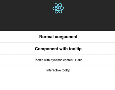
Custom tooltip content
You need to pass element to option html
import {
  Tooltip,
} from 'react-tippy';


<Tooltip
  html={(
    <div>
      <strong>
        Hello
      </strong>
    </div>
  )}
>
  // ...
</Tooltip>
Interactive html tooltip
You can use interactive prop and html for your interactive tooltip
  <Tooltip
    trigger="click"
    interactive
    html={(
      <div>
        <p>{tooltipContent}</p>
        <input
          type="text"
          value={tooltipContent}
          onChange={(e) => {setTooltipContent(e.target.value)}}
        />
      </div>
    )}
  >
    ...
  </Tooltip>
Show/hide your tooltip manually
<Tooltip
  title={tooltipContent}
  open={open}
  onRequestClose={() => {console.log('call'); setIsOpen(false)}}
>
  <span className="App-intro" onClick={() => { setIsOpen(true) }}>
    This will show {tooltipContent}
  </span>
</Tooltip>
Browser support
Tippy gracefully degrades on older browsers (and with JavaScript disabled) by using the browser's default title tooltip.
If you want to support older browsers, please add polyfill by yourself.
Supported browsers
Browsers which support requestAnimationFrame. See caniuse. If your audience has low Opera Mini usage (common in western countries), then support should be >96%.
Touch devices
Tippy works on touch devices almost the same as on desktop/mouse devices. However on iOS devices, in order for tooltips to close when tapping anywhere on the body and to trigger hover events on non-clickable elements, a .tippy-touch { cursor: pointer !important; } class is added to the body.
Accessibility
Tooltips have ARIA labelling to ensure accessibility.
Troubleshoot
I cannot connect html props with redux connect. Or can I use context in tooltip content?
react-tippy provides useContext for Tooltip component. It can allow you to use context in tooltip content. Therefore, you can totally connect it to redux.
<Tooltip
  trigger="click"
  useContext
  html={(
    <TooltipContent />
  )}
>
  Click here
</Tooltip>
Could I change tooltip style (width, height, ...)?
You can change css to have your tooltip width. If you use html props, you can do like this:
html={(
  <div style={{ width: 400 }}>
    // content here
  </div>
)}
License
MIT. Also check Popper.js' license.