React 日历与日期选择器组件架构选型指南
react-big-calendar、react-calendar、react-date-picker 和 react-datepicker 都是 React 生态中处理时间维度的核心库,但它们的定位截然不同。react-big-calendar 是一个功能完备的事件调度引擎,专为构建类似 Google Calendar 的复杂日程管理系统设计,支持月/周/日多视图渲染及拖拽操作。react-calendar 是一个无样式的日历网格组件,专注于提供灵活的日期导航逻辑,常作为自定义日期选择器的底层引擎。react-date-picker 基于 react-calendar 构建,提供了标准的“输入框 + 弹出日历”交互模式,强调开箱即用的表单集成体验。react-datepicker 则是一个历史悠久的独立解决方案,提供高度可配置的弹出层和广泛的自定义选项,适用于需要深度定制 UI 的传统表单场景。
npm下载趋势
GitHub Stars 排名
统计详情


React 日历与日期选择器深度技术对比
在 React 应用中处理时间数据通常面临两类截然不同的挑战:一是简单的“日期录入”,即用户从日历中选择一个时间点填入表单;二是复杂的“日程调度”,即在一个时间轴上展示、创建和移动多个事件。react-big-calendar、react-calendar、react-date-picker 和 react-datepicker 分别占据了这些场景的不同生态位。本文将从架构设计、API 交互模式及扩展能力三个维度,深入剖析它们的工程实现差异。
🏗️ 核心架构定位:日程引擎 vs 选择器组件
理解这些库的第一步是区分它们的根本用途。react-big-calendar 本质上是一个日程渲染引擎,它不关心你如何存储数据,只关心如何将事件数组映射到时间网格上。而其他三个库则是交互组件,核心目标是让用户选出一个或多个日期值。
react-big-calendar 采用无头(Headless)或低样式依赖的设计,它将日历划分为 Month、Week、Day、Agenda 等视图组件。你需要传入事件数组,它负责计算位置,但具体的单元格样式、事件气泡颜色完全由你通过 CSS 或自定义组件控制。
// react-big-calendar: 核心是视图与事件的映射
import { Calendar, momentLocalizer } from 'react-big-calendar';
import moment from 'moment';

const localizer = momentLocalizer(moment);

function ScheduleView({ events }) {
  return (
    <div style={{ height: 500 }}>
      <Calendar
        localizer={localizer}
        events={events}
        startAccessor="start"
        endAccessor="end"
        views={['month', 'week', 'day']}
        // 必须自定义样式类名,否则界面几乎是裸奔的
        className="my-custom-calendar-style"
      />
    </div>
  );
}
react-calendar 则是一个纯粹的日历网格。它不包含输入框,也不管理弹出层的显示隐藏。它的唯一职责是渲染一个可以切换年月、点击日期的网格。这使得它非常轻量,但也意味着如果你想要一个完整的“点击输入框弹出日历”的功能,你需要自己写状态管理。
// react-calendar: 纯粹的网格组件,无输入框
import Calendar from 'react-calendar';

function CustomDatePicker() {
  const [value, onChange] = useState(new Date());

  return (
    <div className="date-picker-wrapper">
      {/* 开发者需自行实现输入框和弹出逻辑 */}
      <input value={value.toLocaleDateString()} readOnly />
      <Calendar onChange={onChange} value={value} />
    </div>
  );
}
react-date-picker 是 react-calendar 的官方封装版。它解决了上述痛点,将输入框、清除按钮和弹出层逻辑打包在一起。它的架构是组合式的:外部是输入控件,内部挂载 react-calendar 实例。
// react-date-picker: 开箱即用的完整组件
import DatePicker from 'react-date-picker';

function FormField() {
  const [value, onChange] = useState(new Date());

  return (
    <DatePicker
      onChange={onChange}
      value={value}
      clearLabel="清除"
      calendarLabel="选择日期"
      // 内置了弹出层管理,无需额外状态
    />
  );
}
react-datepicker 是一个单体式组件。它历史悠久,内部自行实现了日历网格逻辑(不依赖 react-calendar)。它的架构特点是高度依赖 popper.js 进行弹出层定位,并提供了大量的 props 来自定义渲染各个部分(如自定义头部、自定义日期单元格)。
// react-datepicker: 高度可配置的单体组件
import DatePicker from 'react-datepicker';
import "react-datepicker/dist/react-datepicker.css";

function LegacyForm() {
  const [startDate, setStartDate] = useState(new Date());

  return (
    <DatePicker
      selected={startDate}
      onChange={(date) => setStartDate(date)}
      dateFormat="yyyy-MM-dd"
      // 支持自定义渲染每一天的内容
      renderDayContents={(day, date) =>
        day === 15 ? <span className="highlight">💰</span> : day
      }
    />
  );
}
🎨 样式系统与定制能力
在 enterprise 项目中,UI 一致性至关重要。这四个库在处理样式上采取了完全不同的策略。
react-big-calendar 几乎不提供默认样式。它依赖你引入一个基础 CSS 文件(通常作为示例提供),然后强制你通过覆盖类名或使用 components 属性来注入自定义组件。这种设计虽然初期工作量大,但保证了它不会与你的 Tailwind 或 CSS Modules 冲突。
// react-big-calendar: 通过 components 属性完全接管渲染
<Calendar
  components={{
    event: ({ event }) => <div className="custom-event-card">{event.title}</div>,
    day: ({ date }) => <div className="custom-day-cell">{date.getDate()}</div>
  }}
  // ...
/>
react-calendar 和 react-date-picker 使用一套标准的 BEM 命名类名(如 react-calendar__tile--active)。它们提供基础的可读样式,但鼓励你通过 CSS 变量或覆盖类名来调整主题。由于 react-date-picker 依赖 react-calendar,两者的类名体系是打通的,定制起来非常连贯。
// react-date-picker: 通过 className 和 calendarClassName 分别控制
<DatePicker
  className="my-input-class"
  calendarClassName="my-calendar-popup"
  // CSS 中针对 .my-calendar-popup .react-calendar__tile--active 进行覆盖
/>
react-datepicker 自带了一套较为传统的 CSS 样式。虽然它也支持类名覆盖,但由于其内部结构较深(多层嵌套的 react-datepicker__wrapper 等),在某些现代 CSS 架构(如 CSS-in-JS)中可能需要使用 !important 或深层选择器才能生效。不过,它提供了 popperClassName 允许直接控制弹出容器的样式,这在处理 z-index 层级问题时非常有用。
// react-datepicker: 控制弹出层容器样式
<DatePicker
  popperClassName="custom-popper-position"
  calendarContainer={({ className, children }) => (
    <div className={className} style={{ border: '1px solid red' }}>
      {children}
    </div>
  )}
/>
🔄 交互模式与数据流
在处理用户交互时,特别是日期范围选择和键盘导航,各库的表现差异明显。
范围选择(Range Selection) 是 react-date-picker 和 react-datepicker 的强项。
react-date-picker 通过 selectRange 属性原生支持范围选择。用户点击开始日期,再点击结束日期,组件自动处理中间状态。
// react-date-picker: 原生支持范围选择
<DatePicker
  selectRange={true}
  onChange={(range) => {
    // range 是一个包含两个日期的数组 [start, end]
    console.log(`From ${range[0]} to ${range[1]}`);
  }}
/>
react-datepicker 则需要通过 selectsStart 和 selectsEnd 配合两个独立的实例,或者使用 selectsRange(较新版本)来实现。它的逻辑稍微繁琐一些,但灵活性更高,比如可以分别禁用开始日期和结束日期的某些规则。
// react-datepicker: 范围选择需要配置两个状态或特定 props
<DatePicker
  selectsRange
  startDate={startDate}
  endDate={endDate}
  onChange={(update) => {
    const [start, end] = update;
    setStartDate(start);
    setEndDate(end);
  }}
  isClearable={true}
/>
对于 react-big-calendar,交互主要集中在事件的拖拽(Drag & Drop)和调整大小(Resize)。它不直接处理“选择范围”,而是通过 onSelectSlot 回调告诉用户拖选了哪段时间,具体业务逻辑(如弹出新建事件模态框)需由开发者实现。
// react-big-calendar: 处理时间槽选择
<Calendar
  selectable={true}
  onSelectSlot={(slotInfo) => {
    // slotInfo 包含 start, end, action (click, drag, etc.)
    if (slotInfo.action === 'select') {
      openEventModal(slotInfo.start, slotInfo.end);
    }
  }}
  onEventDrop={({ event, start, end }) => {
    // 处理事件拖拽后的数据更新
    moveEvent(event.id, start, end);
  }}
/>
🛠️ 实际场景决策矩阵
为了帮助你在架构评审中快速做出决定,以下是基于真实工程场景的对比总结:
| 特性维度 | react-big-calendar | react-calendar | react-date-picker | react-datepicker |
| :--- | :--- | :--- | :--- :--- |
| 核心用途 | 日程表、排班系统、资源预订 | 自定义日期选择器底层、日期状态展示 | 标准表单日期录入、范围选择 | 复杂表单、遗留系统维护、高度定制 UI |
| 视图模式 | 月、周、日、列表 (Agenda) | 仅月视图 (可切换年/十年) | 仅月视图 (封装在弹出层中) | 月、年、时间选择 (Timepicker) |
| 样式负担 | 高 (需大量自定义 CSS) | 中 (需覆盖默认类名) | 低 (默认样式可用,易覆盖) | 中 (默认样式较重,需深度覆盖) |
| 依赖关系 | 依赖 moment/dayjs/date-fns | 无外部日期库依赖 | 依赖 react-calendar | 无外部日期库依赖 (内置逻辑) |
| 键盘导航 | 基础支持 | 完善 (标准 ARIA) | 完善 (继承自 calendar) | 非常完善 (支持复杂组合键) |
| 维护状态 | 活跃,社区驱动 | 活跃,由 Wojciech Maj 维护 | 活跃,与 calendar 同步更新 | 活跃,重构中,API 较稳定 |
💡 专家建议
在现代 React 架构中,关注点分离是选择的关键。
如果你的任务是**“让用户选个生日”**,请不要引入 react-big-calendar,那是杀鸡用牛刀且难以样式化。此时,react-date-picker 是最佳平衡点,它利用了 react-calendar 稳健的网格逻辑,又省去了你写弹出层状态的麻烦。
如果你的任务是**“构建一个医生排班系统”**,react-big-calendar 是唯一的选择。它的核心价值在于处理复杂的时间切片算法和事件碰撞检测,这是其他三个库完全不具备的能力。虽然样式定制痛苦,但这是为了换取强大的逻辑内核所必须付出的代价。
对于 react-datepicker,它依然是一个强大的备选,特别是当你需要**时间选择器(Timepicker)**功能时。react-date-picker 主要专注于日期,而 react-datepicker 在日期 + 时间的组合选择上有着更成熟的内置支持(通过 showTimeSelect 等 props)。
最后,关于 react-calendar 单独使用:除非你要做一个非常非主流的交互(例如在地图上方直接悬浮显示日历,或者做一个无限滚动的历史日期选择器),否则直接用它的情况较少。大多数时候,你应该直接使用它的封装版 react-date-picker。
总结:
- 做日程管理 ➡️
react-big-calendar - 做标准日期表单 ➡️
react-date-picker - 做日期 + 时间表单 ➡️
react-datepicker - 做完全自定义的日历交互 ➡️
react-calendar
如何选择: react-big-calendar vs react-calendar vs react-date-picker vs react-datepicker
- react-big-calendar:
当你的需求是构建企业级日程管理系统(如会议室预订、员工排班)且需要月、周、日多种视图切换时,选择
react-big-calendar。它提供了完整的事件生命周期管理和拖拽交互,但需要你自己处理样式定制,适合有专门 UI 团队的大型项目。 - react-calendar:
如果你只需要一个纯粹的日历网格来展示日期状态(如标记签到、显示可用房态),或者想基于它从头构建一个完全自定义风格的日期选择器,请选择
react-calendar。它没有内置的输入框或弹出层逻辑,给了开发者最大的控制权,但意味着你需要编写更多的胶水代码。 - react-date-picker:
对于大多数标准的表单日期录入场景(如预订酒店、选择生日),推荐直接使用
react-date-picker。它在react-calendar的基础上封装了输入框和弹出层逻辑,支持键盘导航和范围选择,能在几分钟内集成到项目中,平衡了功能性与开发效率。 - react-datepicker:
如果你的项目依赖特定的旧版 UI 设计规范,或者需要极度灵活的弹出层定位和自定义渲染内容(如在日历中嵌入复杂的表单控件),
react-datepicker是一个成熟的选择。它的 API 非常细致,允许你控制渲染的每一个细节,适合对交互细节有苛刻要求的遗留系统迁移或特殊场景。
热门对比
react-big-calendar的README
react-big-calendar
An events calendar component built for React and designed for modern browsers (read: not IE) and uses flexbox over the classic tables-caption approach.
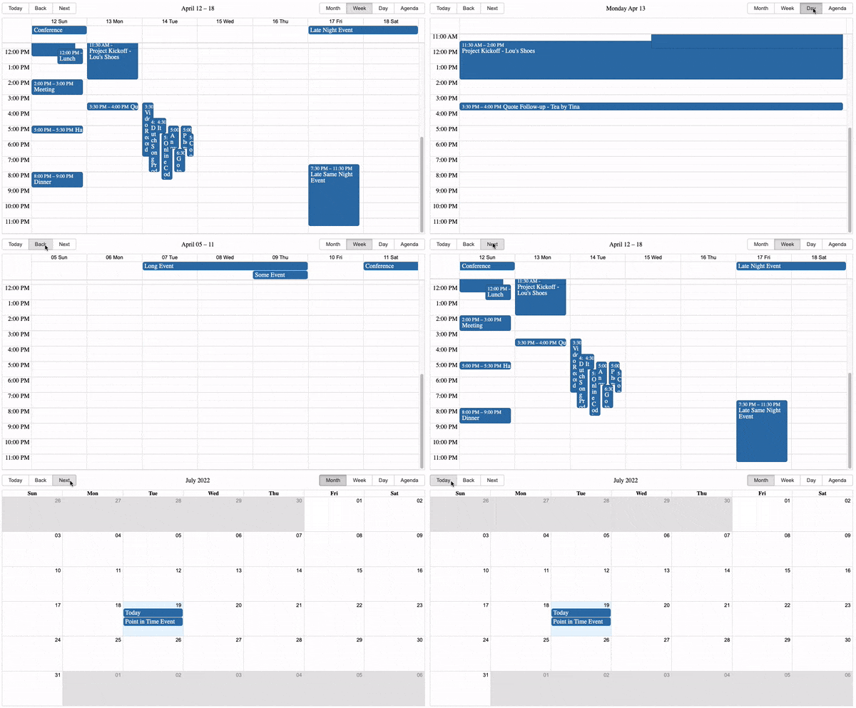
Inspired by Full Calendar.
Use and Setup
yarn add react-big-calendar or npm install --save react-big-calendar
Include react-big-calendar/lib/css/react-big-calendar.css for styles, and make sure your calendar's container
element has a height, or the calendar won't be visible. To provide your own custom styling, see the Custom Styling topic.
Starters
- react-big-calendar
- react-big-calendar with drag and drop
- react-big-calendar with TypeScript and React hooks bundled with Vite
Run examples locally
$ git clone git@github.com:bigcalendar/react-big-calendar.git
$ cd react-big-calendar
$ yarn
$ yarn storybook
- Open localhost:9002.
Localization and Date Formatting
react-big-calendar includes four options for handling the date formatting and culture localization, depending
on your preference of DateTime libraries. You can use either the Moment.js, Globalize.js, date-fns, Day.js localizers.
Regardless of your choice, you must choose a localizer to use this library:
Moment.js
import { Calendar, momentLocalizer } from 'react-big-calendar'
import moment from 'moment'

const localizer = momentLocalizer(moment)

const MyCalendar = (props) => (
  <div>
    <Calendar
      localizer={localizer}
      events={myEventsList}
      startAccessor="start"
      endAccessor="end"
      style={{ height: 500 }}
    />
  </div>
)
Globalize.js v0.1.1
import { Calendar, globalizeLocalizer } from 'react-big-calendar'
import globalize from 'globalize'

const localizer = globalizeLocalizer(globalize)

const MyCalendar = (props) => (
  <div>
    <Calendar
      localizer={localizer}
      events={myEventsList}
      startAccessor="start"
      endAccessor="end"
      style={{ height: 500 }}
    />
  </div>
)
date-fns v2
import { Calendar, dateFnsLocalizer } from 'react-big-calendar'
import format from 'date-fns/format'
import parse from 'date-fns/parse'
import startOfWeek from 'date-fns/startOfWeek'
import getDay from 'date-fns/getDay'
import enUS from 'date-fns/locale/en-US'

const locales = {
  'en-US': enUS,
}

const localizer = dateFnsLocalizer({
  format,
  parse,
  startOfWeek,
  getDay,
  locales,
})

const MyCalendar = (props) => (
  <div>
    <Calendar
      localizer={localizer}
      events={myEventsList}
      startAccessor="start"
      endAccessor="end"
      style={{ height: 500 }}
    />
  </div>
)
Day.js
Note that the dayjsLocalizer extends Day.js with the following plugins:
import { Calendar, dayjsLocalizer } from 'react-big-calendar'
import dayjs from 'dayjs'

const localizer = dayjsLocalizer(dayjs)

const MyCalendar = (props) => (
  <div>
    <Calendar
      localizer={localizer}
      events={myEventsList}
      startAccessor="start"
      endAccessor="end"
      style={{ height: 500 }}
    />
  </div>
)
Custom Styling
Out of the box, you can include the compiled CSS files and be up and running. But, sometimes, you may want to style Big Calendar to match your application styling. For this reason, SASS files are included with Big Calendar.
  @import 'react-big-calendar/lib/sass/styles';
  @import 'react-big-calendar/lib/addons/dragAndDrop/styles'; // if using DnD
SASS implementation provides a variables file containing color and sizing variables that you can
update to fit your application. Note: Changing and/or overriding styles can cause rendering issues with your
Big Calendar. Carefully test each change accordingly.
Join The Community
Help us improve Big Calendar! Join us on Slack. (Slack invite links do expire. If you can't get in, just file an issue and we'll get a new link.)