React Native 模态框组件选型指南
react-native-modal 和 react-native-modalbox 都是 React Native 生态中用于创建弹窗(Modal)的第三方库。它们旨在弥补 React Native 原生 Modal 组件在动画和交互上的不足,提供更流畅的过渡效果和手势支持。react-native-modal 是目前社区维护最活跃的标准方案,基于原生 Modal 封装并增强了动画能力;react-native-modalbox 则是一个较早期的解决方案,提供了一套独立的弹窗逻辑和简单的手势控制,但更新频率较低。
npm下载趋势
GitHub Stars 排名
统计详情


React Native 模态框方案深度对比:react-native-modal vs react-native-modalbox
在 React Native 开发中,原生 Modal 组件虽然够用,但往往缺乏流畅的进入退出动画和灵活的手势控制。react-native-modal 和 react-native-modalbox 都是为了解决这个问题而生的第三方库。虽然它们的目标一致,但在实现原理、API 设计和维护状态上有显著区别。本文将从工程实践角度深入对比两者的技术细节。
🎛️ 基础控制:状态驱动 vs 独立开关
react-native-modal 采用标准的 React 状态驱动模式,依赖 isVisible 属性控制显示。
- 它与 React 的生命周期结合紧密,支持动画完成后的回调。
- 适合需要精确控制弹窗显示逻辑的场景。
// react-native-modal: 状态控制
import Modal from 'react-native-modal';

function MyModal({ isVisible, onClose }) {
  return (
    <Modal isVisible={isVisible} onModalHide={onClose}>
      <View style={{ flex: 1 }}>
        <Text>内容区域</Text>
      </View>
    </Modal>
  );
}
react-native-modalbox 使用 isOpen 属性,逻辑类似但内部实现独立。
- 它不依赖原生
Modal组件,而是自己绘制覆盖层。 - 在某些旧版本 RN 中兼容性较好,但缺乏原生层级支持。
// react-native-modalbox: 独立开关
import ModalBox from 'react-native-modalbox';

function MyModal({ isOpen, onClose }) {
  return (
    <ModalBox isOpen={isOpen} onClosed={onClose}>
      <View style={{ flex: 1 }}>
        <Text>内容区域</Text>
      </View>
    </ModalBox>
  );
}
🎬 动画系统:预设动画 vs 位置控制
react-native-modal 提供丰富的预设动画名称,基于 react-native-animatable。
- 你可以直接使用
slideInUp、fadeIn等字符串。 - 支持自定义动画曲线和时长,灵活性高。
// react-native-modal: 预设动画
<Modal
  isVisible={true}
  animationIn="slideInUp"
  animationOut="slideOutDown"
  animationInTiming={300}
  animationOutTiming={300}
>
  <Text>带动画的弹窗</Text>
</Modal>
react-native-modalbox 主要通过 position 属性控制出现位置。
- 动画逻辑相对固定,主要是从底部、顶部或中间弹出。
- 自定义动画难度较大,适合标准场景。
// react-native-modalbox: 位置控制
<ModalBox
  isOpen={true}
  position="bottom"
  swipeToClose={true}
>
  <Text>从底部弹出</Text>
</ModalBox>
👆 手势交互:背景点击 vs 滑动关闭
react-native-modal 明确区分背景点击和内部手势。
- 通过
onBackdropPress处理背景点击关闭。 - 支持
panHandlers自定义滑动手势,但需额外配置。
// react-native-modal: 背景点击处理
<Modal
  isVisible={true}
  onBackdropPress={() => setVisible(false)}
  backdropOpacity={0.5}
>
  <Text>点击背景关闭</Text>
</Modal>
react-native-modalbox 内置了滑动关闭功能,开箱即用。
- 设置
swipeToClose即可允许用户下滑关闭。 - 对于简单的抽屉式弹窗,配置更少。
// react-native-modalbox: 滑动关闭
<ModalBox
  isOpen={true}
  swipeToClose={true}
  swipeThreshold={100}
>
  <Text>滑动即可关闭</Text>
</ModalBox>
🛠️ 维护状态与兼容性
react-native-modal 由 React Native 社区维护,更新频繁。
- 紧跟 React Native 版本迭代,修复原生 Bug。
- 社区插件和示例丰富,遇到问题容易找到解决方案。
// react-native-modal: 社区支持良好
// 文档齐全,TypeScript 类型定义完善
import { ModalProps } from 'react-native-modal';
react-native-modalbox 更新缓慢,存在潜在风险。
- 最后几次更新间隔较长,可能不兼容新 RN 版本。
- 在新架构(Fabric)下可能表现不稳定,需谨慎评估。
// react-native-modalbox: 维护风险
// 类型定义可能滞后,需自行补充或忽略类型错误
// import ModalBox from 'react-native-modalbox';
📊 核心特性对比表
| 特性 | react-native-modal | react-native-modalbox |
|---|---|---|
| 控制属性 | isVisible (布尔值) | isOpen (布尔值) |
| 动画支持 | 丰富预设 (slideIn, zoomIn) | 基于位置 (top, bottom, center) |
| 手势交互 | 背景点击 (onBackdropPress) | 滑动关闭 (swipeToClose) |
| 底层实现 | 封装原生 Modal | 独立实现覆盖层 |
| 维护状态 | ✅ 活跃维护 | ⚠️ 更新缓慢 |
| TypeScript | ✅ 完善支持 | ⚠️ 部分支持 |
💡 选型建议与总结
react-native-modal 就像是现代工程化的标准工具 🛠️——它稳定、灵活且社区活跃。如果你的项目需要复杂的动画效果、严格的类型检查或者计划长期维护,这是唯一推荐的选择。它能更好地适应 React Native 的未来版本更新。
react-native-modalbox 更像是一个快速原型工具 📦——它简单、直接,适合只需要简单底部弹窗且不想配置太多参数的场景。但由于维护力度不足,在新项目中引入它可能会带来技术债务。
最终建议:除非你正在维护一个依赖它的旧项目,否则请始终选择 react-native-modal。它的灵活性足以覆盖 modalbox 的功能,且风险更低。
如何选择: react-native-modal vs react-native-modalbox
- react-native-modal:
如果你的项目需要长期维护、丰富的动画配置或与社区最新标准保持一致,请选择
react-native-modal。它拥有活跃的社区支持,文档完善,且能更好地配合 React Native 新版本特性。适合大多数现代 React Native 应用,特别是对用户体验和动画细节有要求的场景。 - react-native-modalbox:
仅建议在维护旧项目或需要极简实现且不关心长期维护风险时选择
react-native-modalbox。它的 API 简单直观,适合快速原型开发,但由于更新停滞,可能无法兼容最新的 React Native 版本。在新项目中不推荐使用,除非你有能力自行修复潜在的兼容性问题。
热门对比
react-native-modal的README
Announcements
- 📣 We're looking for maintainers and contributors! See #598
- 🙏 If you have a question, please start a new discussion instead of opening a new issue.
react-native-modal


If you're new to the React Native world, please notice that React Native itself offers a
component that works out-of-the-box .
An enhanced, animated, customizable React Native modal.
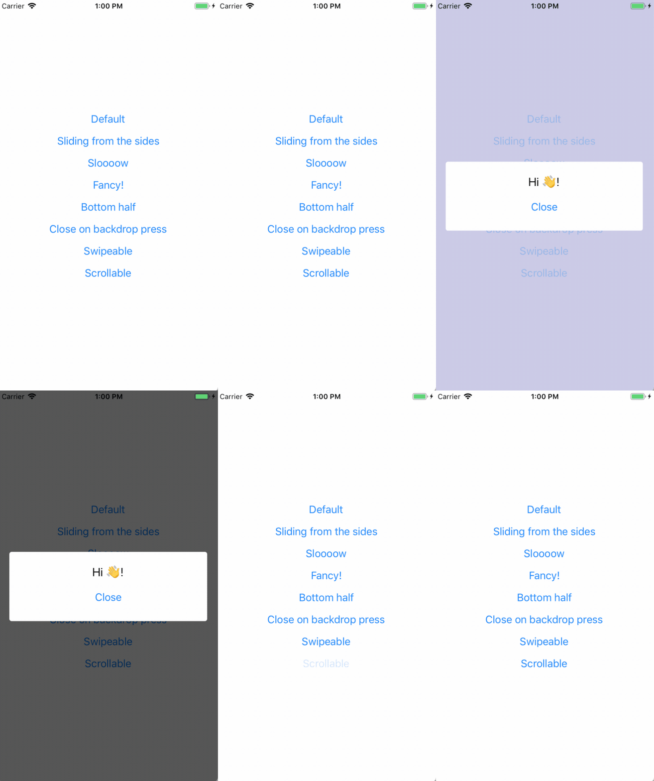
The goal of react-native-modal is expanding the original React Native <Modal> component by adding animations, style customization options, and new features, while still providing a simple API.
Features
- Smooth enter/exit animations
- Plain simple and flexible APIs
- Customizable backdrop opacity, color and timing
- Listeners for the modal animations ending
- Resize itself correctly on device rotation
- Swipeable
- Scrollable
Setup
This library is available on npm, install it with: npm i react-native-modal or yarn add react-native-modal.
Usage
Since react-native-modal is an extension of the original React Native modal, it works in a similar fashion.
- Import
react-native-modal:
import Modal from 'react-native-modal';
- Create a
<Modal>component and nest its content inside of it:
function WrapperComponent() {
  return (
    <View>
      <Modal>
        <View style={{flex: 1}}>
          <Text>I am the modal content!</Text>
        </View>
      </Modal>
    </View>
  );
}
- Then, show the modal by setting the
isVisibleprop totrue:
function WrapperComponent() {
  return (
    <View>
      <Modal isVisible={true}>
        <View style={{flex: 1}}>
          <Text>I am the modal content!</Text>
        </View>
      </Modal>
    </View>
  );
}
The isVisible prop is the only prop you'll really need to make the modal work: you should control this prop value by saving it in your wrapper component state and setting it to true or false when needed.
A complete example
The following example consists in a component (ModalTester) with a button and a modal.
The modal is controlled by the isModalVisible state variable and it is initially hidden, since its value is false.
Pressing the button sets isModalVisible to true, making the modal visible.
Inside the modal there is another button that, when pressed, sets isModalVisible to false, hiding the modal.
import React, {useState} from 'react';
import {Button, Text, View} from 'react-native';
import Modal from 'react-native-modal';

function ModalTester() {
  const [isModalVisible, setModalVisible] = useState(false);

  const toggleModal = () => {
    setModalVisible(!isModalVisible);
  };

  return (
    <View style={{flex: 1}}>
      <Button title="Show modal" onPress={toggleModal} />

      <Modal isVisible={isModalVisible}>
        <View style={{flex: 1}}>
          <Text>Hello!</Text>

          <Button title="Hide modal" onPress={toggleModal} />
        </View>
      </Modal>
    </View>
  );
}

export default ModalTester;
For a more complex example take a look at the /example directory.
Available props
| Name | Type | Default | Description |
|---|---|---|---|
animationIn | string or object | "slideInUp" | Modal show animation |
animationInTiming | number | 300 | Timing for the modal show animation (in ms) |
animationOut | string or object | "slideOutDown" | Modal hide animation |
animationOutTiming | number | 300 | Timing for the modal hide animation (in ms) |
avoidKeyboard | bool | false | Move the modal up if the keyboard is open |
coverScreen | bool | true | Will use RN Modal component to cover the entire screen wherever the modal is mounted in the component hierarchy |
hasBackdrop | bool | true | Render the backdrop |
backdropColor | string | "black" | The backdrop background color |
backdropOpacity | number | 0.70 | The backdrop opacity when the modal is visible |
backdropTransitionInTiming | number | 300 | The backdrop show timing (in ms) |
backdropTransitionOutTiming | number | 300 | The backdrop hide timing (in ms) |
customBackdrop | node | null | The custom backdrop element |
children | node | REQUIRED | The modal content |
deviceHeight | number | null | Device height (useful on devices that can hide the navigation bar) |
deviceWidth | number | null | Device width (useful on devices that can hide the navigation bar) |
isVisible | bool | REQUIRED | Show the modal? |
onBackButtonPress | func | () => null | Called when the Android back button is pressed |
onBackdropPress | func | () => null | Called when the backdrop is pressed |
onModalWillHide | func | () => null | Called before the modal hide animation begins |
onModalHide | func | () => null | Called when the modal is completely hidden |
onModalWillShow | func | () => null | Called before the modal show animation begins |
onModalShow | func | () => null | Called when the modal is completely visible |
onSwipeStart | func | () => null | Called when the swipe action started |
onSwipeMove | func | (percentageShown) => null | Called on each swipe event |
onSwipeComplete | func | ({ swipingDirection }) => null | Called when the swipeThreshold has been reached |
onSwipeCancel | func | () => null | Called when the swipeThreshold has not been reached |
panResponderThreshold | number | 4 | The threshold for when the panResponder should pick up swipe events |
scrollOffset | number | 0 | When > 0, disables swipe-to-close, in order to implement scrollable content |
scrollOffsetMax | number | 0 | Used to implement overscroll feel when content is scrollable. See /example directory |
scrollTo | func | null | Used to implement scrollable modal. See /example directory for reference on how to use it |
scrollHorizontal | bool | false | Set to true if your scrollView is horizontal (for a correct scroll handling) |
swipeThreshold | number | 100 | Swiping threshold that when reached calls onSwipeComplete |
swipeDirection | string or array | null | Defines the direction where the modal can be swiped. Can be 'up', 'down', 'left, or 'right', or a combination of them like ['up','down'] |
useNativeDriver | bool | false | Defines if animations should use native driver |
useNativeDriverForBackdrop | bool | null | Defines if animations for backdrop should use native driver (to avoid flashing on android) |
hideModalContentWhileAnimating | bool | false | Enhances the performance by hiding the modal content until the animations complete |
propagateSwipe | bool or func | false | Allows swipe events to propagate to children components (eg a ScrollView inside a modal) |
style | any | null | Style applied to the modal |
Frequently Asked Questions
The component is not working as expected
Under the hood react-native-modal uses react-native original Modal component.
Before reporting a bug, try swapping react-native-modal with react-native original Modal component and, if the issue persists, check if it has already been reported as a react-native issue.
The backdrop is not completely filled/covered on some Android devices (Galaxy, for one)
React-Native has a few issues detecting the correct device width/height of some devices.
If you're experiencing this issue, you'll need to install react-native-extra-dimensions-android.
Then, provide the real window height (obtained from react-native-extra-dimensions-android) to the modal:
const deviceWidth = Dimensions.get('window').width;
const deviceHeight =
  Platform.OS === 'ios'
    ? Dimensions.get('window').height
    : require('react-native-extra-dimensions-android').get(
        'REAL_WINDOW_HEIGHT',
      );

function WrapperComponent() {
  const [isModalVisible, setModalVisible] = useState(true);

  return (
    <Modal
      isVisible={isModalVisible}
      deviceWidth={deviceWidth}
      deviceHeight={deviceHeight}>
      <View style={{flex: 1}}>
        <Text>I am the modal content!</Text>
      </View>
    </Modal>
  );
}
How can I hide the modal by pressing outside of its content?
The prop onBackdropPress allows you to handle this situation:
<Modal
  isVisible={isModalVisible}
  onBackdropPress={() => setModalVisible(false)}>
  <View style={{flex: 1}}>
    <Text>I am the modal content!</Text>
  </View>
</Modal>
How can I hide the modal by swiping it?
The prop onSwipeComplete allows you to handle this situation (remember to set swipeDirection too!):
<Modal
  isVisible={isModalVisible}
  onSwipeComplete={() => setModalVisible(false)}
  swipeDirection="left">
  <View style={{flex: 1}}>
    <Text>I am the modal content!</Text>
  </View>
</Modal>
Note that when using useNativeDriver={true} the modal won't drag correctly. This is a known issue.
The modal flashes in a weird way when animating
Unfortunately this is a known issue that happens when useNativeDriver=true and must still be solved.
In the meanwhile as a workaround you can set the hideModalContentWhileAnimating prop to true: this seems to solve the issue.
Also, do not assign a backgroundColor property directly to the Modal. Prefer to set it on the child container.
The modal background doesn't animate properly
Are you sure you named the isVisible prop correctly? Make sure it is spelled correctly: isVisible, not visible.
The modal doesn't change orientation
Add a supportedOrientations={['portrait', 'landscape']} prop to the component, as described in the React Native documentation.
Also, if you're providing the deviceHeight and deviceWidth props you'll have to manually update them when the layout changes.
I can't show multiple modals one after another
Unfortunately right now react-native doesn't allow multiple modals to be displayed at the same time.
This means that, in react-native-modal, if you want to immediately show a new modal after closing one you must first make sure that the modal that your closing has completed its hiding animation by using the onModalHide prop.
I can't show multiple modals at the same time
See the question above. Showing multiple modals (or even alerts/dialogs) at the same time is not doable because of a react-native bug. That said, I would strongly advice against using multiple modals at the same time because, most often than not, this leads to a bad UX, especially on mobile (just my opinion).
The StatusBar style changes when the modal shows up
This issue has been discussed here.
The TLDR is: it's a know React-Native issue with the Modal component 😞
The modal is not covering the entire screen
The modal style applied by default has a small margin.
If you want the modal to cover the entire screen you can easily override it this way:
<Modal style={{margin: 0}}>...</Modal>
I can't scroll my ScrollView inside of the modal
Enable propagateSwipe to allow your child components to receive swipe events:
<Modal propagateSwipe>...</Modal>
Please notice that this is still a WIP fix and might not fix your issue yet, see issue #236.
The modal enter/exit animation flickers
Make sure your animationIn and animationOut are set correctly.
We noticed that, for example, using fadeIn as an exit animation makes the modal flicker (it should be fadeOut!).
Also, some users have noticed that setting backdropTransitionOutTiming={0} can fix the flicker without affecting the animation.
The custom backdrop doesn't fill the entire screen
You need to specify the size of your custom backdrop component. You can also make it expand to fill the entire screen by adding a flex: 1 to its style:
<Modal isVisible={isModalVisible} customBackdrop={<View style={{flex: 1}} />}>
  <View style={{flex: 1}}>
    <Text>I am the modal content!</Text>
  </View>
</Modal>
The custom backdrop doesn't dismiss the modal on press
You can provide an event handler to the custom backdrop element to dismiss the modal. The prop onBackdropPress is not supported for a custom backdrop.
<Modal
  isVisible={isModalVisible}
  customBackdrop={
    <TouchableWithoutFeedback onPress={dismissModalHandler}>
      <View style={{flex: 1}} />
    </TouchableWithoutFeedback>
  }
/>
Available animations
Take a look at react-native-animatable to see the dozens of animations available out-of-the-box. You can also pass in custom animation definitions and have them automatically register with react-native-animatable. For more information on creating custom animations, see the react-native-animatable animation definition schema.
Alternatives
Acknowledgements
Thanks @oblador for react-native-animatable, @brentvatne for the npm namespace and to anyone who contributed to this library!
Pull requests, feedbacks and suggestions are welcome!