React Native Picker for iOS, Android, macOS, and Windows


Npm Package Weekly Downloads Trend
Cumulative GitHub Star Trend
Stat Detail
Popular Comparisons
README for @react-native-picker/picker
@react-native-picker/picker
| Android | iOS | PickerIOS |
|---|---|---|
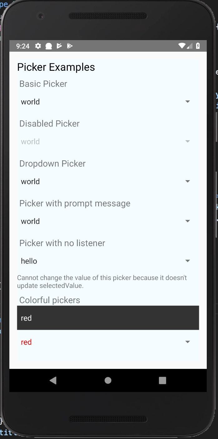 | 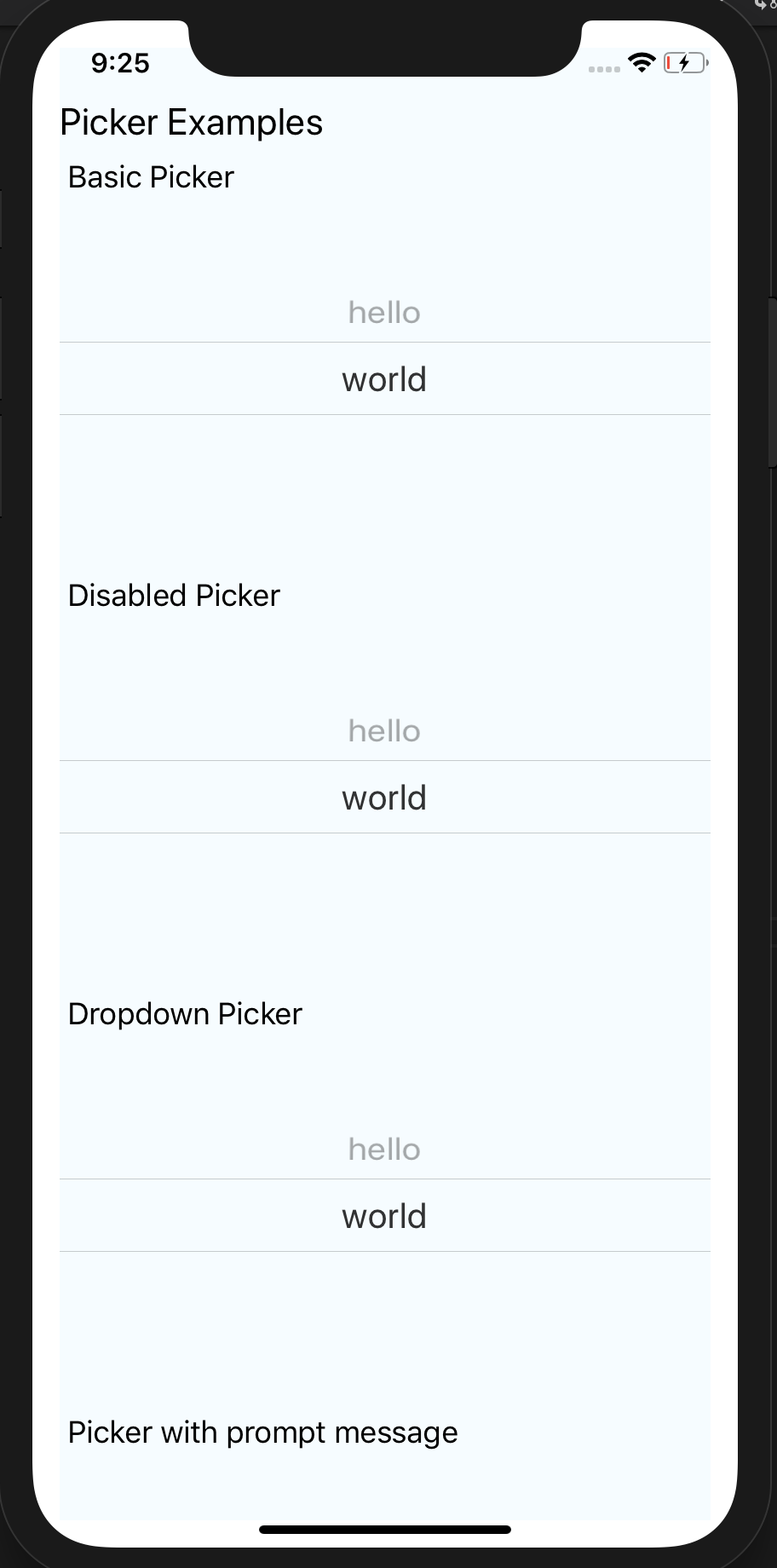 | 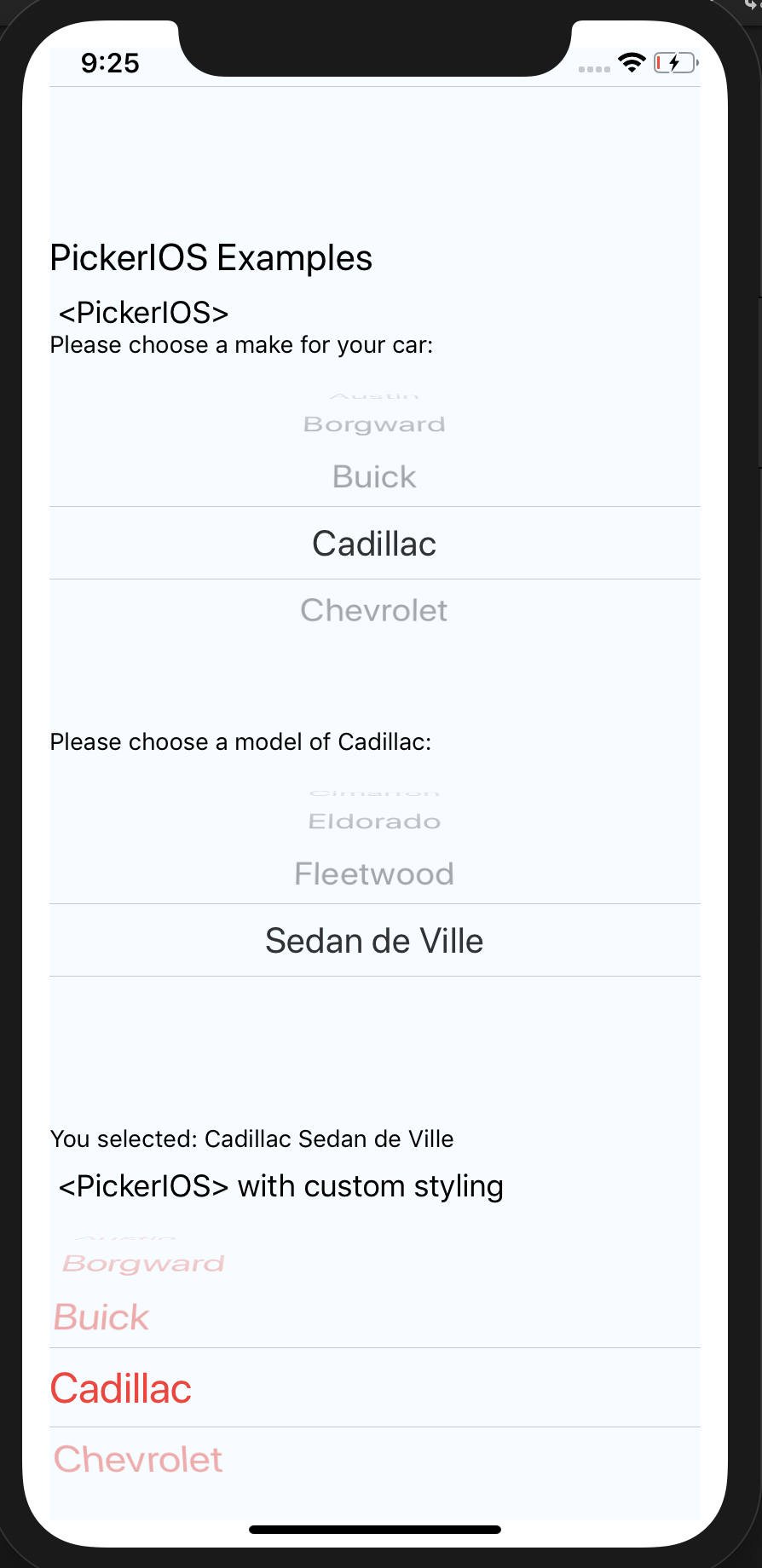 |
| Windows | MacOS |
|---|---|
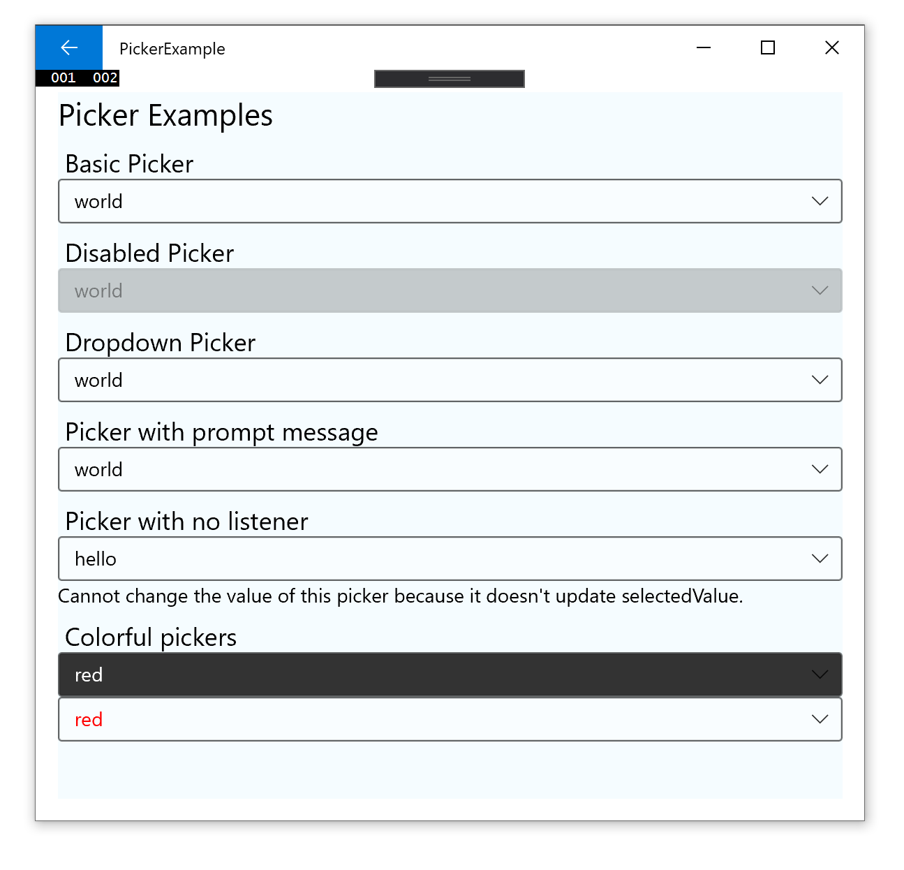 | 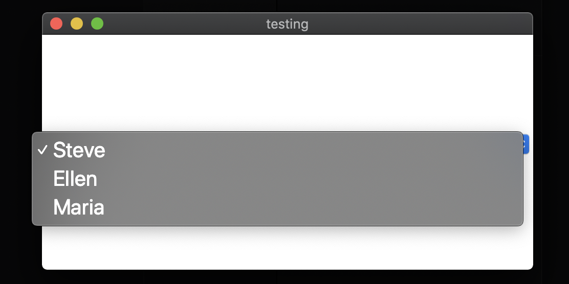 |
Supported Versions
| @react-native-picker/picker | react-native | react-native-windows |
|---|---|---|
| >= 2.0.0 | 0.61+ | 0.64+ |
| >= 1.16.0 | 0.61+ | 0.61+ |
| >= 1.2.0 | 0.60+ or 0.59+ with Jetifier | N/A |
| >= 1.0.0 | 0.57 | N/A |
Getting started
$ npm install @react-native-picker/picker --save
or
$ yarn add @react-native-picker/picker
For React Native v0.60 and above (Autolinking)
As react-native@0.60 and above supports autolinking there is no need to run the linking process.
Read more about autolinking here. This is supported by react-native-windows@0.64 and above.
iOS
CocoaPods on iOS needs this extra step:
npx pod-install
Android
No additional step is required.
Windows (expand for details)
Windows
Usage in Windows without autolinking requires the following extra steps:
Add the ReactNativePicker project to your solution.
- Open the solution in Visual Studio 2019
- Right-click Solution icon in Solution Explorer > Add > Existing Project
Select
D:\dev\RNTest\node_modules\@react-native-picker\picker\windows\ReactNativePicker\ReactNativePicker.vcxproj
windows/myapp.sln
Add a reference to ReactNativePicker to your main application project. From Visual Studio 2019:
Right-click main application project > Add > Reference...
Check ReactNativePicker from Solution Projects.
app.cpp
Add #include "winrt/ReactNativePicker.h" to the headers included at the top of the file.
Add PackageProviders().Append(winrt::ReactNativePicker::ReactPackageProvider()); before InitializeComponent();.
MacOS
CocoaPods on MacOS needs this extra step (called from the MacOS directory)
pod install
React Native below 0.60 (Link and Manual Installation)
The following steps are only necessary if you are working with a version of React Native lower than 0.60
Mostly automatic installation
$ react-native link @react-native-picker/picker
Manual installation
iOS
- In XCode, in the project navigator, right click
Libraries➜Add Files to [your project's name] - Go to
node_modules➜@react-native-picker/pickerand addRNCPicker.xcodeproj - In XCode, in the project navigator, select your project. Add
libRNCPicker.ato your project'sBuild Phases➜Link Binary With Libraries - Run your project (
Cmd+R)<
Android
- Open application file (
android/app/src/main/java/[...]/MainApplication.java)
- Add
import com.reactnativecommunity.picker.RNCPickerPackage;to the imports at the top of the file - Add
new RNCPickerPackage()to the list returned by thegetPackages()method
- Append the following lines to
android/settings.gradle:include ':@react-native-picker_picker' project(':@react-native-picker_picker').projectDir = new File(rootProject.projectDir, '../node_modules/@react-native-picker/picker/android') - Insert the following lines inside the dependencies block in
android/app/build.gradle:implementation project(path: ':@react-native-picker_picker')
MacOS
- In XCode, in the project navigator, right click
Libraries➜Add Files to [your project's name] - Go to
node_modules➜@react-native-picker/pickerand addRNCPicker.xcodeproj - In XCode, in the project navigator, select your project. Add
libRNCPicker.ato your project'sBuild Phases➜Link Binary With Libraries - Run your project (
Cmd+R)<
RTL Support
you need to add android:supportsRtl="true" to AndroidManifest.xml
   <application
      ...
      android:supportsRtl="true">
Usage
Import Picker from @react-native-picker/picker:
import {Picker} from '@react-native-picker/picker';
Create state which will be used by the Picker:
const [selectedLanguage, setSelectedLanguage] = useState();
Add Picker like this:
<Picker
  selectedValue={selectedLanguage}
  onValueChange={(itemValue, itemIndex) =>
    setSelectedLanguage(itemValue)
  }>
  <Picker.Item label="Java" value="java" />
  <Picker.Item label="JavaScript" value="js" />
</Picker>
If you want to open/close picker programmatically on android (available from version 1.16.0+), pass ref to Picker:
const pickerRef = useRef();

function open() {
  pickerRef.current.focus();
}

function close() {
  pickerRef.current.blur();
}

return <Picker
  ref={pickerRef}
  selectedValue={selectedLanguage}
  onValueChange={(itemValue, itemIndex) =>
    setSelectedLanguage(itemValue)
  }>
  <Picker.Item label="Java" value="java" />
  <Picker.Item label="JavaScript" value="js" />
</Picker>
Props
Reference
Props
onValueChange
Callback for when an item is selected. This is called with the following parameters:
itemValue: thevalueprop of the item that was selecteditemPosition: the index of the selected item in this picker
| Type | Required |
|---|---|
| function | No |
selectedValue
Value matching value of one of the items. Can be a string or an integer.
| Type | Required |
|---|---|
| any | No |
style
| Type | Required |
|---|---|
| pickerStyleType | No |
testID
Used to locate this view in end-to-end tests.
| Type | Required |
|---|---|
| string | No |
enabled
If set to false, the picker will be disabled, i.e. the user will not be able to make a selection.
| Type | Required | Platform |
|---|---|---|
| bool | No | Android, Web, Windows |
mode
On Android, specifies how to display the selection items when the user taps on the picker:
- 'dialog': Show a modal dialog. This is the default.
- 'dropdown': Shows a dropdown anchored to the picker view
| Type | Required | Platform |
|---|---|---|
| enum('dialog', 'dropdown') | No | Android |
dropdownIconColor
On Android, specifies color of dropdown triangle. Input value should be value that is accepted by react-native processColor function.
| Type | Required | Platform |
|---|---|---|
| ColorValue | No | Android |
dropdownIconRippleColor
On Android, specifies ripple color of dropdown triangle. Input value should be value that is accepted by react-native processColor function.
| Type | Required | Platform |
|---|---|---|
| ColorValue | No | Android |
prompt
Prompt string for this picker, used on Android in dialog mode as the title of the dialog.
| Type | Required | Platform |
|---|---|---|
| string | No | Android |
itemStyle
Style to apply to each of the item labels.
| Type | Required | Platform |
|---|---|---|
| text styles | No | iOS, Windows |
numberOfLines
On Android & iOS, used to truncate the text with an ellipsis after computing the text layout, including line wrapping, such that the total number of lines does not exceed this number. Default is '1'
| Type | Required | Platform |
|---|---|---|
| number | No | Android, iOS |
onBlur
| Type | Required | Platform |
|---|---|---|
| function | No | Android |
onFocus
| Type | Required | Platform |
|---|---|---|
| function | No | Android |
selectionColor
| Type | Required | Platform |
|---|---|---|
| ColorValue | No | iOS |
Methods
blur (Android only, lib version 1.16.0+)
Programmatically closes picker
focus (Android only, lib version 1.16.0+)
Programmatically opens picker
PickerItemProps
Props that can be applied to individual Picker.Item
label
Displayed value on the Picker Item
| Type | Required |
|---|---|
| string | Yes |
value
Actual value on the Picker Item
| Type | Required |
|---|---|
| number,string | Yes |
color
Displayed color on the Picker Item
| Type | Required |
|---|---|
| ColorValue | No |
fontFamily
Displayed fontFamily on the Picker Item
| Type | Required |
|---|---|
| string | No |
style
Style to apply to individual item labels.
| Type | Required | Platform |
|---|---|---|
| ViewStyleProp | No | Android |
enabled
If set to false, the specific item will be disabled, i.e. the user will not be able to make a selection
@default: true
| Type | Required | Platform |
|---|---|---|
| boolean | No | Android |
contentDescription
Sets the content description to the Picker Item
| Type | Required | Platform |
|---|---|---|
| string | No | Android |
PickerIOS
Props
Reference
Props
itemStyle
| Type | Required |
|---|---|
| text styles | No |
onValueChange
| Type | Required |
|---|---|
| function | No |
selectedValue
| Type | Required |
|---|---|
| any | No |
selectionColor
| Type | Required | Platform |
|---|---|---|
| ColorValue | No | iOS |
themeVariant
| Type | Required |
|---|---|
| enum('light', 'dark') | No |