React Native Picker and Dropdown Selection Libraries
@react-native-community/picker, @react-native-picker/picker, react-native-dropdown-picker, and react-native-picker-select are all React Native libraries designed to provide picker or dropdown selection UI components. @react-native-picker/picker (the successor to the deprecated @react-native-community/picker) wraps the native iOS and Android picker controls, offering platform-consistent behavior and accessibility. react-native-picker-select also uses native pickers but adds a customizable input-like wrapper for improved cross-platform appearance. In contrast, react-native-dropdown-picker is a pure JavaScript implementation that provides extensive customization, multi-select, and search capabilities at the cost of native integration and automatic accessibility compliance.
Npm Package Weekly Downloads Trend
Github Stars Ranking
Stat Detail
React Native Picker Libraries Compared: Technical Deep Dive
When building mobile apps with React Native, selecting the right picker component is more than just UI polish — it affects accessibility, platform consistency, performance, and maintainability. The ecosystem offers several options, but they differ significantly in architecture, native integration, and feature scope. Let’s compare @react-native-community/picker, @react-native-picker/picker, react-native-dropdown-picker, and react-native-picker-select from a professional engineering standpoint.
🚫 Deprecation Status: What’s Still Safe to Use?
First, a critical note: @react-native-community/picker is officially deprecated. According to its npm page, it has been moved to @react-native-picker/picker. New projects should not use it.
// ❌ Do NOT use in new projects
import { Picker } from '@react-native-community/picker';
The community fork @react-native-picker/picker is now the canonical, actively maintained successor.
📱 Core Architecture: Native vs JavaScript Renderers
@react-native-picker/picker (formerly @react-native-community/picker)
This package wraps the native iOS UIPickerView and Android Spinner, meaning it renders actual platform controls. This gives you:
- Full accessibility support out of the box
- Platform-consistent behavior (e.g., iOS wheel picker vs Android dropdown)
- Zero JavaScript overhead during interaction
import { Picker } from '@react-native-picker/picker';
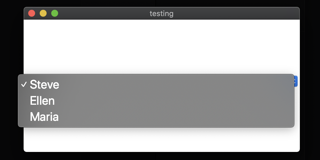
<Picker selectedValue={language} onValueChange={setLanguage}>
<Picker.Item label="JavaScript" value="js" />
<Picker.Item label="Python" value="py" />
</Picker>
react-native-picker-select
This library also uses the native picker under the hood but adds a customizable touchable wrapper to mimic a dropdown field. It bridges the native module but provides a consistent cross-platform appearance by default.
import RNPickerSelect from 'react-native-picker-select';

<RNPickerSelect
  onValueChange={(value) => setLanguage(value)}
  items={[
    { label: 'JavaScript', value: 'js' },
    { label: 'Python', value: 'py' }
  ]}
  value={language}
/>
react-native-dropdown-picker
Unlike the above, this is a pure JavaScript implementation. It renders a custom dropdown using React Native primitives (View, FlatList, etc.). This means:
- Full control over styling and animations
- No native module linking required
- But you lose native accessibility features unless manually implemented
import DropDownPicker from 'react-native-dropdown-picker';

<DropDownPicker
  open={open}
  value={value}
  items={items}
  setOpen={setOpen}
  setValue={setValue}
  setItems={setItems}
/>
🎨 Styling and Customization Capabilities
Native-based pickers (@react-native-picker/picker, react-native-picker-select)
Styling is limited to what the native platforms allow. On iOS, you can change text color and font size; on Android, customization is even more restricted. You cannot change the dropdown animation, height, or add icons inside the picker without workarounds.
Example of minimal styling:
// @react-native-picker/picker
<Picker style={{ color: 'blue' }} itemStyle={{ fontSize: 18 }}>
  {/* items */}
</Picker>
react-native-picker-select improves this slightly by letting you style the input-like trigger element, but the actual modal/wheel remains native and unstyled:
<RNPickerSelect
  style={{ inputIOS: { backgroundColor: '#f0f0f0' } }}
  // ...
/>
Pure JS picker (react-native-dropdown-picker)
Offers complete styling freedom:
- Customize dropdown height, direction (top/bottom), border radius
- Add search bars, checkboxes, or custom list items
- Control open/close animations
<DropDownPicker
  style={{ backgroundColor: '#fafafa' }}
  dropDownContainerStyle={{ backgroundColor: '#e0e0e0' }}
  listItemLabelStyle={{ color: 'darkblue' }}
/>
However, this flexibility comes at the cost of reimplementing behaviors that native pickers handle automatically (like screen-edge detection or safe area insets).
⚙️ State Management and API Design
@react-native-picker/picker
Uses a controlled component model similar to HTML <select>:
<Picker selectedValue={value} onValueChange={onChange}>
  <Picker.Item label="A" value="a" />
  <Picker.Item label="B" value="b" />
</Picker>
You manage the list of items as JSX children. This is simple but inflexible for dynamic lists.
react-native-picker-select
Accepts items as a flat array of objects, making dynamic data easier:
const items = languages.map(lang => ({ label: lang.name, value: lang.code }));

<RNPickerSelect items={items} /* ... */ />
It also supports placeholder text and disabled states cleanly.
react-native-dropdown-picker
Requires explicit state management for open/closed state, which gives fine control but increases boilerplate:
const [open, setOpen] = useState(false);
const [value, setValue] = useState(null);
const [items, setItems] = useState([...]);

<DropDownPicker
  open={open}
  value={value}
  items={items}
  setOpen={setOpen}
  setValue={setValue}
  setItems={setItems}
/>
This pattern scales well for complex forms but feels heavy for simple use cases.
🧪 Platform-Specific Behavior and Gotchas
iOS vs Android Differences
With native-based pickers, iOS shows a bottom sheet with a wheel, while Android shows a modal dialog or inline spinner. This can lead to inconsistent UX if not accounted for.
react-native-picker-select tries to normalize this by always showing a touchable input that opens the native picker, reducing layout shifts.
react-native-dropdown-picker behaves identically on both platforms since it’s JS-rendered — a benefit if visual consistency trumps platform conventions.
Keyboard and Focus Handling
Native pickers automatically dismiss the keyboard when opened — a subtle but important detail for form usability. Pure JS implementations like react-native-dropdown-picker require manual keyboard dismissal:
// react-native-dropdown-picker often needs this
import { Keyboard } from 'react-native';

<DropDownPicker
  onPress={() => Keyboard.dismiss()}
  // ...
/>
🧩 Advanced Features Comparison
| Feature | @react-native-picker/picker | react-native-picker-select | react-native-dropdown-picker |
|---|---|---|---|
| Searchable dropdown | ❌ | ❌ | ✅ |
| Multi-select | ❌ | ❌ | ✅ |
| Custom list item rendering | ❌ | ❌ | ✅ |
| RTL support | ✅ (native) | ✅ | ✅ |
| Dynamic item loading | Limited (JSX only) | ✅ (array input) | ✅ |
| Built-in placeholder | ❌ | ✅ | ✅ |
| Accessibility (VoiceOver/TalkBack) | ✅ (native) | ✅ (native) | ⚠️ Partial (manual effort) |
🛠 Real-World Usage Scenarios
Scenario 1: Simple Country Selector in a Form
You need a basic, accessible country picker that follows platform norms.
- ✅ Best choice:
@react-native-picker/picker - Why? Minimal code, full accessibility, no extra dependencies.
<Picker selectedValue={country} onValueChange={setCountry}>
  {countries.map(c => <Picker.Item key={c.code} label={c.name} value={c.code} />)}
</Picker>
Scenario 2: Consistent Cross-Platform Dropdown with Placeholder
Your design system requires the same look on iOS and Android, including a placeholder like “Select language”.
- ✅ Best choice:
react-native-picker-select - Why? Handles placeholder and consistent trigger UI while still using native picker modals.
<RNPickerSelect
  placeholder={{ label: 'Select language...', value: null }}
  items={languages}
  onValueChange={setLanguage}
  value={language}
/>
Scenario 3: Complex Filter with Search and Multi-Select
You’re building an e-commerce filter where users can select multiple categories and search through 500+ options.
- ✅ Best choice:
react-native-dropdown-picker - Why? Only this package supports search, multi-select, and virtualized lists.
<DropDownPicker
  multiple={true}
  searchable={true}
  min={1}
  max={5}
  // ...
/>
🔒 Maintenance and Future-Proofing
- Avoid
@react-native-community/picker— it’s deprecated. @react-native-picker/pickeris the official community-maintained native picker and is safe for long-term use.react-native-picker-selectis actively maintained and fills a useful niche between native and custom.react-native-dropdown-pickeris mature and feature-rich but carries the burden of maintaining a full custom UI component.
💡 Final Recommendation
Choose based on your trade-off between platform fidelity and customization needs:
- Need accessibility, simplicity, and native behavior? →
@react-native-picker/picker - Want consistent trigger UI with native modals? →
react-native-picker-select - Require advanced features like search, multi-select, or deep styling? →
react-native-dropdown-picker
Never use the deprecated @react-native-community/picker in new codebases. When in doubt, start with the native picker — you can always layer on react-native-picker-select if you need better placeholder handling, and only reach for the pure-JS solution when native limitations block core functionality.
How to Choose: @react-native-picker/picker vs react-native-picker-select vs react-native-dropdown-picker vs @react-native-community/picker
- @react-native-picker/picker:
Choose
@react-native-picker/pickerwhen you need a lightweight, accessible, and truly native picker experience that adheres to platform conventions. It’s ideal for simple selection scenarios where you prioritize performance, accessibility, and minimal JavaScript overhead over visual customization. - react-native-picker-select:
Choose
react-native-picker-selectwhen you want the reliability of native pickers but need a consistent cross-platform trigger UI with built-in placeholder support. It bridges the gap between native behavior and designer-friendly appearance, making it a solid middle ground for standard form dropdowns. - react-native-dropdown-picker:
Choose
react-native-dropdown-pickerwhen you require advanced features like multi-select, searchable dropdowns, or complete control over styling and animations. It’s best suited for complex filtering interfaces or when your design system demands visual consistency across iOS and Android that native pickers can’t provide. - @react-native-community/picker:
Do not use this package in new projects — it is officially deprecated according to its npm page. Migrate existing usage to
@react-native-picker/pickerinstead. It was previously the standard community implementation of the native picker but is no longer maintained.
Popular Comparisons
README for @react-native-picker/picker
@react-native-picker/picker


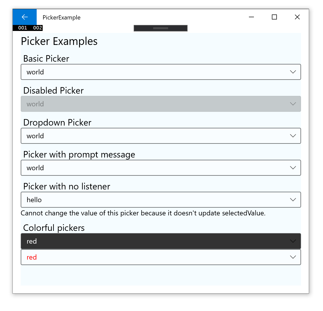
| Android | iOS | PickerIOS |
|---|---|---|
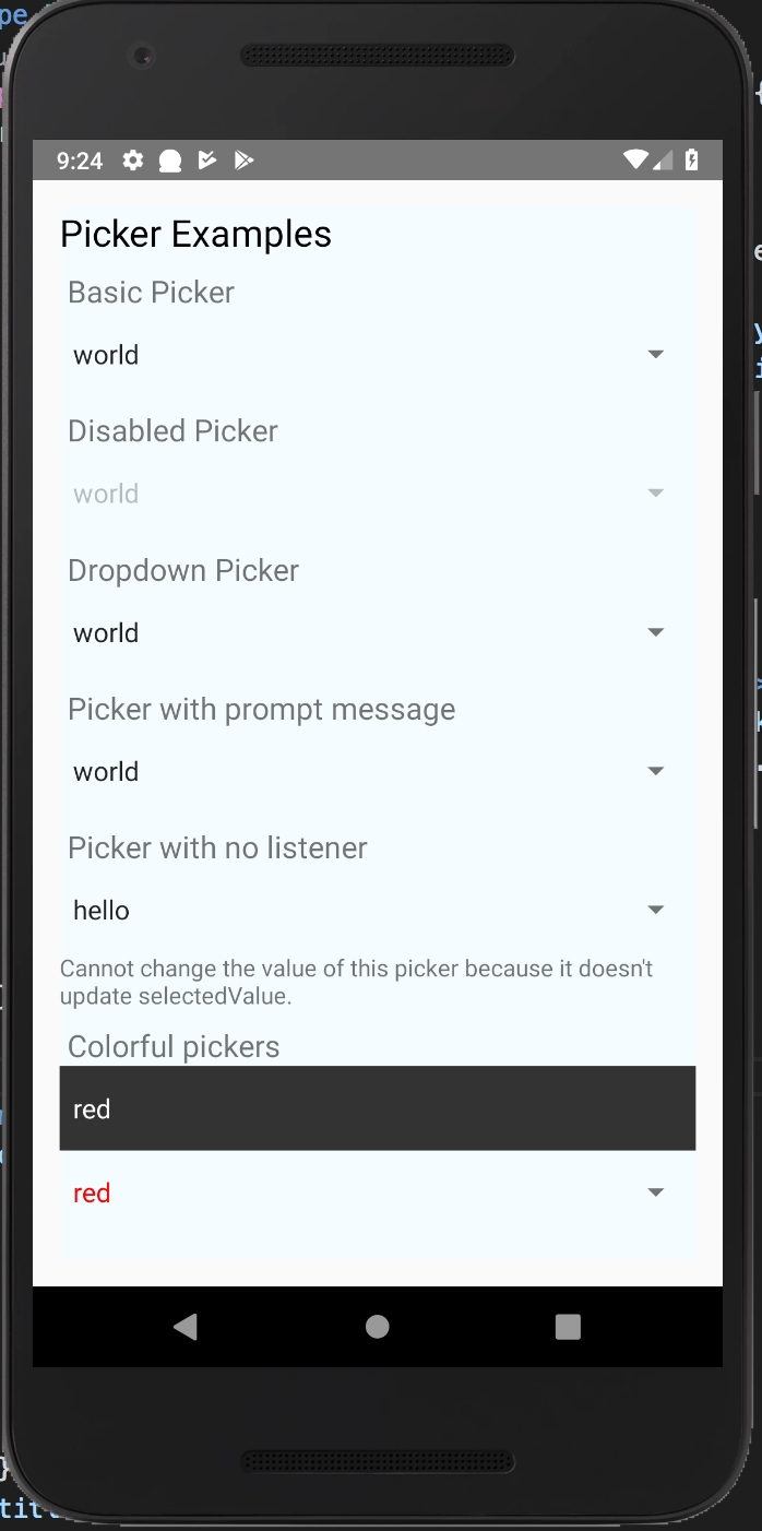 | 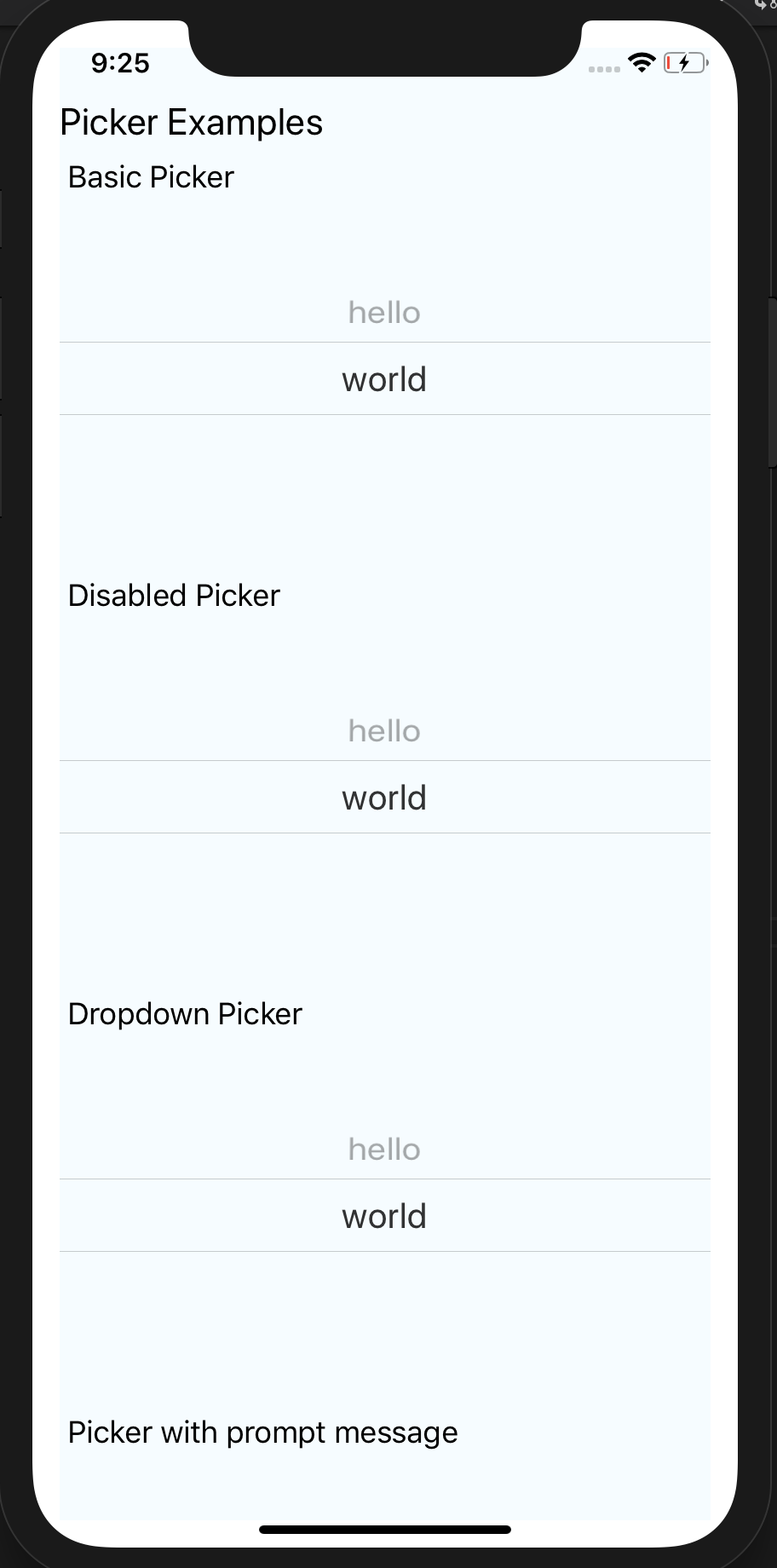 | 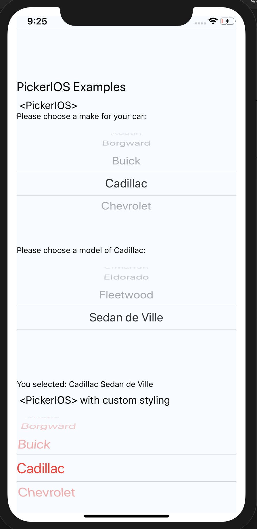 |
| Windows | MacOS |
|---|---|
 |  |
Supported Versions
| @react-native-picker/picker | react-native | react-native-windows |
|---|---|---|
| >= 2.0.0 | 0.61+ | 0.64+ |
| >= 1.16.0 | 0.61+ | 0.61+ |
| >= 1.2.0 | 0.60+ or 0.59+ with Jetifier | N/A |
| >= 1.0.0 | 0.57 | N/A |
Getting started
$ npm install @react-native-picker/picker --save
or
$ yarn add @react-native-picker/picker
For React Native v0.60 and above (Autolinking)
As react-native@0.60 and above supports autolinking there is no need to run the linking process.
Read more about autolinking here. This is supported by react-native-windows@0.64 and above.
iOS
CocoaPods on iOS needs this extra step:
npx pod-install
Android
No additional step is required.
Windows (expand for details)
Windows
Usage in Windows without autolinking requires the following extra steps:
Add the ReactNativePicker project to your solution.
- Open the solution in Visual Studio 2019
- Right-click Solution icon in Solution Explorer > Add > Existing Project
Select
D:\dev\RNTest\node_modules\@react-native-picker\picker\windows\ReactNativePicker\ReactNativePicker.vcxproj
windows/myapp.sln
Add a reference to ReactNativePicker to your main application project. From Visual Studio 2019:
Right-click main application project > Add > Reference...
Check ReactNativePicker from Solution Projects.
app.cpp
Add #include "winrt/ReactNativePicker.h" to the headers included at the top of the file.
Add PackageProviders().Append(winrt::ReactNativePicker::ReactPackageProvider()); before InitializeComponent();.
MacOS
CocoaPods on MacOS needs this extra step (called from the MacOS directory)
pod install
React Native below 0.60 (Link and Manual Installation)
The following steps are only necessary if you are working with a version of React Native lower than 0.60
Mostly automatic installation
$ react-native link @react-native-picker/picker
Manual installation
iOS
- In XCode, in the project navigator, right click
Libraries➜Add Files to [your project's name] - Go to
node_modules➜@react-native-picker/pickerand addRNCPicker.xcodeproj - In XCode, in the project navigator, select your project. Add
libRNCPicker.ato your project'sBuild Phases➜Link Binary With Libraries - Run your project (
Cmd+R)<
Android
- Open application file (
android/app/src/main/java/[...]/MainApplication.java)
- Add
import com.reactnativecommunity.picker.RNCPickerPackage;to the imports at the top of the file - Add
new RNCPickerPackage()to the list returned by thegetPackages()method
- Append the following lines to
android/settings.gradle:include ':@react-native-picker_picker' project(':@react-native-picker_picker').projectDir = new File(rootProject.projectDir, '../node_modules/@react-native-picker/picker/android') - Insert the following lines inside the dependencies block in
android/app/build.gradle:implementation project(path: ':@react-native-picker_picker')
MacOS
- In XCode, in the project navigator, right click
Libraries➜Add Files to [your project's name] - Go to
node_modules➜@react-native-picker/pickerand addRNCPicker.xcodeproj - In XCode, in the project navigator, select your project. Add
libRNCPicker.ato your project'sBuild Phases➜Link Binary With Libraries - Run your project (
Cmd+R)<
RTL Support
you need to add android:supportsRtl="true" to AndroidManifest.xml
   <application
      ...
      android:supportsRtl="true">
Usage
Import Picker from @react-native-picker/picker:
import {Picker} from '@react-native-picker/picker';
Create state which will be used by the Picker:
const [selectedLanguage, setSelectedLanguage] = useState();
Add Picker like this:
<Picker
  selectedValue={selectedLanguage}
  onValueChange={(itemValue, itemIndex) =>
    setSelectedLanguage(itemValue)
  }>
  <Picker.Item label="Java" value="java" />
  <Picker.Item label="JavaScript" value="js" />
</Picker>
If you want to open/close picker programmatically on android (available from version 1.16.0+), pass ref to Picker:
const pickerRef = useRef();

function open() {
  pickerRef.current.focus();
}

function close() {
  pickerRef.current.blur();
}

return <Picker
  ref={pickerRef}
  selectedValue={selectedLanguage}
  onValueChange={(itemValue, itemIndex) =>
    setSelectedLanguage(itemValue)
  }>
  <Picker.Item label="Java" value="java" />
  <Picker.Item label="JavaScript" value="js" />
</Picker>
Props
Reference
Props
onValueChange
Callback for when an item is selected. This is called with the following parameters:
itemValue: thevalueprop of the item that was selecteditemPosition: the index of the selected item in this picker
| Type | Required |
|---|---|
| function | No |
selectedValue
Value matching value of one of the items. Can be a string or an integer.
| Type | Required |
|---|---|
| any | No |
style
| Type | Required |
|---|---|
| pickerStyleType | No |
testID
Used to locate this view in end-to-end tests.
| Type | Required |
|---|---|
| string | No |
enabled
If set to false, the picker will be disabled, i.e. the user will not be able to make a selection.
| Type | Required | Platform |
|---|---|---|
| bool | No | Android, Web, Windows |
mode
On Android, specifies how to display the selection items when the user taps on the picker:
- 'dialog': Show a modal dialog. This is the default.
- 'dropdown': Shows a dropdown anchored to the picker view
| Type | Required | Platform |
|---|---|---|
| enum('dialog', 'dropdown') | No | Android |
dropdownIconColor
On Android, specifies color of dropdown triangle. Input value should be value that is accepted by react-native processColor function.
| Type | Required | Platform |
|---|---|---|
| ColorValue | No | Android |
dropdownIconRippleColor
On Android, specifies ripple color of dropdown triangle. Input value should be value that is accepted by react-native processColor function.
| Type | Required | Platform |
|---|---|---|
| ColorValue | No | Android |
prompt
Prompt string for this picker, used on Android in dialog mode as the title of the dialog.
| Type | Required | Platform |
|---|---|---|
| string | No | Android |
itemStyle
Style to apply to each of the item labels.
| Type | Required | Platform |
|---|---|---|
| text styles | No | iOS, Windows |
numberOfLines
On Android & iOS, used to truncate the text with an ellipsis after computing the text layout, including line wrapping, such that the total number of lines does not exceed this number. Default is '1'
| Type | Required | Platform |
|---|---|---|
| number | No | Android, iOS |
onBlur
| Type | Required | Platform |
|---|---|---|
| function | No | Android |
onFocus
| Type | Required | Platform |
|---|---|---|
| function | No | Android |
selectionColor
| Type | Required | Platform |
|---|---|---|
| ColorValue | No | iOS |
Methods
blur (Android only, lib version 1.16.0+)
Programmatically closes picker
focus (Android only, lib version 1.16.0+)
Programmatically opens picker
PickerItemProps
Props that can be applied to individual Picker.Item
label
Displayed value on the Picker Item
| Type | Required |
|---|---|
| string | Yes |
value
Actual value on the Picker Item
| Type | Required |
|---|---|
| number,string | Yes |
color
Displayed color on the Picker Item
| Type | Required |
|---|---|
| ColorValue | No |
fontFamily
Displayed fontFamily on the Picker Item
| Type | Required |
|---|---|
| string | No |
style
Style to apply to individual item labels.
| Type | Required | Platform |
|---|---|---|
| ViewStyleProp | No | Android |
enabled
If set to false, the specific item will be disabled, i.e. the user will not be able to make a selection
@default: true
| Type | Required | Platform |
|---|---|---|
| boolean | No | Android |
contentDescription
Sets the content description to the Picker Item
| Type | Required | Platform |
|---|---|---|
| string | No | Android |
PickerIOS
Props
Reference
Props
itemStyle
| Type | Required |
|---|---|
| text styles | No |
onValueChange
| Type | Required |
|---|---|
| function | No |
selectedValue
| Type | Required |
|---|---|
| any | No |
selectionColor
| Type | Required | Platform |
|---|---|---|
| ColorValue | No | iOS |
themeVariant
| Type | Required |
|---|---|
| enum('light', 'dark') | No |