Choosing the Right Dropdown Component for React Native
react-native-dropdown-picker and react-native-picker-select are both popular libraries for implementing dropdown selection interfaces in React Native applications. react-native-dropdown-picker is a highly customizable, fully controlled component that renders its own modal or list UI, offering extensive styling options and support for multiple selection, search, and categorization. react-native-picker-select acts as a wrapper around the native Picker component (or its community replacement), providing a consistent API across iOS and Android while attempting to preserve native look-and-feel, though it often relies on the underlying OS dialog for the actual selection interface.
Npm Package Weekly Downloads Trend
Github Stars Ranking
Stat Detail


react-native-dropdown-picker vs react-native-picker-select: Architecture and UX Compared
When building forms in React Native, the dropdown (or picker) is a fundamental interaction pattern. While both react-native-dropdown-picker and react-native-picker-select solve this problem, they take fundamentally different architectural approaches. One builds a custom UI entirely in JavaScript, while the other acts as a unified interface for native components. Let's break down how they handle rendering, state, and customization.
🎨 Rendering Strategy: Custom JS UI vs Native Bridge
react-native-dropdown-picker renders its own UI using standard React Native views (View, Text, ScrollView).
- It does not rely on the native
Pickercomponent. - This means the dropdown looks exactly the same on iOS and Android.
- You have full control over every pixel, including the modal background, item height, and checkmark icons.
// react-native-dropdown-picker: Fully custom JS UI
import DropDownPicker from 'react-native-dropdown-picker';

const [open, setOpen] = useState(false);
const [value, setValue] = useState(null);
const [items, setItems] = useState([
  { label: 'Apple', value: 'apple' },
  { label: 'Banana', value: 'banana' }
]);

return (
  <DropDownPicker
    open={open}
    value={value}
    items={items}
    setOpen={setOpen}
    setValue={setValue}
    setItems={setItems}
    // Custom styling props
    style={{ borderColor: '#ccc' }}
    dropDownContainerStyle={{ backgroundColor: '#fff' }}
  />
);
react-native-picker-select wraps the native Picker component (from @react-native-picker/picker).
- On iOS, it often triggers the native wheel or action sheet.
- On Android, it triggers the native system dialog.
- Customization is limited to the trigger view; the actual selection list is drawn by the OS.
// react-native-picker-select: Native bridge wrapper
import RNPickerSelect from 'react-native-picker-select';

const [value, setValue] = useState(null);
const items = [
  { label: 'Apple', value: 'apple' },
  { label: 'Banana', value: 'banana' }
];

return (
  <RNPickerSelect
    onValueChange={(itemValue) => setValue(itemValue)}
    items={items}
    value={value}
    // Styles only apply to the input box, not the native dialog
    style={{
      inputIOS: { fontSize: 16, paddingVertical: 12 },
      inputAndroid: { fontSize: 16, paddingHorizontal: 10 }
    }}
  />
);
🔄 State Management: Controlled vs Semi-Controlled
react-native-dropdown-picker enforces a strictly controlled component pattern.
- You must manage
open,value, anditemsstate externally. - This provides predictability but requires more boilerplate code.
- It prevents internal state mismatches, which is crucial for complex forms.
// react-native-dropdown-picker: Strict controlled state
const [open, setOpen] = useState(false);
const [value, setValue] = useState(null);
const [items, setItems] = useState([]);

// All three states must be passed and updated via setters
<DropDownPicker
  open={open}
  value={value}
  items={items}
  setOpen={setOpen}
  setValue={setValue}
  setItems={setItems}
/>
react-native-picker-select follows a more traditional React pattern but can behave inconsistently across platforms.
- It relies on
onValueChangeandvalueprops. - It does not manage an "open" state because the OS controls the dialog visibility.
- This simplifies the API but removes the ability to programmatically force the picker open in some scenarios.
// react-native-picker-select: Standard value/onValueChange
const [value, setValue] = useState(null);

<RNPickerSelect
  value={value}
  onValueChange={(itemValue) => setValue(itemValue)}
  items={[{ label: 'Select', value: null }, { label: 'Red', value: 'red' }]}
  // No 'open' prop exists; OS handles visibility
/>
🔍 Advanced Features: Search and Multiple Selection
react-native-dropdown-picker includes built-in support for search and multiple selection.
- You can enable a search bar to filter long lists without extra libraries.
- It supports selecting multiple items, displaying them as chips or tags.
- This makes it suitable for complex filtering interfaces.
// react-native-dropdown-picker: Search and Multi-select
<DropDownPicker
  open={open}
  value={value}
  items={items}
  setOpen={setOpen}
  setValue={setValue}
  setItems={setItems}
  multiple={true} // Enable multiple selection
  searchable={true} // Enable search bar
  placeholder="Select fruits"
  // Customizing the search input
  searchPlaceholder="Search..."
/>
react-native-picker-select does not support search or multiple selection out of the box.
- It is designed for single-selection scenarios only.
- Adding search requires building a completely custom modal, defeating the purpose of using the wrapper.
- It is best kept for simple "choose one" options.
// react-native-picker-select: Single select only
// No props for 'multiple' or 'searchable'
// Attempting to pass them will have no effect
<RNPickerSelect
  onValueChange={setValue}
  items={items}
  value={value}
  // Limited to basic single selection
/>
📱 Platform Consistency: Uniform vs Native
react-native-dropdown-picker guarantees 100% visual consistency.
- What you design is what you get on both iOS and Android.
- Animations and transitions are handled by React Native's animated API.
- This is critical for brands with strict design guidelines.
// react-native-dropdown-picker: Consistent styling
<DropDownPicker
  // These styles apply identically on both platforms
  containerStyle={{ width: '100%' }}
  style={{ backgroundColor: '#f9f9f9' }}
  dropDownContainerStyle={{ borderWidth: 1, borderColor: '#ddd' }}
  listItemContainerStyle={{ paddingVertical: 10 }}
/>
react-native-picker-select embraces platform differences.
- iOS users see the wheel or bottom sheet; Android users see the system dialog.
- This feels more "native" to users but harder to brand.
- You cannot change the background color or font of the native dialog.
// react-native-picker-select: Platform-specific behavior
<RNPickerSelect
  // You can style the trigger, but not the OS dialog
  style={{
    inputIOS: { color: 'black' },
    inputAndroid: { color: 'black', underlineColorAndroid: 'transparent' }
  }}
  useNativeAndroidPickerStyle={true} // Defaults to true, using OS style
/>
🌱 When Not to Use These
Both packages have specific limitations where alternatives might be better:
- Avoid
react-native-picker-selectif you need to support complex layouts inside the dropdown (e.g., images next to text) because the native dialog usually only supports plain text. - Avoid
react-native-dropdown-pickerif your app relies heavily on accessibility features provided by native OS pickers, as custom JS implementations sometimes require extra work to match native accessibility standards. - Consider
@react-native-picker/pickerdirectly if you don't need the wrapper logic ofreact-native-picker-selectand want to stay closer to the community-maintained standard.
📌 Summary Table
| Feature | react-native-dropdown-picker | react-native-picker-select |
|---|---|---|
| UI Implementation | 100% JavaScript (Custom Views) | Native Bridge (OS Dialogs) |
| Visual Consistency | ✅ Identical on iOS & Android | ❌ Differs by OS |
| Search Support | ✅ Built-in | ❌ Not supported |
| Multiple Selection | ✅ Supported | ❌ Single select only |
| State Complexity | High (Open, Value, Items) | Low (Value only) |
| Customization | Unlimited (Styles, Animations) | Limited (Trigger only) |
| Native Feel | Moderate (Depends on styling) | High (Uses OS controls) |
💡 Final Recommendation
Think in terms of control versus convention:
- Need full design control, search, or multi-select? → Choose
react-native-dropdown-picker. It is the robust choice for modern, branded applications where the dropdown is a key part of the UI. - Need a quick, simple single-select that feels native? → Choose
react-native-picker-select. It is perfect for settings screens or simple forms where speed of implementation and native familiarity matter most.
Final Thought: While react-native-picker-select offers simplicity, the industry trend is moving towards fully custom components like react-native-dropdown-picker to ensure consistent branding and richer interactions across all devices.
How to Choose: react-native-dropdown-picker vs react-native-picker-select
- react-native-dropdown-picker:
Choose
react-native-dropdown-pickerif you need a completely custom UI that matches your design system exactly, regardless of the platform. It is the ideal choice when you require advanced features like search filtering, multiple selection, nested categories, or complex validation logic within the dropdown itself. This package is best for projects where consistency across iOS and Android is more important than using native OS controls, and where you need full control over the dropdown's open/close behavior and animation. - react-native-picker-select:
Choose
react-native-picker-selectif you prefer a lightweight solution that leverages native OS pickers for the selection interface, ensuring familiar UX for users on both platforms. It is suitable for simple single-select scenarios where you want to avoid the complexity of managing a custom modal or list view. However, be aware that this package often serves as a bridge to native components, which may limit your ability to customize the appearance of the selection dialog itself compared to a fully JavaScript-based solution.
Popular Comparisons
README for react-native-dropdown-picker
React Native Dropdown Picker 5.x

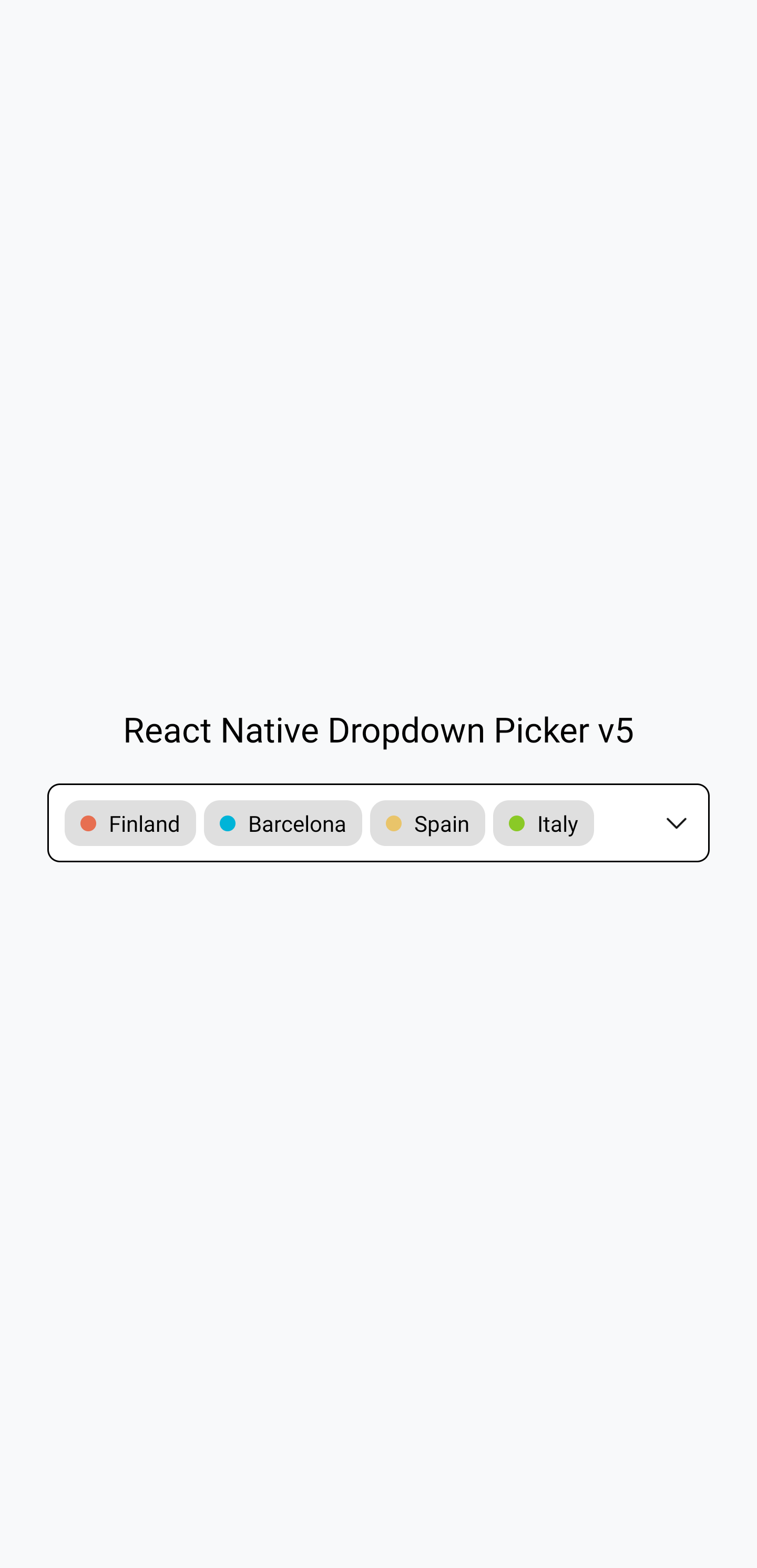

The example in the screenshots: https://snack.expo.dev/8mHmLfcZf
Documentation
Visit https://hossein-zare.github.io/react-native-dropdown-picker-website/
Merge and Release Process
Branches in use
Development
PRs should be made against and merged into the dev-5.x branch, which is set as the default branch on github.
Release
Releases are currently made from the 5.x branch.
Release Process
To make a new release, follow these steps:
- Verify the development branch has all the changes desired in a release and works well
- Make and merge a final PR into development branch that increments the version number in
package.json - Make and merge a PR from the development branch to the release branch
- Using the GitHub web UI, draft a new release using tag name
vx.x.x(replace thexvalues as appropriate of course), with the release branch as the target, with release namevx.x.x(again, with appropriate numbers in place ofxof course) - Verify in the GitHub Actions panel for the repository that NPM publish succeeded