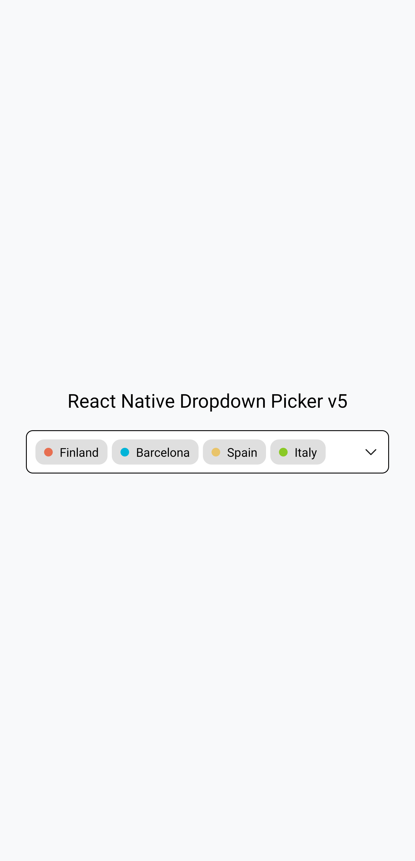
react-native-picker-select vs react-native-modal-selector vs react-native-dropdown-picker
React Native Dropdown Libraries
react-native-picker-selectreact-native-modal-selectorreact-native-dropdown-picker
React Native Dropdown Libraries

Dropdown libraries in React Native provide developers with customizable and user-friendly components to enhance the selection experience in mobile applications. These libraries facilitate the creation of dropdown menus that allow users to select options from a list, improving the overall user interface and interaction. Each library comes with unique features, design principles, and customization options, catering to different use cases and developer preferences.

Npm Package Weekly Downloads Trend
3 Years
Github Stars Ranking
Stat Detail
Package
Downloads
Stars
Size
Issues
Publish
License
react-native-picker-select67,0191,84545.8 kB102a year agoMIT
react-native-modal-selector48,13236943.4 kB41-MIT
react-native-dropdown-picker46,5151,043161 kB1633 years agoMIT
Feature Comparison: react-native-picker-select vs react-native-modal-selector vs react-native-dropdown-picker

Customization

  • react-native-picker-select:

    react-native-picker-select provides basic customization features such as placeholder text, style adjustments, and the ability to integrate with native pickers. It is lightweight and straightforward, making it easy to implement without extensive configuration.

  • react-native-modal-selector:

    react-native-modal-selector is designed for simplicity and elegance, offering limited but effective customization options. It allows developers to define the appearance of the modal and the items within it, focusing on a clean and user-friendly interface without overwhelming options.

  • react-native-dropdown-picker:

    This package offers extensive customization options, allowing developers to modify styles, colors, and behavior of the dropdown. It supports multi-select functionality, enabling users to select multiple items, and provides callbacks for various events, enhancing interactivity.

User Experience

  • react-native-picker-select:

    With a focus on simplicity, react-native-picker-select offers a straightforward dropdown experience that integrates seamlessly with native components. It provides a familiar interface for users, ensuring quick and easy selections.

  • react-native-modal-selector:

    This library emphasizes a clean and elegant user experience by presenting options in a modal view, reducing clutter on the screen. It provides a smooth transition and interaction, making it easy for users to navigate through options without distractions.

  • react-native-dropdown-picker:

    The user experience is enhanced through its intuitive design and support for multi-select options, which allows users to make multiple selections easily. The dropdown can be styled to match the app's theme, providing a cohesive look and feel.

Integration

  • react-native-picker-select:

    This package is designed for easy integration with React Native applications, leveraging the native picker component. It is particularly useful for projects that require a lightweight solution without additional dependencies.

  • react-native-modal-selector:

    react-native-modal-selector is easy to integrate into existing applications, requiring minimal setup. It can handle complex data structures, making it suitable for applications that need to display hierarchical or nested options.

  • react-native-dropdown-picker:

    It integrates well with various state management libraries, making it suitable for complex applications where dropdown selections need to be managed alongside other UI states. This integration capability enhances its versatility in larger projects.

Performance

  • react-native-picker-select:

    As a lightweight component, react-native-picker-select offers excellent performance, especially for simple dropdowns. It leverages native components, ensuring fast rendering and minimal overhead.

  • react-native-modal-selector:

    Performance is generally good, but it may experience slight delays with very large datasets due to the modal presentation. It is best suited for moderate-sized lists to maintain a responsive user experience.

  • react-native-dropdown-picker:

    The performance is optimized for handling large datasets, ensuring smooth interactions even with multiple selections. However, developers should be mindful of the rendering performance when dealing with extensive lists.

Community and Support

  • react-native-picker-select:

    With a robust community and extensive documentation, react-native-picker-select is well-supported. It has a larger user base, which contributes to a wealth of resources and examples for developers.

  • react-native-modal-selector:

    react-native-modal-selector has a smaller community compared to others, but it is still actively maintained. Documentation is clear, and support can be found through GitHub issues and community forums.

  • react-native-dropdown-picker:

    This package has a growing community and active maintenance, with regular updates and contributions. It is well-documented, providing ample resources for developers to troubleshoot and implement features effectively.

How to Choose: react-native-picker-select vs react-native-modal-selector vs react-native-dropdown-picker
  • react-native-picker-select:

    Select react-native-picker-select when you need a lightweight and straightforward dropdown component that integrates well with React Native's native picker component. It is perfect for projects that require basic dropdown functionality with minimal overhead.

  • react-native-modal-selector:

    Opt for react-native-modal-selector if you want a simple and elegant modal-based selector that can handle complex data structures and provides a clean user interface. This package is suitable for applications that prioritize ease of use and a straightforward selection process.

  • react-native-dropdown-picker:

    Choose react-native-dropdown-picker if you need a highly customizable dropdown component that supports multi-select options and offers a variety of styling options. It is ideal for applications requiring a visually appealing and flexible dropdown experience.

README for react-native-picker-select

react-native-picker-select

npm version npm downloads Test Coverage build

A Picker component for React Native which emulates the native <select> interfaces for iOS and Android

For iOS, by default we are wrapping an unstyled TextInput component. You can then pass down styles to customize it to your needs.

For Android, by default we are using the native Picker component. If you prefer, you can set useNativeAndroidPickerStyle to false, which will also render an unstyled TextInput component. You can then pass down styles to customize it to your needs.

For either platform, you can alternatively pass down a child element of your choice that will be wrapped in a touchable area.

iOS Example Android Example

View examples on snack.expo.io

Getting Started

Installing

This package is built around and depends on @react-native-picker/picker. Please make sure you install it correctly (as seen below in installation steps).

npm install react-native-picker-select

# React Native users
npm install @react-native-picker/picker
npx pod-install

# Expo
expo install @react-native-picker/picker

Basic Usage

import RNPickerSelect from 'react-native-picker-select';

export const Dropdown = () => {
  return (
    <RNPickerSelect
      onValueChange={(value) => console.log(value)}
      items={[
        { label: 'Football', value: 'football' },
        { label: 'Baseball', value: 'baseball' },
        { label: 'Hockey', value: 'hockey' },
      ]}
    />
  );
};

Versioning

VersionNotes
>= 8.0.0Uses @react-native-picker/picker. React Native 0.60 or above. If using Expo, SDK38 or above.
>= 3.0.0React v16.3 or above.
< 3.0.0React v16.2 or below.

Props

NameDescriptionDetails
onValueChangeCallback which returns value, indexrequired
function
itemsThe items for the component to render
- Each item should be in the following format:
{label: 'Orange', value: 'orange', key: 'orange', color: 'orange', inputLabel: 'Orange!', testID: 'e2e-orange'}
- label and value are required
- key, color, testID, and inputLabel are optional
- key will be set to equal label if not included
- value can be any data type
- If inputLabel exists, the TextInput will display that value instead of the label
required
array
placeholder- An override for the default placeholder object with a label of Select an item... and a value of null
- An empty object can be used if you'd like to disable the placeholder entirely
object
disabledDisables interaction with the componentboolean
valueWill attempt to locate a matching item from the items array by checking each item's value property. If found, it will update the component to show that item as selected. If the value is not found, it will default to the first item. WARNING: do not use this attribute on iOS if you plan to allow the user to modify the value from within the Picker, use itemKey instead.any
itemKeyWill attempt to locate a matching item from the items array by checking each item's key property. If found, it will update the component to show that item as selected. If the key is not found, it will attempt to find a matching item by value as above.string, number
styleStyle overrides for most parts of the component.
More details in styling
object
darkTheme
iOS only
Use the dark theme for the Picker.boolean
pickerPropsAdditional props to pass to the Picker (some props are used in core functionality so use this carefully)object
IconCustom icon component to be rendered.
More details in styling
Component
textInputPropsAdditional props to pass to the TextInput (some props are used in core functionality so use this carefully). This is iOS only unless useNativeAndroidPickerStyle={false}.object
touchableWrapperPropsAdditional props to pass to the touchable wrapping the TextInput (some props are used in core functionality so use this carefully)object
onOpen()
Callback triggered right before the opening of the picker
Not supported when useNativeAndroidPickerStyle={true}
function
useNativeAndroidPickerStyle
Android only
The component defaults to using the native Android Picker in its un-selected state. Setting this flag to false will mimic the default iOS presentation where a tappable TextInput is displayed.
More details in styling
boolean
fixAndroidTouchableBug
Android only
Experimental flag to fix issue #354boolean
InputAccessoryView
iOS only
Replace the InputAcessoryView section (bar with tabbing arrown and Done button) of the opened picker with your own custom component. Can also return null here to hide completely. While this bar is typical on select elements on the web, the interface guidelines does not include it. View the snack to see examples on how this can be customized.Component
doneText
iOS only
"Done" default text on the modal. Can be overwritten herestring
onUpArrow() / onDownArrow()
iOS only
Presence enables the corresponding arrow
- Closes the picker
- Calls the callback provided
function
onDonePress()
iOS only
Callback when the 'Done' button is pressedfunction
onClose(Bool)
iOS only
Callback triggered right before the closing of the picker. It has one boolean parameter indicating if the done button was pressed or notfunction
modalProps
iOS only
Additional props to pass to the Modal (some props are used in core functionality so use this carefully)object
touchableDoneProps
iOS only
Additional props to pass to the Done touchable (some props are used in core functionality so use this carefully)object

Styling

All properties mentioned below must be nested under the style prop. Examples of different styling options can be found on the example snack.

iOS-specific

  • The component wraps a TextInput without styling. You can target the TextInput styling with inputIOS.
  • Other styles that can be modified for iOS are named inputIOSContainer, placeholder, viewContainer, chevronContainer, chevron, chevronUp, chevronDown, chevronActive, done, modalViewTop, modalViewMiddle, and modalViewBottom

Android-specific

  • The native Picker in its inactive state acts looks similar to a TextInput, but it has limitations on custom styling. Any styling that is possible can be applied via inputAndroid.
  • You can add some styling customization to the active-state native Picker, but that requires modifying some xml files
  • If you set the prop useNativeAndroidPickerStyle to false, the component will allow a few other style objects: inputAndroidContainer, placeholder, and inputAndroid
  • Other styles that can be modified for Android are named headlessAndroidContainer and viewContainer

Web-specific

  • The component creates a select tag
  • The styling of this select tag can be modified using a nested object with the key inputWeb

Icon

  • If a component is passed in via the Icon prop - it will be rendered with { position: 'absolute', right: 0 } applied to its wrapping container. You can modify these values and add additional spacing to position the icon as needed by modifying iconContainer. You'll probably also want to add some paddingRight to your input styling to avoid any longer text appearing behind the icon.
  • You can pass a component of your choosing (css, image, svg, etc..) for use as the icon. For ease of use, consider a library such as react-native-shapes or react-native-vector-icons.
  • Examples of different icons and their usage can be found on the example snack.

Accessibility

If you need to add accessibility props to the rendered component, you may use pickerProps and touchableWrapperProps to pass these through.

pickerProps accepts an object of props that get passed directly to the native <Picker /> component. touchableWrapperProps also accepts an object of props, but this gets passed to a <TouchableOpacity /> that toggles the visibility of the picker.*note: touchableWrapperProps is not supported on web or when useNativeAndroidPickerStyle={true}

Accessibility Example

In the example below, we render the picker with supplementary description text, but for screen readers, we omit this by passing just the title to the accessibilityLabel prop.

const selectedItem = {
  title: 'Selected item title',
  description: 'Secondary long descriptive text ...',
};

export const Dropdown = () => {
  return (
    <RNPickerSelect
      pickerProps={{
        accessibilityLabel: selectedItem.title,
      }}
    >
      <Text>{selectedItem.title}</Text>
      <Text>{selectedItem.description}</Text>
    </RNPickerSelect>
  );
};

Testing

Test suite included. This component has been used and tested since React Native v0.51.

BrowserStack

License

react-native-picker-select is MIT licensed and built with :heart: in Austin, TX by the team at LawnStarter