Selecting the Right Dropdown Component for React Native Architecture
react-native-dropdown-picker and react-native-modal-selector are both popular libraries for implementing selection inputs in React Native, but they solve the problem with fundamentally different architectural approaches. react-native-dropdown-picker is a highly customizable, all-in-one component that renders its own dropdown list directly within the view hierarchy, offering extensive control over styling, search, and multi-selection logic. In contrast, react-native-modal-selector acts as a wrapper that triggers a native-style modal dialog containing a standard FlatList, prioritizing simplicity and consistent OS-level behavior over deep visual customization. While the former is built for complex forms requiring inline interaction, the latter is designed for straightforward selection tasks where a popup dialog is acceptable.
Npm Package Weekly Downloads Trend
Github Stars Ranking
Stat Detail


React Native Dropdowns: Inline Customization vs. Native Modals
Choosing between react-native-dropdown-picker and react-native-modal-selector isn't just about picking a UI component; it's about deciding how your application handles user interaction flows. One library gives you a surgical tool for embedding lists directly into your layout, while the other provides a blunt but effective instrument for triggering standard OS dialogs. Let's break down the technical realities of each.
🏗️ Rendering Strategy: Inline View vs. Modal Overlay
The most critical architectural difference lies in where the options list renders. This decision impacts z-index management, layout shifts, and accessibility.
react-native-dropdown-picker renders the list inline within the parent view hierarchy.
- It expands downward (or upward) directly beneath the trigger input.
- You must manage the
zIndexof surrounding elements manually to prevent the list from being clipped by siblings. - Ideal for forms where context must remain visible.
// react-native-dropdown-picker: Inline rendering
import DropDownPicker from 'react-native-dropdown-picker';

function InlineForm() {
  const [open, setOpen] = useState(false);
  const [value, setValue] = useState(null);
  const [items, setItems] = useState([
    { label: 'Apple', value: 'apple' },
    { label: 'Banana', value: 'banana' },
  ]);

  return (
    <View style={{ zIndex: 1000 }}>
      <DropDownPicker
        open={open}
        value={value}
        items={items}
        setOpen={setOpen}
        setValue={setValue}
        setItems={setItems}
        // Must handle zIndex manually for surrounding containers
        containerStyle={{ height: 40 }}
      />
    </View>
  );
}
react-native-modal-selector renders options inside a full-screen or centered Modal.
- It overlays the entire screen content, ignoring parent layout constraints.
- No need to worry about sibling components clipping the list.
- Best for simple selections where obscuring the background is fine.
// react-native-modal-selector: Modal overlay
import ModalSelector from 'react-native-modal-selector';

function ModalForm() {
  const [selected, setSelected] = useState('');

  return (
    <ModalSelector
      data={[{ key: 'apple', label: 'Apple' }, { key: 'banana', label: 'Banana' }]}
      initValue="Select Fruit"
      onChange={(option) => setSelected(option.label)}
      cancelText="Cancel"
    >
      <View style={{ padding: 15, borderWidth: 1, borderColor: '#ccc' }}>
        <Text>{selected || 'Select Fruit'}</Text>
      </View>
    </ModalSelector>
  );
}
⚙️ State Management: Controlled vs. Semi-Controlled
How you feed data and retrieve values differs significantly between the two, affecting how they fit into your global state management (Redux, Zustand, or Context).
react-native-dropdown-picker enforces a fully controlled component pattern.
- You must manage
open,value, anditemsstates explicitly. - This allows precise synchronization with external state but requires more boilerplate.
- Essential when dropdown options depend on async API responses or other form fields.
// react-native-dropdown-picker: Fully controlled state
const [items, setItems] = useState([]);

// Fetch data and update state manually
useEffect(() => {
  api.getCountries().then(data => {
    setItems(data.map(c => ({ label: c.name, value: c.code })));
  });
}, []);

<DropDownPicker
  open={open}
  value={value}
  items={items}
  setOpen={setOpen}
  setValue={setValue}
  setItems={setItems} // Required prop for internal logic
/>
react-native-modal-selector uses a simpler, event-driven approach.
- You pass a static
dataarray and listen foronChange. - Internal state handling is minimal; it doesn't force you to manage an "open" boolean.
- Great for static lists or when you don't need to react to the list opening/closing.
// react-native-modal-selector: Event-driven
const data = [
  { key: 'us', label: 'United States' },
  { key: 'ca', label: 'Canada' }
];

<ModalSelector
  data={data}
  onChange={(option) => {
    // Just handle the result
    console.log('Selected:', option.label);
  }}
>
  <Text>Choose Country</Text>
</ModalSelector>
🔍 Feature Set: Search & Multi-Select Capabilities
When requirements move beyond simple single-selection, the gap between these libraries widens.
react-native-dropdown-picker includes advanced features out of the box.
- Supports searchable lists via a built-in text input.
- Handles multi-selection (returning an array of values) natively.
- Allows custom rendering of list items for complex UI needs (e.g., flags, icons).
// react-native-dropdown-picker: Search and Multi-select
<DropDownPicker
  open={open}
  value={value}
  items={items}
  setOpen={setOpen}
  setValue={setValue}
  setItems={setItems}
  searchable={true}
  multiple={true}
  // Custom render for each item
  listItemContainerStyle={{ paddingVertical: 10 }}
  renderItem={({ item, label, value }) => (
    <View style={{ flexDirection: 'row' }}>
      <Icon name={item.icon} />
      <Text>{label}</Text>
    </View>
  )}
/>
react-native-modal-selector is strictly single-selection with no built-in search.
- To add search, you must implement a custom
initValueor wrap the children, which is often clunky. - Multi-selection is not supported natively; you would need to fork the library or switch tools.
- It relies on the native
FlatListinside the modal, so customization is limited to modal props.
// react-native-modal-selector: Limited to basic selection
// No native search prop exists
// No native multi-select prop exists
<ModalSelector
  data={data}
  onChange={(option) => setSelected(option.key)}
  // You can customize the modal look, but not the list logic easily
  modalAnimationType="slide"
  cancelButtonText="Close"
>
  <Text>{selected}</Text>
</ModalSelector>
🎨 Styling and Design System Integration
Matching your company's design system can be a dealbreaker depending on which tool you pick.
react-native-dropdown-picker offers granular styling props.
- You can style the container, input, label, list item, and even the search bar independently.
- Supports dark mode and custom fonts easily via props.
- Requires careful testing on both iOS and Android as the custom view might behave differently on each.
// react-native-dropdown-picker: Deep styling
<DropDownPicker
  // ... other props
  style={{ borderColor: '#333' }}
  dropDownContainerStyle={{ backgroundColor: '#fff' }}
  labelStyle={{ fontSize: 16, fontWeight: '600' }}
  tickIconStyle={{ tintColor: 'blue' }}
/>
react-native-modal-selector provides high-level modal styling only.
- You style the trigger child component freely, but the modal content is harder to tweak.
- The list inside the modal uses default React Native styles unless you dive into source code.
- Consistency is higher across platforms because it leverages the native Modal component.
// react-native-modal-selector: Surface styling
<ModalSelector
  style={{ flex: 1 }} // Styles the wrapper
  initValue="Select..."
  labelTextStyle={{ fontSize: 18 }} // Styles text inside modal header
>
  <View style={{ /* Fully custom trigger button */ }}>
    <Text>Pick One</Text>
  </View>
</ModalSelector>
🌱 When to Avoid These Libraries
While powerful, both have scenarios where they are the wrong fit:
- Avoid
react-native-dropdown-pickerif you need a zero-config solution. Its strict controlled state requirements can be overkill for a simple "Yes/No" toggle. Also, if your app heavily relies on native accessibility tools, custom inline views sometimes require extra ARIA-like props to be fully compliant. - Avoid
react-native-modal-selectorif your UX demands that the user sees the context behind the dropdown while selecting. The modal overlay blocks the screen, which can be disorienting in long forms. It is also unsuitable if you need multi-select or search functionality without writing significant custom wrappers.
📊 Summary Table
| Feature | react-native-dropdown-picker | react-native-modal-selector |
|---|---|---|
| Rendering | Inline View (Custom) | Native Modal Overlay |
| State Model | Fully Controlled (Open, Value, Items) | Event Driven (OnChange) |
| Search | ✅ Built-in | ❌ Not Supported |
| Multi-Select | ✅ Native Support | ❌ Not Supported |
| Styling | Granular (Item, List, Input) | Limited (Modal, Trigger) |
| Complexity | High (More props to manage) | Low (Drop-in replacement) |
| Use Case | Complex Forms, Custom Design Systems | Simple Forms, Quick Prototypes |
💡 The Big Picture
react-native-dropdown-picker is the heavy lifter 🏋️♂️. It belongs in enterprise applications where forms are complex, design requirements are strict, and users need to search or select multiple items without losing context. The trade-off is verbosity; you will write more code to wire up the state.
react-native-modal-selector is the sprinter 🏃. It shines in MVPs, admin panels, or simple settings screens where speed of development matters more than pixel-perfect inline integration. If your requirement is simply "let the user pick one thing from a list," this is often the most efficient path.
Final Thought: Don't let the name fool you. If you need a "dropdown" that behaves like a web <select> element (inline, searchable, multi-select), react-native-dropdown-picker is effectively the only choice of the two. If you just need a button that opens a list in a popup, react-native-modal-selector will save you hours of styling time.
How to Choose: react-native-dropdown-picker vs react-native-modal-selector
- react-native-dropdown-picker:
Choose
react-native-dropdown-pickerwhen you need an inline dropdown experience that integrates seamlessly into your form layout without obscuring other content. It is the ideal choice for complex scenarios requiring search functionality, multi-selection support, or strict adherence to a custom design system where every pixel of the dropdown must match your brand. Be prepared to manage more complex state props likeopen,value, anditemsmanually, as this library offers granular control at the cost of higher initial setup complexity. - react-native-modal-selector:
Choose
react-native-modal-selectorif your priority is rapid implementation of a reliable selection input that behaves consistently across iOS and Android using native modals. This package is best suited for simple forms where the dropdown acts as a discrete action (like selecting a country or category) and where covering the underlying screen with a modal is acceptable UX. It is the pragmatic choice when you want to avoid the styling headaches of custom dropdown lists and prefer a 'set it and forget it' approach with minimal boilerplate code.
Popular Comparisons
README for react-native-dropdown-picker
React Native Dropdown Picker 5.x

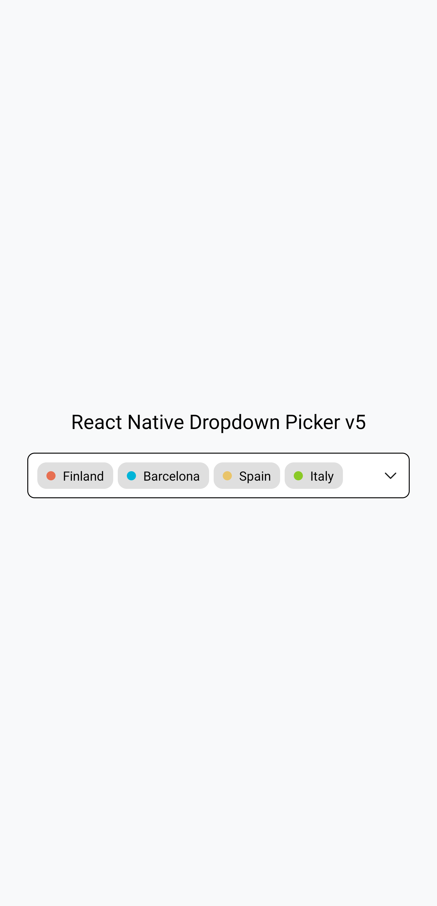

The example in the screenshots: https://snack.expo.dev/8mHmLfcZf
Documentation
Visit https://hossein-zare.github.io/react-native-dropdown-picker-website/
Merge and Release Process
Branches in use
Development
PRs should be made against and merged into the dev-5.x branch, which is set as the default branch on github.
Release
Releases are currently made from the 5.x branch.
Release Process
To make a new release, follow these steps:
- Verify the development branch has all the changes desired in a release and works well
- Make and merge a final PR into development branch that increments the version number in
package.json - Make and merge a PR from the development branch to the release branch
- Using the GitHub web UI, draft a new release using tag name
vx.x.x(replace thexvalues as appropriate of course), with the release branch as the target, with release namevx.x.x(again, with appropriate numbers in place ofxof course) - Verify in the GitHub Actions panel for the repository that NPM publish succeeded