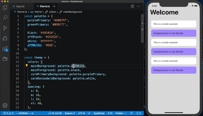
styled-components vs styled-system vs emotion vs @shopify/restyle
CSS-in-JS Libraries Comparison
1 Year
styled-componentsstyled-systememotion@shopify/restyleSimilar Packages:
What's CSS-in-JS Libraries?

CSS-in-JS libraries allow developers to write CSS styles directly within JavaScript files, providing a more dynamic and component-centric approach to styling in web applications. These libraries enable scoped styles, theme management, and often come with additional features like responsive design utilities and theming capabilities. They help streamline the styling process, making it easier to manage styles in large applications and ensuring that styles are co-located with the components they affect, which enhances maintainability and readability.

Package Weekly Downloads Trend
Github Stars Ranking
Stat Detail
Package
Downloads
Stars
Size
Issues
Publish
License
styled-components6,303,86640,7101.66 MB313a month agoMIT
styled-system640,392---5 years agoMIT
emotion629,320---4 years agoMIT
@shopify/restyle46,5783,096100 kB2910 months agoMIT
Feature Comparison: styled-components vs styled-system vs emotion vs @shopify/restyle

Theming Support

  • styled-components:

    styled-components offers a ThemeProvider that allows you to define a theme for your application. You can easily access theme values in your styled components, promoting consistency and reusability of styles.

  • styled-system:

    styled-system is designed with theming in mind, allowing you to create a design system that can be easily applied across your components. It provides a set of utility functions to help manage styles based on your theme.

  • emotion:

    Emotion supports theming through its ThemeProvider, enabling you to define a theme object that can be accessed throughout your application. This allows for easy customization and consistent styling based on the theme.

  • @shopify/restyle:

    @shopify/restyle provides built-in theming capabilities that allow you to define a design system with consistent spacing, colors, and typography. This makes it easy to switch themes or apply a consistent style across your application.

Performance

  • styled-components:

    styled-components has a small runtime overhead but is generally performant for most applications. It supports server-side rendering, which can improve initial load times and SEO.

  • styled-system:

    styled-system focuses on performance by providing utility functions that reduce the need for complex style calculations. It promotes a responsive design approach that can be efficiently managed.

  • emotion:

    Emotion is known for its performance, utilizing a highly optimized runtime that minimizes the overhead of CSS-in-JS. It supports server-side rendering and critical CSS extraction, making it suitable for production applications.

  • @shopify/restyle:

    @shopify/restyle is optimized for performance in React Native applications, ensuring that styles are only recalculated when necessary, which helps maintain smooth animations and transitions.

Learning Curve

  • styled-components:

    styled-components is easy to learn for developers familiar with React. Its syntax is straightforward, allowing you to create styled components with minimal setup, making it accessible for beginners.

  • styled-system:

    styled-system may have a steeper learning curve due to its utility-first approach and the need to understand design tokens and responsive design principles. However, once mastered, it can significantly speed up development.

  • emotion:

    Emotion has a relatively easy learning curve, especially for developers already familiar with CSS and JavaScript. Its API is intuitive, and it provides clear documentation to help new users get started quickly.

  • @shopify/restyle:

    @shopify/restyle has a moderate learning curve, especially for developers familiar with React Native. Its API is straightforward, but understanding the design system concepts may take some time.

Flexibility

  • styled-components:

    styled-components is flexible in that it allows you to create styled components with dynamic styles based on props, enabling a high degree of customization while maintaining a clean component structure.

  • styled-system:

    styled-system is highly flexible, allowing you to create responsive styles using a utility-based approach. It enables rapid prototyping and can be easily integrated with other styling solutions.

  • emotion:

    Emotion provides high flexibility with both styled components and the CSS prop, allowing developers to choose their preferred styling method. This dual approach caters to different coding styles and project requirements.

  • @shopify/restyle:

    @shopify/restyle offers flexibility in styling components, allowing you to create responsive styles and easily switch between different design tokens based on your theme.

Integration

  • styled-components:

    styled-components is primarily for React applications and integrates well with the React ecosystem, making it easy to use alongside other libraries and tools.

  • styled-system:

    styled-system can be integrated with any React application and works well with styled-components and Emotion, allowing developers to leverage its utility-first approach alongside other styling methods.

  • emotion:

    Emotion can be used with any React application, making it versatile for both web and mobile projects. It integrates well with existing CSS frameworks and libraries.

  • @shopify/restyle:

    @shopify/restyle is specifically designed for React Native, making it a great choice for mobile applications. It integrates seamlessly with React Native components and APIs.

How to Choose: styled-components vs styled-system vs emotion vs @shopify/restyle
  • styled-components:

    Choose styled-components if you prefer a straightforward API for creating styled components with a focus on component-based styling. It is great for React applications where you want to encapsulate styles within components, making it easy to manage and reuse styles across your application.

  • styled-system:

    Choose styled-system if you want to build a design system with a focus on responsive design and utility-first styling. It is particularly beneficial for projects that require a consistent spacing, typography, and color system, allowing for rapid prototyping and theming.

  • emotion:

    Choose Emotion if you need a highly flexible and performant solution that supports both styled components and CSS prop syntax. It is ideal for projects that require dynamic styling and theming capabilities, especially when you want to leverage the full power of CSS-in-JS with a focus on performance.

  • @shopify/restyle:

    Choose @shopify/restyle if you are building a React Native application that requires a consistent design system and responsive utilities. It is particularly useful for projects that need to maintain a cohesive look and feel across different screen sizes and devices.

README for styled-components

Visual primitives for the component age. Use the best bits of ES6 and CSS to style your apps without stress 💅

downloads: 600k/month Discord gzip size module formats: umd, cjs, esm Code Coverage

Upgrading from v5? See the migration guide.

Utilizing tagged template literals (a recent addition to JavaScript) and the power of CSS, styled-components allow you to write actual CSS code to style your components. It also removes the mapping between components and styles – using components as a low-level styling construct could not be easier!

const Button = styled.button`
  color: grey;
`;

Alternatively, you may use style objects. This allows for easy porting of CSS from inline styles, while still supporting the more advanced styled-components capabilities like component selectors and media queries.

const Button = styled.button({
  color: 'grey',
});

Equivalent to:

const Button = styled.button`
  color: grey;
`;

styled-components is compatible with both React (for web) and React Native – meaning it's the perfect choice even for truly universal apps! See the documentation about React Native for more information.

Supported by Front End Center. Thank you for making this possible!


Docs

See the documentation at styled-components.com/docs for more information about using styled-components!

Quicklinks to some of the most-visited pages:


Example

import React from 'react';

import styled from 'styled-components';

// Create a <Title> react component that renders an <h1> which is
// centered, palevioletred and sized at 1.5em
const Title = styled.h1`
  font-size: 1.5em;
  text-align: center;
  color: palevioletred;
`;

// Create a <Wrapper> react component that renders a <section> with
// some padding and a papayawhip background
const Wrapper = styled.section`
  padding: 4em;
  background: papayawhip;
`;

function MyUI() {
  return (
    // Use them like any other React component – except they're styled!
    <Wrapper>
      <Title>Hello World, this is my first styled component!</Title>
    </Wrapper>
  );
}

This is what you'll see in your browser:


Looking for v5?

The main branch is for the most-current version of styled-components, currently v6. For changes targeting v5, please point your PRs at the legacy-v5 branch.


Built with styled-components

A lot of hard work goes into community libraries, projects, and guides. A lot of them make it easier to get started or help you with your next project! There are also a whole lot of interesting apps and sites that people have built using styled-components.

Make sure to head over to awesome-styled-components to see them all! And please contribute and add your own work to the list so others can find it.


Contributing

If you want to contribute to styled-components please see our contributing and community guidelines, they'll help you get set up locally and explain the whole process.

Please also note that all repositories under the styled-components organization follow our Code of Conduct, make sure to review and follow it.


Badge

Let everyone know you're using styled-componentsstyle: styled-components

[![style: styled-components](https://img.shields.io/badge/style-%F0%9F%92%85%20styled--components-orange.svg?colorB=daa357&colorA=db748e)](https://github.com/styled-components/styled-components)

Contributors

This project exists thanks to all the people who contribute. [Contribute].


Backers

Thank you to all our backers! 🙏 [Become a backer]


Sponsors

Support this project by becoming a sponsor. Your logo will show up here with a link to your website. [Become a sponsor]


License

Licensed under the MIT License, Copyright © 2016-present Glen Maddern and Maximilian Stoiber.

See LICENSE for more information.


Acknowledgements

This project builds on a long line of earlier work by clever folks all around the world. We'd like to thank Charlie Somerville, Nik Graf, Sunil Pai, Michael Chan, Andrey Popp, Jed Watson & Andrey Sitnik who contributed ideas, code or inspiration.

Special thanks to @okonet for the fantastic logo.