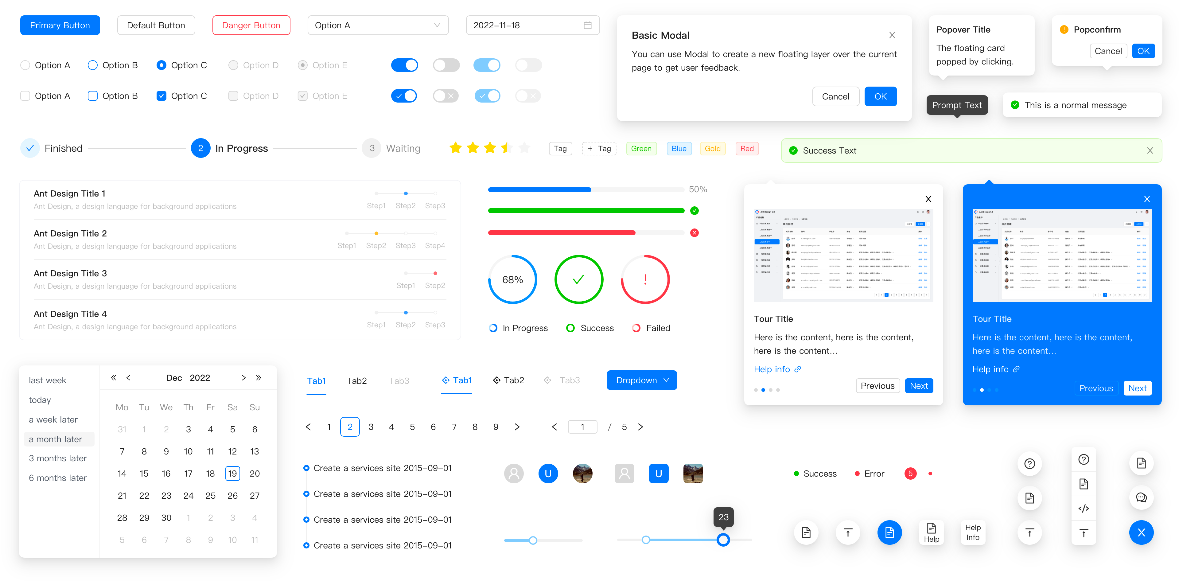
antd vs react-bootstrap vs @material-ui/core vs @blueprintjs/core
Web UI ライブラリ
antdreact-bootstrap@material-ui/core@blueprintjs/core類似パッケージ:
Web UI ライブラリ

Web UI ライブラリは、開発者がウェブアプリケーションのユーザーインターフェースを迅速に構築するための再利用可能なコンポーネントのセットを提供します。これらのライブラリは、スタイル、レイアウト、インタラクションを簡素化し、開発プロセスを効率化することを目的としています。特に、異なるデザイン原則やユーザーエクスペリエンスのニーズに応じて、さまざまなスタイルと機能を持つライブラリが存在します。

npmのダウンロードトレンド
3 年
GitHub Starsランキング
統計詳細
パッケージ
ダウンロード数
Stars
サイズ
Issues
公開日時
ライセンス
antd2,435,01596,93256.2 MB1,3333日前MIT
react-bootstrap1,407,17822,6321.48 MB2037ヶ月前MIT
@material-ui/core1,304,16297,4465.96 MB1,746-MIT
@blueprintjs/core271,80821,4115.86 MB8579日前Apache-2.0
機能比較: antd vs react-bootstrap vs @material-ui/core vs @blueprintjs/core

デザイン原則

  • antd:

    Ant Designは、エンタープライズアプリケーション向けに設計されており、ビジネスニーズに特化したコンポーネントを提供します。洗練されたデザインと使いやすさを重視しています。

  • react-bootstrap:

    React-Bootstrapは、Bootstrapのデザイン原則をReactに適用したもので、シンプルで使いやすいUIを提供します。Bootstrapのスタイルを活かしつつ、Reactのコンポーネントベースのアプローチを利用できます。

  • @material-ui/core:

    Material-UIは、GoogleのMaterial Designガイドラインに従っており、視覚的に魅力的で一貫性のあるデザインを提供します。ユーザーエクスペリエンスを向上させるためのインタラクティブな要素が含まれています。

  • @blueprintjs/core:

    Blueprintは、デスクトップアプリケーションのデザイン原則に基づいており、特にデータ重視のインターフェースに適しています。複雑なデータ表示や操作を簡素化するためのコンポーネントが豊富です。

カスタマイズ性

  • antd:

    Ant Designは、テーマのカスタマイズが可能ですが、デフォルトのスタイルが強力であるため、カスタマイズの必要性は少ないです。

  • react-bootstrap:

    React-Bootstrapは、Bootstrapのカスタマイズ機能を活用でき、Sassを使用してスタイルを調整できます。

  • @material-ui/core:

    Material-UIは、テーマのカスタマイズが非常に柔軟で、プロパティやスタイルを簡単に上書きできます。

  • @blueprintjs/core:

    Blueprintは、スタイルのカスタマイズが容易で、テーマを変更することでアプリケーションの外観を簡単に調整できます。

コンポーネントの豊富さ

  • antd:

    Ant Designは、ビジネスアプリケーションに必要な多くのコンポーネントを提供し、特にフォーム関連のコンポーネントが充実しています。

  • react-bootstrap:

    React-Bootstrapは、Bootstrapの全コンポーネントをReactで使用できるため、非常に多様なUIを構築できます。

  • @material-ui/core:

    Material-UIは、一般的なUIコンポーネントが豊富で、さまざまな用途に対応しています。

  • @blueprintjs/core:

    Blueprintは、特にデータ表示や操作に特化した多くのコンポーネントを提供しています。

レスポンシブデザイン

  • antd:

    Ant Designは、レスポンシブデザインをサポートしており、ビジネスアプリケーションにおいても適切に表示されます。

  • react-bootstrap:

    React-Bootstrapは、Bootstrapのレスポンシブ機能を活用しており、モバイルファーストのアプローチを採用しています。

  • @material-ui/core:

    Material-UIは、レスポンシブデザインを強力にサポートしており、さまざまなデバイスでの表示に最適化されています。

  • @blueprintjs/core:

    Blueprintは、特にデスクトップ向けに設計されているため、モバイルデバイス向けのサポートが限られています。

コミュニティとサポート

  • antd:

    Ant Designは、広範なコミュニティとサポートがあり、特に中国市場での人気があります。

  • react-bootstrap:

    React-Bootstrapは、Bootstrapの人気を背景にしており、広範なサポートとリソースが利用できます。

  • @material-ui/core:

    Material-UIは、非常に活発なコミュニティがあり、多くのリソースやサポートが利用可能です。

  • @blueprintjs/core:

    Blueprintは、比較的新しいライブラリであり、コミュニティは小さいですが、ドキュメントは充実しています。

選び方: antd vs react-bootstrap vs @material-ui/core vs @blueprintjs/core
  • antd:

    Ant Designは、企業向けのアプリケーションを構築する場合に最適です。特に、ビジネスアプリケーションに必要な多くのコンポーネントと機能を提供しています。

  • react-bootstrap:

    React-Bootstrapは、BootstrapのスタイルをReactコンポーネントとして使用したい場合に選択してください。Bootstrapの既存のデザインを活用しつつ、Reactの利点を享受できます。

  • @material-ui/core:

    Material-UIは、GoogleのMaterial Designに基づいた美しいインターフェースを求める場合に選択してください。カスタマイズ性が高く、レスポンシブデザインを簡単に実現できます。

  • @blueprintjs/core:

    Blueprintは、デスクトップアプリケーションのような複雑なインターフェースを構築する必要がある場合に選択してください。特に、データ重視のアプリケーションや、豊富なインタラクションを持つアプリケーションに適しています。

antd のREADME

Ant Design

An enterprise-class UI design language and React UI library.

CI status codecov NPM version NPM downloads

Follow Twitter dumi FOSSA Status Issues need help LFX Active Contributors

Changelog · Report Bug · Request Feature · English · 中文

❤️ Sponsors

✨ Features

  • 🌈 Enterprise-class UI designed for web applications.
  • 📦 A set of high-quality React components out of the box.
  • 🛡 Written in TypeScript with predictable static types.
  • ⚙️ Whole package of design resources and development tools.
  • 🌍 Internationalization support for dozens of languages.
  • 🎨 Powerful theme customization based on CSS-in-JS.

🖥 Environment Support

  • Modern browsers
  • Server-side Rendering
  • Electron
Edge
Edge
Firefox
Firefox
Chrome
Chrome
Safari
Safari
Electron
Electron
Edgelast 2 versionslast 2 versionslast 2 versionslast 2 versions

📦 Install

npm install antd
yarn add antd
pnpm add antd
bun add antd

🔨 Usage

import { Button, DatePicker } from 'antd';

export default () => (
  <>
    <Button type="primary">PRESS ME</Button>
    <DatePicker placeholder="select date" />
  </>
);

🔗 Links

⌨️ Development

Use opensumi.run, a free online pure front-end dev environment.

opensumi.run

Or clone locally:

$ git clone git@github.com:ant-design/ant-design.git
$ cd ant-design
$ npm install
$ npm start

Open your browser and visit http://127.0.0.1:8001, see more at Development.

🤝 Contributing PRs Welcome

Top Contributors of ant-design/ant-design - Last 28 days Performance Stats of ant-design/ant-design - Last 28 days
New participants of ant-design - past 28 days
Contribution Leaderboard

Let's build a better antd together.

We warmly invite contributions from everyone. Before you get started, please take a moment to review our Contribution Guide. Feel free to share your ideas through Pull Requests or GitHub Issues. If you're interested in enhancing our codebase, explore the Development Instructions and enjoy your coding journey! :)

For collaborators, adhere to our Pull Request Principle and utilize our Pull Request Template when creating a Pull Request.

Issue funding

We use Issuehunt to up-vote and promote specific features that you would like to see and implement. Check our backlog and help us:

Let's fund issues in this repository

❤️ Backers