React 用エンタープライズ UI コンポーネントライブラリの比較
antd、material-ui(MUI)、reactstrap、semantic-ui-react は、React アプリケーションの UI 構築を加速する主要なコンポーネントライブラリです。これらは設計思想、カスタマイズ性、そしてメンテナンス状況において明確な違いがあります。antd はエンタープライズ向けの豊富な機能を提供し、material-ui は Material Design に基づいた高いカスタマイズ性を持ちます。reactstrap は Bootstrap の React ラッパーとしてシンプルさを重視し、semantic-ui-react は宣言的なクラス名が特徴ですが、メンテナンス状況に注意が必要です。
npmのダウンロードトレンド
GitHub Starsランキング
統計詳細
React UI ライブラリ徹底比較:antd vs MUI vs Reactstrap vs Semantic UI React
企業規模の React アプリケーションを開発する際、UI コンポーネントライブラリの選定はアーキテクチャ全体に影響する重要な決定です。antd、material-ui(MUI)、reactstrap、semantic-ui-react はそれぞれ異なる強みを持っていますが、メンテナンス状況やカスタマイズ方法には大きな違いがあります。実務的な観点から、これらを深く比較します。
🛠️ メンテナンスとエコシステム状況
ライブラリの選定において、将来にわたってメンテナンスされるかは最も重要な要素です。各パッケージの導入方法と現状を確認します。
antd は Ant Financial によって actively にメンテナンスされており、エンタープライズ向け機能の更新が頻繁です。
// antd: 標準的なインポート
import { Button, Table } from 'antd';
import 'antd/dist/reset.css'; // v5 では CSS インポート不要な場合あり
material-ui は MUI Team によって管理され、React コミュニティで最も人気のあるライブラリの一つです。
// material-ui: 標準的なインポート
import { Button, Table } from '@mui/material';
import { createTheme, ThemeProvider } from '@mui/material/styles';
reactstrap は Bootstrap の React ラッパーであり、Bootstrap のバージョンアップに依存します。
// reactstrap: 標準的なインポート
import { Button, Table } from 'reactstrap';
import 'bootstrap/dist/css/bootstrap.min.css';
semantic-ui-react は公式の React 統合ですが、元となる Semantic UI CSS の開発が停滞しており、メンテナンスリスクがあります。
// semantic-ui-react: 標準的なインポート
import { Button, Table } from 'semantic-ui-react';
import 'semantic-ui-css/semantic.min.css';
🎨 テーマとカスタマイズ方法
デザインシステムをプロジェクトにどう組み込むかは、ライブラリごとにアプローチが異なります。
antd は ConfigProvider を使用して、グローバルなテーマ設定を一元管理できます。
// antd: ConfigProvider でテーマ設定
import { ConfigProvider, Button } from 'antd';

<ConfigProvider theme={{ token: { colorPrimary: '#00b96b' } }}>
  <Button type="primary">Primary Button</Button>
</ConfigProvider>
material-ui は createTheme を使用し、パレットやタイポグラフィを細かく定義できます。
// material-ui: createTheme でテーマ設定
import { ThemeProvider, createTheme, Button } from '@mui/material';

const theme = createTheme({ palette: { primary: { main: '#00b96b' } } });

<ThemeProvider theme={theme}>
  <Button variant="contained">Primary Button</Button>
</ThemeProvider>
reactstrap は Bootstrap のクラス名に依存するため、CSS オーバーライドやカスタムクラスの使用が一般的です。
// reactstrap: className でカスタマイズ
import { Button } from 'reactstrap';

<Button className="btn-custom" color="primary">Primary Button</Button>
/* CSS: .btn-custom { background-color: #00b96b; } */
semantic-ui-react はコンポーネントプロパティでスタイルを制御しますが、深いカスタマイズには LESS 変数の変更が必要です。
// semantic-ui-react: プロパティとクラスで制御
import { Button } from 'semantic-ui-react';

<Button primary style={{ backgroundColor: '#00b96b' }}>Primary Button</Button>
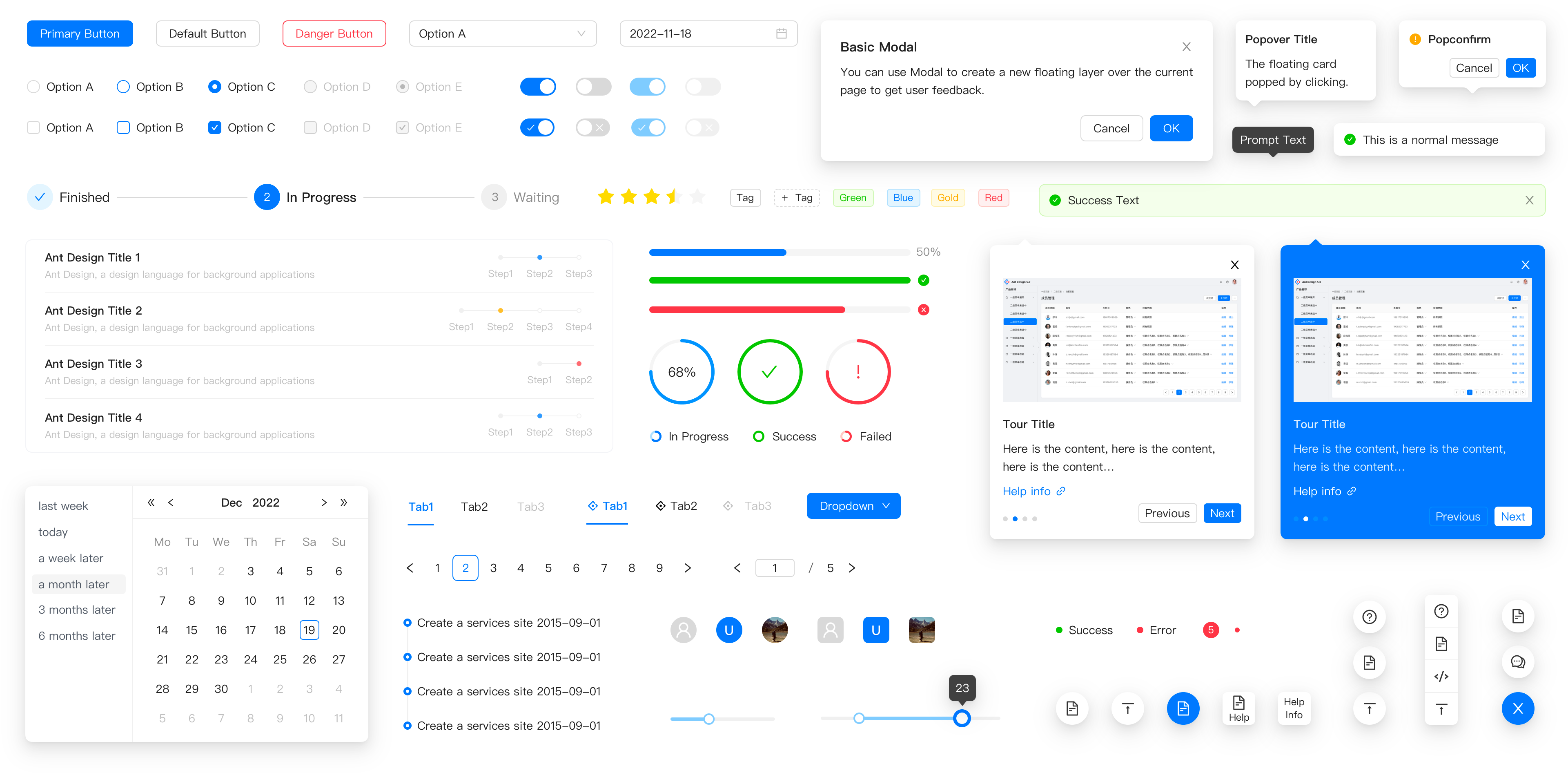
🔘 基本コンポーネントの実装
ボタンなどの基本コンポーネントでも、API デザインに違いが見られます。
antd は type プロパティで見た目を定義し、ビジネス向けの色付けがされています。
// antd: type プロパティを使用
import { Button } from 'antd';

<Button type="primary">Primary</Button>
<Button type="dashed">Dashed</Button>
material-ui は variant プロパティでバリエーションを定義し、Material Design に準拠しています。
// material-ui: variant プロパティを使用
import { Button } from '@mui/material';

<Button variant="contained">Contained</Button>
<Button variant="outlined">Outlined</Button>
reactstrap は Bootstrap の color プロパティを使用し、直感的な色指定が可能です。
// reactstrap: color プロパティを使用
import { Button } from 'reactstrap';

<Button color="primary">Primary</Button>
<Button color="secondary">Secondary</Button>
semantic-ui-react はフラグ的なプロパティ(primary、basic など)を直接使用します。
// semantic-ui-react: フラグプロパティを使用
import { Button } from 'semantic-ui-react';

<Button primary>Primary</Button>
<Button basic>Basic</Button>
📊 複雑なコンポーネント(テーブル)
エンタープライズアプリではテーブル機能の差が生産性に直結します。
antd はソート、フィルター、ページネーションが最初から内蔵されており、設定のみで高度な機能を使えます。
// antd: 高機能な Table コンポーネント
import { Table } from 'antd';

const columns = [{ title: 'Name', dataIndex: 'name', sorter: true }];
<Table dataSource={data} columns={columns} pagination={{ pageSize: 10 }} />
material-ui は基本の Table の他に、高機能な DataGrid を別パッケージで提供しています。
// material-ui: DataGrid を使用(別パッケージ)
import { DataGrid } from '@mui/x-data-grid';

<DataGrid rows={rows} columns={columns} pageSize={10} />
reactstrap は基本的な HTML テーブルのラッパーであり、高度な機能は自分で実装する必要があります。
// reactstrap: 基本的な Table ラッパー
import { Table } from 'reactstrap';

<Table>
  <thead><tr><th>Name</th></tr></thead>
  <tbody>{data.map(item => <tr><td>{item.name}</td></tr>)}</tbody>
</Table>
semantic-ui-react も基本的な構造を提供し、ソートやページネーションは手動で実装するのが一般的です。
// semantic-ui-react: 基本的な Table 構造
import { Table } from 'semantic-ui-react';

<Table celled>
  <Table.Header><Table.Row><Table.HeaderCell>Name</Table.HeaderCell></Table.Row></Table.Header>
  <Table.Body>{data.map(item => <Table.Row><Table.Cell>{item.name}</Table.Cell></Table.Row>)}</Table.Body>
</Table>
⚠️ 選定における重要な注意点
各ライブラリには明確なユースケースがありますが、特にメンテナンス状況には注意が必要です。
1. 🚀 開発スピードと機能性
antdとmaterial-uiは、複雑な UI コンポーネントを最初から提供しており、開発時間を大幅に短縮できます。reactstrapとsemantic-ui-reactは軽量ですが、高度な機能を実装するには追加のコードが必要です。
2. 🔄 長期的なメンテナンス
antdとmaterial-uiは大規模なチームによって支えられており、セキュリティアップデートや新機能の提供が継続的です。semantic-ui-reactは元プロジェクトの活動が低下しており、新しいプロジェクトでの採用はリスクを伴います。既存の資産がある場合を除き、他の選択肢を検討すべきです。
3. 🎨 デザインの自由度
material-uiはテーマシステムが最も柔軟で、ブランドカラーへの完全な適合が可能です。antdも v5 でカスタマイズ性が向上しましたが、依然として独自のデザイン言語の影響を強く受けます。reactstrapは Bootstrap の制約を受けますが、CSS 知識があれば容易に変更可能です。
📊 比較サマリー
| 特徴 | antd | material-ui | reactstrap | semantic-ui-react |
|---|---|---|---|---|
| デザイン | エンタープライズ風 | Material Design | Bootstrap | Semantic UI |
| テーブル機能 | 内蔵(高機能) | DataGrid(別パッケージ) | 基本のみ | 基本のみ |
| テーマ設定 | ConfigProvider | createTheme | CSS クラス | 変数/プロパティ |
| メンテナンス | 活発 | 活発 | 安定 | 停滞気味 |
| 学習コスト | 中 | 中 | 低 | 低 |
💡 最終的な推奨
antd は管理画面やデータ処理が中心のアプリ — 例:CRM、ダッシュボード — に最適です。機能性が最優先される場合に選んでください。
material-ui は消費者向けアプリや、デザインのカスタマイズ性を重視するプロジェクト — 例:SaaS、スタートアップ — に適しています。
reactstrap は Bootstrap に慣れたチームや、シンプルな構成を維持したいレガシーシステムの刷新に向いています。
semantic-ui-react は新しいプロジェクトでの使用は避けるべきです。メンテナンスの懸念があり、長期的な技術的負債になる可能性があります。
結論:現代の React 開発において、安定性と機能性を求めるなら antd または material-ui が安全な選択です。プロジェクトの要件とチームのスキルセットに合わせて、これらの中から最適なツールを選んでください。
選び方: antd vs reactstrap vs semantic-ui-react vs material-ui
- antd:
管理ダッシュボードやデータ密集型のエンタープライズアプリを構築する場合に
antdを選択してください。テーブル、フォーム、ツリービューなどの複雑なコンポーネントが最初から充実しており、少コードで高機能な UI を実装できます。 - reactstrap:
既に Bootstrap の知識があるチームや、CSS フレームワークに依存したシンプルな構成を好む場合に
reactstrapを選定します。軽量なラッパーであり、Bootstrap のアップデートに追従しやすい環境适合します。 - semantic-ui-react:
既存の Semantic UI 資産を活かす場合を除き、新しいプロジェクトでの採用は慎重に検討してください。メンテナンス頻度が他と比較して低く、長期的なサポートに懸念があるため、代替ライブラリの評価を推奨します。
- material-ui:
独自のデザインシステムを構築したい場合や、Material Design を採用する場合は
material-uiが最適です。テーマエンジンの柔軟性が高く、コンポーネントの見た目を細かく制御したいプロジェクトに向いています。
人気の比較
antd のREADME

Ant Design
An enterprise-class UI design language and React UI library.


Changelog · Report Bug · Request Feature · English · 中文
❤️ Sponsors 
 |  |  |
|---|
✨ Features
- 🌈 Enterprise-class UI designed for web applications.
- 📦 A set of high-quality React components out of the box.
- 🛡 Written in TypeScript with predictable static types.
- ⚙️ Whole package of design resources and development tools.
- 🌍 Internationalization support for dozens of languages.
- 🎨 Powerful theme customization based on CSS-in-JS.
🖥 Environment Support
- Modern browsers
- Server-side Rendering
- Electron
 Edge |  Firefox |  Chrome |  Safari |  Electron |
|---|---|---|---|---|
| Edge | last 2 versions | last 2 versions | last 2 versions | last 2 versions |
📦 Install
npm install antd
yarn add antd
pnpm add antd
bun add antd
🔨 Usage
import { Button, DatePicker } from 'antd';

export default () => (
  <>
    <Button type="primary">PRESS ME</Button>
    <DatePicker placeholder="select date" />
  </>
);
🔗 Links
- Home page
- Components Overview
- Sponsor
- Change Log
- rc-components
- 🆕 Ant Design X
- Ant Design Pro
- Pro Components
- Ant Design Mobile
- Ant Design Mini
- Ant Design Charts
- Ant Design Web3
- Landing Pages
- Ant Motion
- Scaffold Market
- Developer Instruction
- Versioning Release Note
- FAQ
- Online Playground for bug reports
- Customize Theme
- How to Apply for Being A Collaborator
⌨️ Development
Use opensumi.run, a free online pure front-end dev environment.
Or clone locally:
$ git clone git@github.com:ant-design/ant-design.git
$ cd ant-design
$ npm install
$ npm start
Open your browser and visit http://127.0.0.1:8001, see more at Development.
🤝 Contributing 

|

|

|
Let's build a better antd together.
We warmly invite contributions from everyone. Before you get started, please take a moment to review our Contribution Guide. Feel free to share your ideas through Pull Requests or GitHub Issues. If you're interested in enhancing our codebase, explore the Development Instructions and enjoy your coding journey! :)
For collaborators, adhere to our Pull Request Principle and utilize our Pull Request Template when creating a Pull Request.
Issue funding
We use Issuehunt to up-vote and promote specific features that you would like to see and implement. Check our backlog and help us:

❤️ Backers 
