企業向けフロントエンドアーキテクチャにおけるチャートライブラリの選定
apexcharts、chart.js、d3、highcharts は、すべて Web アプリケーションでデータを視覚化するための JavaScript ライブラリですが、描画エンジン、設定方法、ライセンスモデル、そして柔軟性が大きく異なります。chart.js は Canvas を使用し、シンプルな標準グラフに最適です。apexcharts と highcharts は SVG ベースで、豊富なインタラクション機能を標準搭載しています。一方、d3 は特定のグラフ型を提供せず、DOM 操作を通じて完全にカスタマイズ可能な視覚化を実現する低レベルライブラリです。
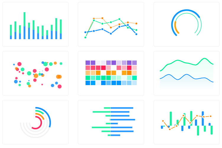
npmのダウンロードトレンド
GitHub Starsランキング
統計詳細
ApexCharts vs Chart.js vs D3 vs Highcharts: 描画エンジン、ライセンス、開発体験の比較
apexcharts、chart.js、d3、highcharts は、フロントエンド開発においてデータを視覚化するための代表的なライブラリです。これらはすべてグラフを描画できますが、内部の仕組み、開発者の負担、そしてコストモデルが全く異なります。アーキテクチャ選定においては、単に見た目だけでなく、描画方式やライセンス条件を深く理解する必要があります。
🎨 描画方式:Canvas vs SVG vs DOM
描画エンジンの違いは、パフォーマンスとカスタマイズ性に直結します。
chart.js は Canvas を使用します。
- ピクセル単位で描画するため、大量のデータポイントがある場合でも比較的軽快です。
- 一方、個々の要素に CSS を適用したり、SVG のような細かいインタラクションを追加するのは困難です。
// chart.js: Canvas コンテキストを使用
const ctx = document.getElementById('myChart');
new Chart(ctx, {
  type: 'bar',
  data: { labels: ['A', 'B'], datasets: [{ data: [1, 2] }] }
});
apexcharts と highcharts は SVG を使用します。
- 各グラフ要素が DOM ノードとして存在するため、CSS でのスタイル変更やイベント付与が容易です。
- データ量が極端に多い場合、Canvas に比べて描画が重くなる可能性があります。
// apexcharts: SVG ベースの設定
const options = {
  chart: { type: 'bar' },
  series: [{ name: 'Sales', data: [1, 2] }]
};
const chart = new ApexCharts(document.querySelector('#chart'), options);
// highcharts: SVG ベースの設定
Highcharts.chart('container', {
  chart: { type: 'bar' },
  series: [{ data: [1, 2] }]
});
d3 は DOM 操作そのもの です。
- 特定の描画エンジンに縛られず、SVG、Canvas、HTML 要素を自由に組み合わせて描画します。
- 開発者がすべての描画ロジックを記述するため、自由度は最高ですが手間も最大です。
// d3: SVG 要素を直接操作
const svg = d3.select('#chart').append('svg');
svg.selectAll('rect')
  .data([1, 2])
  .enter()
  .append('rect')
  .attr('width', d => d * 10);
⚙️ 設定と初期化:設定オブジェクト vs 低レベル操作
ライブラリによって、グラフを定義するアプローチが異なります。
chart.js、apexcharts、highcharts は、設定オブジェクトを渡すだけでグラフが完成します。
- 開発者は「何を描画したいか」を宣言するだけでよく、内部の描画ロジックはライブラリが担当します。
- 実装速度が速く、バグが発生しにくい傾向があります。
// chart.js: 設定オブジェクトで完結
const config = { type: 'line', data: { datasets: [...] } };

// apexcharts: 系列とチャート設定を分離
const options = { series: [{ data: [...] }], chart: { type: 'line' } };

// highcharts: 伝統的な設定構造
const options = { series: [{ data: [...] }], chart: { type: 'line' } };
d3 は、データバインディングとスケール変換を manualmente 記述します。
- 軸の描画、スケールの計算、要素の配置をすべてコードで定義する必要があります。
- 複雑な計算ロジックを実装できる反面、コード量が増え、メンテナンスコストが高くなります。
// d3: スケールと軸を手動で定義
const x = d3.scaleLinear().domain([0, 10]).range([0, 100]);
const xAxis = d3.axisBottom(x);
svg.append('g').call(xAxis);
🖱️ インタラクション:標準機能 vs 自作
ツールチップ、ズーム、パンなどの機能実装コストも重要な選定基準です。
apexcharts と highcharts は、豊富なインタラクションを標準搭載しています。
- ツールチップ、凡例のクリック、ズーム、ダウンロード機能などが設定なし、または minimal な設定で利用可能です。
- 業務ダッシュボードなど、ユーザー操作が多い画面に適しています。
// apexcharts: ツールチップやズームは標準機能
const options = {
  chart: { zoomType: 'xy' }, // ズーム有効化
  tooltip: { enabled: true }  // ツールチップ有効化
};
chart.js は基本的なインタラクションを提供しますが、高度な機能はプラグイン依存です。
- 標準でツールチップは使えますが、複雑なズーム機能などは追加ライブラリが必要です。
// chart.js: 基本的なインタラクション設定
const options = {
  plugins: {
    tooltip: { enabled: true },
    zoom: { /* プラグイン設定が必要 */ }
  }
};
d3 はすべて自作です。
- マウスイベントを监听し、座標計算を行い、DOM を更新するロジックをすべて自分で書きます。
- 完全に制御できる代わりに、実装には相当な時間と技術力が必要です。
// d3: イベント监听を手動で実装
svg.on('mousemove', (event) => {
  const coords = d3.pointer(event);
  // ツールチップの位置計算と表示ロジックを自力で実装
});
💰 ライセンスとコスト:無料 vs 商用有料
プロジェクトの予算と配布形態によって、選択肢が制限される場合があります。
chart.js、apexcharts、d3 は オープンソースライセンス です。
- 商用利用でも無料で利用可能です(MIT または BSD ライセンス)。
- コストを気にせず、個人プロジェクトから大規模エンタープライズまで幅広く使えます。
highcharts は 商用利用にはライセンス購入 が必要です。
- 個人や非営利団体は無料ですが、営利目的の商業製品に組み込む場合は有料ライセンスが必要です。
- 機能とサポートが手厚いため、予算があり安定性を求める企業ではよく選ばれます。
// highcharts: 商用利用時はライセンスキー登録が必要
Highcharts.setOptions({
  global: { useUTC: false }
  // ライセンス購入後、キーを登録して警告を非表示にする
});
🤝 共通点:データ視覚化の基盤
異なるアプローチを取っていますが、これらのライブラリには共通する目的と機能があります。
1. 📊 データ駆動型の描画
- すべて配列やオブジェクト形式のデータを受け取り、視覚的な要素に変換します。
- データが更新されれば、グラフも再描画されます。
// 全ライブラリ共通:データ配列を渡す
const data = [10, 20, 30];
// chart.js, apexcharts, highcharts, d3 すべてこのデータを元に描画
2. 🌐 ブラウザでの動作
- すべて JavaScript で動作し、サーバー側の処理は不要です(データ取得を除く)。
- 現代のブラウザで動作することを前提に設計されています。
// 全ライブラリ共通:DOM 要素を指定して描画
const container = document.getElementById('chart-container');
// この容器の中にグラフが描画される
3. 🎨 カスタマイズ可能性
- 色、フォント、サイズなど、見た目の調整機能を持っています。
d3は最も自由度が高く、他は設定項目の範囲内で調整します。
// 全ライブラリ共通:色の指定
const color = '#FF5733';
// 設定オブジェクトやスタイル属性で色を適用可能
📊 サマリーテーブル
| 特徴 | chart.js | apexcharts | highcharts | d3 |
|---|---|---|---|---|
| 描画エンジン | Canvas | SVG | SVG | DOM (SVG/Canvas) |
| 学習曲線 | 低い | 低い | 低い | 高い |
| インタラクション | 基本機能 | 豊富 | 非常に豊富 | 自作 |
| ライセンス | MIT (無料) | MIT (無料) | 商用有料 | BSD (無料) |
| カスタマイズ | 限定 | 中程度 | 中程度 | 無限 |
| 主な用途 | シンプルなグラフ | モダンなダッシュボード | 業務システム | 独自可視化 |
💡 最終推奨
chart.js は、シンプルさ — 軽量化を最優先するプロジェクトに最適です。標準的なグラフで十分であり、バンドルサイズを抑えたい場合に適しています。
apexcharts は、現代の Web アプリケーション — 特に React や Vue を使用するプロジェクトに推奨されます。見た目が美しく、インタラクション機能も充実しており、無料で商用利用可能です。
highcharts は、予算があり — 安定性と包括的な機能を求めるエンタープライズ環境で真価を発揮します。ライセンスコストを許容できる場合、最も安心できる選択肢です。
d3 は、既存のライブラリでは実現できない — 独自の視覚化が必要な場合にのみ選択すべきです。学習コストは高いですが、表現力の限界はありません。
結論として、多くの現代フロントエンドプロジェクトでは、バランスの取れた apexcharts が第一候補となります。特殊な事情がない限り、これで十分すぎるほどの機能を提供してくれます。
選び方: apexcharts vs chart.js vs d3 vs highcharts
- apexcharts:
モダンな SVG ベースのグラフを素早く実装したい場合に選択します。ドラッグアンドドロップやズームなどのインタラクション機能が標準で備わっており、React や Vue 用のラッパーも公式に提供されているため、現代のフレームワークとの親和性が高いです。
- chart.js:
軽量でシンプルな実装を優先する場合に選択します。Canvas ベースのため大量のデータポイントを描画しても比較的軽快に動作し、設定も簡単です。標準的なグラフ类型で十分であり、複雑なカスタマイズが必要ないプロジェクトに向いています。
- d3:
既存のグラフ型では表現できない、独自のカスタム視覚化が必要な場合に選択します。データに基づいて DOM 要素を直接操作するため、自由度は最高ですが、実装には SVG やデータバインディングに関する深い知識が必要になります。
- highcharts:
エンタープライズ級の機能とサポートが必要で、商用ライセンスの購入が可能な場合に選択します。非常に多くのグラフ类型と機能を標準で提供しており、レガシーブラウザのサポートや複雑な業務システムでの安定性が求められる場面で威力を発揮します。
人気の比較
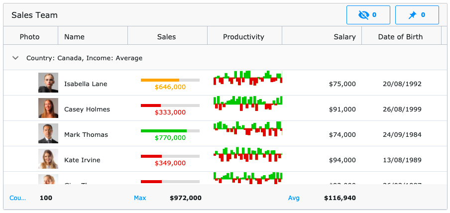
apexcharts のREADME
![]()
ApexCharts
Modern, interactive JavaScript charts your users will love - built for dashboards, SaaS, and data-heavy UIs.


Live demos · Documentation · License
Why ApexCharts
- 16+ chart types out of the box — line, area, bar, column, pie, donut, radar, heatmap, treemap, candlestick, boxplot, funnel, pyramid, gauge and more
- SSR support for Next.js, Nuxt, SvelteKit, Astro, and other meta-frameworks — render real SVG on the server, hydrate on the client
- Tree-shakable — import only the chart types and features you need; typical bundles are 30–60% smaller than the full build
- TypeScript-first — full type definitions ship with the package, no
@types/*install needed - Zero runtime dependencies — no React/Vue/D3 required; works in any framework or vanilla JS
- Accessibility — keyboard navigation and ARIA support built in
- Free for most users — see License
Install
npm install apexcharts
Or via CDN:
<script src="https://cdn.jsdelivr.net/npm/apexcharts"></script>
Quick start
import ApexCharts from 'apexcharts'

const chart = new ApexCharts(document.querySelector('#chart'), {
  chart: { type: 'bar' },
  series: [{ name: 'Sales', data: [30, 40, 35, 50, 49, 60, 70, 91, 125] }],
  xaxis: { categories: [1991, 1992, 1993, 1994, 1995, 1996, 1997, 1998, 1999] }
})

chart.render()
Browse 100+ ready-to-use samples — copy, paste, ship.
Chart types
- Line · Area · Range Area
- Bar · Column · Range Bar / Timeline
- Scatter · Bubble
- Candlestick · BoxPlot
- Pie · Donut · Polar Area · Radial Bar / Gauge
- Radar · Heatmap · Treemap
- Funnel
Combine any of the above as mixed/combo charts, stacked variants, sparklines, or synchronized multi-chart layouts.
Framework wrappers
Official:
- React — react-apexcharts
- Vue 3 — vue3-apexcharts
- Vue 2 — vue-apexcharts
- Angular — ng-apexcharts
- Blazor — Blazor-ApexCharts
- Stencil — stencil-apexcharts
Community:
- Svelte — svelte-apexcharts
- Ruby — apexcharts.rb
- Laravel — larapex-charts
- R — apexcharter
Server-side rendering
Render chart HTML on the server, then hydrate in the browser. Works with Next.js, Nuxt, SvelteKit, Astro, Remix, and any Node-based framework.
// Server
import ApexCharts from 'apexcharts/ssr'

const chartHTML = await ApexCharts.renderToHTML({
  chart: { type: 'bar' },
  series: [{ data: [30, 40, 35, 50, 49, 60, 70, 91, 125] }],
  xaxis: { categories: [1991, 1992, 1993, 1994, 1995, 1996, 1997, 1998, 1999] }
}, { width: 500, height: 300 })

// Returns hydration-ready HTML with embedded SVG
// Client
import ApexCharts from 'apexcharts/client'

ApexCharts.hydrate(document.getElementById('my-chart'))
// or: ApexCharts.hydrateAll()
No more dynamic(() => import(...), { ssr: false }) workarounds — the chart renders on the server and becomes interactive on hydration.
Tree-shaking — ship only what you use
By default import ApexCharts from 'apexcharts' includes everything. For smaller bundles, import from apexcharts/core and add only what you need:
import ApexCharts from 'apexcharts/core'   // bare class — no chart types, no features

// Chart types (match the value of chart.type)
import 'apexcharts/line'
import 'apexcharts/bar'
// import 'apexcharts/area'
// import 'apexcharts/scatter'

// Optional features
import 'apexcharts/features/legend'
import 'apexcharts/features/toolbar'      // zoom/pan toolbar
// import 'apexcharts/features/exports'      // SVG/PNG/CSV download
// import 'apexcharts/features/annotations'
// import 'apexcharts/features/keyboard'     // keyboard navigation
See the tree-shaking guide for the complete list of entry points.
Browser support
ApexCharts works in all modern evergreen browsers (Chrome, Firefox, Safari, Edge). For server-side rendering, Node.js 18+ is required.
Documentation
Contributing
npm install
npm run dev     # vite build --watch
npm test        # e2e + unit
See CONTRIBUTING.md for setup, coding conventions, and PR guidelines.
License
ApexCharts uses a revenue-based license:
- Free for individuals, and organizations with under $2M USD in annual gross revenue — including commercial and internal use. No registration required.
- Commercial license required for organizations at or above $2M USD annual gross revenue.
Full terms: apexcharts.com/license
Need an enterprise data grid?
We've partnered with Infragistics, creators of Ignite UI — high-performance data grids that handle unlimited rows and columns, with custom templates and real-time updates.
Available for:
Angular · React · Blazor · Web Components · jQuery
Contact
- Issues & bugs: GitHub Issues
- Questions: GitHub Discussions
- Email: info@apexcharts.com