Cross-Platform UI Component Libraries for React Native
native-base, react-native-elements, and react-native-paper are popular UI component libraries for React Native that provide pre-built, customizable components to accelerate mobile app development. native-base offers a utility-first approach with a focus on theming and consistency across platforms. react-native-elements provides a simple set of cross-platform components with a focus on ease of use. react-native-paper implements Google's Material Design specification, offering a polished look and feel with strong accessibility support.
Npm Package Weekly Downloads Trend
Github Stars Ranking
Stat Detail
Native-Base vs React Native Elements vs React Native Paper: Architecture and API Compared
When building React Native applications, choosing a UI kit is a foundational decision. native-base, react-native-elements, and react-native-paper all solve the problem of inconsistent default components, but they approach theming, customization, and design philosophy differently. Let's compare how they handle common engineering tasks.
🎨 Theming Architecture: Utility vs Object vs Material
native-base uses a design token system that allows you to define global values for colors, spacing, and fonts. It relies on a provider to inject these tokens into the component tree.
// native-base: Theme Provider
import { NativeBaseProvider, extendTheme } from 'native-base';

const theme = extendTheme({
  colors: { primary: '#6B46C1' }
});

export default function App() {
  return (
    <NativeBaseProvider theme={theme}>
      <HomeScreen />
    </NativeBaseProvider>
  );
}
react-native-elements uses a simpler ThemeProvider that merges your custom values with defaults. It is less granular than NativeBase but easier to grasp quickly.
// react-native-elements: Theme Provider
import { ThemeProvider } from '@rneui/themed';

const theme = {
  Button: { titleStyle: { color: 'red' } }
};

export default function App() {
  return (
    <ThemeProvider theme={theme}>
      <HomeScreen />
    </ThemeProvider>
  );
}
react-native-paper enforces a strict Material Design theme structure. You must adhere to specific keys like colors, fonts, and roundness.
// react-native-paper: Provider
import { Provider as PaperProvider, MD3LightTheme } from 'react-native-paper';

const theme = {
  ...MD3LightTheme,
  colors: { primary: '#6B46C1' }
};

export default function App() {
  return (
    <PaperProvider theme={theme}>
      <HomeScreen />
    </PaperProvider>
  );
}
🔘 Component API: Props vs Styles vs Modes
native-base components accept standard style props alongside custom ones. You can pass color, size, and variant directly.
// native-base: Button
import { Button } from 'native-base';

<Button colorScheme="purple" size="lg">
  Click Me
</Button>
react-native-elements often separates the title and container styles. The API is straightforward but can require nested props for deep styling.
// react-native-elements: Button
import { Button } from '@rneui/themed';

<Button
  title="Click Me"
  buttonStyle={{ backgroundColor: '#6B46C1' }}
/>
react-native-paper uses a mode prop to switch between text, contained, and outlined variants. This aligns with Material Design specs.
// react-native-paper: Button
import { Button } from 'react-native-paper';

<Button mode="contained" onPress={() => {}}>
  Click Me
</Button>
🛠️ Customization: SX Prop vs Style Props vs Theme Override
native-base shines with its sx prop, allowing utility-based styling directly on components without creating separate style objects.
// native-base: Inline Styling
import { Box } from 'native-base';

<Box sx={{ bg: 'red.500', p: 4, borderRadius: 'md' }}>
  <Text>Content</Text>
</Box>
react-native-elements relies on standard React Native style props or specific component props like containerStyle.
// react-native-elements: Inline Styling
import { Card } from '@rneui/themed';

<Card containerStyle={{ padding: 16, borderRadius: 8 }}>
  <Text>Content</Text>
</Card>
react-native-paper encourages using the style prop for layout but expects visual changes to come from the theme or specific props.
// react-native-paper: Inline Styling
import { Card } from 'react-native-paper';

<Card style={{ padding: 16, margin: 8 }}>
  <Text>Content</Text>
</Card>
⚠️ Maintenance and Stability
native-base underwent a major rewrite in version 3. While powerful, early v3 releases had performance concerns. Check the latest issues before adopting for high-performance lists.
react-native-elements had a well-documented period of low maintenance activity, which led the community to create the @rneui/themed fork. For new projects, verify if the main package or the fork better suits your long-term needs.
react-native-paper is maintained by Callstack and has a reputation for stability. It is generally safe for enterprise applications where long-term support is critical.
🤝 Similarities: Shared Ground
While they differ in philosophy, all three libraries share core goals and patterns.
1. 📱 Cross-Platform Consistency
- All three ensure components look consistent on iOS and Android.
- They handle platform-specific differences internally.
// All libraries handle this internally
// You write one component, it renders natively on both platforms
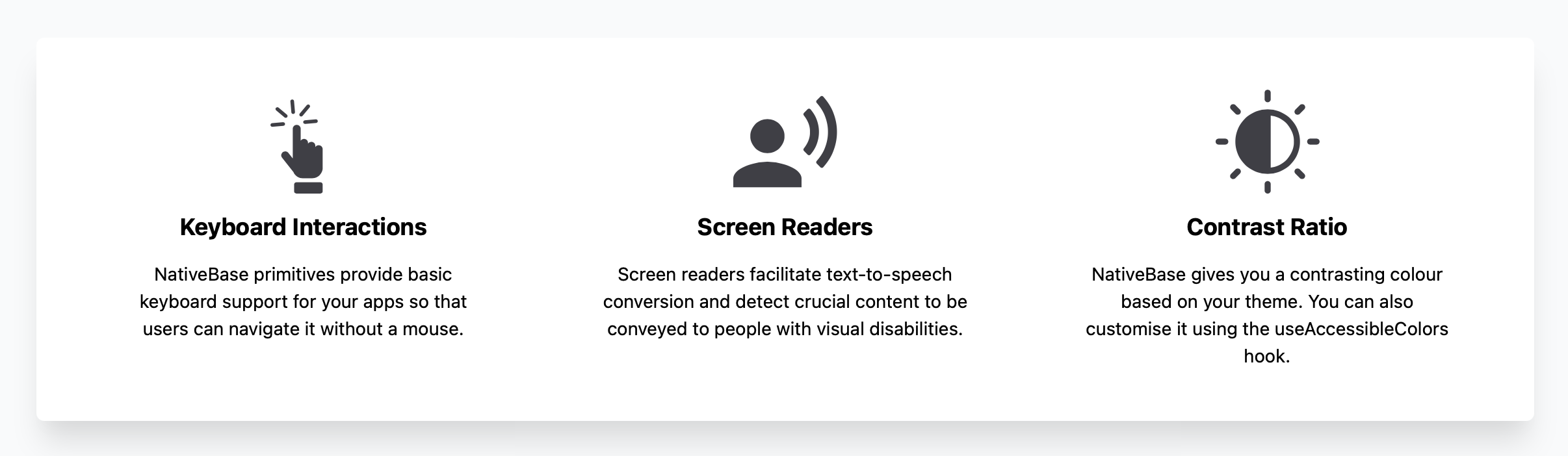
2. ♿ Accessibility Support
- Each library invests in accessibility props like
accessibilityLabel. - Paper leads in this area due to Material Design requirements.
// Example: Accessible Button
<Button accessibilityLabel="Submit form">Submit</Button>
3. 🧩 Component Composition
- All support composing smaller components into larger layouts.
- You can nest Cards, Lists, and Inputs freely.
// Example: Card Composition
<Card>
  <Card.Title>Header</Card.Title>
  <Card.Content>Body</Card.Content>
</Card>
4. 🎨 Dark Mode Support
- All three provide built-in mechanisms for dark mode.
- Usually toggled via the Provider context.
// Example: Dark Mode Theme
const theme = useColorScheme() === 'dark' ? DarkTheme : LightTheme;
5. 📦 TypeScript Support
- All libraries ship with TypeScript definitions.
- Enables autocomplete and type safety in modern editors.
// Example: Typed Props
interface Props {
  count: number;
}
const MyComponent: React.FC<Props> = ({ count }) => { ... };
📊 Summary: Key Similarities
| Feature | Shared by All Three |
|---|---|
| Platform | 📱 iOS & Android |
| Language | 📘 TypeScript Support |
| Theming | 🎨 Provider-based Configuration |
| Accessibility | ♿ Basic ARIA/Label Support |
| Ecosystem | 📦 NPM Installable |
🆚 Summary: Key Differences
| Feature | native-base | react-native-elements | react-native-paper |
|---|---|---|---|
| Design System | 🎨 Custom / Utility-first | 🧩 Generic / Simple | 📘 Material Design |
| Styling | 🛠️ sx prop / Tokens | 🧵 Style Props | 🎨 Theme Overrides |
| Maintenance | ⚠️ Check Version Status | ⚠️ Check Fork Status | ✅ Stable / Active |
| Flexibility | 🔓 High Customization | 🔓 Medium Customization | 🔒 Opinionated |
| Bundle | 📦 Modular | 📦 Modular | 📦 Modular |
💡 The Big Picture
native-base is like a design system builder 🏗️—great for teams that want to create their own unique look using utility classes. Ideal for brands that do not want to look like standard Material or iOS apps.
react-native-elements is like a basic toolkit 🧰—perfect for quick prototypes or internal tools where speed matters more than unique design. Verify maintenance status before use.
react-native-paper is like a polished product 📱—best for consumer-facing apps that benefit from Material Design's familiarity and robustness. Choose this for stability and accessibility.
Final Thought: All three libraries can build great apps. The choice depends on whether you value custom design (native-base), simplicity (react-native-elements), or standard compliance (react-native-paper).
How to Choose: native-base vs react-native-elements vs react-native-paper
- native-base:
Choose
native-baseif you want a utility-first styling experience similar to Tailwind CSS but for React Native. It is ideal for teams that need deep customization without fighting default styles, as it allows you to build components from primitives. However, verify the current maintenance status before committing, as the project has undergone significant version changes. - react-native-elements:
Choose
react-native-elementsif you need simple, no-frills components and want to minimize setup time. It is suitable for prototypes or internal tools where strict design compliance is not critical. Be aware that the package has experienced maintenance gaps in the past, so evaluate the community fork@rneui/themedfor long-term projects. - react-native-paper:
Choose
react-native-paperif your app follows Material Design guidelines or if you prioritize accessibility and performance out of the box. It is the best fit for production-grade apps that need a consistent, polished UI with minimal configuration. The library is actively maintained and has a stable API.
Popular Comparisons
README for native-base


NativeBase is a mobile-first, accessible component library for building a consistent design system across android, iOS & web.
Table of Contents
- Introduction
- Motivation
- Features
- Dependencies
- Installation & Setup
- Components
- Examples
- KitchenSink App
- Tech Stack
- Compatible Versions
- Contributors
- Changelog
- Community
- License
1. Introduction?
NativeBase is a mobile-first, component library for React & React Native. Version 3.0 ships with complete ARIA integration, support for utility props and nearly 40 components that are consistent across Android, iOS and Web. Fast-track your dev process with NativeBase 3.0.
Recommended by Awesome React Native
NativeBase was added to the list of Frameworks of Awesome React Native and it is used by numerous React lovers across the world.
2. Motivation
Building with React Native from scratch is a tedious process with multiple steps such as adding styling, interactions, state management, responsiveness, accessibility, etc. We wanted to build and ship accessible, high-quality apps quickly.
Our inspirations include Material UI, Chakra UI, Ant Design, Braid Design System, Bootstrap, TailwindCSS & Flutter.
3. Features
Out of the Box Accessibility
Integrated with React ARIA and React Native ARIA, which provides React hooks. This enables you to build accessible design systems in no time.
Supporting Utility Props
Powered by Styled System so you can rapidly build custom UI components with constraint-based utility style props.
Rich Component Library
NativeBase offers around 40 components so you can build seamlessly. It includes button, checkbox, flex, stack and more.
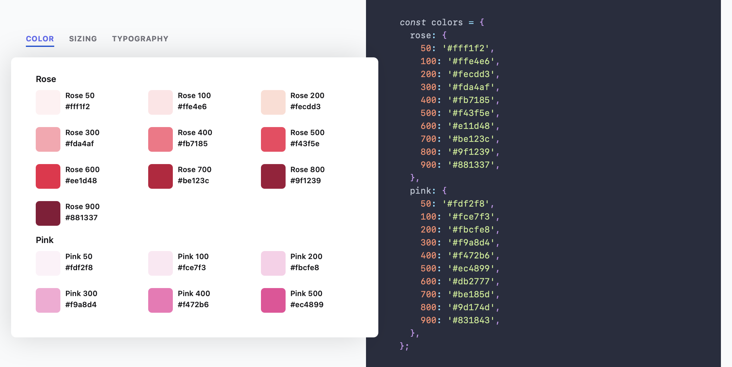
Highly Themeable
Themeability is one of the core elements of NativeBase. You can customise your app theme and component styles to your heart's content.
Available for Both Mobile and Web
NativeBase 3.0 is powered by React Native Web so you can build consistent UIs across Web, Android and iOS.
Responsiveness Made Easy
Instead of manually adding responsiveness, NativeBase 3.0 allows you to provide object and array values to add responsive styles.
Now with Dark Mode
Building apps with a dark mode setting just got a whole lot easier. NativeBase is now optimised for light and dark modes.
4. Dependencies
React Native, Expo
5. Installation
NativeBase is supported in Expo or React Native CLI initiated apps. Web support is made possible by react-native-web.
Refer the guides to setup NativeBase in your React app.
6. Components
NativeBase 3.0 is a rich component library with nearly 40 components.
7. Examples
Check out the Todo-List example
8. KitchenSink App
Kitchen Sink is a comprehensive demo app showcasing all the NativeBase components in action. It includes buttons, forms, icons, etc.


9. Tech Stack
JavaScript, React Native, Styled System
Made with :heart: at GeekyAnts
NativeBase is an open-source project made by the tech-savvy geeks at GeekyAnts. GeekyAnts is a group of React Native experts. Do get in touch with us for any help with your React Native project. Always happy to help!
10. Compatible Versions
| NativeBase | React Native |
|---|---|
| v0.1.1 | v0.22 to v0.23 |
| v0.2.0 to v0.3.1 | v0.24 to v0.25 |
| v0.4.6 to v0.4.9 | v0.26.0 - v0.27.1 |
| v0.5.0 to v0.5.15 | v0.26.0 - v0.37.0 |
| v0.5.16 to v0.5.20 | v0.38.0 - v0.39.0 |
| v2.0.0-alpha1 to v2.1.3 | v0.38.0 to v0.43.0 |
| v2.1.4 to v2.1.5 | v0.44.0 to v0.45.0 |
| v2.2.0 | v0.44.0 to v0.45.0 |
| v2.2.1 | v0.46.0 and above |
| v2.3.0 to 2.6.1 | v0.46.0 and above (does not support React 16.0.0-alpha.13) |
| v2.7.0 | v0.56.0 and above |
| v3.0.0-next.36 to v3.0.0-next-41 | v0.63.0 and above |
| v3.0.0 to latest | v0.63.0 and above |
11. Contributors
Code Contributors
This project exists thanks to all the people who contribute. [Contribute].

Financial Contributors
Become a financial contributor and help us sustain our community. [Contribute]
Individuals

Organizations
Support this project with your organization. Your logo will show up here with a link to your website. [Contribute]
12. Changelog
Check out the changelog in the official documentation
13. Community
14. License
Licensed under the MIT License, Copyright © 2021 GeekyAnts. See LICENSE for more information.