React Slider Component Libraries for Professional UI Development
rc-slider, react-input-slider, and react-slider are React-based libraries that provide customizable slider UI components for selecting numeric values within a range. These packages enable developers to build intuitive input controls for settings, filters, form inputs, and data visualization interfaces. While all three serve the core purpose of rendering draggable sliders, they differ significantly in architecture, feature sets, customization capabilities, and maintenance status.
Npm Package Weekly Downloads Trend
Github Stars Ranking
Stat Detail
React Slider Libraries Compared: rc-slider vs react-input-slider vs react-slider
When building forms, dashboards, or configuration panels in React, you’ll often need a slider component to let users pick values from a continuous or discrete range. Three notable options exist in the ecosystem: rc-slider, react-input-slider, and react-slider. But they’re not equally viable today. Let’s examine their technical realities — including one that should be off your radar entirely.
⚠️ Deprecation Status: One Package Is Officially Retired
Before diving into features, it’s critical to address maintenance:
react-input-slideris deprecated. Its npm page shows a deprecation warning: “This package has been deprecated. Use rc-slider instead.” The GitHub repository is archived, and the last publish was years ago. Do not use it in new projects.
That leaves us with two actively maintained contenders: rc-slider and react-slider. We’ll focus our comparison there, but include react-input-slider only to warn against its use.
🎛️ Basic Usage: How You Wire Up a Simple Slider
Even a minimal slider requires setting min, max, and handling changes. Here’s how each package approaches it.
rc-slider uses a declarative API with props like onChange and value. It requires explicit state management.
// rc-slider
import Slider from 'rc-slider';
import 'rc-slider/assets/index.css'; // Required styles

function MySlider() {
  const [value, setValue] = useState(50);
  return <Slider min={0} max={100} value={value} onChange={setValue} />;
}
react-slider follows a similar pattern but uses different prop names (onChange receives the new value directly).
// react-slider
import ReactSlider from 'react-slider';

function MySlider() {
  const [value, setValue] = useState(50);
  return <ReactSlider min={0} max={100} value={value} onChange={setValue} />;
}
react-input-slider (deprecated):
// DO NOT USE — shown for historical context only
import Slider from 'react-input-slider';

function MySlider() {
  const [state, setState] = useState({ x: 50 });
  return <Slider xmin={0} xmax={100} x={state.x} onChange={({ x }) => setState({ x })} />;
}
💡 Note: Both
rc-sliderandreact-sliderrequire you to manage state externally — neither provides internal state by default.
📏 Range Selection: Single vs Dual Handles
Need to select a range (e.g., price filters)? Support varies.
rc-slider natively supports ranges via the range prop. Pass an array of two values.
// rc-slider range
<Slider
  range
  min={0}
  max={200}
  value={[30, 80]}
  onChange={(values) => console.log(values)} // [30, 80]
/>
react-slider also supports ranges by passing an array to value.
// react-slider range
<ReactSlider
  min={0}
  max={200}
  value={[30, 80]}
  onChange={(values) => console.log(values)}
/>
react-input-slider supported ranges using separate x and y props, but again — it’s deprecated.
Both active libraries handle ranges well, but rc-slider offers more fine-grained control over individual handles (e.g., disabling one).
🏷️ Marks and Labels: Guiding User Input
Adding visual markers (e.g., “Low,” “Medium,” “High”) improves usability.
rc-slider uses a marks prop that maps numeric values to labels or React elements.
// rc-slider with marks
<Slider
  min={0}
  max={100}
  marks={{
    0: 'Cold',
    50: 'Warm',
    100: 'Hot'
  }}
  step={null} // snap to marks
/>
react-slider supports marks through the renderMark prop, which is a function called for each mark position.
// react-slider with marks
<ReactSlider
  min={0}
  max={100}
  renderMark={(value) => {
    if (value === 0) return 'Cold';
    if (value === 50) return 'Warm';
    if (value === 100) return 'Hot';
    return null;
  }}
/>
rc-slider’s approach is more declarative and easier to read. react-slider gives you full render control but requires more logic.
💬 Tooltips: Showing Current Values on Hover/Drag
Tooltips enhance precision by displaying the current value near the handle.
rc-slider includes built-in tooltip support via the tipFormatter prop.
// rc-slider tooltip
<Slider
  tipFormatter={(value) => `${value}%`}
  defaultValue={50}
/>
react-slider does not include tooltips out of the box. You must implement them yourself using onDragStart/onDragEnd and state.
// react-slider: manual tooltip (simplified)
function SliderWithTooltip() {
  const [value, setValue] = useState(50);
  const [showTip, setShowTip] = useState(false);

  return (
    <div>
      {showTip && <div className="tooltip">{value}%</div>}
      <ReactSlider
        value={value}
        onChange={setValue}
        onDragStart={() => setShowTip(true)}
        onDragEnd={() => setShowTip(false)}
      />
    </div>
  );
}
If you need tooltips without extra work, rc-slider wins.
🧭 Orientation and Layout Flexibility
Sliders aren’t always horizontal.
Both rc-slider and react-slider support vertical orientation:
// rc-slider vertical
<Slider vertical min={0} max={100} />

// react-slider vertical
<ReactSlider min={0} max={100} orientation="vertical" />
rc-slider also supports reverse direction (reverse prop) and custom rail/handle rendering via handle and railStyle props, offering deeper layout control.
♿ Accessibility and Keyboard Support
Professional apps must support keyboard navigation.
rc-slider provides full ARIA compliance, keyboard arrow support, and focus management out of the box. You can tab to the slider and use left/right arrows to adjust.
react-slider also supports keyboard navigation (arrow keys, home/end) and includes ARIA attributes, though its implementation is less configurable.
Both meet baseline accessibility requirements, but rc-slider exposes more hooks for customizing a11y behavior (e.g., ariaLabelGroupForHandles).
🎨 Styling and Theming
How easy is it to match your design system?
rc-slider ships with a default CSS file (which you must import) but allows complete restyling via:
- CSS class overrides (using
classNameandhandleClassName) - Inline styles (
trackStyle,handleStyle) - Custom handle/rail components
// rc-slider custom handle
const CustomHandle = (props) => (
  <span {...props} style={{ ...props.style, backgroundColor: 'blue' }} />
);

<Slider handle={<CustomHandle />} />
react-slider uses a purely CSS-class-based approach. It applies classes like .react-slider__thumb and .react-slider__track, which you can target in your stylesheet. No inline style props are exposed.
/* react-slider custom styling */
.react-slider__thumb {
  width: 20px;
  height: 20px;
  background: blue;
}
If you prefer CSS-in-JS or inline styles, rc-slider offers more flexibility. If you’re all-in on global CSS, react-slider’s approach may feel cleaner.
📦 Bundle Impact and Dependencies
rc-slider depends on rc-util and classnames, adding modest overhead. It’s optimized but larger than minimal alternatives.
react-slider has zero dependencies — just React and your code. This makes it attractive for micro-frontends or size-sensitive apps.
However, remember: saving 5KB isn’t worth losing features you’ll later polyfill yourself.
🧪 TypeScript Support
Both rc-slider and react-slider ship with TypeScript definitions. Types are accurate and up-to-date, providing good developer experience in typed codebases.
🆚 Summary: When to Use Which
| Feature | rc-slider | react-slider | react-input-slider |
|---|---|---|---|
| Maintenance | ✅ Actively maintained | ✅ Actively maintained | ❌ Deprecated |
| Range Support | ✅ Full | ✅ Basic | ⚠️ Historical only |
| Tooltips | ✅ Built-in | ❌ Manual implementation | ⚠️ Not applicable |
| Marks/Labels | ✅ Declarative | ✅ Functional render | ⚠️ Not applicable |
| Styling | ✅ Inline + CSS + Components | ✅ CSS classes only | ⚠️ Not applicable |
| Accessibility | ✅ Full ARIA + keyboard | ✅ Basic ARIA + keyboard | ⚠️ Unknown |
| Bundle Size | 🟡 Moderate | ✅ Very light | ⚠️ Irrelevant |
💡 Final Recommendation
-
For most professional applications: Choose
rc-slider. Its rich feature set, built-in tooltips, flexible theming, and robust accessibility make it the safest choice for complex UIs. The slight bundle cost is justified by reduced custom code. -
For lightweight or minimalist needs: Choose
react-sliderif you only need a basic slider, are comfortable implementing tooltips yourself, and prioritize minimal dependencies. -
Never choose
react-input-slider— it’s deprecated, unmaintained, and poses long-term risk.
In practice, unless you’re building a tiny utility with strict size constraints, rc-slider’s maturity and completeness make it the default recommendation for serious frontend teams.
How to Choose: rc-slider vs react-input-slider vs react-slider
- rc-slider:
Choose
rc-sliderif you need a highly customizable, production-grade slider with extensive support for ranges, marks, tooltips, vertical orientation, and keyboard accessibility. It’s ideal for enterprise applications where UI consistency, internationalization, and complex interaction patterns (like dual-handle ranges) are required. Its modular design and TypeScript support make it suitable for large-scale codebases. - react-input-slider:
Avoid
react-input-sliderin new projects — it is officially deprecated and no longer maintained. The npm registry marks it as deprecated with a message recommending alternatives likerc-slider. Using it introduces technical debt and potential security or compatibility risks with modern React versions. - react-slider:
Choose
react-sliderif you prefer a lightweight, dependency-free slider with a clean API and good defaults for basic use cases. It supports vertical orientation, custom styling via CSS classes, and simple range selection. It’s well-suited for small to medium applications where bundle size matters and advanced features like tooltip formatting or dynamic marks aren’t needed.
Popular Comparisons
README for rc-slider
rc-slider
Slider UI component for React


Install
Example
npm start and then go to http://localhost:8000
Online examples: https://slider.react-component.now.sh/
Usage
Slider
import Slider from 'rc-slider';
import 'rc-slider/assets/index.css';

export default () => (
  <>
    <Slider />
  </>
);
Range
Please refer to #825 for information regarding usage of Range.
An example:
import Slider, { Range } from 'rc-slider';
import 'rc-slider/assets/index.css';

export default () => (
  <>
    <Slider range />
  </>
);
Compatibility
 IE / Edge |  Firefox |  Chrome |  Safari |  Electron |
|---|---|---|---|---|
| IE11, Edge | last 2 versions | last 2 versions | last 2 versions | last 2 versions |
API
createSliderWithTooltip(Slider | Range) => React.Component
An extension to make Slider or Range support Tooltip on handle.
const Slider = require('rc-slider');
const createSliderWithTooltip = Slider.createSliderWithTooltip;
const Range = createSliderWithTooltip(Slider.Range);
After Range or Slider was wrapped by createSliderWithTooltip, it will have the following props:
| Name | Type | Default | Description |
|---|---|---|---|
| tipFormatter | (value: number): React.ReactNode | value => value | A function to format tooltip's overlay |
| tipProps | Object | { placement: 'top', prefixCls: 'rc-slider-tooltip', overlay: tipFormatter(value) } | A function to format tooltip's overlay |
Common API
The following APIs are shared by Slider and Range.
| Name | Type | Default | Description |
|---|---|---|---|
| className | string | '' | Additional CSS class for the root DOM node |
| min | number | 0 | The minimum value of the slider |
| max | number | 100 | The maximum value of the slider |
| id | string | '' | Unique identifier for the component, used for accessibility |
| marks | {number: ReactNode} or{number: { style, label }} | {} | Marks on the slider. The key determines the position, and the value determines what will show. If you want to set the style of a specific mark point, the value should be an object which contains style and label properties. |
| step | number or null | 1 | Value to be added or subtracted on each step the slider makes. Must be greater than zero, and max - min should be evenly divisible by the step value. When marks is not an empty object, step can be set to null, to make marks as steps. |
| vertical | boolean | false | If vertical is true, the slider will be vertical. |
| handle | (props) => React.ReactNode | A handle generator which could be used to customized handle. | |
| included | boolean | true | If the value is true, it means a continuous value interval, otherwise, it is a independent value. |
| reverse | boolean | false | If the value is true, it means the component is rendered reverse. |
| disabled | boolean | false | If true, handles can't be moved. |
| keyboard | boolean | true | Support using keyboard to move handlers. |
| dots | boolean | false | When the step value is greater than 1, you can set the dots to true if you want to render the slider with dots. |
| onBeforeChange | Function | NOOP | onBeforeChange will be triggered when ontouchstart or onmousedown is triggered. |
| onChange | Function | NOOP | onChange will be triggered while the value of Slider changing. |
| onChangeComplete | Function | NOOP | onChangeComplete will be triggered when ontouchend or onmouseup is triggered. |
| minimumTrackStyle | Object | please use trackStyle instead. (only used for slider, just for compatibility , will be deprecate at rc-slider@9.x ) | |
| maximumTrackStyle | Object | please use railStyle instead (only used for slider, just for compatibility , will be deprecate at rc-slider@9.x) | |
| handleStyle | Array[Object] | Object | [{}] | The style used for handle. (both for slider(Object) and range(Array of Object), the array will be used for multi handle following element order) |
| trackStyle | Array[Object] | Object | [{}] | The style used for track. (both for slider(Object) and range(Array of Object), the array will be used for multi track following element order) |
| railStyle | Object | {} | The style used for the track base color. |
| dotStyle | Object | (dotValue) => Object | {} | The style used for the dots. |
| activeDotStyle | Object | (dotValue) => Object | {} | The style used for the active dots. |
Slider
| Name | Type | Default | Description |
|---|---|---|---|
| defaultValue | number | 0 | Set initial value of slider. |
| value | number | - | Set current value of slider. |
| startPoint | number | undefined | Track starts from this value. If undefined, min is used. |
| tabIndex | number | 0 | Set the tabIndex of the slider handle. |
| ariaLabelForHandle | string | - | Set the aria-label attribute on the slider handle. |
| ariaLabelledByForHandle | string | - | Set the aria-labelledby attribute on the slider handle. |
| ariaRequired | boolean | - | Set the aria-required attribute on the slider handle. |
| ariaValueTextFormatterForHandle | (value) => string | - | A function to set the aria-valuetext attribute on the slider handle. It receives the current value of the slider and returns a formatted string describing the value. See WAI-ARIA Authoring Practices 1.1 for more information. |
Range
| Name | Type | Default | Description |
|---|---|---|---|
| defaultValue | number[] | [0, 0] | Set initial positions of handles. |
| value | number[] | Set current positions of handles. | |
| tabIndex | number[] | [0, 0] | Set the tabIndex of each handle. |
| ariaLabelGroupForHandles | Array[string] | - | Set the aria-label attribute on each handle. |
| ariaLabelledByGroupForHandles | Array[string] | - | Set the aria-labelledby attribute on each handle. |
| ariaValueTextFormatterGroupForHandles | Array[(value) => string] | - | A function to set the aria-valuetext attribute on each handle. It receives the current value of the slider and returns a formatted string describing the value. See WAI-ARIA Authoring Practices 1.1 for more information. |
| count | number | 1 | Determine how many ranges to render, and multiple handles will be rendered (number + 1). |
| allowCross | boolean | true | allowCross could be set as true to allow those handles to cross. |
| pushable | boolean or number | false | pushable could be set as true to allow pushing of surrounding handles when moving a handle. When set to a number, the number will be the minimum ensured distance between handles. Example: 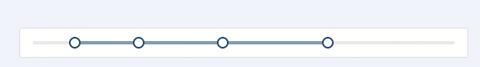 |
| draggableTrack | boolean | false | Open the track drag. open after click on the track will be invalid. |
SliderTooltip
The Tooltip Component that keep following with content.
Development
npm install
npm start
Test Case
npm run test
Coverage
npm run coverage
License
rc-slider is released under the MIT license.