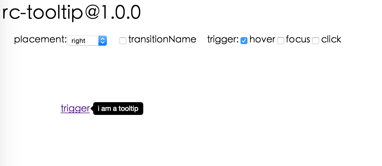
rc-tooltip vs react-popper vs react-tippy vs react-tooltip
React Tooltip Libraries
rc-tooltipreact-popperreact-tippyreact-tooltipSimilar Packages:

React Tooltip Libraries

These libraries provide various ways to implement tooltips in React applications, enhancing user experience by offering contextual information on hover or focus. Each library has its own unique features, design principles, and use cases, making them suitable for different scenarios in web development. Understanding their differences can help developers choose the right tool for their specific needs.

Npm Package Weekly Downloads Trend

3 Years

Github Stars Ranking

Stat Detail

Package
Downloads
Stars
Size
Issues
Publish
License
rc-tooltip094856.2 kB75a year agoMIT
react-popper02,49879.1 kB39-MIT
react-tippy0981-1036 years agoMIT
react-tooltip03,789889 kB125 months agoMIT

Feature Comparison: rc-tooltip vs react-popper vs react-tippy vs react-tooltip

Positioning

  • rc-tooltip:

    rc-tooltip provides basic positioning capabilities and allows for easy customization of tooltip placement through props. It supports various placement options, making it flexible for different UI designs.

  • react-popper:

    react-popper excels in positioning tooltips accurately using the Popper.js library. It dynamically calculates the best position based on available space and can handle complex scenarios like flipping and preventing overflow, ensuring tooltips are always visible.

  • react-tippy:

    react-tippy offers configurable positioning options and supports various placements. It also includes features like arrow positioning and offset adjustments, allowing for precise control over tooltip placement in relation to the target element.

  • react-tooltip:

    react-tooltip provides straightforward positioning options with a focus on simplicity. It allows for easy placement adjustments and is suitable for most common use cases, though it may not handle complex positioning scenarios as effectively as react-popper.

Customization

  • rc-tooltip:

    rc-tooltip allows for extensive customization through CSS and props, enabling developers to style tooltips to fit their application's design. This flexibility makes it suitable for projects that require unique visual styles.

  • react-popper:

    react-popper focuses on positioning rather than styling, but it can be easily combined with other styling libraries to achieve desired aesthetics. Customization is primarily done through the parent component's styles.

  • react-tippy:

    react-tippy is highly customizable, offering built-in options for animations, themes, and styles. This makes it ideal for developers looking to create visually appealing tooltips with minimal effort.

  • react-tooltip:

    react-tooltip provides a range of customization options, including styles, effects, and triggers. It is user-friendly and allows for quick adjustments to meet design requirements.

Performance

  • rc-tooltip:

    rc-tooltip is lightweight and optimized for performance, making it suitable for applications where speed is crucial. It does not impose significant overhead, ensuring smooth interactions even in larger applications.

  • react-popper:

    react-popper is also performance-oriented, leveraging efficient algorithms from Popper.js to manage positioning without causing reflows or repaints, which is essential for maintaining smooth user experiences.

  • react-tippy:

    react-tippy balances performance with rich features, ensuring that animations and transitions do not hinder responsiveness. It is designed to handle multiple tooltips efficiently without impacting overall performance.

  • react-tooltip:

    react-tooltip is straightforward and performs well in most scenarios, but may not be as optimized for complex layouts as react-popper. It is best suited for simpler applications where performance is not a critical concern.

Ease of Use

  • rc-tooltip:

    rc-tooltip has a simple API that is easy to integrate into existing projects. Its minimalistic approach makes it accessible for developers who prefer straightforward implementations without much overhead.

  • react-popper:

    react-popper requires a bit more setup due to its advanced positioning capabilities, which may present a learning curve for beginners. However, once understood, it offers powerful positioning features.

  • react-tippy:

    react-tippy is designed for ease of use, with a user-friendly API that allows developers to quickly implement tooltips with minimal configuration. It is suitable for both beginners and experienced developers.

  • react-tooltip:

    react-tooltip is very easy to use and requires minimal setup, making it a great choice for developers who need a quick and simple tooltip solution without extensive configuration.

Accessibility

  • rc-tooltip:

    rc-tooltip provides basic accessibility features, but developers need to implement additional attributes for full compliance. It is important to ensure tooltips are keyboard navigable and screen reader friendly.

  • react-popper:

    react-popper does not specifically address accessibility, so developers must ensure that tooltips are implemented with proper ARIA attributes and keyboard navigation support to meet accessibility standards.

  • react-tippy:

    react-tippy includes accessibility features, but developers should verify that tooltips are accessible through keyboard navigation and screen readers. It is important to follow best practices for tooltip accessibility.

  • react-tooltip:

    react-tooltip emphasizes accessibility, providing built-in support for ARIA attributes and ensuring that tooltips are accessible to all users, including those using assistive technologies.

How to Choose: rc-tooltip vs react-popper vs react-tippy vs react-tooltip

  • rc-tooltip:

    Choose rc-tooltip if you need a lightweight and flexible tooltip solution that integrates well with existing React components. It offers a simple API and is suitable for projects where minimalism and customization are priorities.

  • react-popper:

    Opt for react-popper if you require advanced positioning capabilities and dynamic placement of tooltips. It leverages the Popper.js library for precise positioning and is ideal for complex layouts where tooltips need to adapt to various screen sizes and orientations.

  • react-tippy:

    Select react-tippy for a feature-rich tooltip experience with built-in animations and a variety of customization options. It is perfect for developers looking for an easy-to-use library that enhances visual appeal without sacrificing performance.

  • react-tooltip:

    Use react-tooltip if you want a straightforward and highly customizable tooltip solution. It is great for projects that need a simple implementation with a focus on accessibility and usability.

README for rc-tooltip

rc-tooltip

React Tooltip

NPM version npm download build status Codecov bundle size dumi

Screenshot

Browsers support

IE / Edge
IE / Edge
Firefox
Firefox
Chrome
Chrome
Safari
Safari
Opera
Opera
IE 8 + ✔Firefox 31.0+ ✔Chrome 31.0+ ✔Safari 7.0+ ✔Opera 30.0+ ✔

Install

rc-tooltip

Usage

var Tooltip = require('rc-tooltip');
var React = require('react');
var ReactDOM = require('react-dom');

// By default, the tooltip has no style.
// Consider importing the stylesheet it comes with:
// 'rc-tooltip/assets/bootstrap_white.css'

ReactDOM.render(
  <Tooltip placement="left" trigger={['click']} overlay={<span>tooltip</span>}>
    <a href="#">hover</a>
  </Tooltip>,
  container,
);

Examples

npm start and then go to http://localhost:8000/demo

Online demo: https://react-component.github.io/tooltip/demo

API

Props

nametypedefaultdescription
triggerstring | string[]'hover'which actions cause tooltip shown. enum of 'hover','click','focus'
visiblebooleanfalsewhether tooltip is visible
defaultVisiblebooleanfalsewhether tooltip is visible by default
placementstring'right'tooltip placement. enum of 'top','left','right','bottom', 'topLeft', 'topRight', 'bottomLeft', 'bottomRight', 'leftTop', 'leftBottom', 'rightTop', 'rightBottom'
motionobjectConfig popup motion. Please ref demo for example
onVisibleChange(visible: boolean) => void;Callback when visible change
afterVisibleChange(visible: boolean) => void;Callback after visible change
overlayReactNode | () => ReactNodetooltip overlay content
overlayStyleobjectdeprecated, Please use styles={{ root: {} }}
overlayClassNamestringdeprecated, Please use classNames={{ root: {} }}
prefixClsstring'rc-tooltip'prefix class name of tooltip
mouseEnterDelaynumber0delay time (in second) before tooltip shows when mouse enter
mouseLeaveDelaynumber0.1delay time (in second) before tooltip hides when mouse leave
getTooltipContainer(triggerNode: HTMLElement) => HTMLElement() => document.bodyget container of tooltip, default to body
destroyTooltipOnHidebooleanfalsedestroy tooltip when it is hidden
alignobjectalign config of tooltip. Please ref demo for usage example
showArrowboolean | objectfalsewhether to show arrow of tooltip
zIndexnumberconfig popup tooltip zIndex
classNamesclassNames?: { root?: string; body?: string;};Semantic DOM class
stylesstyles?: {root?: React.CSSProperties;body?: React.CSSProperties;};Semantic DOM styles

Important Note

Tooltip requires a child node that accepts an onMouseEnter, onMouseLeave, onFocus, onClick event. This means the child node must be a built-in component like div or span, or a custom component that passes its props to its built-in component child.

Accessibility

For accessibility purpose you can use the id prop to link your tooltip with another element. For example attaching it to an input element:

<Tooltip
    ...
    id={this.props.name}>
    <input type="text"
           ...
           aria-describedby={this.props.name}/>
</Tooltip>

If you do it like this, a screenreader would read the content of your tooltip if you focus the input element.

NOTE: role="tooltip" is also added to expose the purpose of the tooltip element to a screenreader.

Development

npm install
npm start

Test Case

npm test
npm run chrome-test

Coverage

npm run coverage

License

rc-tooltip is released under the MIT license.