Customization
- rc-tree:
rc-tree offers extensive customization options, allowing developers to define their own node rendering, styles, and behaviors. This flexibility makes it suitable for complex applications that require tailored tree structures.
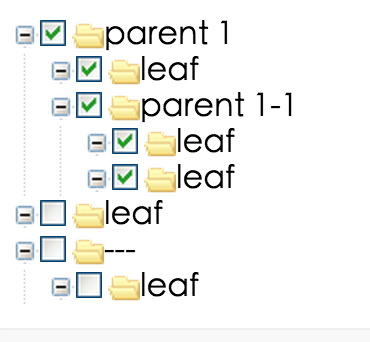
- react-checkbox-tree:
react-checkbox-tree provides limited customization primarily focused on checkbox functionality. While you can style the tree, the core behavior is centered around selection, making it less flexible than rc-tree.
- react-sortable-tree:
react-sortable-tree allows for customization of node rendering and drag-and-drop behavior, but it is primarily designed for reordering items. Customization is available but may require more effort compared to rc-tree.
- react-treebeard:
react-treebeard is designed for simplicity and ease of use, offering basic customization options for node rendering. It is less flexible than rc-tree but is quick to implement for straightforward tree structures.
User Interaction
- rc-tree:
rc-tree supports various user interactions, including drag-and-drop, selection, and context menus. This makes it suitable for applications that require rich user engagement with the tree structure.
- react-checkbox-tree:
react-checkbox-tree focuses on checkbox interactions, allowing users to select multiple nodes easily. It is ideal for scenarios where selection is the primary interaction, such as filtering or categorizing items.
- react-sortable-tree:
react-sortable-tree emphasizes drag-and-drop functionality, enabling users to reorder nodes intuitively. This interaction model is perfect for applications where the organization of items is user-driven.
- react-treebeard:
react-treebeard provides basic interactions like expanding and collapsing nodes, making it user-friendly for simple navigation through hierarchical data without complex interactions.
Performance
- rc-tree:
rc-tree is optimized for performance, supporting features like virtual scrolling and lazy loading, which are essential for handling large datasets efficiently without compromising user experience.
- react-checkbox-tree:
react-checkbox-tree performs well for moderate datasets, but may face performance issues with very large trees due to its reliance on rendering all nodes at once. It's best suited for smaller to medium-sized trees.
- react-sortable-tree:
react-sortable-tree is designed for performance with drag-and-drop functionality, but performance can degrade with very large trees if not implemented with optimizations like memoization.
- react-treebeard:
react-treebeard is lightweight and performs well for small to medium-sized trees. However, it may not handle very large datasets as efficiently as rc-tree due to its simpler architecture.
Learning Curve
- rc-tree:
rc-tree has a moderate learning curve due to its extensive features and customization options. Developers may need to invest time to understand its API and capabilities fully.
- react-checkbox-tree:
react-checkbox-tree is relatively easy to learn, especially for developers familiar with checkbox inputs. Its straightforward API allows for quick implementation in projects requiring checkbox functionality.
- react-sortable-tree:
react-sortable-tree has a moderate learning curve, particularly for implementing drag-and-drop features. Developers will need to understand how to manage state effectively for reordering items.
- react-treebeard:
react-treebeard is easy to learn and implement, making it suitable for developers looking for a simple tree structure without complex interactions or configurations.
Use Cases
- rc-tree:
rc-tree is ideal for applications that require complex tree structures with features like drag-and-drop, lazy loading, and dynamic updates, such as file explorers or hierarchical data management systems.
- react-checkbox-tree:
react-checkbox-tree is best for scenarios where users need to select multiple items from a hierarchical structure, such as category selection in e-commerce or filtering options in search interfaces.
- react-sortable-tree:
react-sortable-tree is perfect for applications that require user-driven reordering of items, such as task management apps or content organization tools.
- react-treebeard:
react-treebeard is suitable for applications needing a basic tree view for navigation or simple data representation, such as displaying organizational structures or simple category trees.


