React Native 日期选择器架构选型与对比
这四个包都旨在解决 React Native 中的日期选择问题,但实现路径截然不同。react-native-date-picker 直接调用原生组件,提供零配置的原生体验;react-native-datepicker 是早期的社区方案,目前已停止维护,不建议在新项目中使用;react-native-modal-datetime-picker 基于社区标准原生 picker 封装了模态框逻辑,提供更灵活的 UI 控制;react-native-paper-dates 则是 Material Design 设计系统的专用实现,适合深度集成 React Native Paper 的项目。
npm下载趋势
GitHub Stars 排名
统计详情


React Native 日期选择器:原生体验、维护状态与设计系统对比
在 React Native 生态中,日期选择看似简单,实则涉及原生模块调用、UI 一致性维护以及长期兼容性等多个架构层面的决策。react-native-date-picker、react-native-datepicker、react-native-modal-datetime-picker 和 react-native-paper-dates 代表了四种不同的解决思路。本文将从维护状态、渲染机制、API 设计及依赖管理四个维度进行深度对比。
🛠️ 维护状态与生命周期:新项目的首要考量
架构选型的第一原则是可持续性。一个停止维护的库会带来巨大的技术债务。
react-native-date-picker 保持活跃维护。
- 作者持续跟进 React Native 新版本。
- 适合长期投入的生产环境项目。
// react-native-date-picker: 活跃维护
import DatePicker from 'react-native-date-picker';
// 定期更新以支持新 OS 版本
react-native-datepicker 已停止维护(Deprecated)。
- 最后更新时间久远,不兼容新版 RN 架构。
- 存在安全隐患和崩溃风险,严禁用于新项目。
// react-native-datepicker: 已废弃 (Legacy)
import DatePicker from 'react-native-datepicker';
// ⚠️ 警告:不再接收安全补丁或兼容性修复
react-native-modal-datetime-picker 社区驱动,维护良好。
- 基于
@react-native-community/datetimepicker构建。 - 依赖社区标准,生命周期更有保障。
// react-native-modal-datetime-picker: 社区维护
import DateTimePickerModal from 'react-native-modal-datetime-picker';
// 跟随社区标准组件更新
react-native-paper-dates 依附于 Paper 生态。
- 随 React Native Paper 版本迭代。
- 适合 Paper 用户,独立使用则依赖过重。
// react-native-paper-dates: 生态绑定
import { DatePicker } from 'react-native-paper-dates';
// 依赖 react-native-paper 核心库
📱 渲染机制:原生控件 vs 自定义 UI
日期选择器的核心体验取决于它是调用系统原生控件还是使用 JS 绘制。
react-native-date-picker 直接渲染原生视图。
- iOS 显示
UIDatePicker,Android 显示DatePickerDialog。 - 无法通过 CSS 修改内部样式,但保证系统级流畅度。
// react-native-date-picker: 原生渲染
<DatePicker
  date={date}
  onDateChange={setDate}
  mode="date"
/>
// 直接嵌入原生组件,无模态框包裹
react-native-datepicker 早期混合实现。
- 旧版 RN 兼容方案,现已被原生模块取代。
- 在不同系统版本上表现不一致。
// react-native-datepicker: 混合渲染 (旧)
<DatePicker
  date={date}
  onDateChange={setDate}
  mode="date"
/>
// 内部实现已过时,可能调用遗留桥接代码
react-native-modal-datetime-picker 原生控件 + 自定义模态框。
- 底层调用社区原生 picker,外层用 JS 控制弹窗。
- 可自定义遮罩、按钮位置和动画。
// react-native-modal-datetime-picker: 原生 + 模态框
<DateTimePickerModal
  isVisible={visible}
  onConfirm={setDate}
  onCancel={hidePicker}
/>
// 原生内核,外层可定制 Modal 样式
react-native-paper-dates 完全遵循 Material Design。
- Android 表现原生,iOS 使用 JS 模拟 Material 风格。
- 确保跨平台视觉一致性,但 iOS 上非原生体验。
// react-native-paper-dates: 设计系统渲染
<DatePicker
  label="Select Date"
  value={date}
  onValueChange={setDate}
/>
// 输入框样式遵循 Paper 主题,弹窗可配置
🔌 API 设计与开发者体验 (DX)
API 的直观程度直接影响开发效率和出错率。
react-native-date-picker 极简主义。
- 属性少,专注于日期绑定。
- 适合快速集成,无需复杂配置。
// react-native-date-picker: 简洁 API
<DatePicker
  date={new Date()}
  onDateChange={(d) => console.log(d)}
  minimumDate={new Date(2020, 0, 1)}
/>
react-native-datepicker 旧式回调风格。
- 使用字符串日期格式,类型安全性差。
- 需要额外处理格式转换。
// react-native-datepicker: 旧式 API
<DatePicker
  date={dateStr}
  onDateChange={(d) => setDate(d)}
  format="YYYY-MM-DD"
/>
// 需要手动处理字符串与 Date 对象转换
react-native-modal-datetime-picker 显式控制可见性。
- 需要管理
isVisible状态。 - 提供更细粒度的事件控制(确认/取消)。
// react-native-modal-datetime-picker: 显式控制
<DateTimePickerModal
  isVisible={isPickerVisible}
  onConfirm={(d) => { hidePicker(); setDate(d); }}
  onCancel={hidePicker}
/>
// 需手动管理弹窗状态生命周期
react-native-paper-dates 表单集成友好。
- 类似
TextInput的 API 设计。 - 内置 Label 和错误状态支持。
// react-native-paper-dates: 表单友好
<DatePicker
  label="Birth Date"
  value={date}
  onValueChange={setDate}
  error={!isValid}
/>
// 天然支持表单验证样式和标签
📦 依赖管理与集成成本
引入第三方库意味着引入依赖树,需评估集成成本。
react-native-date-picker 零外部依赖。
- 仅依赖 React Native 核心。
- 集成简单,只需运行
pod install。
# react-native-date-picker: 依赖少
npm install react-native-date-picker
cd ios && pod install
react-native-datepicker 无额外依赖但已过时。
- 虽无依赖,但兼容成本极高。
- 可能需要修改原生代码以适配新 RN 版本。
# react-native-datepicker: 兼容成本高
npm install react-native-datepicker
# ⚠️ 可能需要在 Android/iOS 原生层进行手动修补
react-native-modal-datetime-picker 依赖社区标准库。
- 依赖
@react-native-community/datetimepicker。 - 需同时维护两个库的版本兼容性。
# react-native-modal-datetime-picker: 双重依赖
npm install react-native-modal-datetime-picker
npm install @react-native-community/datetimepicker
react-native-paper-dates 强依赖 Paper 生态。
- 必须安装
react-native-paper和react-native-vector-icons。 - 适合已使用 Paper 的项目,否则包体积增加明显。
# react-native-paper-dates: 生态依赖
npm install react-native-paper-dates
npm install react-native-paper
📊 总结对比表
| 特性 | react-native-date-picker | react-native-datepicker | react-native-modal-datetime-picker | react-native-paper-dates |
|---|---|---|---|---|
| 维护状态 | ✅ 活跃 | ❌ 已废弃 | ✅ 活跃 | ✅ 活跃 |
| UI 风格 | 系统原生 | 旧版混合 | 原生内核 + 自定义模态 | Material Design |
| iOS 体验 | 原生 UIDatePicker | 不一致 | 原生 UIDatePicker | JS 模拟 Material |
| Android 体验 | 原生 DatePickerDialog | 不一致 | 原生 DatePickerDialog | 原生/材料风格 |
| 自定义能力 | 低 | 中 | 高 (模态框) | 中 (主题配置) |
| 依赖复杂度 | 低 | 低 (但兼容难) | 中 | 高 (需 Paper) |
💡 架构师建议
react-native-date-picker 是大多数通用场景的首选 🏆。它提供了最稳定的原生体验,且没有多余的依赖负担。如果你的需求只是让用户选择一个日期,且不需要特殊的弹窗样式,这是最安全的选择。
react-native-modal-datetime-picker 适合需要统一交互流程的场景 🎨。当你需要在 picker 弹出前后执行特定逻辑,或者需要自定义弹窗底部的按钮布局时,它的封装提供了必要的灵活性。
react-native-paper-dates 是设计系统驱动项目的最佳拍伴 🎯。如果你的应用已经全面采用 Material Design,使用它可以避免样式冲突,确保视觉语言的一致性。
react-native-datepicker 应被立即淘汰 🚫。除非你正在维护一个无法升级的旧项目,否则不要在任何新代码库中引入它。技术债务的成本远高于重新集成的成本。
最终建议:优先评估 react-native-date-picker 以满足功能需求。若需深度定制 UI 或已绑定 Paper 生态,再分别考虑 react-native-modal-datetime-picker 或 react-native-paper-dates。始终避开已废弃的 react-native-datepicker。
如何选择: react-native-modal-datetime-picker vs react-native-date-picker vs react-native-paper-dates vs react-native-datepicker
- react-native-modal-datetime-picker:
选择
react-native-modal-datetime-picker如果你需要模态框交互且希望基于社区标准组件进行扩展。它在原生 picker 外层包裹了可定制的 Modal,适合需要统一弹窗样式或添加额外操作按钮的场景。 - react-native-date-picker:
选择
react-native-date-picker如果你需要最纯粹的原生体验且不希望处理复杂的模态框逻辑。它直接渲染原生 iOS/Android 控件,性能最好,适合对原生一致性要求高的项目,但自定义样式能力有限。 - react-native-paper-dates:
选择
react-native-paper-dates如果你的项目已经深度使用 React Native Paper 设计系统。它能确保日期选择器与整体 Material Design 风格完全一致,减少 UI 碎片化,但会增加对 Paper 库的依赖。 - react-native-datepicker:
切勿在新项目中选择
react-native-datepicker。该库已多年未维护,不支持新版 React Native 架构,存在兼容性风险。应将其视为遗留代码,仅在处理旧项目迁移时参考,新开发请直接评估其他替代方案。
热门对比
react-native-modal-datetime-picker的README
react-native-modal-datetime-picker


A declarative cross-platform react-native date and time picker.
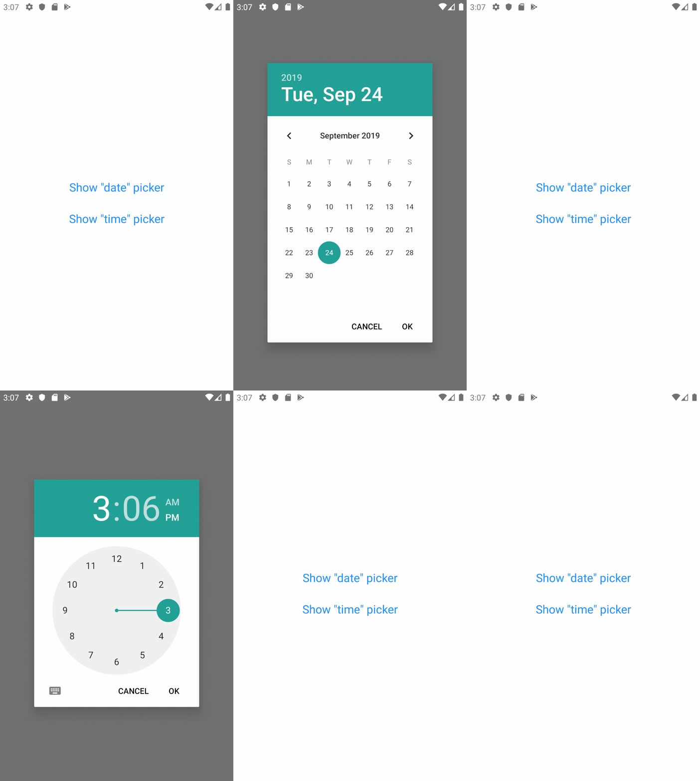
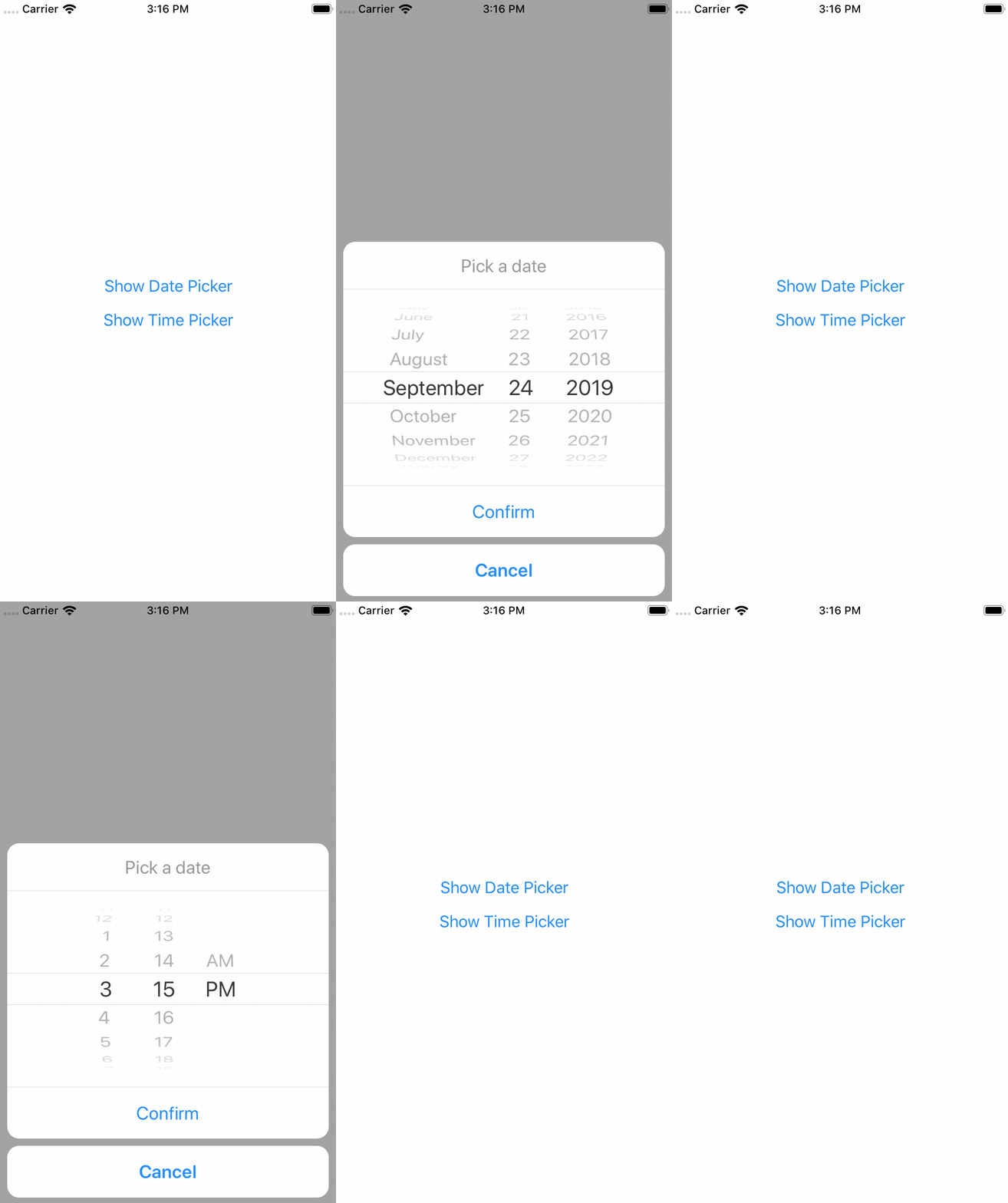
This library exposes a cross-platform interface for showing the native date-picker and time-picker inside a modal, providing a unified user and developer experience.
Under the hood, this library is using @react-native-community/datetimepicker.
Setup (for non-Expo projects)
If your project is not using Expo, install the library and the community date/time picker using npm or yarn:
# using npm
$ npm i react-native-modal-datetime-picker @react-native-community/datetimepicker

# using yarn
$ yarn add react-native-modal-datetime-picker @react-native-community/datetimepicker
Please notice that the @react-native-community/datetimepicker package is a native module so it might require manual linking.
Setup (for Expo projects)
If your project is using Expo, install the library and the community date/time picker using the Expo CLI:
npx expo install react-native-modal-datetime-picker @react-native-community/datetimepicker
To ensure the picker theme respects the device theme, you should also configure the appearance styles in your app.json this way:
{
  "expo": {
    "userInterfaceStyle": "automatic"
  }
}
Refer to the Appearance documentation on Expo for more info.
Usage
import React, { useState } from "react";
import { Button, View } from "react-native";
import DateTimePickerModal from "react-native-modal-datetime-picker";

const Example = () => {
  const [isDatePickerVisible, setDatePickerVisibility] = useState(false);

  const showDatePicker = () => {
    setDatePickerVisibility(true);
  };

  const hideDatePicker = () => {
    setDatePickerVisibility(false);
  };

  const handleConfirm = (date) => {
    console.warn("A date has been picked: ", date);
    hideDatePicker();
  };

  return (
    <View>
      <Button title="Show Date Picker" onPress={showDatePicker} />
      <DateTimePickerModal
        isVisible={isDatePickerVisible}
        mode="date"
        onConfirm={handleConfirm}
        onCancel={hideDatePicker}
      />
    </View>
  );
};

export default Example;
Available props
👉 Please notice that all the @react-native-community/react-native-datetimepicker props are supported as well!
| Name | Type | Default | Description |
|---|---|---|---|
buttonTextColorIOS | string | The color of the confirm button texts (iOS) | |
backdropStyleIOS | style | The style of the picker backdrop view style (iOS) | |
cancelButtonTestID | string | Used to locate cancel button in end-to-end tests | |
cancelTextIOS | string | "Cancel" | The label of the cancel button (iOS) |
confirmButtonTestID | string | Used to locate confirm button in end-to-end tests | |
confirmTextIOS | string | "Confirm" | The label of the confirm button (iOS) |
customCancelButtonIOS | component | Overrides the default cancel button component (iOS) | |
customConfirmButtonIOS | component | Overrides the default confirm button component (iOS) | |
customHeaderIOS | component | Overrides the default header component (iOS) | |
customPickerIOS | component | Overrides the default native picker component (iOS) | |
date | obj | new Date() | Initial selected date/time |
isVisible | bool | false | Show the datetime picker? |
isDarkModeEnabled | bool? | undefined | Forces the picker dark/light mode if set (otherwise fallbacks to the Appearance color scheme) (iOS) |
modalPropsIOS | object | {} | Additional modal props for iOS |
modalStyleIOS | style | Style of the modal content (iOS) | |
mode | string | "date" | Choose between "date", "time", and "datetime" |
onCancel | func | REQUIRED | Function called on dismiss |
onChange | func | () => null | Function called when the date changes (with the new date as parameter). |
onConfirm | func | REQUIRED | Function called on date or time picked. It returns the date or time as a JavaScript Date object |
onHide | func | () => null | Called after the hide animation |
pickerContainerStyleIOS | style | The style of the picker container (iOS) | |
pickerStyleIOS | style | The style of the picker component wrapper (iOS) | |
pickerComponentStyleIOS | style | The style applied to the actual picker component - this can be either a native iOS picker or a custom one if customPickerIOS was provided |
Frequently Asked Questions
This repo is only maintained by me, and unfortunately I don't have enough time for dedicated support & question.
If you're experiencing issues, please check the FAQs below.
For questions and support, please start try starting a discussion or try asking it on StackOverflow.
⚠️ Please use the GitHub issues only for well-described and reproducible bugs. Question/support issues will be closed.
The component is not working as expected, what should I do?
Under the hood react-native-modal-datetime-picker uses @react-native-community/datetimepicker.
If you're experiencing issues, try swapping react-native-datetime-picker with @react-native-community/datetimepicker. If the issue persists, check if it has already been reported as a an issue or check the other FAQs.
How can I show the timepicker instead of the datepicker?
Set the mode prop to time.
You can also display both the datepicker and the timepicker in one step by setting the mode prop to datetime.
Why is the initial date not working?
Please make sure you're using the date props (and not the value one).
Can I use the new iOS 14 style for the date/time picker?
Yes!
You can set the display prop (that we'll pass down to react-native-datetimepicker) to inline to use the new iOS 14 picker.
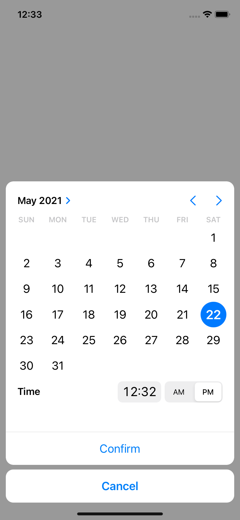
Please notice that you should probably avoid using this new style with a time-only picker (so with
modeset totime) because it doesn't suit well this use case.
Why does the picker show up twice on Android?
This seems to be a known issue of the @react-native-community/datetimepicker. Please see this thread for a couple of workarounds. The solution, as described in this reply is hiding the modal, before doing anything else.
Example of solution using Input + DatePicker
The most common approach for solving this issue when using an Input is:
- Wrap your
Inputwith a "Pressable"/Button(TouchableWithoutFeedback/TouchableOpacity+activeOpacity={1}for example) - Prevent
Inputfrom being focused. You could seteditable={false}too for preventing Keyboard opening - Triggering your
hideModal()callback as a first thing insideonConfirm/onCancelcallback props
const [isVisible, setVisible] = useState(false);
const [date, setDate] = useState('');

<TouchableOpacity
  activeOpacity={1}
  onPress={() => setVisible(true)}>
  <Input
    value={value}
    editable={false} // optional
  />
</TouchableOpacity>
<DatePicker
  isVisible={isVisible}
  onConfirm={(date) => {
    setVisible(false); // <- first thing
    setValue(parseDate(date));
  }}
  onCancel={() => setVisible(false)}
/>
How can I allow picking only specific dates?
You can't — @react-native-community/datetimepicker doesn't allow you to do so. That said, you can allow only "range" of dates by setting a minimum and maximum date. See below for more info.
How can I set a minimum and/or maximum date?
You can use the minimumDate and maximumDate props from @react-native-community/datetimepicker.
How do I change the color of the Android date and time pickers?
This is more a React-Native specific question than a react-native-modal-datetime-picker one.
See issue #29 and #106 for some solutions.
How to set a 24-hours format in iOS?
The is24Hour prop is only available on Android but you can use a small hack for enabling it on iOS by setting the picker timezone to en_GB:
<DatePicker
  mode="time"
  locale="en_GB" // Use "en_GB" here
  date={new Date()}
/>
How can I change the picker language/locale?
Under the hood this library is using @react-native-community/datetimepicker. You can't change the language/locale from react-native-modal-datetime-picker. Locale/language is set at the native level, on the device itself.
How can I set an automatic locale in iOS?
On iOS, you can set an automatic detection of the locale (fr_FR, en_GB, ...) depending on the user's device locale.
To do so, edit your AppDelegate.m file and add the following to didFinishLaunchingWithOptions.
// Force DatePicker locale to current language (for: 24h or 12h format, full day names etc...)
NSString *currentLanguage = [[NSLocale preferredLanguages] firstObject];
[[UIDatePicker appearance] setLocale:[[NSLocale alloc]initWithLocaleIdentifier:currentLanguage]];
Why is the picker is not showing the right layout on iOS >= 14?
Please make sure you're on the latest version of react-native-modal-datetime-picker and of the @react-native-community/datetimepicker.
We already closed several iOS 14 issues that were all caused by outdated/cached versions of the community datetimepicker.
Why is the picker not visible/transparent on iOS?
Please make sure you're on the latest version of react-native-modal-datetime-picker and of @react-native-community/datetimepicker.
Also, double-check that the picker light/dark theme is aligned with the OS one (e.g., don't "force" a theme using isDarkModeEnabled).
Why can't I show an alert after the picker has been hidden (on iOS)?
Unfortunately this is a know issue with React-Native on iOS. Even by using the onHide callback exposed by react-native-modal-datetime-picker you might not be able to show the (native) alert successfully. The only workaround that seems to work consistently for now is to wrap showing the alter in a setTimeout 😔:
const handleHide = () => {
  setTimeout(() => Alert.alert("Hello"), 0);
};
See issue #512 for more info.
Why does the date of onConfirm not match the picked date (on iOS)?
On iOS, clicking the "Confirm" button while the spinner is still in motion — even just slightly in motion — will cause the onConfirm callback to return the initial date instead of the picked one. This is is a long standing iOS issue (that can happen even on native app like the iOS calendar) and there's no failproof way to fix it on the JavaScript side.
See this GitHub gist for an example of how it might be solved at the native level — but keep in mind it won't work on this component until it has been merged into the official React-Native repo.
Related issue in the React-Native repo here.
How do I make it work with snapshot testing?
See issue #216 for a possible workaround.
Contributing
Please see the contributing guide.
License
The library is released under the MIT license. For more details see LICENSE.