React 与 React Native 日期选择器库的技术选型对比
react-calendar、react-datepicker 和 react-datetime 是专为 Web 端 React 应用设计的日期选择组件,提供日历视图、日期范围选择及时间输入功能。react-native-date-picker、react-native-datepicker 和 react-native-modal-datetime-picker 则是针对 React Native 移动端的解决方案,利用原生 iOS 和 Android 的日期选择器控件或模态框界面。这些库旨在解决跨平台日期输入的一致性问题,同时处理时区、格式化和本地化等复杂场景。
npm下载趋势
GitHub Stars 排名
统计详情


React 与 React Native 日期选择器库:架构、体验与维护性深度对比
在构建涉及日期输入的应用时,选择合适的库直接影响用户体验和代码维护成本。Web 端和移动端(React Native)的生态完全不同,因此我们将这六个包分为两组进行对比:Web 组(react-calendar、react-datepicker、react-datetime)和 Native 组(react-native-date-picker、react-native-datepicker、react-native-modal-datetime-picker)。让我们从实际工程角度看看它们的区别。
🗂️ 核心架构:纯组件 vs 原生模块
Web 组 全部基于 React DOM 实现,通过 CSS 和 JavaScript 模拟日历行为。
react-calendar 是一个纯 React 组件,不依赖外部弹窗库,渲染逻辑完全由你控制。
// react-calendar: 纯组件,需自行管理状态
import Calendar from 'react-calendar';

function MyApp() {
  const [value, onChange] = useState(new Date());
  return <Calendar onChange={onChange} value={value} />;
}
react-datepicker 封装了输入框和弹窗,内部依赖 Popper.js 定位。
// react-datepicker: 封装输入框 + 弹窗
import DatePicker from 'react-datepicker';

function MyApp() {
  const [startDate, setStartDate] = useState(new Date());
  return <DatePicker selected={startDate} onChange={date => setStartDate(date)} />;
}
react-datetime 类似 react-datepicker,但已停止维护,结构较旧。
// react-datetime: 旧式封装(不推荐)
import Datetime from 'react-datetime';

function MyApp() {
  return <Datetime />;
}
Native 组 则涉及桥接原生代码或使用原生控件。
react-native-date-picker 直接调用原生 iOS/Android 的 UIDatePicker 和 DatePickerDialog。
// react-native-date-picker: 原生控件
import DatePicker from 'react-native-date-picker';

function MyApp() {
  const [date, setDate] = useState(new Date());
  return <DatePicker date={date} onDateChange={setDate} />;
}
react-native-modal-datetime-picker 基于社区通用组件,通过模态框展示。
// react-native-modal-datetime-picker: 模态框封装
import DateTimePickerModal from 'react-native-modal-datetime-picker';

function MyApp() {
  const [visible, setVisible] = useState(false);
  return <DateTimePickerModal isVisible={visible} onConfirm={setVisible} />;
}
react-native-datepicker 是过时的原生封装,接口已不兼容新版 RN。
// react-native-datepicker: 过时原生封装(不推荐)
import DatePicker from 'react-native-datepicker';

function MyApp() {
  return <DatePicker date={new Date()} />;
}
🎨 UI 定制能力:CSS 覆盖 vs 原生限制
react-calendar 提供详细的类名,允许通过 CSS 完全重写样式。
/* react-calendar: 深度样式定制 */
.react-calendar__tile--now { background: #ff0000; }
.react-calendar__tile--active { color: #ffffff; }
react-datepicker 支持 calendarClassName 属性,但内部结构复杂,覆盖样式较难。
// react-datepicker: 类名注入
<DatePicker calendarClassName="custom-calendar" />;
react-native-date-picker 的样式受限于原生系统,仅支持少量属性如 theme。
// react-native-date-picker: 有限主题支持
<DatePicker theme="dark" />;
react-native-modal-datetime-picker 允许通过 pickerStyleIOS 等属性调整模态框外观。
// react-native-modal-datetime-picker: 模态框样式
<DateTimePickerModal pickerStyleIOS={{ height: 200 }} />;
📅 功能特性:范围选择与时间精度
react-calendar 原生支持日期范围选择(selectRange)。
// react-calendar: 范围选择
<Calendar selectRange={true} onChange={range => console.log(range)} />;
react-datepicker 通过 selectsStart 和 selectsEnd 实现范围选择。
// react-datepicker: 范围选择配置
<DatePicker selectsStart startDate={start} endDate={end} />;
<DatePicker selectsEnd startDate={start} endDate={end} />;
react-native-date-picker 支持分钟级精度配置(minuteInterval)。
// react-native-date-picker: 时间精度
<DatePicker minuteInterval={5} mode="time" />;
react-native-modal-datetime-picker 同样支持 minuteInterval,但依赖底层实现。
// react-native-modal-datetime-picker: 时间精度
<DateTimePickerModal minuteInterval={5} mode="time" />;
⚠️ 维护状态与风险提示
react-datetime 和 react-native-datepicker 已明确不再维护。
react-datetime: 最后更新停留在数年前,存在未修复的 XSS 风险,不支持 React 18 并发特性。react-native-datepicker: 不兼容 React Native 0.60+ 的自动链接机制,在新项目中会导致构建错误。
建议:如果当前项目正在使用这两个库,请制定迁移计划。Web 端迁移至 react-datepicker,移动端迁移至 react-native-date-picker。
🌐 本地化与时区处理
react-calendar 依赖外部 locale 文件,需手动导入。
// react-calendar: 手动导入语言包
import 'react-calendar/dist/Calendar.css';
import { registerLocale } from 'react-datepicker'; // 注意:此处示例需修正为 react-calendar 的 locale 导入
// 正确示例:
// import 'react-calendar/dist/Calendar.css';
// 需配合 date-fns 或其他库处理 locale
(注:react-calendar 通常配合 locale 属性使用,具体依赖版本)
react-datepicker 内置 registerLocale,集成 date-fns 方便。
// react-datepicker: 内置本地化
import { registerLocale } from 'react-datepicker';
import { zhCN } from 'date-fns/locale';
registerLocale('zh-cn', zhCN);
<DatePicker locale="zh-cn" />;
react-native-date-picker 自动跟随系统语言,也可强制指定 locale。
// react-native-date-picker: 系统跟随或强制
<DatePicker locale="zh-CN" />;
🤝 相似之处:核心交互模式
尽管平台不同,这些库在核心交互上有一致性:
1. 受控组件模式
所有库都支持通过 value/date 和 onChange 属性进行受控管理。
// 所有库通用模式
<Component value={state} onChange={setState} />;
2. 禁用日期逻辑
都提供 minDate、maxDate 或 filterDate 来限制可选范围。
// react-datepicker
<DatePicker minDate={new Date()} />;

// react-calendar
<Calendar minDate={new Date()} />;

// react-native-date-picker
<DatePicker minimumDate={new Date()} />;
3. 无障碍支持
Web 端库均支持键盘导航,移动端库支持系统读屏。
// react-datepicker: 键盘支持
<DatePicker onKeyDown={handleKey} />;

// react-native-date-picker: 原生无障碍
// 自动继承系统无障碍属性
📊 总结:关键差异对比
| 特性 | react-calendar | react-datepicker | react-datetime |
|---|---|---|---|
| 平台 | Web | Web | Web |
| 维护状态 | ✅ 活跃 | ✅ 活跃 | ❌ 停止维护 |
| UI 控制 | 高(纯组件) | 中(封装弹窗) | 低(旧架构) |
| 依赖 | 无 | Popper.js, date-fns | Moment.js (旧) |
| 特性 | react-native-date-picker | react-native-modal... | react-native-datepicker |
|---|---|---|---|
| 平台 | Native | Native | Native |
| 维护状态 | ✅ 活跃 | ✅ 活跃 | ❌ 停止维护 |
| 控件类型 | 原生系统控件 | 社区模态框 | 旧原生控件 |
| 配置难度 | 中(需原生配置) | 低(JS 配置) | 高(兼容性问题) |
💡 架构师建议
Web 端:
- 选择
react-calendar如果你需要构建复杂的日期范围选择器(如酒店预订、报表筛选),且设计团队要求高度定制 UI。 - 选择
react-datepicker如果是标准表单场景(如注册生日、简单日期筛选),希望快速落地且不需要深度定制样式。 - 避免 使用
react-datetime,技术债务成本过高。
移动端:
- 选择
react-native-date-picker如果应用追求原生性能和外观,且团队有能力处理原生链接配置。 - 选择
react-native-modal-datetime-picker如果需要统一的跨平台模态体验,或者原生控件无法满足设计稿要求。 - 避免 使用
react-native-datepicker,它已成为历史遗留问题。
最终思考:日期组件看似简单,实则涉及时区、本地化、无障碍和原生交互等复杂细节。选择维护活跃、社区支持良好的库,能在长期迭代中节省大量调试时间。
如何选择: react-calendar vs react-datepicker vs react-datetime vs react-native-date-picker vs react-native-datepicker vs react-native-modal-datetime-picker
- react-calendar:
如果你需要一个高度可定制、无依赖的纯 React 日历组件,
react-calendar是最佳选择。它专注于日历视图本身,不强制绑定特定的输入框样式,适合需要嵌入复杂日期范围选择或自定义 UI 的场景。该库维护活跃,API 稳定,适合对 UI 控制要求较高的企业级后台系统。 - react-datepicker:
当你需要一个开箱即用、包含输入框和弹窗的完整日期选择器时,选择
react-datepicker。它在社区中非常流行,支持时间选择、日期范围及多种语言,适合快速构建标准表单。如果项目依赖 Popper.js 进行弹窗定位且需要丰富的配置项,这个库能减少大量样板代码。 - react-datetime:
仅在不维护的旧项目中遇到此库时考虑保留,新项目中不建议使用。
react-datetime已停止维护,缺乏对现代 React 特性(如 Hooks)的原生支持,且存在已知安全问题。如果必须使用类似功能,建议迁移至react-datepicker或react-calendar以获得长期支持。 - react-native-date-picker:
如果你的 React Native 应用需要调用原生 iOS 和 Android 系统自带的日期选择器,
react-native-date-picker是首选。它提供最佳的原生体验和性能,支持分钟级精度和多种模式(日期、时间、日期时间)。适合追求原生外观和流畅交互的移动应用,但需注意原生链接配置。 - react-native-datepicker:
避免在新项目中使用
react-native-datepicker,该库已过时且不再维护。它基于旧的 React Native 架构,可能在新版本 RN 中无法正常工作,且缺乏对现代 Android/iOS 系统的支持。建议立即评估迁移到react-native-date-picker或react-native-modal-datetime-picker。 - react-native-modal-datetime-picker:
如果你希望使用 React Native 社区通用的模态框样式而非原生控件,选择
react-native-modal-datetime-picker。它基于@react-native-community/datetimepicker,提供统一的跨平台模态体验,配置灵活且易于定制主题。适合需要统一 UI 风格或原生控件无法满足设计需求的场景。
热门对比
react-calendar的README



react-calendar
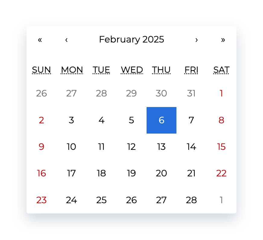
Ultimate calendar for your React app.
- Pick days, months, years, or even decades
- Supports range selection
- Supports virtually any language
- No moment.js needed
tl;dr
- Install by executing
npm install react-calendaroryarn add react-calendar. - Import by adding
import Calendar from 'react-calendar'. - Use by adding
<Calendar />. UseonChangeprop for getting new values.
Demo
A minimal demo page can be found in sample directory.
Online demo is also available!
Before you continue
react-calendar is under constant development. This documentation is written for react-calendar 4.x branch. If you want to see documentation for other versions of react-calendar, use dropdown on top of GitHub page to switch to an appropriate tag. Here are quick links to the newest docs from each branch:
Getting started
Compatibility
Your project needs to use React 16.8 or later.
react-calendar uses modern web technologies. That's why it's so fast, lightweight and easy to style. This, however, comes at a cost of supporting only modern browsers.
My locale isn't supported! What can I do?
If your locale isn't supported, you can use Intl.js or another Intl polyfill along with react-calendar.
Installation
Add react-calendar to your project by executing npm install react-calendar or yarn add react-calendar.
Usage
Here's an example of basic usage:
import { useState } from 'react';
import Calendar from 'react-calendar';

type ValuePiece = Date | null;

type Value = ValuePiece | [ValuePiece, ValuePiece];

function MyApp() {
  const [value, onChange] = useState<Value>(new Date());

  return (
    <div>
      <Calendar onChange={onChange} value={value} />
    </div>
  );
}
Check the sample directory in this repository for a full working example. For more examples and more advanced use cases, check Recipes in react-calendar Wiki.
Custom styling
If you want to use default react-calendar styling to build upon it, you can import react-calendar's styles by using:
import 'react-calendar/dist/Calendar.css';
User guide
Calendar
Displays a complete, interactive calendar.
Props
| Prop name | Description | Default value | Example values |
|---|---|---|---|
| activeStartDate | The beginning of a period that shall be displayed. If you wish to use react-calendar in an uncontrolled way, use defaultActiveStartDate instead. | (today) | new Date(2017, 0, 1) |
| allowPartialRange | Whether to call onChange with only partial result given selectRange prop. | false | true |
| calendarType | Type of calendar that should be used. Can be 'gregory, 'hebrew', 'islamic', 'iso8601'. Setting to "gregory" or "hebrew" will change the first day of the week to Sunday. Setting to "islamic" will change the first day of the week to Saturday. Setting to "islamic" or "hebrew" will make weekends appear on Friday to Saturday. | Type of calendar most commonly used in a given locale | 'iso8601' |
| className | Class name(s) that will be added along with "react-calendar" to the main react-calendar <div> element. | n/a |
|
| data-testid | The test ID used for testing purposes. | n/a | 'calendar' |
| defaultActiveStartDate | The beginning of a period that shall be displayed by default. If you wish to use react-calendar in a controlled way, use activeStartDate instead. | (today) | new Date(2017, 0, 1) |
| defaultValue | Calendar value that shall be selected initially. Can be either one value or an array of two values. If you wish to use react-calendar in a controlled way, use value instead. | n/a |
|
| defaultView | Determines which calendar view shall be opened initially. Does not disable navigation. Can be "month", "year", "decade" or "century". If you wish to use react-calendar in a controlled way, use view instead. | The most detailed view allowed | "year" |
| formatDay | Function called to override default formatting of day tile labels. Can be used to use your own formatting function. | (default formatter) | (locale, date) => formatDate(date, 'd') |
| formatLongDate | Function called to override default formatting of day tile abbr labels. Can be used to use your own formatting function. | (default formatter) | (locale, date) => formatDate(date, 'dd MMM YYYY') |
| formatMonth | Function called to override default formatting of month names. Can be used to use your own formatting function. | (default formatter) | (locale, date) => formatDate(date, 'MMM') |
| formatMonthYear | Function called to override default formatting of months and years. Can be used to use your own formatting function. | (default formatter) | (locale, date) => formatDate(date, 'MMMM YYYY') |
| formatShortWeekday | Function called to override default formatting of weekday names (shortened). Can be used to use your own formatting function. | (default formatter) | (locale, date) => formatDate(date, 'dd') |
| formatWeekday | Function called to override default formatting of weekday names. Can be used to use your own formatting function. | (default formatter) | (locale, date) => formatDate(date, 'dd') |
| formatYear | Function called to override default formatting of year in the top navigation section. Can be used to use your own formatting function. | (default formatter) | (locale, date) => formatDate(date, 'YYYY') |
| goToRangeStartOnSelect | Whether to go to the beginning of the range when selecting the end of the range. | true | false |
| inputRef | A prop that behaves like ref, but it's passed to main <div> rendered by <Calendar> component. | n/a |
|
| locale | Locale that should be used by the calendar. Can be any IETF language tag. Note: When using SSR, setting this prop may help resolving hydration errors caused by locale mismatch between server and client. | Server locale/User's browser settings | "hu-HU" |
| maxDate | Maximum date that the user can select. Periods partially overlapped by maxDate will also be selectable, although react-calendar will ensure that no later date is selected. | n/a | Date: new Date() |
| maxDetail | The most detailed view that the user shall see. View defined here also becomes the one on which clicking an item will select a date and pass it to onChange. Can be "month", "year", "decade" or "century". | "month" | "year" |
| minDate | Minimum date that the user can select. Periods partially overlapped by minDate will also be selectable, although react-calendar will ensure that no earlier date is selected. | n/a | Date: new Date() |
| minDetail | The least detailed view that the user shall see. Can be "month", "year", "decade" or "century". | "century" | "decade" |
| navigationAriaLabel | aria-label attribute of a label rendered on calendar navigation bar. | n/a | "Go up" |
| navigationAriaLive | aria-live attribute of a label rendered on calendar navigation bar. | undefined | "polite" |
| navigationLabel | Content of a label rendered on calendar navigation bar. | (default label) | ({ date, label, locale, view }) => alert(`Current view: ${view}, date: ${date.toLocaleDateString(locale)}`) |
| next2AriaLabel | aria-label attribute of the "next on higher level" button on the navigation pane. | n/a | "Jump forwards" |
| next2Label | Content of the "next on higher level" button on the navigation pane. Setting the value explicitly to null will hide the icon. | "»" |
|
| nextAriaLabel | aria-label attribute of the "next" button on the navigation pane. | n/a | "Next" |
| nextLabel | Content of the "next" button on the navigation pane. Setting the value explicitly to null will hide the icon. | "›" |
|
| onActiveStartDateChange | Function called when the user navigates from one view to another using previous/next button. Note that this function will not be called when e.g. drilling up from January 2021 to 2021 or drilling down the other way around.action signifies the reason for active start date change and can be one of the following values: "prev", "prev2", "next", "next2", "drillUp", "drillDown", "onChange". | n/a | ({ action, activeStartDate, value, view }) => alert('Changed view to: ', activeStartDate, view) |
| onChange | Function called when the user clicks an item (day on month view, month on year view and so on) on the most detailed view available. | n/a | (value, event) => alert('New date is: ', value) |
| onClickDay | Function called when the user clicks a day. | n/a | (value, event) => alert('Clicked day: ', value) |
| onClickDecade | Function called when the user clicks a decade. | n/a | (value, event) => alert('Clicked decade: ', value) |
| onClickMonth | Function called when the user clicks a month. | n/a | (value, event) => alert('Clicked month: ', value) |
| onClickWeekNumber | Function called when the user clicks a week number. | n/a | (weekNumber, date, event) => alert('Clicked week: ', weekNumber, 'that starts on: ', date) |
| onClickYear | Function called when the user clicks a year. | n/a | (value, event) => alert('Clicked year: ', value) |
| onDrillDown | Function called when the user drills down by clicking a tile. | n/a | ({ activeStartDate, view }) => alert('Drilled down to: ', activeStartDate, view) |
| onDrillUp | Function called when the user drills up by clicking drill up button. | n/a | ({ activeStartDate, view }) => alert('Drilled up to: ', activeStartDate, view) |
| onViewChange | Function called when the user navigates from one view to another using drill up button or by clicking a tile.action signifies the reason for view change and can be one of the following values: "prev", "prev2", "next", "next2", "drillUp", "drillDown", "onChange". | n/a | ({ action, activeStartDate, value, view }) => alert('New view is: ', view) |
| prev2AriaLabel | aria-label attribute of the "previous on higher level" button on the navigation pane. | n/a | "Jump backwards" |
| prev2Label | Content of the "previous on higher level" button on the navigation pane. Setting the value explicitly to null will hide the icon. | "«" |
|
| prevAriaLabel | aria-label attribute of the "previous" button on the navigation pane. | n/a | "Previous" |
| prevLabel | Content of the "previous" button on the navigation pane. Setting the value explicitly to null will hide the icon. | "‹" |
|
| returnValue | Which dates shall be passed by the calendar to the onChange function and onClick{Period} functions. Can be "start", "end" or "range". The latter will cause an array with start and end values to be passed. | "start" | "range" |
| selectRange | Whether the user shall select two dates forming a range instead of just one. Note: This feature will make react-calendar return array with two dates regardless of returnValue setting. | false | true |
| showDoubleView | Whether to show two months/years/… at a time instead of one. Defaults showFixedNumberOfWeeks prop to be true. | false | true |
| showFixedNumberOfWeeks | Whether to always show fixed number of weeks (6). Forces showNeighboringMonth prop to be true. | false | true |
| showNavigation | Whether a navigation bar with arrows and title shall be rendered. | true | false |
| showNeighboringCentury | Whether decades from next century shall be rendered to fill the entire last row in. | false | true |
| showNeighboringDecade | Whether years from next decade shall be rendered to fill the entire last row in. | false | true |
| showNeighboringMonth | Whether days from previous or next month shall be rendered if the month doesn't start on the first day of the week or doesn't end on the last day of the week, respectively. | true | false |
| showWeekNumbers | Whether week numbers shall be shown at the left of MonthView or not. | false | true |
| tileClassName | Class name(s) that will be applied to a given calendar item (day on month view, month on year view and so on). | n/a |
|
| tileContent | Allows to render custom content within a given calendar item (day on month view, month on year view and so on). | n/a |
|
| tileDisabled | Pass a function to determine if a certain day should be displayed as disabled. | n/a | ({ activeStartDate, date, view }) => date.getDay() === 0 |
| value | Calendar value. Can be either one value or an array of two values. If you wish to use react-calendar in an uncontrolled way, use defaultValue instead. | n/a |
|
| view | Determines which calendar view shall be opened. Does not disable navigation. Can be "month", "year", "decade" or "century". If you wish to use react-calendar in an uncontrolled way, use defaultView instead. | The most detailed view allowed | "year" |
MonthView, YearView, DecadeView, CenturyView
Displays a given month, year, decade and a century, respectively.
Props
| Prop name | Description | Default value | Example values |
|---|---|---|---|
| activeStartDate | The beginning of a period that shall be displayed. | n/a | new Date(2017, 0, 1) |
| hover | The date over which the user is hovering. Used only when selectRange is enabled, to render a “WIP” range when the user is selecting range. | n/a | new Date(2017, 0, 1) |
| maxDate | Maximum date that the user can select. Periods partially overlapped by maxDate will also be selectable, although react-calendar will ensure that no later date is selected. | n/a | Date: new Date() |
| minDate | Minimum date that the user can select. Periods partially overlapped by minDate will also be selectable, although react-calendar will ensure that no earlier date is selected. | n/a | Date: new Date() |
| onClick | Function called when the user clicks an item (day on month view, month on year view and so on). | n/a | (value) => alert('New date is: ', value) |
| tileClassName | Class name(s) that will be applied to a given calendar item (day on month view, month on year view and so on). | n/a |
|
| tileContent | Allows to render custom content within a given item (day on month view, month on year view and so on). Note: For tiles with custom content you might want to set fixed height of react-calendar__tile to ensure consistent layout. | n/a | ({ date, view }) => view === 'month' && date.getDay() === 0 ? <p>It's Sunday!</p> : null |
| value | Calendar value. Can be either one value or an array of two values. | n/a |
|
Useful links
License
The MIT License.
Author

| Wojciech Maj |
Thank you
Sponsors
Thank you to all our sponsors! Become a sponsor and get your image on our README on GitHub.

Backers
Thank you to all our backers! Become a backer and get your image on our README on GitHub.

Top Contributors
Thank you to all our contributors that helped on this project!