Design Principles
- antd:
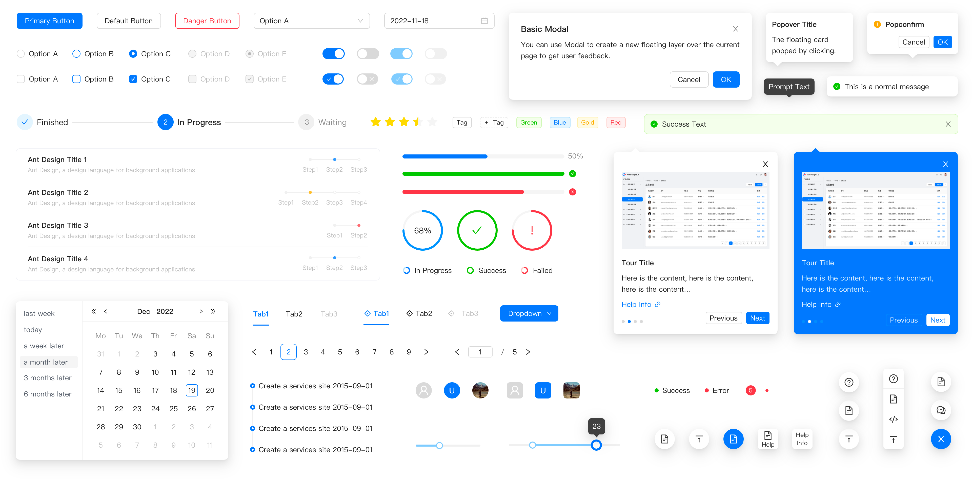
Ant Design is centered around a design system that emphasizes enterprise-level applications. It provides a cohesive set of components that adhere to a specific design language, ensuring consistency and ease of use in complex applications.
- react-bootstrap:
React Bootstrap integrates Bootstrap's design principles into React, allowing developers to create responsive, mobile-first applications. It retains Bootstrap's grid system and utility classes, making it easy to build layouts that adapt to various screen sizes.
- @material-ui/core:
Material-UI is built on Google's Material Design principles, promoting a clean, modern aesthetic with a focus on usability and accessibility. It provides a consistent design language across components, making it easy to create visually appealing applications.
- @blueprintjs/core:
Blueprint follows a design philosophy that emphasizes clarity and usability, particularly for complex interfaces. It offers a set of components that are optimized for desktop applications, focusing on data visualization and interaction.
Component Variety
- antd:
Ant Design features a large selection of high-quality components tailored for enterprise applications, including advanced form controls, data visualization tools, and layout components, making it suitable for complex user interfaces.
- react-bootstrap:
React Bootstrap provides a set of essential Bootstrap components, including modals, tooltips, and carousels. While it may not have as extensive a component library as others, it effectively covers the basics needed for responsive design.
- @material-ui/core:
Material-UI boasts a comprehensive library of components, from basic buttons to advanced data grids. It provides a rich set of customizable components that can be easily styled and extended to fit various use cases.
- @blueprintjs/core:
Blueprint offers a wide range of components specifically designed for building complex UIs, including tables, forms, and menus. It excels in providing components that handle intricate data interactions and visualizations.
Customization
- antd:
Ant Design provides a robust theming capability, allowing developers to customize the design tokens and styles globally or per component. This flexibility is essential for enterprise applications that require adherence to specific branding guidelines.
- react-bootstrap:
React Bootstrap allows for customization through Bootstrap's utility classes and custom CSS. While it may not offer as much flexibility as others, it is straightforward for developers familiar with Bootstrap.
- @material-ui/core:
Material-UI offers a powerful theming system that allows developers to customize the appearance of components easily. It supports CSS-in-JS styling, enabling dynamic styling based on component state.
- @blueprintjs/core:
Blueprint allows for extensive customization of components through theming and style overrides, making it suitable for applications that require a unique look and feel while maintaining usability.
Learning Curve
- antd:
Ant Design has a steeper learning curve due to its comprehensive component set and design system. Developers may need time to understand its conventions and best practices, especially for enterprise-level applications.
- react-bootstrap:
React Bootstrap is easy to pick up for developers already familiar with Bootstrap. Its straightforward integration of Bootstrap components into React makes it an excellent choice for quick development.
- @material-ui/core:
Material-UI is relatively easy to learn for those familiar with React. Its clear documentation and adherence to Material Design principles make it accessible for new developers, while still offering depth for advanced users.
- @blueprintjs/core:
Blueprint has a moderate learning curve, especially for developers unfamiliar with its component structure and the intricacies of building complex UIs. However, once familiar, it offers powerful tools for data-heavy applications.
Community and Support
- antd:
Ant Design has a strong community, particularly in the enterprise space, with extensive documentation and resources available. Its popularity in Asia contributes to a wealth of shared knowledge and examples.
- react-bootstrap:
React Bootstrap benefits from the large Bootstrap community, providing ample resources, tutorials, and third-party plugins. Its familiarity among developers ensures a supportive environment for troubleshooting.
- @material-ui/core:
Material-UI has a large and active community, providing extensive documentation, tutorials, and third-party resources. This support makes it easier for developers to find solutions and best practices.
- @blueprintjs/core:
Blueprint has a growing community, but it is smaller compared to others. Documentation is comprehensive, but community support may be limited, making it essential to rely on official resources for troubleshooting.


