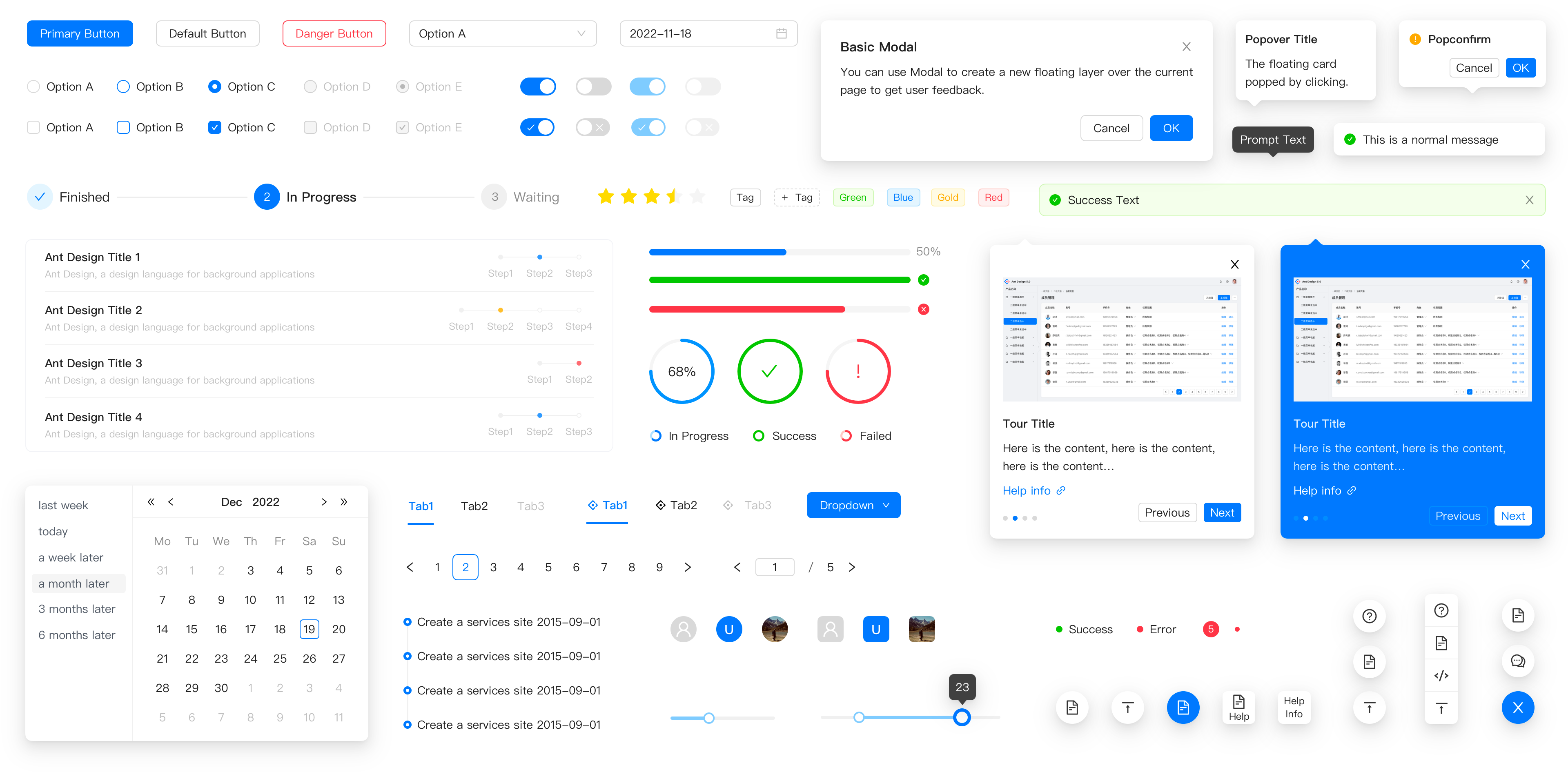
Enterprise UI Component Libraries for React Applications
antd, bootstrap, material-ui, and semantic-ui-react are all popular UI component libraries that provide pre-built, styled components to accelerate frontend development in React applications. antd is a comprehensive design system based on Ant Design principles, offering rich data-intensive components like tables and forms. bootstrap (via react-bootstrap) brings the familiar Bootstrap CSS framework into the React ecosystem with wrapper components. material-ui (now commonly known as MUI) implements Google's Material Design guidelines with a focus on customization and theming. semantic-ui-react is the official React integration for Semantic UI, emphasizing human-friendly HTML and declarative APIs. Each library targets different design philosophies and use cases, from enterprise dashboards to marketing sites.
Npm Package Weekly Downloads Trend
Github Stars Ranking
Stat Detail
Enterprise UI Component Libraries: antd vs Bootstrap vs Material-UI vs Semantic UI React
When building professional React applications, choosing the right UI component library can dramatically affect development velocity, design consistency, and long-term maintainability. Let’s compare these four major players across key technical dimensions that matter to experienced developers.
🎨 Design Philosophy and Customization
antd follows Ant Design principles — a design system created by Alibaba focused on enterprise applications. It provides a cohesive, opinionated aesthetic optimized for data-heavy interfaces.
// antd: Built-in theme variables and ConfigProvider
import { ConfigProvider, Button } from 'antd';

<ConfigProvider
  theme={{
    token: {
      colorPrimary: '#1890ff',
      borderRadius: 6,
    },
  }}
>
  <Button type="primary">Submit</Button>
</ConfigProvider>
bootstrap (via react-bootstrap) uses Bootstrap’s utility-first CSS framework under the hood. Customization happens through Sass variables or CSS overrides rather than a JavaScript theming system.
// react-bootstrap: Standard Bootstrap classes with React components
import { Button } from 'react-bootstrap';

<Button variant="primary" className="rounded-pill px-4">
  Submit
</Button>
material-ui implements Google’s Material Design with a powerful theme engine that lets you customize every aspect of the design system programmatically.
// material-ui: Theme customization with createTheme
import { ThemeProvider, createTheme, Button } from '@mui/material';

const theme = createTheme({
  palette: {
    primary: { main: '#1976d2' },
  },
  shape: { borderRadius: 8 },
});

<ThemeProvider theme={theme}>
  <Button variant="contained">Submit</Button>
</ThemeProvider>
semantic-ui-react emphasizes human-friendly, semantic class names and readable HTML structure. Theming is done through CSS/LESS files rather than JavaScript configuration.
// semantic-ui-react: Declarative props and semantic classes
import { Button } from 'semantic-ui-react';

<Button primary circular size="large">
  Submit
</Button>
📊 Data-Intensive Components
For applications dealing with complex data displays, component richness matters significantly.
antd shines with enterprise-grade components like advanced tables with built-in sorting, filtering, pagination, and row selection.
// antd: Advanced Table with integrated features
import { Table } from 'antd';

const columns = [
  { title: 'Name', dataIndex: 'name', sorter: true },
  { title: 'Age', dataIndex: 'age', filters: [...] }
];

<Table
  columns={columns}
  dataSource={data}
  pagination={{ pageSize: 10 }}
  rowSelection={{}}
/>
bootstrap doesn’t include advanced data components out of the box. You’d typically pair it with separate libraries like react-table for complex table functionality.
// react-bootstrap: Basic table requiring additional libraries
import { Table } from 'react-bootstrap';

<Table striped bordered hover>
  <thead>
    <tr><th>Name</th><th>Age</th></tr>
  </thead>
  <tbody>
    {data.map(item => (
      <tr key={item.id}>
        <td>{item.name}</td>
        <td>{item.age}</td>
      </tr>
    ))}
  </tbody>
</Table>
material-ui provides solid data components through its core library and extended packages like @mui/x-data-grid for advanced grid functionality.
// material-ui: DataGrid with built-in features
import { DataGrid } from '@mui/x-data-grid';

<DataGrid
  rows={data}
  columns={columns}
  pageSize={10}
  checkboxSelection
/>
semantic-ui-react includes basic table components but lacks advanced features like built-in filtering or virtualized scrolling. Complex data scenarios would require third-party solutions.
// semantic-ui-react: Basic Table component
import { Table } from 'semantic-ui-react';

<Table celled>
  <Table.Header>
    <Table.Row>
      <Table.HeaderCell>Name</Table.HeaderCell>
      <Table.HeaderCell>Age</Table.HeaderCell>
    </Table.Row>
  </Table.Header>
  <Table.Body>
    {data.map(item => (
      <Table.Row key={item.id}>
        <Table.Cell>{item.name}</Table.Cell>
        <Table.Cell>{item.age}</Table.Cell>
      </Table.Row>
    ))}
  </Table.Body>
</Table>
🌍 Internationalization and Accessibility
antd includes built-in internationalization support for over 70 languages and follows accessibility standards across its components.
// antd: Internationalization setup
import { ConfigProvider } from 'antd';
import enUS from 'antd/locale/en_US';

<ConfigProvider locale={enUS}>
  {/* Your app */}
</ConfigProvider>
bootstrap components are generally accessible but don’t include internationalization utilities — you’d handle this at the application level with libraries like i18next.
material-ui provides robust accessibility support following WAI-ARIA standards and integrates well with internationalization libraries, though it doesn’t bundle locale data itself.
// material-ui: Date picker with localization
import { LocalizationProvider } from '@mui/x-date-pickers';
import { AdapterDateFns } from '@mui/x-date-pickers/AdapterDateFns';

<LocalizationProvider dateAdapter={AdapterDateFns}>
  {/* Date pickers automatically respect locale */}
</LocalizationProvider>
semantic-ui-react includes basic accessibility attributes but has limited built-in internationalization support, requiring manual implementation for multi-language applications.
⚙️ Form Handling and Validation
antd offers a complete form solution with Form.Item wrappers that handle layout, validation, and error display automatically.
// antd: Integrated form validation
import { Form, Input, Button } from 'antd';

<Form>
  <Form.Item
    name="email"
    rules={[{ required: true, type: 'email' }]}
  >
    <Input placeholder="Email" />
  </Form.Item>
  <Button htmlType="submit">Submit</Button>
</Form>
bootstrap provides form components but leaves validation logic entirely to the developer or external libraries like react-hook-form.
// react-bootstrap: Manual validation handling
import { Form, Button } from 'react-bootstrap';

<Form>
  <Form.Group>
    <Form.Control
      type="email"
      isInvalid={!!errors.email}
      placeholder="Email"
    />
    <Form.Control.Feedback type="invalid">
      {errors.email}
    </Form.Control.Feedback>
  </Form.Group>
  <Button type="submit">Submit</Button>
</Form>
material-ui components work seamlessly with validation libraries like yup and react-hook-form, but don’t include built-in validation logic.
// material-ui: Integration with react-hook-form
import { TextField, Button } from '@mui/material';
import { useForm } from 'react-hook-form';

const { register, handleSubmit, formState: { errors } } = useForm();

<form onSubmit={handleSubmit(onSubmit)}>
  <TextField
    {...register('email', { required: true })}
    error={!!errors.email}
    helperText={errors.email ? 'Required' : ''}
  />
  <Button type="submit">Submit</Button>
</form>
semantic-ui-react provides form components with basic validation support through the Form component’s validation prop.
// semantic-ui-react: Built-in validation rules
import { Form, Button } from 'semantic-ui-react';

<Form>
  <Form.Input
    label="Email"
    placeholder="Email"
    rules="email"
  />
  <Button type="submit">Submit</Button>
</Form>
📱 Responsive Behavior and Mobile Support
All four libraries support responsive design, but their approaches differ:
antdincludes responsive utilities and components that adapt to screen sizes, with mobile-optimized versions of complex components like drawers.bootstrapleverages Bootstrap’s mature grid system and responsive breakpoints, making it straightforward for developers familiar with CSS frameworks.material-uiprovides a responsive grid system and hooks likeuseMediaQueryfor custom responsive logic, following Material Design’s adaptive guidelines.semantic-ui-reactincludes responsive behaviors through component props and CSS classes, though the implementation is less comprehensive than the others.
🔧 Maintenance and Ecosystem Considerations
antd, bootstrap (via react-bootstrap), and material-ui all have active maintenance, regular releases, and strong community support. semantic-ui-react is worth noting: while the React implementation remains functional, the underlying Semantic UI CSS framework has seen significantly reduced activity since 2020, which may impact long-term viability for new projects requiring ongoing updates or security patches.
📊 Summary Table
| Feature | antd | bootstrap | material-ui | semantic-ui-react |
|---|---|---|---|---|
| Design System | Ant Design | Bootstrap | Material Design | Semantic UI |
| Theming | JavaScript config | CSS/Sass variables | JavaScript theme engine | CSS/LESS files |
| Data Components | ✅ Rich built-in | ❌ Requires external libs | ✅ Core + X packages | ⚠️ Basic only |
| Form Validation | ✅ Built-in | ❌ Manual | ⚠️ External libs | ✅ Basic built-in |
| Internationalization | ✅ Built-in | ❌ External | ⚠️ External adapters | ❌ Manual |
| Maintenance Status | ✅ Active | ✅ Active | ✅ Active | ⚠️ Reduced activity |
💡 Final Recommendation
- Choose
antdfor enterprise applications with complex data requirements and teams that value convention over configuration. - Choose
bootstrapfor rapid prototyping, marketing sites, or when integrating with existing Bootstrap ecosystems. - Choose
material-uifor applications requiring Material Design compliance, deep customization, and modern component architecture. - Approach
semantic-ui-reactcautiously for new projects due to reduced maintenance of the underlying framework, though it remains viable for simple applications with semantic HTML priorities.
How to Choose: antd vs bootstrap vs material-ui vs semantic-ui-react
- antd:
Choose
antdif you're building data-heavy enterprise applications like admin panels or dashboards that require robust components such as advanced tables, date pickers, and form validation. Its consistent design language and built-in internationalization support make it ideal for large-scale applications with complex workflows, though its opinionated styling may require significant effort to customize beyond the default aesthetic. - bootstrap:
Choose
bootstrap(viareact-bootstrap) if your team is already familiar with Bootstrap's utility-first approach or if you need to integrate with existing Bootstrap-based designs. It's particularly suitable for marketing sites, prototypes, or applications where rapid development with a well-known grid system and component set is more important than unique visual identity. The component API closely mirrors standard Bootstrap classes, making migration straightforward. - material-ui:
Choose
material-uiif you want to follow Google's Material Design guidelines or need deep theming capabilities with a modern, polished look. It excels in applications requiring consistent design patterns across platforms, with excellent support for accessibility and responsive behavior. The library's extensive customization options through the theme system make it adaptable to branded experiences while maintaining Material Design foundations. - semantic-ui-react:
Choose
semantic-ui-reactif you prefer a more natural, human-friendly syntax and need components that emphasize readability and semantic HTML structure. It's well-suited for content-focused applications where clean markup matters, though note that the original Semantic UI project has seen reduced maintenance activity in recent years, which may impact long-term viability for new projects.
Popular Comparisons
README for antd

Ant Design
An enterprise-class UI design language and React UI library.


Changelog · Report Bug · Request Feature · English · 中文
❤️ Sponsors 
 |  |  |  |
|---|
✨ Features
- 🌈 Enterprise-class UI designed for web applications.
- 📦 A set of high-quality React components out of the box.
- 🛡 Written in TypeScript with predictable static types.
- ⚙️ Whole package of design resources and development tools.
- 🌍 Internationalization support for dozens of languages.
- 🎨 Powerful theme customization based on CSS-in-JS.
🖥 Environment Support
- Modern browsers
- Server-side Rendering
- Electron
 Edge |  Firefox |  Chrome |  Safari |  Electron |
|---|---|---|---|---|
| Edge | last 2 versions | last 2 versions | last 2 versions | last 2 versions |
📦 Install
npm install antd
yarn add antd
pnpm add antd
bun add antd
🔨 Usage
import { Button, DatePicker } from 'antd';

export default () => (
  <>
    <Button type="primary">PRESS ME</Button>
    <DatePicker placeholder="select date" />
  </>
);
🔗 Links
- Home page
- Components Overview
- Sponsor
- Change Log
- rc-components
- 🆕 Ant Design X
- Ant Design Pro
- Pro Components
- Ant Design Mobile
- Ant Design Mini
- Ant Design Charts
- Ant Design Web3
- Landing Pages
- Ant Motion
- Scaffold Market
- Developer Instruction
- Versioning Release Note
- FAQ
- Online Playground for bug reports
- Customize Theme
- How to Apply for Being A Collaborator
⌨️ Development
Use opensumi.run, a free online pure front-end dev environment.
Or clone locally:
$ git clone git@github.com:ant-design/ant-design.git
$ cd ant-design
$ npm install
$ npm start
Open your browser and visit http://127.0.0.1:8001, see more at Development.
🤝 Contributing 

|

|

|
Let's build a better antd together.
We warmly invite contributions from everyone. Before you get started, please take a moment to review our Contribution Guide. Feel free to share your ideas through Pull Requests or GitHub Issues. If you're interested in enhancing our codebase, explore the Development Instructions and enjoy your coding journey! :)
For collaborators, adhere to our Pull Request Principle and utilize our Pull Request Template when creating a Pull Request.
Issue funding
We use Issuehunt to up-vote and promote specific features that you would like to see and implement. Check our backlog and help us:

❤️ Backers 
