React UI Component Libraries for Enterprise Applications
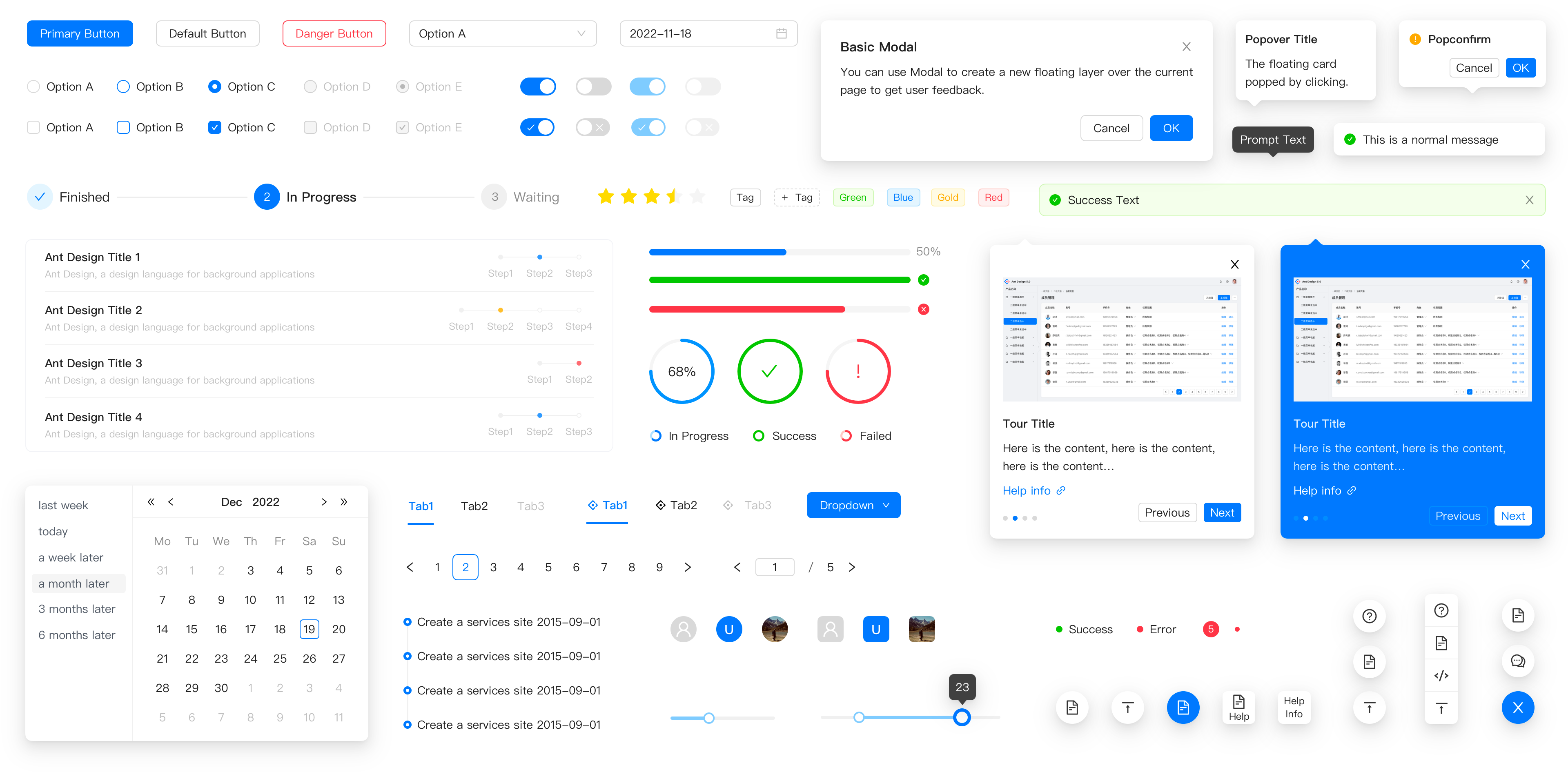
antd, material-ui, react-bootstrap, and semantic-ui-react are mature React component libraries that provide pre-built, styled UI elements for building consistent, accessible web applications. Each implements a distinct design system — Ant Design, Material Design, Bootstrap, and Semantic UI respectively — and offers a comprehensive suite of components like forms, tables, modals, and navigation elements. These libraries aim to accelerate development by reducing the need to build common UI patterns from scratch while ensuring visual coherence and usability.
Npm Package Weekly Downloads Trend
Github Stars Ranking
Stat Detail
React UI Libraries Compared: antd vs Material UI vs React Bootstrap vs Semantic UI React
When selecting a UI library for a production React application, you’re not just picking components — you’re committing to a design philosophy, styling strategy, and long-term maintenance trajectory. Let’s compare how these four libraries handle real-world engineering concerns.
🎨 Styling Approach: CSS-in-JS vs Utility Classes vs Legacy CSS
antd uses a custom CSS-in-JS solution with static extraction. Styles are generated at build time, and theming is done through LESS variables or runtime configuration.
// antd: Theme customization via ConfigProvider
import { ConfigProvider, Button } from 'antd';

<ConfigProvider
  theme={{
    token: { colorPrimary: '#1DA57A' }
  }}
>
  <Button type="primary">Custom Themed</Button>
</ConfigProvider>
material-ui (now @mui/material) relies on Emotion for dynamic CSS-in-JS. Theming uses a centralized object, and inline styles can be applied via the sx prop.
// material-ui: Theming and sx prop
import { ThemeProvider, createTheme, Button } from '@mui/material';

const theme = createTheme({
  palette: { primary: { main: '#1976d2' } }
});

<ThemeProvider theme={theme}>
  <Button variant="contained" sx={{ borderRadius: 2 }}>Themed</Button>
</ThemeProvider>
react-bootstrap delegates styling entirely to Bootstrap’s CSS. You import the stylesheet and use utility classes alongside component props.
// react-bootstrap: Relies on external CSS
import 'bootstrap/dist/css/bootstrap.min.css';
import { Button } from 'react-bootstrap';

// Uses Bootstrap's .btn-primary class internally
<Button variant="primary" className="rounded-pill">Bootstrap Styled</Button>
semantic-ui-react is deprecated and uses its own static CSS file. Customization required overriding CSS or using SASS variables — a fragile approach in modern toolchains.
// semantic-ui-react: Deprecated approach
import 'semantic-ui-css/semantic.min.css';
import { Button } from 'semantic-ui-react';

// No built-in theming; relies on global CSS
<Button primary>Legacy Styled</Button>
⚙️ Component Customization: Props vs Slots vs CSS Overrides
antd favors configuration through props. Complex components like Table accept objects for columns, pagination, and row selection.
// antd: Table with column config
import { Table } from 'antd';

const columns = [{ title: 'Name', dataIndex: 'name' }];
const data = [{ key: '1', name: 'John' }];

<Table columns={columns} dataSource={data} pagination={false} />
material-ui uses composition via the children prop or slots. For example, DataGrid uses column definitions but allows custom cell renderers.
// material-ui: DataGrid with renderCell
import { DataGrid } from '@mui/x-data-grid';

const columns = [
  { field: 'name', renderCell: (params) => <strong>{params.value}</strong> }
];

<DataGrid rows={data} columns={columns} autoHeight />
react-bootstrap follows Bootstrap’s markup patterns. Customization often means combining components with utility classes.
// react-bootstrap: Table with manual structure
import { Table } from 'react-bootstrap';

<Table striped bordered>
  <thead><tr><th>Name</th></tr></thead>
  <tbody><tr><td>John</td></tr></tbody>
</Table>
semantic-ui-react used prop-based configuration similar to antd but is no longer maintained.
// semantic-ui-react: Deprecated Table
import { Table } from 'semantic-ui-react';

<Table celled>
  <Table.Header><Table.Row><Table.HeaderCell>Name</Table.HeaderCell></Table.Row></Table.Header>
  <Table.Body><Table.Row><Table.Cell>John</Table.Cell></Table.Row></Table.Body>
</Table>
🌍 Internationalization and Accessibility
antd includes built-in i18n support for 70+ languages. Components like DatePicker automatically adapt to locale formats.
// antd: Locale provider
import { ConfigProvider } from 'antd';
import frFR from 'antd/locale/fr_FR';

<ConfigProvider locale={frFR}>
  <DatePicker />
</ConfigProvider>
material-ui provides localization utilities but requires manual integration for date pickers (via @mui/x-date-pickers). Accessibility is thoroughly implemented per WAI-ARIA standards.
// material-ui: Date picker localization
import { LocalizationProvider } from '@mui/x-date-pickers';
import { AdapterDateFns } from '@mui/x-date-pickers/AdapterDateFns';
import fr from 'date-fns/locale/fr';

<LocalizationProvider dateAdapter={AdapterDateFns} adapterLocale={fr}>
  <DatePicker />
</LocalizationProvider>
react-bootstrap has no built-in i18n. Accessibility depends on Bootstrap’s underlying markup, which meets basic standards but lacks advanced ARIA patterns for complex widgets.
semantic-ui-react had incomplete accessibility coverage, and since it’s deprecated, known issues like missing focus management won’t be fixed.
📦 Bundle Impact and Tree Shaking
All active libraries support tree shaking when imported properly. However:
antdrequires explicit imports (import Button from 'antd/es/button') or babel-plugin-import for optimal results.material-uisupports direct path imports (import Button from '@mui/material/Button') out of the box.react-bootstrapcomponents are lightweight wrappers, but you still pay the full cost of Bootstrap’s CSS unless you customize the Sass build.semantic-ui-react’s bundle size is irrelevant for new projects due to deprecation.
🛑 Deprecation Status
Critical note: semantic-ui-react is officially deprecated. Its GitHub repository displays an archive banner stating: “This repository has been archived by the owner on Jul 14, 2023. It is now read-only.” The npm page also warns against new usage. Do not select it for any new project.
💡 When to Use Which
- Enterprise dashboards with complex data tables? →
antdgives you batteries-included components with minimal styling overhead. - Consumer apps needing pixel-perfect Material Design? →
material-uioffers the deepest integration with Google’s guidelines and modern styling APIs. - Migrating a jQuery/Bootstrap app to React? →
react-bootstraplets you incrementally adopt React without redesigning your UI. - Starting a new project in 2024? → Avoid
semantic-ui-reactentirely; consider its spiritual successorfomantic-ui-reactonly if you’ve evaluated its maintenance status carefully.
📊 Summary Table
| Aspect | antd | material-ui | react-bootstrap | semantic-ui-react |
|---|---|---|---|---|
| Design System | Ant Design | Material Design | Bootstrap | Semantic UI (deprecated) |
| Styling | CSS-in-JS (static) | Emotion (dynamic) | External CSS | Static CSS (unmaintained) |
| Theming | ConfigProvider + tokens | ThemeProvider + sx prop | Bootstrap Sass variables | SASS overrides (deprecated) |
| i18n | Built-in | Partial (date pickers external) | None | None (deprecated) |
| Accessibility | Good | Excellent | Basic | Incomplete (unmaintained) |
| New Projects | ✅ Yes | ✅ Yes | ✅ Yes (if tied to Bootstrap) | ❌ No |
How to Choose: antd vs react-bootstrap vs semantic-ui-react vs material-ui
- antd:
Choose
antdif you're building data-heavy enterprise applications (like dashboards or admin panels) and want a cohesive, opinionated design system with strong TypeScript support and built-in internationalization. Its components are highly customizable through configuration props rather than CSS overrides, which streamlines consistency but requires adopting its design language fully. - react-bootstrap:
Choose
react-bootstrapif your team already uses Bootstrap CSS or needs to integrate React components into an existing Bootstrap-based project without disrupting the current styling. It wraps Bootstrap's markup patterns in React components while relying on the original Bootstrap stylesheet, so you get familiar utility classes and responsive behavior but must manage CSS dependencies separately. - semantic-ui-react:
Do not choose
semantic-ui-reactfor new projects as it is officially deprecated. The repository archive notice states active development has ceased, and critical issues like accessibility gaps may never be addressed. While it offered a clean, human-friendly API in its prime, modern alternatives likefomantic-ui-reactexist but lack comparable maintenance momentum. - material-ui:
Choose
material-uiif your product follows Google's Material Design guidelines or you need deep theme customization using a robust theming engine based on CSS-in-JS. It integrates well with design tools like Figma's Material kits and offers fine-grained control over styling via thesxprop or styled components, making it ideal for teams that prioritize design-system fidelity and developer flexibility.
Popular Comparisons
README for antd
Ant Design
An enterprise-class UI design language and React UI library.
Changelog · Report Bug · Request Feature · English · 中文
❤️ Sponsors 
 |  |
|---|
✨ Features
- 🌈 Enterprise-class UI designed for web applications.
- 📦 A set of high-quality React components out of the box.
- 🛡 Written in TypeScript with predictable static types.
- ⚙️ Whole package of design resources and development tools.
- 🌍 Internationalization support for dozens of languages.
- 🎨 Powerful theme customization based on CSS-in-JS.
🖥 Environment Support
- Modern browsers
- Server-side Rendering
- Electron
 Edge |  Firefox |  Chrome |  Safari |  Electron |
|---|---|---|---|---|
| Edge | last 2 versions | last 2 versions | last 2 versions | last 2 versions |
📦 Install
npm install antd
yarn add antd
pnpm add antd
bun add antd
🔨 Usage
import { Button, DatePicker } from 'antd';

export default () => (
  <>
    <Button type="primary">PRESS ME</Button>
    <DatePicker placeholder="select date" />
  </>
);
🔗 Links
- Home page
- Components Overview
- Sponsor
- Change Log
- rc-components
- 🆕 Ant Design X
- Ant Design Pro
- Pro Components
- Ant Design Mobile
- Ant Design Mini
- Ant Design Charts
- Ant Design Web3
- Landing Pages
- Ant Motion
- Scaffold Market
- Developer Instruction
- Versioning Release Note
- FAQ
- Online Playground for bug reports
- Customize Theme
- How to Apply for Being A Collaborator
⌨️ Development
Use opensumi.run, a free online pure front-end dev environment.
Or clone locally:
$ git clone git@github.com:ant-design/ant-design.git
$ cd ant-design
$ npm install
$ npm start
Open your browser and visit http://127.0.0.1:8001, see more at Development.
🤝 Contributing 

|

|

|
Let's build a better antd together.
We warmly invite contributions from everyone. Before you get started, please take a moment to review our Contribution Guide. Feel free to share your ideas through Pull Requests or GitHub Issues. If you're interested in enhancing our codebase, explore the Development Instructions and enjoy your coding journey! :)
For collaborators, adhere to our Pull Request Principle and utilize our Pull Request Template when creating a Pull Request.
Issue funding
We use Issuehunt to up-vote and promote specific features that you would like to see and implement. Check our backlog and help us:


