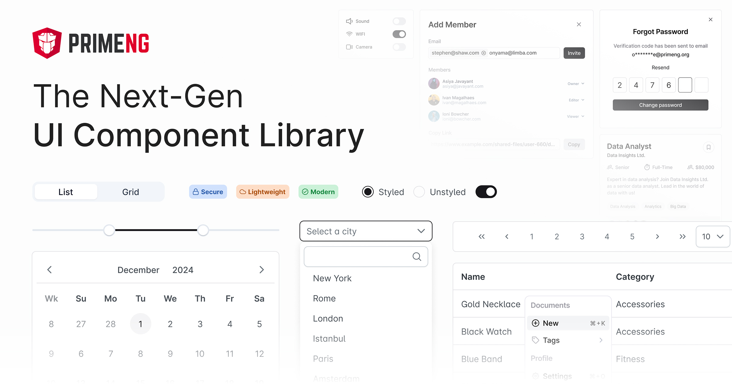
Design Principles
- primeng:
PrimeNG offers a diverse set of components that can be styled to fit various design systems. While it doesn't strictly adhere to a single design principle, it provides flexibility in customization, allowing developers to create unique user interfaces.
- @ng-bootstrap/ng-bootstrap:
@ng-bootstrap/ng-bootstrap follows Bootstrap's design principles, ensuring that all components are responsive and mobile-first. It allows developers to create applications that maintain the Bootstrap aesthetic while leveraging Angular's capabilities.
- ngx-bootstrap:
ngx-bootstrap adheres to Bootstrap's design philosophy, providing components that are styled according to Bootstrap's guidelines. This makes it easy to create applications that look and feel like traditional Bootstrap applications while using Angular's features.
- angular-material:
Angular Material is built around Material Design principles, which emphasize a clean, modern look with intuitive interactions. It provides components that are designed to be accessible and responsive, ensuring a consistent user experience across devices.
Component Variety
- primeng:
PrimeNG boasts an extensive library of components, including advanced features like data tables, tree views, and charts. This makes it suitable for applications that require complex UI elements and interactions.
- @ng-bootstrap/ng-bootstrap:
@ng-bootstrap/ng-bootstrap offers a comprehensive set of Bootstrap components, including modals, tooltips, and dropdowns, all built specifically for Angular. This ensures that developers can easily implement common UI elements without additional dependencies.
- ngx-bootstrap:
ngx-bootstrap includes a variety of Bootstrap components, such as alerts, pagination, and carousels, specifically tailored for Angular. This allows developers to utilize Bootstrap's popular components while taking advantage of Angular's data binding and dependency injection.
- angular-material:
Angular Material provides a wide range of components, including form controls, navigation elements, and layout tools. Its components are designed to work together seamlessly, promoting a cohesive user experience across the application.
Customization
- primeng:
PrimeNG offers extensive customization options, allowing developers to modify component styles and behaviors. It also supports theming, enabling developers to create unique visual styles for their applications.
- @ng-bootstrap/ng-bootstrap:
@ng-bootstrap/ng-bootstrap allows for easy customization of Bootstrap components through Angular's templating and styling capabilities. Developers can override Bootstrap styles or create custom themes to fit their application's branding.
- ngx-bootstrap:
ngx-bootstrap components can be customized using Bootstrap's built-in classes and styles. While it offers less flexibility than some other libraries, developers can still achieve a good level of customization through CSS.
- angular-material:
Angular Material provides a theming system that allows developers to customize the appearance of components easily. It supports dark and light themes and provides tools for creating custom themes that align with branding requirements.
Learning Curve
- primeng:
PrimeNG has a moderate learning curve due to its extensive feature set. Developers may need time to explore and understand the various components and their configurations, but the documentation is comprehensive and helpful.
- @ng-bootstrap/ng-bootstrap:
@ng-bootstrap/ng-bootstrap has a moderate learning curve, especially for developers already familiar with Bootstrap. Understanding Angular's component-based architecture is essential, but the transition is generally smooth for those with Bootstrap experience.
- ngx-bootstrap:
ngx-bootstrap is relatively easy to learn, particularly for developers with prior Bootstrap experience. Its components are straightforward to implement, but understanding Angular's features is necessary for effective use.
- angular-material:
Angular Material may present a steeper learning curve for developers unfamiliar with Material Design principles. However, once the concepts are understood, the components are intuitive and easy to use, especially for those already familiar with Angular.
Performance
- primeng:
PrimeNG offers a rich set of features, but performance can vary based on the complexity of the components used. Developers should consider optimizing their implementations and using lazy loading where appropriate.
- @ng-bootstrap/ng-bootstrap:
@ng-bootstrap/ng-bootstrap is optimized for performance, leveraging Angular's change detection and rendering strategies. However, developers should be mindful of performance implications when using complex Bootstrap components.
- ngx-bootstrap:
ngx-bootstrap is generally performant, as it utilizes Angular's rendering capabilities. However, developers should be cautious about using too many components simultaneously, as this can impact performance.
- angular-material:
Angular Material is designed with performance in mind, ensuring that components are lightweight and efficient. The library provides tools for lazy loading and optimizing rendering to enhance application performance.
