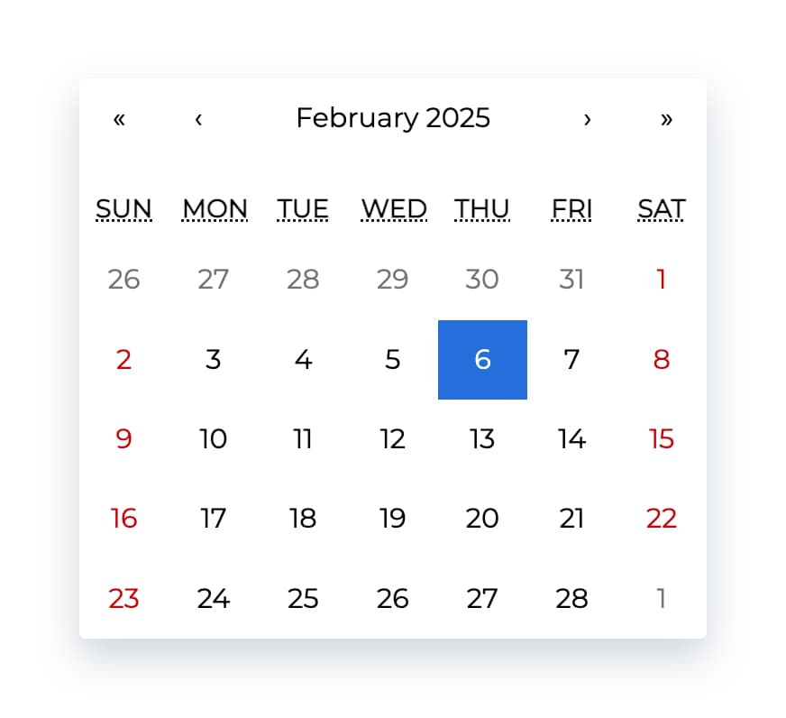
react-datepicker vs react-calendar vs react-native-modal-datetime-picker vs react-datetime vs react-native-date-picker vs react-native-datepicker
React Date and Time Picker Libraries Comparison
1 Year
react-datepickerreact-calendarreact-native-modal-datetime-pickerreact-datetimereact-native-date-pickerreact-native-datepickerSimilar Packages:
What's React Date and Time Picker Libraries?

These libraries provide various components for selecting dates and times in React applications. They cater to different use cases, including web and mobile applications, and offer unique features for user interaction, customization, and localization. Choosing the right library depends on the specific requirements of your project, such as the need for mobile compatibility, customization options, and user experience.

Package Weekly Downloads Trend
Github Stars Ranking
Stat Detail
Package
Downloads
Stars
Size
Issues
Publish
License
react-datepicker2,458,8628,2121.93 MB30616 days agoMIT
react-calendar730,4823,658580 kB434 months agoMIT
react-native-modal-datetime-picker355,4683,00843.9 kB446 months agoMIT
react-datetime268,0602,007291 kB1843 months agoMIT
react-native-date-picker184,2662,329313 kB46a month agoMIT
react-native-datepicker36,1442,123-2877 years agoMIT
Feature Comparison: react-datepicker vs react-calendar vs react-native-modal-datetime-picker vs react-datetime vs react-native-date-picker vs react-native-datepicker

User Interface

  • react-datepicker:

    react-datepicker features a dropdown interface that allows users to select dates and times conveniently. It includes a calendar view and time selection, making it versatile for various input scenarios and enhancing user interaction.

  • react-calendar:

    react-calendar offers a clean and straightforward calendar interface, allowing users to navigate through months and select dates easily. It is designed to be visually appealing while maintaining simplicity, making it user-friendly for all ages.

  • react-native-modal-datetime-picker:

    react-native-modal-datetime-picker enhances the user interface by presenting the date and time picker in a modal. This approach minimizes distractions and focuses user attention on the selection process, improving overall usability.

  • react-datetime:

    react-datetime combines both date and time selection in a single interface, providing a seamless user experience. Its design allows users to switch between date and time views easily, catering to applications that require both inputs.

  • react-native-date-picker:

    react-native-date-picker provides a native mobile interface that aligns with iOS and Android design principles. It offers a smooth and responsive experience, ensuring that users feel comfortable interacting with the date picker on mobile devices.

  • react-native-datepicker:

    react-native-datepicker presents a simple and intuitive interface for date selection in mobile applications. It is designed to be easy to use, ensuring that users can quickly select dates without confusion.

Customization

  • react-datepicker:

    react-datepicker offers a variety of props for customization, including the ability to format dates, control the display of the calendar, and style components. This flexibility makes it suitable for applications with specific design needs.

  • react-calendar:

    react-calendar allows for extensive customization options, enabling developers to style the calendar according to their application's theme. You can easily modify colors, fonts, and layouts to match your design requirements.

  • react-native-modal-datetime-picker:

    react-native-modal-datetime-picker offers customization for the modal presentation, including styles and animations. This allows developers to create a unique user experience that aligns with their app's design.

  • react-datetime:

    react-datetime provides customization options for both date and time formats, allowing developers to tailor the component to fit their application's requirements. You can also customize the appearance and behavior of the picker.

  • react-native-date-picker:

    react-native-date-picker is designed to be easily customizable, allowing developers to change styles and properties to fit the app's design. It supports various modes, such as date, time, or datetime, enhancing its versatility.

  • react-native-datepicker:

    react-native-datepicker allows for basic customization, including date formats and styles. While it may not be as flexible as others, it still provides enough options for most standard use cases.

Localization

  • react-datepicker:

    react-datepicker includes built-in localization support, enabling developers to easily adapt the date picker to different languages and formats. This makes it suitable for international applications.

  • react-calendar:

    react-calendar supports localization, allowing developers to present dates in various formats based on user preferences or regional settings. This feature is essential for applications targeting a global audience.

  • react-native-modal-datetime-picker:

    react-native-modal-datetime-picker supports localization, allowing developers to present date and time formats that are familiar to users in different regions, enhancing the overall user experience.

  • react-datetime:

    react-datetime supports localization, allowing developers to format dates and times according to user preferences. This feature enhances usability for users from different regions.

  • react-native-date-picker:

    react-native-date-picker supports localization, ensuring that date and time formats align with local conventions. This is crucial for mobile applications that cater to diverse user bases.

  • react-native-datepicker:

    react-native-datepicker provides basic localization support, allowing developers to format dates according to user preferences. While not as extensive as others, it still meets the needs of many applications.

Mobile Compatibility

  • react-datepicker:

    react-datepicker is also primarily for web applications and may not be optimized for mobile use. It is best used in scenarios where desktop users are the primary audience.

  • react-calendar:

    react-calendar is primarily designed for web applications and may not provide the best user experience on mobile devices. It is best suited for desktop applications where a full calendar view is beneficial.

  • react-native-modal-datetime-picker:

    react-native-modal-datetime-picker is optimized for mobile applications, providing a modal interface that enhances usability on mobile devices. It is ideal for apps that prioritize a clean and focused user experience.

  • react-datetime:

    react-datetime is designed for web applications and may not offer the best mobile experience. It is ideal for projects where desktop usage is predominant.

  • react-native-date-picker:

    react-native-date-picker is specifically built for React Native applications, ensuring a native look and feel on mobile devices. It is the best choice for mobile-first applications requiring date selection.

  • react-native-datepicker:

    react-native-datepicker is tailored for mobile applications, providing a simple and effective date selection interface. It is suitable for projects focused on mobile user experience.

Integration

  • react-datepicker:

    react-datepicker integrates well with forms and other UI components, making it a suitable choice for applications that require date input alongside other form elements.

  • react-calendar:

    react-calendar can be easily integrated into any React application, making it a versatile choice for developers looking for a straightforward calendar component without complex dependencies.

  • react-native-modal-datetime-picker:

    react-native-modal-datetime-picker is easy to integrate into React Native applications, allowing developers to implement a modal date and time picker with minimal effort.

  • react-datetime:

    react-datetime can be integrated seamlessly into forms and other components, offering a consistent user experience across the application. It is ideal for projects that require both date and time inputs.

  • react-native-date-picker:

    react-native-date-picker is designed for easy integration into React Native applications, ensuring that developers can quickly implement date selection features without extensive setup.

  • react-native-datepicker:

    react-native-datepicker is straightforward to integrate into React Native applications, providing a simple solution for date selection without complex configurations.

How to Choose: react-datepicker vs react-calendar vs react-native-modal-datetime-picker vs react-datetime vs react-native-date-picker vs react-native-datepicker
  • react-datepicker:

    Select react-datepicker for a more feature-rich date picker that supports date ranges, time selection, and localization. It is suitable for applications that require a robust date input with a user-friendly interface and extensive customization options.

  • react-calendar:

    Choose react-calendar if you need a simple and customizable calendar component for selecting dates. It is lightweight and easy to integrate into any React application, making it ideal for projects that require a straightforward date selection without complex features.

  • react-native-modal-datetime-picker:

    Select react-native-modal-datetime-picker for a modal-based date and time picker in React Native applications. It enhances user experience by presenting the picker in a modal, making it ideal for apps that prioritize a clean and focused interface.

  • react-datetime:

    Opt for react-datetime if you need a versatile component that combines both date and time selection. It is ideal for applications that require users to select both elements simultaneously, providing a seamless experience for datetime inputs.

  • react-native-date-picker:

    Use react-native-date-picker for mobile applications built with React Native. It offers a native look and feel, making it perfect for mobile apps that require a date and time selection interface that aligns with platform-specific design guidelines.

  • react-native-datepicker:

    Choose react-native-datepicker if you want a simple and customizable date picker for React Native applications. It provides a straightforward implementation and is suitable for projects that do not require extensive features but still need a reliable date selection component.

README for react-datepicker

React Date Picker

npm version Test suite codecov Downloads

A simple and reusable Datepicker component for React (Demo)

Installation

The package can be installed via npm:

npm install react-datepicker --save

Or via yarn:

yarn add react-datepicker

You’ll need to install React and PropTypes separately since those dependencies aren’t included in the package. If you need to use a locale other than the default en-US, you'll also need to import that into your project from date-fns (see Localization section below). Below is a simple example of how to use the Datepicker in a React view. You will also need to require the CSS file from this package (or provide your own). The example below shows how to include the CSS from this package if your build system supports requiring CSS files (Webpack is one that does).

import React, { useState } from "react";
import DatePicker from "react-datepicker";

import "react-datepicker/dist/react-datepicker.css";

// CSS Modules, react-datepicker-cssmodules.css
// import 'react-datepicker/dist/react-datepicker-cssmodules.css';

const Example = () => {
  const [startDate, setStartDate] = useState(new Date());
  return <DatePicker selected={startDate} onChange={(date) => setStartDate(date)} />;
};

Configuration

The most basic use of the DatePicker can be described with:

<DatePicker selected={startdate} onChange={(date) => setStartDate(date)} />

You can use onSelect event handler which fires each time some calendar date has been selected

<DatePicker
  selected={date}
  onSelect={handleDateSelect} //when day is clicked
  onChange={handleDateChange} //only when value has changed
/>

onClickOutside handler may be useful to close datepicker in inline mode

See here for a full list of props that may be passed to the component. Examples are given on the main website.

Time picker

You can also include a time picker by adding the showTimeSelect prop

<DatePicker selected={date} onChange={handleDateChange} showTimeSelect dateFormat="Pp" />

Times will be displayed at 30-minute intervals by default (default configurable via timeIntervals prop)

More examples of how to use the time picker are given on the main website

Localization

The date picker relies on date-fns internationalization to localize its display components. By default, the date picker will use the locale globally set, which is English. Provided are 3 helper methods to set the locale:

  • registerLocale (string, object): loads an imported locale object from date-fns
  • setDefaultLocale (string): sets a registered locale as the default for all datepicker instances
  • getDefaultLocale: returns a string showing the currently set default locale
import { registerLocale, setDefaultLocale } from  "react-datepicker";
import { es } from 'date-fns/locale/es';
registerLocale('es', es)

<DatePicker
  locale="es"
/>

Locales can be changed in the following way:

  • Globally - setDefaultLocale('es');

Compatibility

React

We're always trying to stay compatible with the latest version of React. We can't support all older versions of React.

Latest compatible versions:

  • React 16 or newer: React-datepicker v2.9.4 and newer
  • React 15.5: React-datepicker v2.9.3
  • React 15.4.1: needs React-datepicker v0.40.0, newer won't work (due to react-onclickoutside dependencies)
  • React 0.14 or newer: All above React-datepicker v0.13.0
  • React 0.13: React-datepicker v0.13.0
  • pre React 0.13: React-datepicker v0.6.2

Moment.js

Up until version 1.8.0, this package was using Moment.js. Starting v2.0.0, we switched to using date-fns, which uses native Date objects, to reduce the size of the package. If you're switching from 1.8.0 to 2.0.0 or higher, please see the updated example above of check out the examples site for up to date examples.

Browser Support

The date picker is compatible with the latest versions of Chrome, Firefox, and IE10+.

Unfortunately, it is difficult to support legacy browsers while maintaining our ability to develop new features in the future. For IE9 support, it is known that the classlist polyfill is needed, but this may change or break at any point in the future.

Local Development

The main branch contains the latest version of the Datepicker component.

To begin local development:

  1. Run yarn install from project root
  2. Run yarn build from project root
  3. Run yarn start from project root

The last step starts documentation app as a simple webserver on http://localhost:5173.

You can run yarn test to execute the test suite and linters. To help you develop the component we’ve set up some tests that cover the basic functionality (can be found in /tests). Even though we’re big fans of testing, this only covers a small piece of the component. We highly recommend you add tests when you’re adding new functionality.

Please refer to CONTRIBUTING.md file for more details about getting set up.

The examples

The examples are hosted within the docs folder and are ran in the simple app that loads the Datepicker. To extend the examples with a new example, you can simply duplicate one of the existing examples and change the unique properties of your example.

Accessibility

Keyboard support

  • Left: Move to the previous day.
  • Right: Move to the next day.
  • Up: Move to the previous week.
  • Down: Move to the next week.
  • PgUp: Move to the previous month.
  • Shift+PgUp: Move to the same day and month of the previous year. If that day does not exist, moves focus to the last day of the month.
  • PgDn: Move to the next month.
  • Shift+PgDn: Move to the same day and month of the next year. If that day does not exist, moves focus to the last day of the month.
  • Home: Move to the first day (e.g Sunday) of the current week.
  • End: Move to the last day (e.g. Saturday) of the current week.
  • Enter/Esc/Tab: close the calendar. (Enter & Esc calls preventDefault)

For month picker

  • Left: Move to the previous month.
  • Right: Move to the next month.
  • Enter: Select date and close the calendar

License

Copyright (c) 2014-2025 HackerOne Inc. and individual contributors. Licensed under MIT license, see LICENSE for the full license.