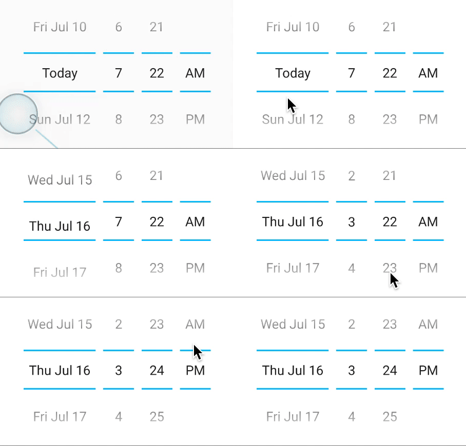
react-native-modal vs react-native-modal-datetime-picker vs react-native-date-picker vs react-native-datepicker
React Native Date and Time Picker Libraries Comparison
1 Year
react-native-modalreact-native-modal-datetime-pickerreact-native-date-pickerreact-native-datepickerSimilar Packages:
What's React Native Date and Time Picker Libraries?

These libraries provide various solutions for implementing date and time pickers in React Native applications. They offer different features, user interfaces, and customization options, allowing developers to choose the best fit for their app's design and functionality needs. Understanding the differences between these packages is crucial for selecting the right one based on project requirements and user experience goals.

Package Weekly Downloads Trend
Github Stars Ranking
Stat Detail
Package
Downloads
Stars
Size
Issues
Publish
License
react-native-modal418,2175,53072.7 kB150-MIT
react-native-modal-datetime-picker355,4683,00843.9 kB446 months agoMIT
react-native-date-picker184,2662,329313 kB46a month agoMIT
react-native-datepicker36,1442,123-2877 years agoMIT
Feature Comparison: react-native-modal vs react-native-modal-datetime-picker vs react-native-date-picker vs react-native-datepicker

User Interface

  • react-native-modal:

    Provides a flexible modal interface that can be styled and customized to fit various design requirements, allowing developers to create unique user experiences.

  • react-native-modal-datetime-picker:

    Combines a modal interface with a date and time picker, offering a cohesive and user-friendly design that enhances usability and accessibility.

  • react-native-date-picker:

    Offers a sleek and modern interface that closely resembles native date pickers, providing a seamless user experience. It allows for customization of styles to match the app's theme.

  • react-native-datepicker:

    Features a more traditional calendar interface with options for customization, including colors and fonts, making it suitable for apps that prefer a classic look.

Customization Options

  • react-native-modal:

    Highly customizable in terms of animations, styles, and behaviors, allowing developers to create modals that fit their app's aesthetic and functional requirements.

  • react-native-modal-datetime-picker:

    Provides various customization options for both date and time selection, including format, appearance, and behavior, ensuring it meets diverse user needs.

  • react-native-date-picker:

    Allows for basic customization such as changing the color scheme and font styles, making it easy to adapt to different app designs without extensive modifications.

  • react-native-datepicker:

    Offers extensive customization options, including date formats, styles, and even the ability to add custom components, making it highly adaptable to specific needs.

Integration and Compatibility

  • react-native-modal:

    Designed to work seamlessly with other components, allowing for easy integration into existing applications without significant refactoring.

  • react-native-modal-datetime-picker:

    Works well with both date and time selection components, providing a unified solution that can be easily integrated into any React Native project.

  • react-native-date-picker:

    Easily integrates with other React Native components and libraries, ensuring compatibility and smooth functionality across different platforms and devices.

  • react-native-datepicker:

    Compatible with various React Native versions and commonly used libraries, making it a reliable choice for developers looking for stability and support.

Performance

  • react-native-modal:

    Performance is efficient, but the complexity of the modal and its contents can impact responsiveness if not managed properly. Careful design is required for optimal performance.

  • react-native-modal-datetime-picker:

    Designed for performance, ensuring smooth transitions and quick response times when selecting dates and times, making it suitable for high-demand applications.

  • react-native-date-picker:

    Optimized for performance with minimal overhead, ensuring quick loading times and responsive interactions, even on lower-end devices.

  • react-native-datepicker:

    Performance is generally good, but may experience slight delays with extensive customization or complex date logic due to its traditional approach.

Learning Curve

  • react-native-modal:

    Learning to use modals effectively may take some time, especially for developers unfamiliar with modal behaviors and transitions in React Native.

  • react-native-modal-datetime-picker:

    Offers a straightforward implementation process, but understanding its full capabilities may require some exploration, making it slightly more complex than simpler date pickers.

  • react-native-date-picker:

    Has a relatively low learning curve, making it easy for developers to implement and customize quickly, even for those new to React Native.

  • react-native-datepicker:

    May require a bit more time to understand due to its extensive customization options, but is still manageable for developers with basic React Native knowledge.

How to Choose: react-native-modal vs react-native-modal-datetime-picker vs react-native-date-picker vs react-native-datepicker
  • react-native-modal:

    Opt for this package if you want to create modal components in your application. It is not specifically a date picker but can be used in conjunction with other date picker libraries to present them in a modal format, enhancing user experience by providing a focused interaction area.

  • react-native-modal-datetime-picker:

    This package is the best choice if you want a complete solution that combines both date and time selection in a modal interface. It provides a user-friendly experience and is highly customizable, making it suitable for applications that require both date and time inputs.

  • react-native-date-picker:

    Choose this package if you need a simple and customizable date picker that integrates well with the native UI and provides a clean, modern look. It is ideal for apps that require straightforward date selection without complex features.

  • react-native-datepicker:

    Select this package if you need a more traditional date picker with a wide range of customization options, including date formatting and styling. It's suitable for applications that require a classic calendar interface and additional features like time selection.

README for react-native-modal

Announcements

  • 📣 We're looking for maintainers and contributors! See #598
  • 💡 We're brainstorming if/how we can make a JavaScript-only version of react-native-modal. See #597
  • 🙏 If you have a question, please start a new discussion instead of opening a new issue.

react-native-modal

npm version styled with prettier

If you're new to the React Native world, please notice that React Native itself offers a component that works out-of-the-box.

An enhanced, animated, customizable React Native modal.

The goal of react-native-modal is expanding the original React Native <Modal> component by adding animations, style customization options, and new features, while still providing a simple API.

Features

  • Smooth enter/exit animations
  • Plain simple and flexible APIs
  • Customizable backdrop opacity, color and timing
  • Listeners for the modal animations ending
  • Resize itself correctly on device rotation
  • Swipeable
  • Scrollable

Setup

This library is available on npm, install it with: npm i react-native-modal or yarn add react-native-modal.

Usage

Since react-native-modal is an extension of the original React Native modal, it works in a similar fashion.

  1. Import react-native-modal:
import Modal from "react-native-modal";
  1. Create a <Modal> component and nest its content inside of it:
function WrapperComponent() {
  return (
    <View>
      <Modal>
        <View style={{ flex: 1 }}>
          <Text>I am the modal content!</Text>
        </View>
      </Modal>
    </View>
  );
}
  1. Then, show the modal by setting the isVisible prop to true:
function WrapperComponent() {
  return (
    <View>
      <Modal isVisible={true}>
        <View style={{ flex: 1 }}>
          <Text>I am the modal content!</Text>
        </View>
      </Modal>
    </View>
  );
}

The isVisible prop is the only prop you'll really need to make the modal work: you should control this prop value by saving it in your wrapper component state and setting it to true or false when needed.

A complete example

The following example consists in a component (ModalTester) with a button and a modal. The modal is controlled by the isModalVisible state variable and it is initially hidden, since its value is false.
Pressing the button sets isModalVisible to true, making the modal visible.
Inside the modal there is another button that, when pressed, sets isModalVisible to false, hiding the modal.

import React, { useState } from "react";
import { Button, Text, View } from "react-native";
import Modal from "react-native-modal";

function ModalTester() {
  const [isModalVisible, setModalVisible] = useState(false);

  const toggleModal = () => {
    setModalVisible(!isModalVisible);
  };

  return (
    <View style={{ flex: 1 }}>
      <Button title="Show modal" onPress={toggleModal} />

      <Modal isVisible={isModalVisible}>
        <View style={{ flex: 1 }}>
          <Text>Hello!</Text>

          <Button title="Hide modal" onPress={toggleModal} />
        </View>
      </Modal>
    </View>
  );
}

export default ModalTester;

For a more complex example take a look at the /example directory.

Available props

| Name | Type | Default | Description | | -------------------------------- | -------------------- | ------------------------------ | ------------------------------------------------------------------------------------------------------------------------------------------ | | animationIn | string or object | "slideInUp" | Modal show animation | | animationInTiming | number | 300 | Timing for the modal show animation (in ms) | | animationOut | string or object | "slideOutDown" | Modal hide animation | | animationOutTiming | number | 300 | Timing for the modal hide animation (in ms) | | avoidKeyboard | bool | false | Move the modal up if the keyboard is open | | coverScreen | bool | true | Will use RN Modal component to cover the entire screen wherever the modal is mounted in the component hierarchy | | hasBackdrop | bool | true | Render the backdrop | | backdropColor | string | "black" | The backdrop background color | | backdropOpacity | number | 0.70 | The backdrop opacity when the modal is visible | | backdropTransitionInTiming | number | 300 | The backdrop show timing (in ms) | | backdropTransitionOutTiming | number | 300 | The backdrop hide timing (in ms) | | customBackdrop | node | null | The custom backdrop element | | children | node | REQUIRED | The modal content | | deviceHeight | number | null | Device height (useful on devices that can hide the navigation bar) | | deviceWidth | number | null | Device width (useful on devices that can hide the navigation bar) | | isVisible | bool | REQUIRED | Show the modal? | | onBackButtonPress | func | () => null | Called when the Android back button is pressed | | onBackdropPress | func | () => null | Called when the backdrop is pressed | | onModalWillHide | func | () => null | Called before the modal hide animation begins | | onModalHide | func | () => null | Called when the modal is completely hidden | | onModalWillShow | func | () => null | Called before the modal show animation begins | | onModalShow | func | () => null | Called when the modal is completely visible | | onSwipeStart | func | () => null | Called when the swipe action started | | onSwipeMove | func | (percentageShown) => null | Called on each swipe event | | onSwipeComplete | func | ({ swipingDirection }) => null | Called when the swipeThreshold has been reached | | onSwipeCancel | func | () => null | Called when the swipeThreshold has not been reached | | panResponderThreshold | number | 4 | The threshold for when the panResponder should pick up swipe events | | scrollOffset | number | 0 | When > 0, disables swipe-to-close, in order to implement scrollable content | | scrollOffsetMax | number | 0 | Used to implement overscroll feel when content is scrollable. See /example directory | | scrollTo | func | null | Used to implement scrollable modal. See /example directory for reference on how to use it | | scrollHorizontal | bool | false | Set to true if your scrollView is horizontal (for a correct scroll handling) | | swipeThreshold | number | 100 | Swiping threshold that when reached calls onSwipeComplete | | swipeDirection | string or array | null | Defines the direction where the modal can be swiped. Can be 'up', 'down', 'left, or 'right', or a combination of them like ['up','down'] | | useNativeDriver | bool | false | Defines if animations should use native driver | | useNativeDriverForBackdrop | bool | null | Defines if animations for backdrop should use native driver (to avoid flashing on android) | | hideModalContentWhileAnimating | bool | false | Enhances the performance by hiding the modal content until the animations complete | | propagateSwipe | bool or func | false | Allows swipe events to propagate to children components (eg a ScrollView inside a modal) | | style | any | null | Style applied to the modal |

Frequently Asked Questions

The component is not working as expected

Under the hood react-native-modal uses react-native original Modal component.
Before reporting a bug, try swapping react-native-modal with react-native original Modal component and, if the issue persists, check if it has already been reported as a react-native issue.

The backdrop is not completely filled/covered on some Android devices (Galaxy, for one)

React-Native has a few issues detecting the correct device width/height of some devices.
If you're experiencing this issue, you'll need to install react-native-extra-dimensions-android.
Then, provide the real window height (obtained from react-native-extra-dimensions-android) to the modal:

const deviceWidth = Dimensions.get("window").width;
const deviceHeight =
  Platform.OS === "ios"
    ? Dimensions.get("window").height
    : require("react-native-extra-dimensions-android").get(
        "REAL_WINDOW_HEIGHT"
      );

function WrapperComponent() {
  const [isModalVisible, setModalVisible] = useState(true);

  return (
    <Modal
      isVisible={isModalVisible}
      deviceWidth={deviceWidth}
      deviceHeight={deviceHeight}
    >
      <View style={{ flex: 1 }}>
        <Text>I am the modal content!</Text>
      </View>
    </Modal>
  );
}

How can I hide the modal by pressing outside of its content?

The prop onBackdropPress allows you to handle this situation:

<Modal
  isVisible={isModalVisible}
  onBackdropPress={() => setModalVisible(false)}
>
  <View style={{ flex: 1 }}>
    <Text>I am the modal content!</Text>
  </View>
</Modal>

How can I hide the modal by swiping it?

The prop onSwipeComplete allows you to handle this situation (remember to set swipeDirection too!):

<Modal
  isVisible={isModalVisible}
  onSwipeComplete={() => setModalVisible(false)}
  swipeDirection="left"
>
  <View style={{ flex: 1 }}>
    <Text>I am the modal content!</Text>
  </View>
</Modal>

Note that when using useNativeDriver={true} the modal won't drag correctly. This is a known issue.

The modal flashes in a weird way when animating

Unfortunately this is a known issue that happens when useNativeDriver=true and must still be solved.
In the meanwhile as a workaround you can set the hideModalContentWhileAnimating prop to true: this seems to solve the issue. Also, do not assign a backgroundColor property directly to the Modal. Prefer to set it on the child container.

The modal background doesn't animate properly

Are you sure you named the isVisible prop correctly? Make sure it is spelled correctly: isVisible, not visible.

The modal doesn't change orientation

Add a supportedOrientations={['portrait', 'landscape']} prop to the component, as described in the React Native documentation.

Also, if you're providing the deviceHeight and deviceWidth props you'll have to manually update them when the layout changes.

I can't show multiple modals one after another

Unfortunately right now react-native doesn't allow multiple modals to be displayed at the same time. This means that, in react-native-modal, if you want to immediately show a new modal after closing one you must first make sure that the modal that your closing has completed its hiding animation by using the onModalHide prop.

I can't show multiple modals at the same time

See the question above. Showing multiple modals (or even alerts/dialogs) at the same time is not doable because of a react-native bug. That said, I would strongly advice against using multiple modals at the same time because, most often than not, this leads to a bad UX, especially on mobile (just my opinion).

The StatusBar style changes when the modal shows up

This issue has been discussed here.
The TLDR is: it's a know React-Native issue with the Modal component 😞

The modal is not covering the entire screen

The modal style applied by default has a small margin.
If you want the modal to cover the entire screen you can easily override it this way:

<Modal style={{ margin: 0 }}>...</Modal>

I can't scroll my ScrollView inside of the modal

Enable propagateSwipe to allow your child components to receive swipe events:

<Modal propagateSwipe>...</Modal>

Please notice that this is still a WIP fix and might not fix your issue yet, see issue #236.

The modal enter/exit animation flickers

Make sure your animationIn and animationOut are set correctly.
We noticed that, for example, using fadeIn as an exit animation makes the modal flicker (it should be fadeOut!). Also, some users have noticed that setting backdropTransitionOutTiming={0} can fix the flicker without affecting the animation.

The custom backdrop doesn't fill the entire screen

You need to specify the size of your custom backdrop component. You can also make it expand to fill the entire screen by adding a flex: 1 to its style:

<Modal isVisible={isModalVisible} customBackdrop={<View style={{ flex: 1 }} />}>
  <View style={{ flex: 1 }}>
    <Text>I am the modal content!</Text>
  </View>
</Modal>

The custom backdrop doesn't dismiss the modal on press

You can provide an event handler to the custom backdrop element to dismiss the modal. The prop onBackdropPress is not supported for a custom backdrop.

<Modal
  isVisible={isModalVisible}
  customBackdrop={
    <TouchableWithoutFeedback onPress={dismissModalHandler}>
      <View style={{ flex: 1 }} />
    </TouchableWithoutFeedback>
  }
/>

Available animations

Take a look at react-native-animatable to see the dozens of animations available out-of-the-box. You can also pass in custom animation definitions and have them automatically register with react-native-animatable. For more information on creating custom animations, see the react-native-animatable animation definition schema.

Alternatives

Acknowledgements

Thanks @oblador for react-native-animatable, @brentvatne for the npm namespace and to anyone who contributed to this library!

Pull requests, feedbacks and suggestions are welcome!