React Notification and Toast Libraries Compared
react-notification-system, react-notifications, react-toast-notifications, and react-toastify are all React libraries designed to display notification messages (toasts, alerts, or popups) to users. These libraries help developers show success messages, errors, warnings, and info notifications without building the UI from scratch. react-toastify is currently the most actively maintained with modern React support including hooks. react-toast-notifications offers a hook-based API from Josh Comeau but has slower update cycles. react-notification-system and react-notifications are older packages with limited maintenance - both rely on class components and older React patterns that may not fit modern codebases.
Npm Package Weekly Downloads Trend
Github Stars Ranking
Stat Detail
React Notification Libraries: Technical Deep-Dive for Production Apps
When your React app needs to show users feedback — like "Save successful" or "Invalid email" — you reach for a notification library. The four packages we're comparing (react-notification-system, react-notifications, react-toast-notifications, react-toastify) all solve this problem, but they differ significantly in API design, maintenance status, and modern React compatibility. Let's break down the real technical differences.
⚠️ Maintenance Status: What You Need to Know First
Before diving into APIs, understand the maintenance reality:
react-notification-system — This package has not seen meaningful updates in years. The repository shows minimal activity, and it uses React patterns from before hooks existed. Do not use this in new projects.
react-notifications — Similar situation. Limited recent commits, no active issue triage, and relies on class component patterns. Do not use this in new projects.
react-toast-notifications — More modern with hook-based API, but update frequency has slowed. Still functional for basic use cases but may not keep pace with React's evolution.
react-toastify — Actively maintained with regular releases, active issue responses, and ongoing feature additions. This is the safest choice for production work.
🎯 Basic Usage: How You Show a Toast
The API design reveals how each library thinks about notifications.
react-notification-system uses an imperative ref-based approach:
import NotificationSystem from 'react-notification-system';

class App extends React.Component {
  constructor(props) {
    super(props);
    this.notificationSystem = React.createRef();
  }

  showSuccess = () => {
    this.notificationSystem.current.addNotification({
      title: 'Success',
      message: 'Your changes were saved',
      level: 'success'
    });
  }

  render() {
    return (
      <div>
        <button onClick={this.showSuccess}>Save</button>
        <NotificationSystem ref={this.notificationSystem} />
      </div>
    );
  }
}
react-notifications uses a component you render directly:
import { NotificationContainer, NotificationManager } from 'react-notifications';

class App extends React.Component {
  showSuccess = () => {
    NotificationManager.success('Your changes were saved', 'Success', 5000);
  }

  render() {
    return (
      <div>
        <button onClick={this.showSuccess}>Save</button>
        <NotificationContainer />
      </div>
    );
  }
}
react-toast-notifications uses a hook-based approach:
import { ToastProvider, useToasts } from 'react-toast-notifications';

function App() {
  const { addToast } = useToasts();

  const showSuccess = () => {
    addToast('Your changes were saved', {
      appearance: 'success',
      autoDismiss: true
    });
  };

  return (
    <button onClick={showSuccess}>Save</button>
  );
}

// Wrap your app
function Root() {
  return (
    <ToastProvider>
      <App />
    </ToastProvider>
  );
}
react-toastify offers the simplest API with both hook and function calls:
import { toast, ToastContainer } from 'react-toastify';
import 'react-toastify/dist/ReactToastify.css';

function App() {
  const showSuccess = () => {
    toast.success('Your changes were saved', {
      position: 'top-right',
      autoClose: 5000
    });
  };

  return (
    <div>
      <button onClick={showSuccess}>Save</button>
      <ToastContainer />
    </div>
  );
}
🎨 Customization: Styling Your Notifications
How much control do you have over appearance?
react-notification-system allows inline styles through the notification object:
this.notificationSystem.current.addNotification({
  title: 'Success',
  message: 'Saved',
  level: 'success',
  style: {
    Success: {
      WebkitBorderRadius: '4px',
      MozBorderRadius: '4px',
      msBorderRadius: '4px',
      OBorderRadius: '4px',
      borderRadius: '4px'
    }
  }
});
react-notifications requires CSS overrides:
// In your CSS file
.notification-item.success {
  background-color: #4caf50;
  border-radius: 4px;
}

// Component usage stays the same
NotificationManager.success('Saved', 'Success');
react-toast-notifications lets you pass custom components:
function CustomToast({ appearance, onDismiss, children }) {
  return (
    <div className={`custom-toast ${appearance}`}>
      {children}
      <button onClick={onDismiss}>×</button>
    </div>
  );
}

function App() {
  const { addToast } = useToasts();

  addToast('Saved', {
    appearance: 'success',
    components: { Toast: CustomToast }
  });
}
react-toastify provides the most customization options:
// Custom toast component
function CustomToast({ closeToast }) {
  return (
    <div className="custom-toast">
      <p>Custom content here</p>
      <button onClick={closeToast}>Close</button>
    </div>
  );
}

// Usage
tost(<CustomToast />, {
  className: 'my-custom-class',
  style: { background: 'blue' }
});

// Or use built-in types with custom styling
tost.success('Saved', {
  className: 'success-toast',
  progressClassName: 'custom-progress'
});
📍 Positioning: Where Toasts Appear
Control over notification placement varies significantly.
react-notification-system has limited positioning — mostly fixed to corners with minimal configuration:
<NotificationSystem
  ref={this.notificationSystem}
  style={{
    wrapper: {
      top: '20px',
      right: '20px',
      position: 'fixed'
    }
  }}
/>
react-notifications supports four positions through props:
<NotificationContainer
  position={'top-right'}
  alertTimeout={5000}
/>

// Options: 'top-right', 'top-left', 'bottom-right', 'bottom-left'
react-toast-notifications uses placement prop on the provider:
<ToastProvider placement="top-right">
  <App />
</ToastProvider>

// Options: 'top-left', 'top-center', 'top-right',
// 'bottom-left', 'bottom-center', 'bottom-right'
react-toastify offers the most positioning flexibility:
<ToastContainer
  position="top-right"
  // Options: 'top-left', 'top-center', 'top-right',
  // 'bottom-left', 'bottom-center', 'bottom-right'
/>

// Or per-toast positioning
tost.success('Saved', {
  position: 'bottom-center'
});
🔄 Dismissal Behavior: Auto-Close and Manual Control
How do notifications go away?
react-notification-system requires explicit autoDismiss configuration:
this.notificationSystem.current.addNotification({
  title: 'Success',
  message: 'Saved',
  level: 'success',
  autoDismiss: 5, // seconds
  dismissible: true
});
react-notifications handles timing in the method call:
NotificationManager.success(
  'Your changes were saved',
  'Success',
  5000, // milliseconds
  () => {}, // callback when dismissed
  true // clickable to dismiss
);
react-toast-notifications uses autoDismiss in the options:
addToast('Saved', {
  appearance: 'success',
  autoDismiss: true,
  autoDismissTimeout: 5000
});

// Manual dismiss
const { addToast, removeToast } = useToasts();
const toastId = addToast('Processing...');
// Later
removeToast(toastId);
react-toastify provides the most control:
// Auto-close
tost.success('Saved', {
  autoClose: 5000,
  closeOnClick: true,
  pauseOnHover: true
});

// Manual control
tost.info('Processing...', { toastId: 'process' });
// Later
tost.dismiss('process');

// Dismiss all
tost.dismiss();
🎭 Animations: Enter and Exit Effects
Visual polish matters for user experience.
react-notification-system has basic built-in animations with limited customization:
<NotificationSystem
  ref={this.notificationSystem}
  allowHTML={true}
  // Animation is built-in, not easily customizable
/>
react-notifications uses CSS animations you can override:
/* Override default animations */
.notification-item {
  animation: slideIn 0.3s ease-out;
}

@keyframes slideIn {
  from { transform: translateX(100%); }
  to { transform: translateX(0); }
}
react-toast-notifications has minimal animation support:
<ToastProvider
  placement="top-right"
  // Limited animation customization
>
  <App />
</ToastProvider>
react-toastify offers rich animation options:
<ToastContainer
  transition={Slide}
  // Built-in transitions: Slide, Fade, Zoom, Flip, Bounce
/>

// Custom transition
import { Slide } from 'react-toastify';

// Or define your own
function CustomTransition(props) {
  return <div className={props.state}>{props.children}</div>;
}
📦 TypeScript Support
Type safety matters for large codebases.
react-notification-system — No official TypeScript types. You'll need @types/react-notification-system which may be outdated:
// May need to define your own types
interface Notification {
  title: string;
  message: string;
  level: 'success' | 'error' | 'warning' | 'info';
}
react-notifications — Limited TypeScript support, community types available:
// Community types may not match current API
import { NotificationManager } from 'react-notifications';
// Type checking may be incomplete
react-toast-notifications — Has TypeScript definitions included:
import { ToastProvider, useToasts, ToastOptions } from 'react-toast-notifications';

const options: ToastOptions = {
  appearance: 'success',
  autoDismiss: true
};
react-toastify — Excellent TypeScript support built-in:
import { toast, ToastOptions } from 'react-toastify';

const options: ToastOptions = {
  position: 'top-right',
  autoClose: 5000,
  type: 'success'
};

tost.success('Saved', options);
🧩 Advanced Features Comparison
Progress Bars
react-notification-system — No built-in progress bar.
react-notifications — No built-in progress bar.
react-toast-notifications — No built-in progress bar.
react-toastify — Has progress bar support:
<ToastContainer progressClassName="custom-progress" />

tost.info('Uploading...', {
  progress: 0.5 // Manual progress control
});
Multiple Toasts Management
react-notification-system — Queues notifications but limited control:
// Notifications stack automatically
this.notificationSystem.current.addNotification({...});
react-notifications — Basic stacking:
// Multiple calls create multiple toasts
NotificationManager.success('First');
NotificationManager.success('Second');
react-toast-notifications — Better control with IDs:
const { addToast, removeToast } = useToasts();
const id = addToast('Processing', { id: 'unique-id' });
// Update or remove by ID later
react-toastify — Full control with update and dismiss:
const toastId = tost.info('Processing...');

// Update existing toast
tost.update(toastId, {
  type: 'success',
  render: 'Complete!'
});

// Dismiss specific toast
tost.dismiss(toastId);
Accessibility
react-notification-system — Basic ARIA support, not comprehensive.
react-notifications — Limited accessibility features.
react-toast-notifications — Better accessibility with proper ARIA labels.
react-toastify — Strong accessibility support:
<ToastContainer
  role="alert"
  aria-live="assertive"
  newestOnTop={false}
  closeOnClick
  rtl={false}
  pauseOnFocusLoss
  draggable
  pauseOnHover
/>
📊 Quick Reference Table
| Feature | react-notification-system | react-notifications | react-toast-notifications | react-toastify |
|---|---|---|---|---|
| Maintenance | ❌ Inactive | ❌ Inactive | ⚠️ Slow updates | ✅ Active |
| React Hooks | ❌ No | ❌ No | ✅ Yes | ✅ Yes |
| TypeScript | ⚠️ Community types | ⚠️ Community types | ✅ Included | ✅ Included |
| Positioning | ⚠️ Limited | ✅ 4 positions | ✅ 6 positions | ✅ 6 positions |
| Custom Components | ⚠️ Limited | ⚠️ CSS only | ✅ Yes | ✅ Yes |
| Progress Bar | ❌ No | ❌ No | ❌ No | ✅ Yes |
| Toast Updates | ❌ No | ❌ No | ⚠️ Limited | ✅ Yes |
| Animations | ⚠️ Basic | ⚠️ CSS only | ⚠️ Basic | ✅ Multiple built-in |
| Accessibility | ⚠️ Basic | ⚠️ Basic | ✅ Good | ✅ Excellent |
💡 Real-World Recommendations
For New Projects in 2024+
Choose react-toastify — It's the only package with active maintenance, modern React patterns, and comprehensive features. The API is straightforward, TypeScript support is solid, and you won't outgrow it as your app scales.
// Production-ready setup
import { toast, ToastContainer, Bounce } from 'react-toastify';

function App() {
  const handleSave = async () => {
    const toastId = tost.loading('Saving...');

    try {
      await api.save(data);
      tost.update(toastId, {
        type: 'success',
        render: 'Saved successfully!',
        isLoading: false
      });
    } catch (error) {
      tost.update(toastId, {
        type: 'error',
        render: 'Save failed',
        isLoading: false
      });
    }
  };

  return (
    <>
      <button onClick={handleSave}>Save</button>
      <ToastContainer
        position="top-right"
        transition={Bounce}
        autoClose={5000}
      />
    </>
  );
}
For Legacy Codebases
If you're maintaining an existing app using react-notification-system or react-notifications, plan a migration to react-toastify. The API differences mean you'll need to refactor notification calls, but the long-term maintenance benefits outweigh the short-term effort.
For Simple Use Cases
If you need basic toast functionality without advanced features, react-toast-notifications works fine. The API is clean and the hook-based approach fits modern React. Just understand you may need to switch if you need features it doesn't provide.
🎯 Final Thoughts
The notification library landscape has shifted. Older packages like react-notification-system and react-notifications served their purpose but haven't evolved with React's move toward hooks and functional components. react-toast-notifications bridges this gap with a modern API but lacks the feature depth and maintenance pace of react-toastify.
For production applications where reliability matters, react-toastify is the clear choice. It handles the common cases simply while providing escape hatches for complex scenarios. The active maintenance means security updates, bug fixes, and React compatibility will continue — something you can't guarantee with the other options.
Bottom line: Start with react-toastify for new projects. Only consider alternatives if you have specific constraints that it doesn't meet — and even then, weigh the maintenance risk carefully.
How to Choose: react-notification-system vs react-notifications vs react-toast-notifications vs react-toastify
- react-notification-system:
Avoid this package for new projects. It has not been actively maintained for several years and uses outdated React patterns like class components and refs. The API requires wrapping your app with a provider component and accessing notifications through imperative method calls. Only consider this if you're maintaining a legacy codebase that already depends on it and migration is not feasible.
- react-notifications:
Avoid this package for new projects. Like react-notification-system, it relies on older React patterns and has minimal recent maintenance activity. The API uses a component-based approach where you render notification components directly. This works but lacks the modern hooks-based DX that teams now expect. Choose only for legacy maintenance scenarios.
- react-toast-notifications:
Choose
react-toast-notificationsif you want a clean, hook-based API from a respected developer (Josh Comeau) and don't need frequent feature updates. It providesuseToastshook for adding and removing notifications programmatically. Works well for simpler use cases where you need basic toast functionality without extensive customization. Best for projects that value API simplicity over feature richness. - react-toastify:
Choose
react-toastifyfor most new projects. It has active maintenance, excellent TypeScript support, and a rich feature set including custom components, progress bars, and multiple positioning options. The API supports both hooks (toast()) and imperative calls. Works with functional components and modern React patterns. Best for production applications that need reliability, customization, and long-term support.
Popular Comparisons
README for react-notification-system
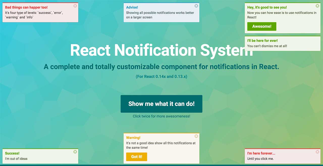
React Notification System


A complete and totally customizable component for notifications in React.
Initially built for Eterpret @ Scalable Path.
Installing
This component is available as CommonJS and UMD module. Install via NPM running:
npm install react-notification-system
Important
For React ^0.14.x or React ^15.x.x, use version 0.2.x:
npm install react-notification-system@0.2.x
For React 0.13.x, use version 0.1.x:
npm install react-notification-system@0.1.x
Using
For optimal appearance, this component must be rendered on a top level HTML element in your application to avoid position conflicts.
Here is a basic example. For a more advanced usage, please see the example code.
Class-based components can also be used as follows
import React from 'react';
import ReactDOM from 'react-dom';
import NotificationSystem from 'react-notification-system';

export default class MyComponent extends React.Component {
  notificationSystem = React.createRef();

  addNotification = event => {
    event.preventDefault();
    const notification = this.notificationSystem.current;
    notification.addNotification({
      message: 'Notification message',
      level: 'success'
    });
  };

  render() {
    return (
      <div>
        <button onClick={this.addNotification}>Add notification</button>
        <NotificationSystem ref={this.notificationSystem} />
      </div>
    );
  }
}

ReactDOM.render(
  React.createElement(MyComponent),
  document.getElementById('app')
);
Methods
addNotification(notification)
Add a notification object. This displays the notification based on the object you passed.
Returns the notification object to be used to programmatically dismiss a notification.
removeNotification(notification)
Remove a notification programmatically. You can pass an object returned by addNotification() or by onAdd() callback. If passing an object, you need to make sure it must contain the uid property. You can pass only the uid too: removeNotification(uid).
editNotification(notification, newProperties)
Edit a notification programmatically. You can pass an object previously returned by addNotification() or by onAdd() callback as notification. If passing an object as notification, you need to make sure it must contain the uid property. You can pass only the uid too: editNotification(uid, newProperties).
clearNotifications()
Removes ALL notifications programatically.
Creating a notification
The notification object has the following properties:
| Name | Type | Default | Description |
|---|---|---|---|
| title | string | null | Title of the notification |
| message | string | null | Message of the notification |
| level | string | null | Level of the notification. Available: success, error, warning and info |
| position | string | tr | Position of the notification. Available: tr (top right), tl (top left), tc (top center), br (bottom right), bl (bottom left), bc (bottom center) |
| autoDismiss | integer | 5 | Delay in seconds for the notification go away. Set this to 0 to not auto-dismiss the notification |
| dismissible | string | both | Settings controlling how the user can dismiss the notification and whether the dismiss button is visible. Available: both (The disable button is visible and the user can click anywhere on the notification to dismiss), click (The disable button is NOT visible and the user can click anywhere on the notification to dismiss), button (The user can click on the disable button to dismiss the notifiction), none (None See more) |
| action | object | null | Add a button with label and callback function (callback is optional). See more |
| children | element,string | null | Adds custom content, and overrides action (if defined) See more |
| onAdd | function | null | A callback function that will be called when the notification is successfully added. The first argument is the original notification e.g. function (notification) { console.log(notification.title + 'was added'); } |
| onRemove | function | null | A callback function that will be called when the notification is about to be removed. The first argument is the original notification e.g. function (notification) { console.log(notification.title + 'was removed'); } |
| uid | integer/string | null | Overrides the internal uid. Useful if you are managing your notifications id. Notifications with same uid won't be displayed. |
Dismissible
If set to 'none', the button will only be dismissible programmatically or after autoDismiss timeout. See more
Action
Add a button and a callback function to the notification. If this button is clicked, the callback function is called (if provided) and the notification is dismissed.
notification = {
  [...],
  action: {
    label: 'Button name',
    callback: function() {
      console.log('Notification button clicked!');
    }
  }
}
Children
Add custom content / react elements
notification = {
  [...],
  children: (
    <div>
      <h2>Hello World</h2>
      <a>Anchor</a>
    </div>
  )
}
Styles
This component was made to work as plug and play. For that, a handcrafted style was added to it and is used as inline CSS.
You can change this style by overriding the default inline styles or disable all inline styles and use your own styles.
Overriding
For this, use the style prop to pass an object with your styles. Your object must be something like this:
var style = {
  NotificationItem: { // Override the notification item
    DefaultStyle: { // Applied to every notification, regardless of the notification level
      margin: '10px 5px 2px 1px'
    },

    success: { // Applied only to the success notification item
      color: 'red'
    }
  }
}

<NotificationSystem ref="notificationSystem" style={style} />
Refer to this file to see what can you override.
Disabling inline styles
To disable all inline styles, just pass false to the prop style.
<NotificationSystem ref="notificationSystem" style={false} />
Here is the notification HTML:
<div class="notifications-wrapper">
  <div class="notifications-{position}"> <!-- '{position}' can be one of the positions available: ex: notifications-tr -->
    <div class="notification notification-{level} notification-{state} {notification-not-dismissible}"> <!-- '{level}' can be: success | error | warning | info. '{state}' can be: visible | hidden. {notification-not-dismissible} is present if notification is not dismissible by user -->
      <h4 class="notification-title">Default title</h4>
      <div class="notification-message">Default message</div>
      <span class="notification-dismiss">×</span>
      <div class="notification-action-wrapper">
        <button class="notification-action-button">Action button</button>
      </div>
    </div>
  </div>
</div>
Important
Using this method you have to take care of every style, from containers positions to animations. To control animations, use the classes notification-visible and notification-hidden. If your CSS styles will not handle any animation (transition), you need to set the prop noAnimation to true when adding the Notification System component:
<NotificationSystem ref="notificationSystem" noAnimation={true} />
See #74 for more details.
Appending/Prepending notifications
You can control where should new notification appear (on the top or bottom of current notifications, defaults to bottom) by setting newOnTop boolean prop on <NotificationSystem /> component:
<NotificationSystem ref="notificationSystem" newOnTop={true} />
This will render new notifications on top of current ones
Roadmap
- Improve tests and coverage
- Improve performance
Contributions
Clone this repo by running:
git clone git@github.com:igorprado/react-notification-system.git
Enter the project folder and install the dependencies:
npm install
To start a development server and use the example app to load the component, type:
npm start
Open http://localhost:8000.
Run the tests:
npm test
You can find the coverage details under coverage/ folder.
After that, just edit the files under src/ and example/src/app.js. It uses React hot reload.
This component is under construction. I will add more guidelines to who wants to contribute.