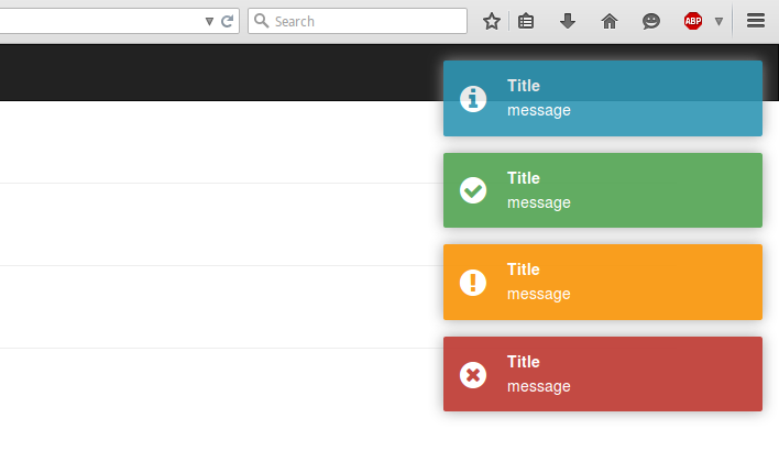
react-notifications vs react-s-alert vs react-toast-notifications vs react-toastify
React Notification Libraries
react-notificationsreact-s-alertreact-toast-notificationsreact-toastifySimilar Packages:

React Notification Libraries

React notification libraries provide developers with tools to display alerts, messages, and notifications to users in a web application. These libraries enhance user experience by providing timely feedback on user actions, system events, or errors. They often come with customizable styles, animations, and various display options to fit different application needs. By integrating these libraries, developers can ensure that users are informed without disrupting their workflow, making notifications an essential part of modern web applications.

Npm Package Weekly Downloads Trend

3 Years

Github Stars Ranking

Stat Detail

Package
Downloads
Stars
Size
Issues
Publish
License
react-notifications086158 kB16-MIT
react-s-alert0647-318 years agoMIT
react-toast-notifications02,167-305 years agoMIT
react-toastify013,428536 kB106a year agoMIT

Feature Comparison: react-notifications vs react-s-alert vs react-toast-notifications vs react-toastify

Customization

  • react-notifications:

    react-notifications offers basic customization options, allowing developers to change colors and styles through CSS. However, it lacks advanced customization features, making it less suitable for projects requiring unique designs.

  • react-s-alert:

    react-s-alert provides extensive customization capabilities, including different alert types, custom styles, and animations. Developers can easily tailor the alerts to match the application's design, making it a versatile choice for various use cases.

  • react-toast-notifications:

    react-toast-notifications allows for some customization, such as changing the duration of the toast and basic styling. However, it is more limited compared to others in terms of advanced options.

  • react-toastify:

    react-toastify excels in customization, offering a wide range of options for styling, positioning, and animations. Developers can create highly personalized notifications that fit seamlessly into their application's UI.

Ease of Use

  • react-notifications:

    react-notifications is straightforward to use, with a simple API that allows developers to quickly integrate notifications into their applications without much overhead.

  • react-s-alert:

    react-s-alert has a slightly steeper learning curve due to its extensive features, but it is still user-friendly for those familiar with React. The documentation provides clear guidance for setup and usage.

  • react-toast-notifications:

    react-toast-notifications is designed for ease of use, allowing developers to implement notifications with minimal configuration. Its API is intuitive, making it accessible for beginners.

  • react-toastify:

    react-toastify is known for its user-friendly API and comprehensive documentation, making it easy for developers of all skill levels to implement and customize notifications.

Animation and Display

  • react-notifications:

    react-notifications provides basic fade-in and fade-out animations, which are sufficient for simple notification needs but may not be enough for applications requiring more dynamic effects.

  • react-s-alert:

    react-s-alert supports various animations and display options, allowing developers to choose how alerts appear and disappear, enhancing the user experience with visually appealing transitions.

  • react-toast-notifications:

    react-toast-notifications features simple animations for toast notifications, but it lacks advanced options for transitions, making it suitable for straightforward use cases.

  • react-toastify:

    react-toastify offers a rich set of animation options and display configurations, including slide, bounce, and flip effects, making it ideal for applications that prioritize engaging user interactions.

Community and Support

  • react-notifications:

    react-notifications has a smaller community and limited support resources, which may make troubleshooting more challenging for developers.

  • react-s-alert:

    react-s-alert benefits from a moderate community, with decent documentation and examples available, but it may not have as extensive support as larger libraries.

  • react-toast-notifications:

    react-toast-notifications has a growing community and provides good documentation, making it easier for developers to find help and resources.

  • react-toastify:

    react-toastify boasts a large and active community, along with comprehensive documentation and numerous examples, ensuring that developers can easily find support and solutions.

Performance

  • react-notifications:

    react-notifications is lightweight and performs well for simple notification needs, but it may struggle with performance in applications with high-frequency notifications due to its basic structure.

  • react-s-alert:

    react-s-alert is optimized for performance and can handle multiple alerts efficiently, making it suitable for applications that require frequent notifications.

  • react-toast-notifications:

    react-toast-notifications performs adequately for most use cases, but it may not be as optimized for high-frequency notifications as other libraries.

  • react-toastify:

    react-toastify is designed for high performance, capable of handling numerous notifications simultaneously without significant impact on application performance, making it ideal for dynamic applications.

How to Choose: react-notifications vs react-s-alert vs react-toast-notifications vs react-toastify

  • react-notifications:

    Choose react-notifications if you need a simple and lightweight solution for displaying notifications with minimal setup. It is ideal for applications that require basic notification functionalities without extensive customization.

  • react-s-alert:

    Select react-s-alert if you want a highly customizable alert system with various styles and options. It is suitable for applications that require different types of alerts (success, error, info) and need more control over the appearance and behavior of notifications.

  • react-toast-notifications:

    Opt for react-toast-notifications if you prefer a toast notification system that is easy to implement and offers a clean design. It is great for applications that need non-intrusive notifications that appear briefly and then disappear automatically.

  • react-toastify:

    Choose react-toastify for a robust and feature-rich solution that supports a wide range of customization options, including animations, auto-dismiss, and positioning. It is perfect for applications that require a comprehensive notification system with extensive features.

README for react-notifications

React Notifications

Installation

npm install --save react-notifications

Usage

Note

Use only one 'NotificationContainer' component in the app.

CSS

Webpack:

import 'react-notifications/lib/notifications.css';

Other

<link rel="stylesheet" type="text/css" href="path/to/notifications.css">

JS

import React from 'react';
import {NotificationContainer, NotificationManager} from 'react-notifications';

class Example extends React.Component {
  createNotification = (type) => {
    return () => {
      switch (type) {
        case 'info':
          NotificationManager.info('Info message');
          break;
        case 'success':
          NotificationManager.success('Success message', 'Title here');
          break;
        case 'warning':
          NotificationManager.warning('Warning message', 'Close after 3000ms', 3000);
          break;
        case 'error':
          NotificationManager.error('Error message', 'Click me!', 5000, () => {
            alert('callback');
          });
          break;
      }
    };
  };

  render() {
    return (
      <div>
        <button className='btn btn-info'
          onClick={this.createNotification('info')}>Info
        </button>
        <hr/>
        <button className='btn btn-success'
          onClick={this.createNotification('success')}>Success
        </button>
        <hr/>
        <button className='btn btn-warning'
          onClick={this.createNotification('warning')}>Warning
        </button>
        <hr/>
        <button className='btn btn-danger'
          onClick={this.createNotification('error')}>Error
        </button>

        <NotificationContainer/>
      </div>
    );
  }
}

export default Example;

UMD

<link rel="stylesheet" type="text/css" href="path/to/react-notifications/dist/react-notifications.css">
<script src="path/to/react-notifications/dist/react-notifications.js"></script>
const NotificationContainer = window.ReactNotifications.NotificationContainer;
const NotificationManager = window.ReactNotifications.NotificationManager;

NotificationContainer Props

NameTypeDefaultRequired
enterTimeoutnumber400false
leaveTimeoutnumber400false

NotificationManager API

  • NotificationManager.info(message, title, timeOut, callback, priority);
  • NotificationManager.success(message, title, timeOut, callback, priority);
  • NotificationManager.warning(message, title, timeOut, callback, priority);
  • NotificationManager.error(message, title, timeOut, callback, priority);
NameTypeDescription
messagestringThe message string
titlestringThe title string
timeOutintegerThe popup timeout in milliseconds
callbackfunctionA function that gets fired when the popup is clicked
prioritybooleanIf true, the message gets inserted at the top

Example

View demo or example folder.

Contributing

When contributing to this reposity, please first open an issue and discuss intended changes with maintainers. If there is already an issue open for the feature you are looking to develop, please just coordinate with maintainers before assigning issue to yourself.

Branches

master is the main branch from which we publish packages. next is the branch from which we will publish the next release. All issue branches should be branched from master, unless specifically told by the maintainers to use a different branch. All pull requests should be submitted to merge with next in order to make the next release.

Workflow

  • Fork repo
  • Create an issue branch
  • Commit your changes
  • Open a PR against next.
  • Link the Issue to your PR.

Pull Request Guidelines

  • PRs should be submitted to merge with next.
  • PRs should be small in scope, work on 1 issue in a single PR.
  • Link the Issue you are working to your PR.

You can add as many commits to your PR as you would like. All commits will be squashed into a single commit when merging PR.