React Notification Libraries for User Feedback
react-notifications, react-s-alert, and react-toastify are React libraries designed to display transient user feedback messages—such as success confirmations, warnings, or errors—without interrupting the user’s workflow. These packages abstract away the complexity of managing DOM insertion, animation timing, stacking behavior, and dismissal logic, allowing developers to trigger notifications declaratively from anywhere in their application.
Npm Package Weekly Downloads Trend
Github Stars Ranking
Stat Detail
React Notification Libraries Compared: react-notifications vs react-s-alert vs react-toastify
When you need to show temporary messages in a React app—like “Settings saved” or “Network error”—you quickly realize that rolling your own solution leads to messy state management, inconsistent styling, and poor accessibility. Dedicated notification libraries solve this by handling rendering, lifecycle, and UX polish. Let’s compare three popular options.
⚠️ Maintenance Status: Don’t Build on Quicksand
Before diving into features, check whether a library is still alive.
react-notifications is deprecated. Its GitHub repo is archived, and the npm page states: “This package is no longer maintained.” Do not use it in new projects.
// ❌ Avoid — deprecated and unmaintained
import { Notifications, notify } from 'react-notifications';

function App() {
  return (
    <>
      <button onClick={() => notify('Hello', 'success')}>Show</button>
      <Notifications />
    </>
  );
}
react-s-alert hasn’t seen significant updates since 2018. While not officially deprecated, its GitHub repo shows no recent commits, and issues remain unanswered. Use with caution.
react-toastify is actively maintained, with regular releases, TypeScript support, and responsive issue triage. This matters for security patches, React version compatibility, and new platform features (like focus management).
🧩 Basic Usage: How You Trigger a Notification
All three follow a similar pattern: include a container component once, then call a function elsewhere.
react-notifications (deprecated):
// ❌ Deprecated example
import { Notifications, notify } from 'react-notifications';

function App() {
  return (
    <>
      <button onClick={() => notify('Item deleted', 'error', 3000)}>Delete</button>
      <Notifications />
    </>
  );
}
react-s-alert:
// ✅ Still works, but aging
import SAlert from 'react-s-alert';
import 'react-s-alert/dist/s-alert-default.css';

function App() {
  return (
    <>
      <button onClick={() => SAlert.error('Failed to save', { timeout: 4000 })}>
        Save
      </button>
      <SAlert stack={{ limit: 3 }} />
    </>
  );
}
react-toastify:
// ✅ Modern, clean API
import { ToastContainer, toast } from 'react-toastify';
import 'react-toastify/dist/ReactToastify.css';

function App() {
  return (
    <>
      <button onClick={() => toast.error('Failed to save', { autoClose: 4000 })}>
        Save
      </button>
      <Toast-container position="top-right" />
    </>
  );
}
Note how react-toastify uses consistent naming (toast.error) and separates concerns: the container configures global behavior, while individual calls set per-notification options.
🎨 Customization and Theming
Need branded colors, custom icons, or interactive buttons inside notifications?
react-notifications offers almost no theming—just basic type-based classes.
react-s-alert lets you override CSS and inject JSX content:
SAlert.info(
  <div>
    <strong>New message!</strong>
    <button onClick={handleReply}>Reply</button>
  </div>,
  { customFields: { myClass: 'custom-alert' } }
);
But you’re on your own for styling and accessibility.
react-toastify shines here. You can pass JSX directly, use render props, or even create fully custom components:
toast.success(
  <div style={{ display: 'flex', alignItems: 'center' }}>
    <CheckIcon />
    <span>Profile updated</span>
  </div>
);

// Or use a custom component
const UpdateNotice = ({ closeToast }) => (
  <div>
    Data synced!
    <button onClick={closeToast}>Dismiss</button>
  </div>
);

toast(<UpdateNotice />);
It also supports dark mode out of the box via CSS variables or theme prop.
♿ Accessibility and Mobile UX
Notifications must be screen-reader friendly and work on touch devices.
react-notifications and react-s-alert do not implement ARIA live regions properly, meaning screen readers may miss alerts.
react-toastify includes role="alert" and aria-live="assertive" by default, ensuring assistive technologies announce messages. It also supports:
- Swipe-to-dismiss on mobile
- Pause on hover/focus to prevent auto-close while interacting
- Keyboard navigation support
<ToastContainer
  pauseOnFocusLoss={false}
  pauseOnHover={true}
  draggable={true} // enables swipe on mobile
/>
🔁 Advanced Patterns: Async Operations and Promise Tracking
What if you want to show “Saving…” → “Saved!” or “Error” based on a fetch result?
react-notifications and react-s-alert require manual state management:
// With react-s-alert
SAlert.info('Saving...', { id: 'save' });
api.save()
  .then(() => {
    SAlert.close('save');
    SAlert.success('Saved!');
  })
  .catch(() => {
    SAlert.close('save');
    SAlert.error('Failed');
  });
react-toastify simplifies this with toast.promise():
// Clean and declarative
toast.promise(
  api.save(),
  {
    pending: 'Saving...',
    success: 'Saved!',
    error: 'Failed to save'
  }
);
It automatically replaces the pending toast with success/error based on the promise outcome.
📦 Integration with Modern React
react-notifications uses outdated patterns (no hooks, class components only).
react-s-alert works with hooks but doesn’t leverage them.
react-toastify provides a useToast hook for programmatic control and plays well with Context, Suspense, and concurrent rendering.
// Using the hook
function MyComponent() {
  const toast = useToast();
  const handleClick = () => toast('Hello from hook!');
  return <button onClick={handleClick}>Notify</button>;
}
🛑 Final Recommendation
- Do not use
react-notifications— it’s deprecated. - Avoid
react-s-alertunless you’re maintaining an old project or specifically need its animation integrations. - Use
react-toastifyfor all new projects. It’s the only one that’s actively maintained, accessible, customizable, and aligned with modern React best practices.
In short: if you’re starting today, there’s really only one serious choice.
How to Choose: react-notifications vs react-s-alert vs react-toastify
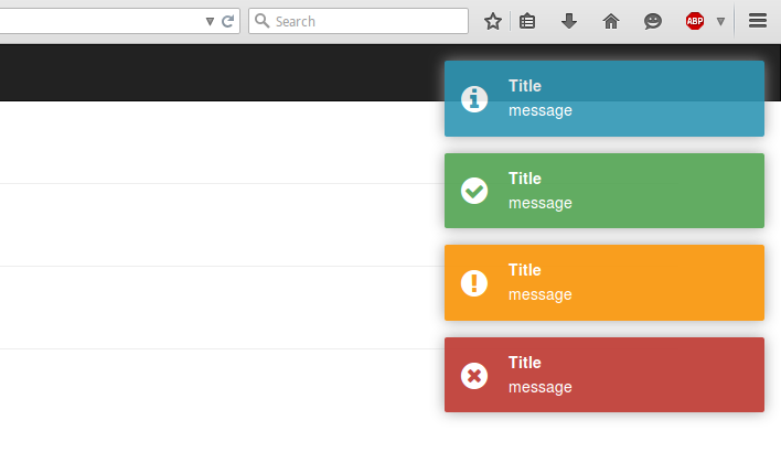
- react-notifications:
Avoid
react-notificationsin new projects—it is deprecated and no longer maintained. The GitHub repository is archived, and the npm package page explicitly warns against its use. While it once offered basic notification types and positioning, it lacks modern features like promise-based dismissal, accessibility support, or TypeScript definitions. Only consider it if maintaining a legacy codebase where migration isn’t feasible. - react-s-alert:
Choose
react-s-alertif you need fine-grained control over animation transitions using Velocity.js or GSAP and require custom layout behaviors like stacking direction or offset adjustments. It supports both functional and component-based invocation styles and allows per-alert configuration. However, be aware that development has slowed significantly, with minimal recent activity on GitHub. Use it only if your project already depends on it or if you specifically need its animation integration. - react-toastify:
Choose
react-toastifyfor new projects requiring a robust, actively maintained notification system with strong defaults, extensive customization, and full accessibility compliance. It provides built-in support for promise resolution tracking, swipe-to-dismiss on mobile, auto-close controls, and theming via CSS variables or styled-components. Its API is intuitive for both simple and complex use cases, and it integrates cleanly with modern React patterns like hooks and context.
Popular Comparisons
README for react-notifications
React Notifications
Installation
npm install --save react-notifications
Usage
Note
Use only one 'NotificationContainer' component in the app.
CSS
Webpack:
import 'react-notifications/lib/notifications.css';
Other
<link rel="stylesheet" type="text/css" href="path/to/notifications.css">
JS
import React from 'react';
import {NotificationContainer, NotificationManager} from 'react-notifications';

class Example extends React.Component {
  createNotification = (type) => {
    return () => {
      switch (type) {
        case 'info':
          NotificationManager.info('Info message');
          break;
        case 'success':
          NotificationManager.success('Success message', 'Title here');
          break;
        case 'warning':
          NotificationManager.warning('Warning message', 'Close after 3000ms', 3000);
          break;
        case 'error':
          NotificationManager.error('Error message', 'Click me!', 5000, () => {
            alert('callback');
          });
          break;
      }
    };
  };

  render() {
    return (
      <div>
        <button className='btn btn-info'
          onClick={this.createNotification('info')}>Info
        </button>
        <hr/>
        <button className='btn btn-success'
          onClick={this.createNotification('success')}>Success
        </button>
        <hr/>
        <button className='btn btn-warning'
          onClick={this.createNotification('warning')}>Warning
        </button>
        <hr/>
        <button className='btn btn-danger'
          onClick={this.createNotification('error')}>Error
        </button>

        <NotificationContainer/>
      </div>
    );
  }
}

export default Example;
UMD
<link rel="stylesheet" type="text/css" href="path/to/react-notifications/dist/react-notifications.css">
<script src="path/to/react-notifications/dist/react-notifications.js"></script>
const NotificationContainer = window.ReactNotifications.NotificationContainer;
const NotificationManager = window.ReactNotifications.NotificationManager;
NotificationContainer Props
| Name | Type | Default | Required |
|---|---|---|---|
| enterTimeout | number | 400 | false |
| leaveTimeout | number | 400 | false |
NotificationManager API
- NotificationManager.info(message, title, timeOut, callback, priority);
- NotificationManager.success(message, title, timeOut, callback, priority);
- NotificationManager.warning(message, title, timeOut, callback, priority);
- NotificationManager.error(message, title, timeOut, callback, priority);
| Name | Type | Description |
|---|---|---|
| message | string | The message string |
| title | string | The title string |
| timeOut | integer | The popup timeout in milliseconds |
| callback | function | A function that gets fired when the popup is clicked |
| priority | boolean | If true, the message gets inserted at the top |
Example
View demo or example folder.
Contributing
When contributing to this reposity, please first open an issue and discuss intended changes with maintainers. If there is already an issue open for the feature you are looking to develop, please just coordinate with maintainers before assigning issue to yourself.
Branches
master is the main branch from which we publish packages. next is the branch from which we will publish the next release. All issue branches should be branched from master, unless specifically told by the maintainers to use a different branch. All pull requests should be submitted to merge with next in order to make the next release.
Workflow
- Fork repo
- Create an issue branch
- Commit your changes
- Open a PR against
next. - Link the Issue to your PR.
Pull Request Guidelines
- PRs should be submitted to merge with
next. - PRs should be small in scope, work on 1 issue in a single PR.
- Link the Issue you are working to your PR.
You can add as many commits to your PR as you would like. All commits will be squashed into a single commit when merging PR.