Toast Notification Libraries for React Applications
react-notifications, react-toast-notifications, and react-toastify are all libraries designed to display transient, non-blocking toast notifications in React applications. These toasts typically appear briefly at the top or bottom of the screen to inform users of events like successful actions, errors, or system updates without interrupting their workflow. While they share a common goal, they differ significantly in architecture, customization capabilities, maintenance status, and developer ergonomics.
Npm Package Weekly Downloads Trend
Github Stars Ranking
Stat Detail
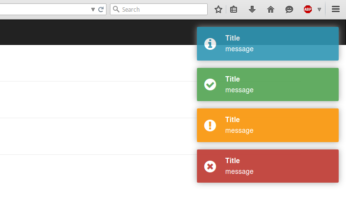
Toast Notification Libraries for React: A Practical Comparison
When your React app needs to show ephemeral messages — success confirmations, error alerts, or loading hints — toast notifications are the go-to UI pattern. Among the popular choices are react-notifications, react-toast-notifications, and react-toastify. But they’re not equally viable today. Let’s cut through the noise with real code and current facts.
⚠️ Deprecation Status: One Package Is Off the Table
react-notifications is deprecated.
The npm page explicitly states: "This package has been deprecated. Please use react-toast-notifications instead." The GitHub repository is archived and read-only. Do not use this in any new project. Even existing usages should be migrated.
// ❌ DO NOT USE — Deprecated and unmaintained
import { NotificationContainer, NotificationManager } from 'react-notifications';

NotificationManager.success('Hello!', 'Success');
That leaves us with two contenders: react-toast-notifications and react-toastify.
🧩 Core Architecture: Context vs Global Instance
react-toast-notifications uses React Context under the hood. You wrap your app with a provider, then use a custom hook (useToasts) to trigger notifications anywhere.
// react-toast-notifications
import { ToastProvider, useToasts } from 'react-toast-notifications';

function App() {
  return (
    <ToastProvider>
      <MyComponent />
    </ToastProvider>
  );
}

function MyComponent() {
  const { addToast } = useToasts();

  const handleClick = () => {
    addToast('Your action succeeded!', { appearance: 'success' });
  };

  return <button onClick={handleClick}>Submit</button>;
}
react-toastify uses a global instance managed internally. No provider is required (though optional for advanced config), and you call toast() directly.
// react-toastify
import { toast, ToastContainer } from 'react-toastify';
import 'react-toastify/dist/ReactToastify.css';

function App() {
  return (
    <>
      <ToastContainer />
      <MyComponent />
    </>
  );
}

function MyComponent() {
  const handleClick = () => {
    toast.success('Your action succeeded!');
  };

  return <button onClick={handleClick}>Submit</button>;
}
💡 Trade-off: Context-based (
react-toast-notifications) feels more "React-native" but requires prop drilling or hooks. Global instance (react-toastify) is simpler to call but less aligned with React’s data flow principles.
🎨 Styling and Customization
react-toast-notifications ships with minimal default styles. You style toasts using standard CSS classes or by passing a custom appearance and rendering your own component.
// Custom toast in react-toast-notifications
const CustomToast = ({ message, onDismiss }) => (
  <div className="my-custom-toast">
    {message}
    <button onClick={onDismiss}>×</button>
  </div>
);

addToast('Custom!', { appearance: 'custom', children: CustomToast });
react-toastify includes polished default styles (you must import the CSS file) and supports deep theming via CSS variables, props, or custom components.
// Theming in react-toastify
<ToastContainer
  position="top-right"
  autoClose={3000}
  hideProgressBar={false}
  newestOnTop={false}
  closeOnClick
  rtl={false}
  pauseOnFocusLoss
  draggable
  pauseOnHover
  theme="colored"
/>

// Or override with CSS variables
:root {
  --toastify-color-success: #4caf50;
  --toastify-color-error: #f44336;
}
💡 Trade-off: If you want pixel-perfect control with your own design system,
react-toast-notificationsgives you a blank canvas. If you want something that looks good immediately with tweakable defaults,react-toastifywins.
⏳ Advanced Features: Progress, Promises, and Updates
react-toast-notifications supports basic features: dismiss on click, auto-dismiss timeout, and manual dismissal. It does not support progress bars, updating existing toasts, or promise resolution tracking.
// Limited control in react-toast-notifications
addToast('Processing...', {
  appearance: 'info',
  autoDismiss: true,
  // No progress bar, no update capability
});
react-toastify includes advanced capabilities out of the box:
- Progress bars showing remaining time
- Update existing toasts (e.g., change from "Loading..." to "Success!")
- Promise helpers that auto-show pending/error/success states
- Drag-to-dismiss and pause on hover
// Advanced features in react-toastify
const id = toast.loading("Please wait...");

// Update after async operation
fetch('/api/data')
  .then(res => {
    toast.update(id, {
      render: "Success!",
      type: "success",
      isLoading: false
    });
  })
  .catch(() => {
    toast.update(id, {
      render: "Error!",
      type: "error",
      isLoading: false
    });
  });

// Or use promise helper
toast.promise(
  fetch('/api/data'),
  {
    pending: 'Loading...',
    success: 'Success!',
    error: 'Error!'
  }
);
💡 Trade-off: For simple apps, basic toasts suffice. For complex workflows (file uploads, multi-step processes),
react-toastify’s advanced features reduce boilerplate significantly.
📦 Bundle Impact and Dependencies
Both libraries are lightweight, but react-toastify includes more features by default, so its bundle is larger. However, react-toastify supports tree-shaking — you only pay for what you use if your bundler supports it.
react-toast-notifications has zero runtime dependencies beyond React, while react-toastify bundles its own transition logic and icon set (though icons can be disabled).
🛠️ TypeScript Support
react-toast-notifications was built with TypeScript and offers excellent type safety out of the box.
react-toastify also provides comprehensive TypeScript definitions and keeps them up to date.
Both are solid here — no meaningful difference for TS users.
🔄 Maintenance and Ecosystem
As of 2024:
react-toast-notifications: Last significant update was over a year ago. The repo shows low recent activity. It works but isn’t evolving rapidly.react-toastify: Actively maintained with frequent releases, bug fixes, and new features. Large community, extensive documentation, and third-party integrations.
✅ Recommendation Summary
| Concern | Choose react-toast-notifications | Choose react-toastify |
|---|---|---|
| New project | ❌ (slowing maintenance) | ✅ |
| Minimal bundle | ✅ | ⚠️ (but tree-shakeable) |
| Out-of-the-box polish | ❌ | ✅ |
| Advanced features needed | ❌ | ✅ |
| Full design control | ✅ | ✅ (via overrides) |
| TypeScript | ✅ | ✅ |
💡 Final Guidance
- For most professional applications,
react-toastifyis the clear winner: it’s actively maintained, packed with useful features, and requires less custom code to achieve polished results. - Only consider
react-toast-notificationsif you’re already using it, need absolute minimalism, and are comfortable maintaining your own toast logic long-term. - Never use
react-notifications— it’s deprecated and poses maintenance risks.
In practice, the productivity gains from react-toastify’s promise helpers, update API, and built-in UX refinements make it worth the slightly larger footprint for nearly all real-world apps.
How to Choose: react-notifications vs react-toast-notifications vs react-toastify
- react-notifications:
Avoid
react-notificationsin new projects — it is officially deprecated and no longer maintained. The repository has been archived on GitHub, and the npm package page includes a deprecation notice recommending migration to alternatives. Using it introduces technical debt and security risks due to lack of updates. - react-toast-notifications:
Choose
react-toast-notificationsif you prefer a minimal, hook-based API with strong TypeScript support and don’t need extensive built-in styling or animation options. It’s suitable for teams that want full control over notification appearance and behavior using standard CSS, but be aware that active development has slowed and the project may be in maintenance mode. - react-toastify:
Choose
react-toastifyif you need a mature, feature-rich solution with out-of-the-box animations, progress indicators, promise-based triggers, and extensive customization options via props and CSS variables. It’s ideal for production applications requiring robust notification handling with minimal setup, and it remains actively maintained with regular updates.
Popular Comparisons
README for react-notifications
React Notifications
Installation
npm install --save react-notifications
Usage
Note
Use only one 'NotificationContainer' component in the app.
CSS
Webpack:
import 'react-notifications/lib/notifications.css';
Other
<link rel="stylesheet" type="text/css" href="path/to/notifications.css">
JS
import React from 'react';
import {NotificationContainer, NotificationManager} from 'react-notifications';

class Example extends React.Component {
  createNotification = (type) => {
    return () => {
      switch (type) {
        case 'info':
          NotificationManager.info('Info message');
          break;
        case 'success':
          NotificationManager.success('Success message', 'Title here');
          break;
        case 'warning':
          NotificationManager.warning('Warning message', 'Close after 3000ms', 3000);
          break;
        case 'error':
          NotificationManager.error('Error message', 'Click me!', 5000, () => {
            alert('callback');
          });
          break;
      }
    };
  };

  render() {
    return (
      <div>
        <button className='btn btn-info'
          onClick={this.createNotification('info')}>Info
        </button>
        <hr/>
        <button className='btn btn-success'
          onClick={this.createNotification('success')}>Success
        </button>
        <hr/>
        <button className='btn btn-warning'
          onClick={this.createNotification('warning')}>Warning
        </button>
        <hr/>
        <button className='btn btn-danger'
          onClick={this.createNotification('error')}>Error
        </button>

        <NotificationContainer/>
      </div>
    );
  }
}

export default Example;
UMD
<link rel="stylesheet" type="text/css" href="path/to/react-notifications/dist/react-notifications.css">
<script src="path/to/react-notifications/dist/react-notifications.js"></script>
const NotificationContainer = window.ReactNotifications.NotificationContainer;
const NotificationManager = window.ReactNotifications.NotificationManager;
NotificationContainer Props
| Name | Type | Default | Required |
|---|---|---|---|
| enterTimeout | number | 400 | false |
| leaveTimeout | number | 400 | false |
NotificationManager API
- NotificationManager.info(message, title, timeOut, callback, priority);
- NotificationManager.success(message, title, timeOut, callback, priority);
- NotificationManager.warning(message, title, timeOut, callback, priority);
- NotificationManager.error(message, title, timeOut, callback, priority);
| Name | Type | Description |
|---|---|---|
| message | string | The message string |
| title | string | The title string |
| timeOut | integer | The popup timeout in milliseconds |
| callback | function | A function that gets fired when the popup is clicked |
| priority | boolean | If true, the message gets inserted at the top |
Example
View demo or example folder.
Contributing
When contributing to this reposity, please first open an issue and discuss intended changes with maintainers. If there is already an issue open for the feature you are looking to develop, please just coordinate with maintainers before assigning issue to yourself.
Branches
master is the main branch from which we publish packages. next is the branch from which we will publish the next release. All issue branches should be branched from master, unless specifically told by the maintainers to use a different branch. All pull requests should be submitted to merge with next in order to make the next release.
Workflow
- Fork repo
- Create an issue branch
- Commit your changes
- Open a PR against
next. - Link the Issue to your PR.
Pull Request Guidelines
- PRs should be submitted to merge with
next. - PRs should be small in scope, work on 1 issue in a single PR.
- Link the Issue you are working to your PR.
You can add as many commits to your PR as you would like. All commits will be squashed into a single commit when merging PR.