


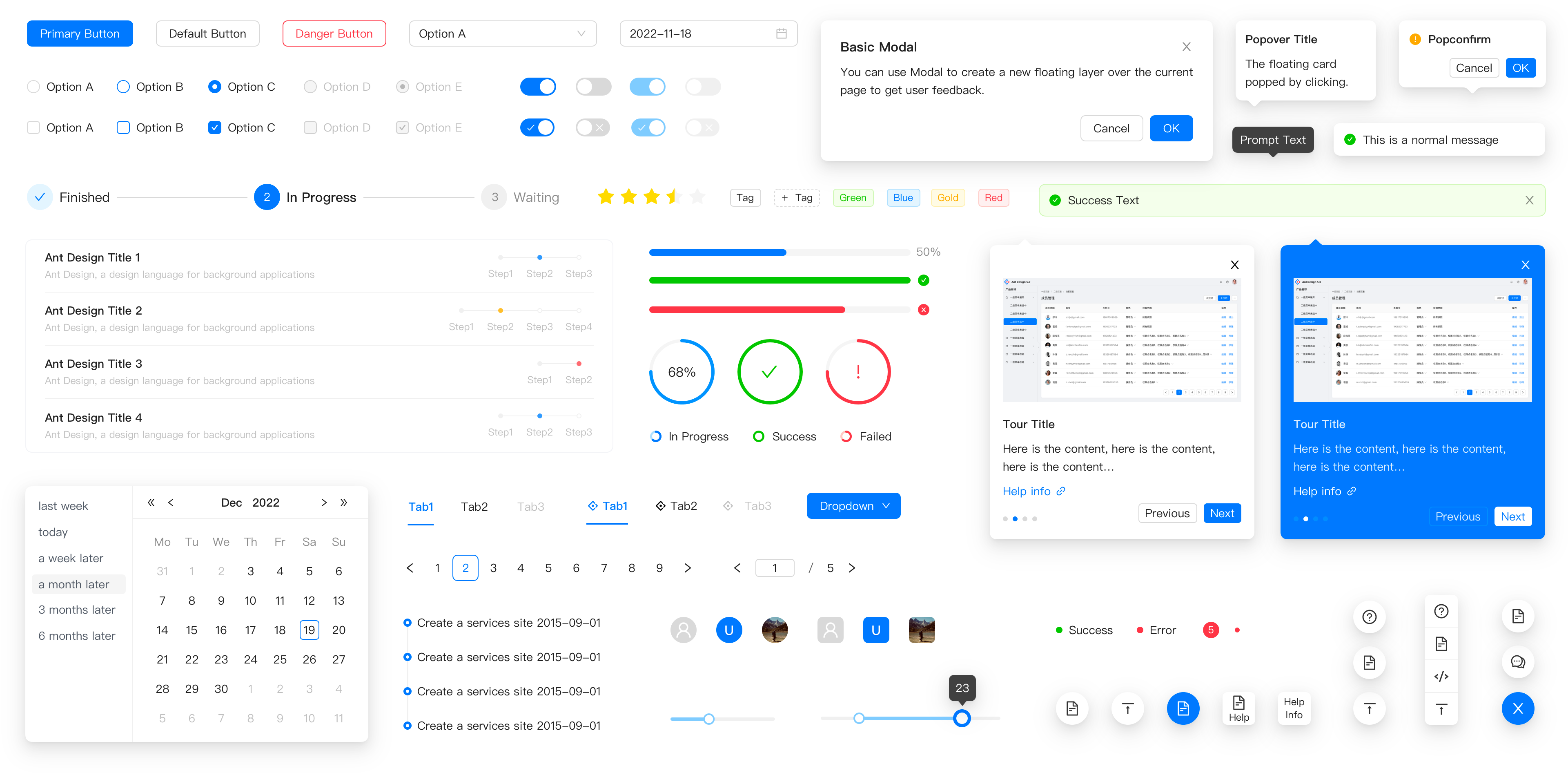
Design Principles
- antd:
Ant Design is built on a set of design principles that focus on providing a consistent and user-friendly experience. It emphasizes clarity, usability, and a clean aesthetic, making it suitable for complex enterprise applications.
- bootstrap-vue:
Bootstrap-Vue follows the principles of Bootstrap, which emphasize responsive design and mobile-first development. It provides a grid system and utility classes that make it easy to create layouts that adapt to various screen sizes.
- material-ui:
Material-UI is based on Google’s Material Design, which focuses on creating a tactile and intuitive user experience. It emphasizes depth, motion, and bold colors, providing a modern look and feel to applications.
- vant:
Vant is designed specifically for mobile applications, focusing on touch interactions and mobile usability. Its components are optimized for performance on mobile devices, ensuring a smooth user experience.
Component Variety
- antd:
Ant Design offers a comprehensive suite of components, including complex ones like tables, forms, and modals, making it suitable for building feature-rich applications. It also includes advanced components like data visualization tools, which are essential for enterprise applications.
- bootstrap-vue:
Bootstrap-Vue provides a solid selection of components that cover most common UI needs, such as buttons, forms, and modals, but may lack some of the more specialized components found in other libraries.
- material-ui:
Material-UI boasts a wide variety of components that adhere to Material Design guidelines, including advanced components like sliders, pickers, and menus. This variety allows for rich and interactive user interfaces.
- vant:
Vant offers a focused set of components specifically tailored for mobile applications, including touch-friendly elements like buttons, sliders, and action sheets, ensuring a seamless mobile experience.
Customization
- antd:
Ant Design allows for extensive customization through its theming capabilities, enabling developers to adjust styles and components to fit their brand identity while maintaining a consistent design language.
- bootstrap-vue:
Bootstrap-Vue inherits Bootstrap's customization options, allowing developers to override default styles using CSS variables or custom stylesheets, providing flexibility in design while keeping the responsive grid intact.
- material-ui:
Material-UI offers a powerful theming system that allows developers to create custom themes and styles for components, enabling a high degree of customization while adhering to Material Design principles.
- vant:
Vant provides customization options through its built-in CSS variables, allowing developers to easily adjust component styles to match their application's branding and design.
Learning Curve
- antd:
Ant Design has a moderate learning curve, especially for developers new to React. However, its comprehensive documentation and examples help ease the learning process, making it accessible for most developers.
- bootstrap-vue:
Bootstrap-Vue is relatively easy to learn, especially for those familiar with Bootstrap. Its straightforward API and extensive documentation make it a good choice for developers looking to quickly integrate UI components into their Vue applications.
- material-ui:
Material-UI has a moderate learning curve, particularly for those unfamiliar with Material Design. However, its well-structured documentation and examples facilitate a smoother onboarding process for new users.
- vant:
Vant is designed to be user-friendly, with a gentle learning curve for Vue developers. Its documentation is clear and concise, making it easy to get started with mobile UI development.
Community and Support
- antd:
Ant Design has a strong community and extensive support, with numerous resources, tutorials, and a vibrant ecosystem of plugins and extensions available for developers.
- bootstrap-vue:
Bootstrap-Vue benefits from the large Bootstrap community, providing a wealth of resources, tutorials, and third-party components that enhance its usability and support.
- material-ui:
Material-UI has a robust community and is widely used in the React ecosystem, offering extensive documentation, community support, and a variety of resources for developers.
- vant:
Vant has a growing community, particularly among mobile developers using Vue. While it may not be as extensive as others, it offers solid documentation and support for its users.


