bootstrap vs antd vs shadcn-ui vs material-ui
UI Component Libraries Comparison
1 Year
bootstrapantdshadcn-uimaterial-uiSimilar Packages:
What's UI Component Libraries?

UI component libraries provide pre-built components and styles that help developers create user interfaces more efficiently. They offer a set of design patterns and reusable components, which can significantly speed up the development process and ensure a consistent look and feel across applications. These libraries often come with built-in accessibility features, responsive design capabilities, and customization options, making them essential tools for modern web development.

Package Weekly Downloads Trend
Github Stars Ranking
Stat Detail
Package
Downloads
Stars
Size
Issues
Publish
License
bootstrap4,659,322171,6239.67 MB677a year agoMIT
antd1,730,33293,78547.8 MB1,284a day agoMIT
shadcn-ui134,79381,6364.31 kB1,6803 months agoMIT
material-ui52,15494,879-1,8377 years agoMIT
Feature Comparison: bootstrap vs antd vs shadcn-ui vs material-ui

Design Principles

  • bootstrap:

    Bootstrap is based on a mobile-first approach, ensuring that applications are responsive and accessible on all devices. Its design principles focus on simplicity and ease of use, allowing developers to create visually appealing interfaces without extensive CSS knowledge.

  • antd:

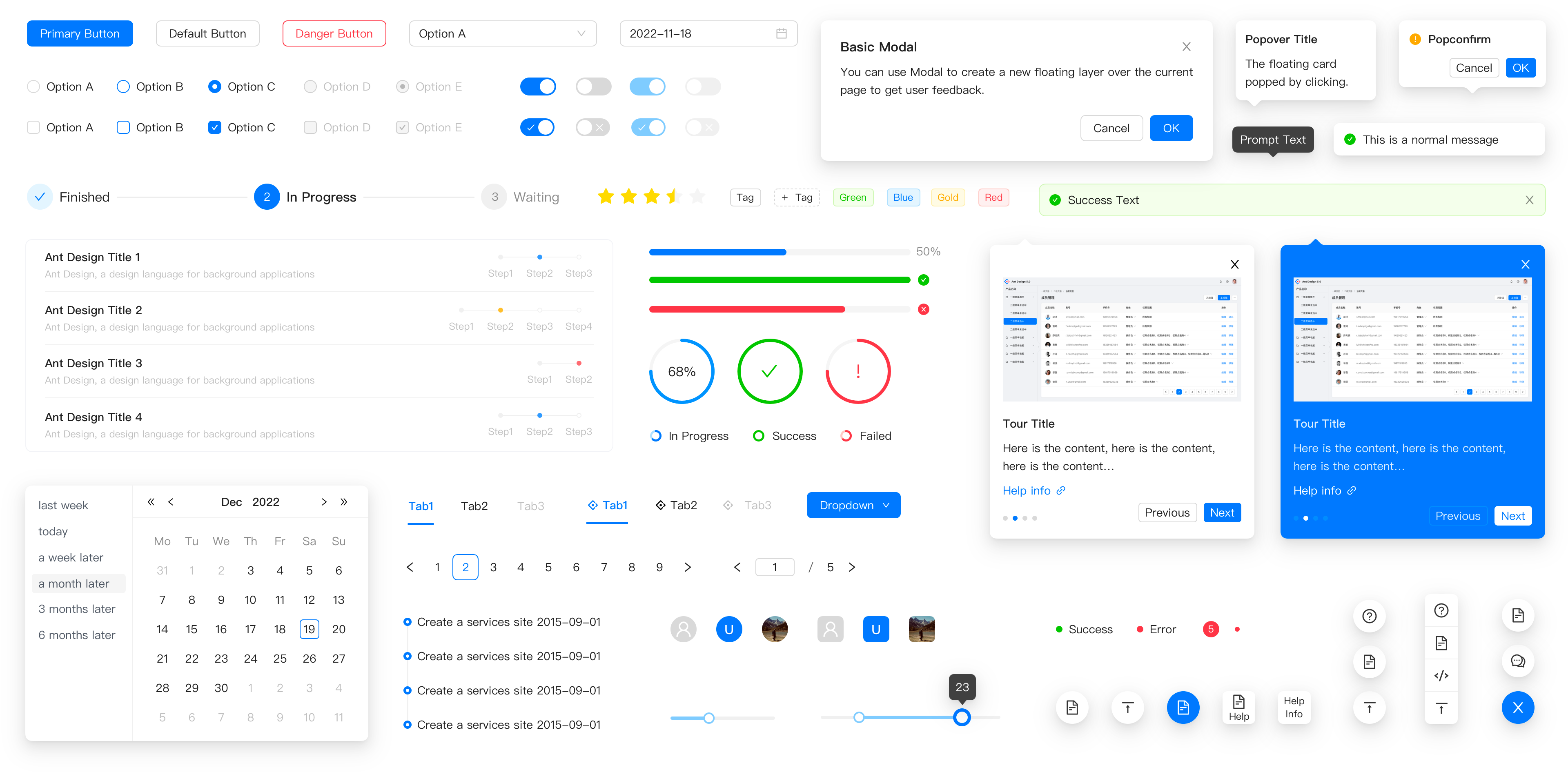
    Ant Design follows a design language that emphasizes clarity, hierarchy, and usability. It provides a comprehensive set of design guidelines and components that ensure a cohesive user experience across applications, particularly in data-rich environments.

  • shadcn-ui:

    Shadcn-UI is centered around utility-first design principles, leveraging Tailwind CSS for rapid styling. It encourages developers to build custom designs while maintaining consistency, making it ideal for projects that require flexibility in design.

  • material-ui:

    Material-UI is built on Google's Material Design, which emphasizes depth, motion, and bold colors. This design philosophy aims to create intuitive and engaging user experiences, making it suitable for applications that prioritize aesthetics and usability.

Customization

  • bootstrap:

    Bootstrap provides a straightforward way to customize components using Sass variables and utility classes. This makes it easy to adapt the framework to fit specific design requirements without extensive overrides.

  • antd:

    Ant Design offers extensive customization options through its theming capabilities, allowing developers to tailor the look and feel of components to match their brand identity. However, customization may require a deeper understanding of its design system.

  • shadcn-ui:

    Shadcn-UI is designed for high customization, allowing developers to easily modify styles using Tailwind CSS classes. This utility-first approach enables rapid design changes without the need for complex overrides.

  • material-ui:

    Material-UI allows for deep customization through its styling solution, enabling developers to override styles at the component level. It also supports theming, making it easy to switch between light and dark modes or apply custom color palettes.

Component Variety

  • bootstrap:

    Bootstrap offers a solid set of basic components, including buttons, forms, and navigation elements. While it covers essential UI needs, it may lack advanced components compared to other libraries.

  • antd:

    Ant Design boasts a comprehensive library of components that cater to complex user interfaces, including data visualization components like tables and charts, making it ideal for enterprise applications.

  • shadcn-ui:

    Shadcn-UI includes a growing collection of components designed for flexibility and customization, focusing on modern UI patterns and interactions, which can be tailored to fit various design needs.

  • material-ui:

    Material-UI provides a rich set of components that adhere to Material Design guidelines, including advanced components like sliders, date pickers, and more, making it suitable for modern web applications.

Learning Curve

  • bootstrap:

    Bootstrap is known for its low learning curve, making it accessible for beginners. Its straightforward class-based approach allows developers to quickly grasp its usage and start building responsive layouts.

  • antd:

    Ant Design has a moderate learning curve, especially for developers unfamiliar with its design principles. However, its comprehensive documentation and examples help ease the onboarding process.

  • shadcn-ui:

    Shadcn-UI is designed to be intuitive for developers familiar with Tailwind CSS. Its utility-first approach may require some adjustment for those new to this methodology, but it promotes rapid development once understood.

  • material-ui:

    Material-UI has a moderate learning curve due to its extensive API and customization options. However, developers familiar with React will find it relatively easy to integrate and use.

Community and Support

  • bootstrap:

    Bootstrap has one of the largest communities among UI libraries, offering extensive documentation, tutorials, and a plethora of themes and templates available for use.

  • antd:

    Ant Design has a strong community and is widely used in enterprise applications, providing ample resources, plugins, and third-party integrations to support developers.

  • shadcn-ui:

    Shadcn-UI is newer and may have a smaller community compared to others, but it is gaining traction due to its modern approach and integration with Tailwind CSS, attracting a growing number of developers.

  • material-ui:

    Material-UI benefits from a vibrant community and is actively maintained, with regular updates and a wealth of resources, including documentation and examples, to assist developers.

How to Choose: bootstrap vs antd vs shadcn-ui vs material-ui
  • bootstrap:

    Select Bootstrap for its simplicity and ease of use, especially if you are building responsive websites quickly. Bootstrap is ideal for projects that need a solid foundation with a grid system and pre-styled components, making it a great choice for beginners and rapid prototyping.

  • antd:

    Choose Ant Design if you are developing enterprise-level applications that require a comprehensive design system with a rich set of high-quality components, especially for data-heavy interfaces. Ant Design emphasizes a clean and professional aesthetic, making it suitable for business applications.

  • shadcn-ui:

    Consider Shadcn-UI if you are looking for a modern, customizable UI library that leverages Tailwind CSS for styling. Shadcn-UI is designed for developers who want to create unique designs while maintaining a consistent user experience, making it suitable for projects that require a high degree of customization.

  • material-ui:

    Opt for Material-UI if you want to implement Google's Material Design principles in your application. Material-UI offers a wide range of customizable components that adhere to Material Design guidelines, making it perfect for applications that prioritize aesthetics and user experience.

README for bootstrap

Bootstrap logo

Bootstrap

Sleek, intuitive, and powerful front-end framework for faster and easier web development.
Explore Bootstrap docs »

Report bug · Request feature · Themes · Blog

Bootstrap 5

Our default branch is for development of our Bootstrap 5 release. Head to the v4-dev branch to view the readme, documentation, and source code for Bootstrap 4.

Table of contents

Quick start

Several quick start options are available:

  • Download the latest release
  • Clone the repo: git clone https://github.com/twbs/bootstrap.git
  • Install with npm: npm install bootstrap@v5.3.3
  • Install with yarn: yarn add bootstrap@v5.3.3
  • Install with Composer: composer require twbs/bootstrap:5.3.3
  • Install with NuGet: CSS: Install-Package bootstrap Sass: Install-Package bootstrap.sass

Read the Getting started page for information on the framework contents, templates, examples, and more.

Status

Build Status npm version Gem version Meteor Atmosphere Packagist Prerelease NuGet Coverage Status CSS gzip size CSS Brotli size JS gzip size JS Brotli size Backers on Open Collective Sponsors on Open Collective

What's included

Within the download you'll find the following directories and files, logically grouping common assets and providing both compiled and minified variations.

Download contents
bootstrap/
├── css/
│   ├── bootstrap-grid.css
│   ├── bootstrap-grid.css.map
│   ├── bootstrap-grid.min.css
│   ├── bootstrap-grid.min.css.map
│   ├── bootstrap-grid.rtl.css
│   ├── bootstrap-grid.rtl.css.map
│   ├── bootstrap-grid.rtl.min.css
│   ├── bootstrap-grid.rtl.min.css.map
│   ├── bootstrap-reboot.css
│   ├── bootstrap-reboot.css.map
│   ├── bootstrap-reboot.min.css
│   ├── bootstrap-reboot.min.css.map
│   ├── bootstrap-reboot.rtl.css
│   ├── bootstrap-reboot.rtl.css.map
│   ├── bootstrap-reboot.rtl.min.css
│   ├── bootstrap-reboot.rtl.min.css.map
│   ├── bootstrap-utilities.css
│   ├── bootstrap-utilities.css.map
│   ├── bootstrap-utilities.min.css
│   ├── bootstrap-utilities.min.css.map
│   ├── bootstrap-utilities.rtl.css
│   ├── bootstrap-utilities.rtl.css.map
│   ├── bootstrap-utilities.rtl.min.css
│   ├── bootstrap-utilities.rtl.min.css.map
│   ├── bootstrap.css
│   ├── bootstrap.css.map
│   ├── bootstrap.min.css
│   ├── bootstrap.min.css.map
│   ├── bootstrap.rtl.css
│   ├── bootstrap.rtl.css.map
│   ├── bootstrap.rtl.min.css
│   └── bootstrap.rtl.min.css.map
└── js/
    ├── bootstrap.bundle.js
    ├── bootstrap.bundle.js.map
    ├── bootstrap.bundle.min.js
    ├── bootstrap.bundle.min.js.map
    ├── bootstrap.esm.js
    ├── bootstrap.esm.js.map
    ├── bootstrap.esm.min.js
    ├── bootstrap.esm.min.js.map
    ├── bootstrap.js
    ├── bootstrap.js.map
    ├── bootstrap.min.js
    └── bootstrap.min.js.map

We provide compiled CSS and JS (bootstrap.*), as well as compiled and minified CSS and JS (bootstrap.min.*). Source maps (bootstrap.*.map) are available for use with certain browsers' developer tools. Bundled JS files (bootstrap.bundle.js and minified bootstrap.bundle.min.js) include Popper.

Bugs and feature requests

Have a bug or a feature request? Please first read the issue guidelines and search for existing and closed issues. If your problem or idea is not addressed yet, please open a new issue.

Documentation

Bootstrap's documentation, included in this repo in the root directory, is built with Hugo and publicly hosted on GitHub Pages at https://getbootstrap.com/. The docs may also be run locally.

Documentation search is powered by Algolia's DocSearch.

Running documentation locally

  1. Run npm install to install the Node.js dependencies, including Hugo (the site builder).
  2. Run npm run test (or a specific npm script) to rebuild distributed CSS and JavaScript files, as well as our docs assets.
  3. From the root /bootstrap directory, run npm run docs-serve in the command line.
  4. Open http://localhost:9001/ in your browser, and voilà.

Learn more about using Hugo by reading its documentation.

Documentation for previous releases

You can find all our previous releases docs on https://getbootstrap.com/docs/versions/.

Previous releases and their documentation are also available for download.

Contributing

Please read through our contributing guidelines. Included are directions for opening issues, coding standards, and notes on development.

Moreover, if your pull request contains JavaScript patches or features, you must include relevant unit tests. All HTML and CSS should conform to the Code Guide, maintained by Mark Otto.

Editor preferences are available in the editor config for easy use in common text editors. Read more and download plugins at https://editorconfig.org/.

Community

Get updates on Bootstrap's development and chat with the project maintainers and community members.

Versioning

For transparency into our release cycle and in striving to maintain backward compatibility, Bootstrap is maintained under the Semantic Versioning guidelines. Sometimes we screw up, but we adhere to those rules whenever possible.

See the Releases section of our GitHub project for changelogs for each release version of Bootstrap. Release announcement posts on the official Bootstrap blog contain summaries of the most noteworthy changes made in each release.

Creators

Mark Otto

Jacob Thornton

Thanks

BrowserStack

Thanks to BrowserStack for providing the infrastructure that allows us to test in real browsers!

Netlify

Thanks to Netlify for providing us with Deploy Previews!

Sponsors

Support this project by becoming a sponsor. Your logo will show up here with a link to your website. [Become a sponsor]

OC sponsor 0 OC sponsor 1 OC sponsor 2 OC sponsor 3 OC sponsor 4 OC sponsor 5 OC sponsor 6 OC sponsor 7 OC sponsor 8 OC sponsor 9

Backers

Thank you to all our backers! 🙏 [Become a backer]

Backers

Copyright and license

Code and documentation copyright 2011–2024 the Bootstrap Authors. Code released under the MIT License. Docs released under Creative Commons.