Design Philosophy
- antd:
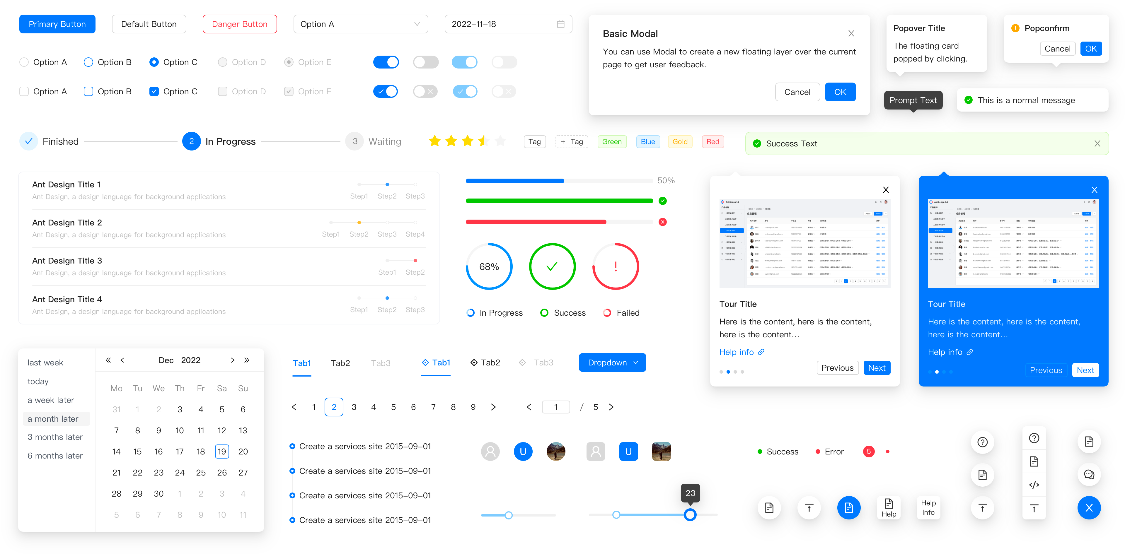
Ant Design follows a design philosophy that emphasizes user experience and consistency across complex applications. It provides a comprehensive set of design guidelines and components that are tailored for enterprise-level applications, ensuring a cohesive look and feel.
- flowbite-react:
Flowbite React is built around the utility-first approach of Tailwind CSS, promoting a minimalistic design philosophy. It allows developers to create custom designs quickly while maintaining simplicity and ease of use.
- material-ui:
Material-UI is based on Google's Material Design, which focuses on creating a visual language that synthesizes classic design principles with innovation. It encourages the use of depth, movement, and bold colors to enhance user experience.
- react-bootstrap:
React Bootstrap retains the classic Bootstrap design philosophy, focusing on responsive design and mobile-first principles. It provides a familiar set of components that are easy to use and integrate into existing Bootstrap projects.
- semantic-ui-react:
Semantic UI React emphasizes the use of human-friendly HTML and a clean, natural language approach to UI design. It aims to make the development process intuitive and straightforward, allowing developers to create beautiful interfaces with minimal effort.
Component Variety
- antd:
Ant Design offers a vast array of components, including complex ones like tables, date pickers, and forms, making it suitable for building intricate user interfaces. Its component library is extensive and well-documented, catering to various use cases.
- flowbite-react:
Flowbite React provides a smaller set of components compared to others, focusing on essential UI elements that can be easily customized. This makes it ideal for projects that require flexibility without unnecessary complexity.
- material-ui:
Material-UI boasts a comprehensive set of components that adhere to Material Design guidelines. It includes everything from basic buttons to advanced data grids, making it suitable for a wide range of applications.
- react-bootstrap:
React Bootstrap includes a full suite of Bootstrap components, allowing developers to use familiar elements like modals, alerts, and navigation bars. This library is perfect for those who want to leverage Bootstrap's extensive component library in a React environment.
- semantic-ui-react:
Semantic UI React provides a rich set of components that are designed to be easily customizable and extendable. It includes a variety of UI elements that promote semantic HTML, making it easier to maintain and understand the code.
Customization and Theming
- antd:
Ant Design allows for extensive customization through its theming capabilities. Developers can easily adjust styles and create custom themes to fit their brand's identity, ensuring a consistent user experience across applications.
- flowbite-react:
Flowbite React is designed for easy customization, leveraging Tailwind CSS's utility classes. This allows developers to quickly adapt the components to their design needs without extensive overrides.
- material-ui:
Material-UI provides a powerful theming system that allows developers to create custom themes and adjust component styles globally. It supports both light and dark themes, making it versatile for various applications.
- react-bootstrap:
React Bootstrap allows for customization through Bootstrap's built-in theming capabilities. Developers can use Sass variables to modify styles and create a unique look while still benefiting from Bootstrap's responsive design.
- semantic-ui-react:
Semantic UI React offers a theming system that allows developers to customize the default styles easily. It supports a variety of themes and provides tools for creating custom themes that align with branding.
Accessibility
- antd:
Ant Design places a strong emphasis on accessibility, ensuring that its components are usable by people with disabilities. It follows ARIA standards and provides keyboard navigation support, making it suitable for enterprise applications that require compliance.
- flowbite-react:
Flowbite React focuses on accessibility by adhering to best practices in web development. It ensures that components are usable with screen readers and keyboard navigation, promoting inclusivity in design.
- material-ui:
Material-UI prioritizes accessibility by following the WAI-ARIA guidelines. It provides components that are designed to be accessible out of the box, making it easier for developers to create inclusive applications.
- react-bootstrap:
React Bootstrap maintains Bootstrap's commitment to accessibility, providing components that are designed to be accessible and usable with assistive technologies. It ensures that applications built with React Bootstrap can be enjoyed by all users.
- semantic-ui-react:
Semantic UI React emphasizes accessibility by providing components that are designed with ARIA attributes and keyboard navigation in mind. It aims to create a user-friendly experience for all users, including those with disabilities.
Community and Support
- antd:
Ant Design has a large community and extensive documentation, making it easy for developers to find support and resources. Its popularity in the enterprise sector ensures a wealth of tutorials and examples for best practices.
- flowbite-react:
Flowbite React is relatively new but is growing in popularity, especially among Tailwind CSS users. The community is active, and the documentation is straightforward, making it easy for developers to get started.
- material-ui:
Material-UI has a robust community and is one of the most popular React component libraries. It offers extensive documentation, examples, and community support, making it a reliable choice for developers.
- react-bootstrap:
React Bootstrap benefits from the large Bootstrap community, providing ample resources, tutorials, and support. Its familiarity makes it easy for developers transitioning from traditional Bootstrap to React.
- semantic-ui-react:
Semantic UI React has a dedicated community and offers good documentation. While it may not be as large as some other libraries, it provides sufficient resources for developers to find help and examples.


