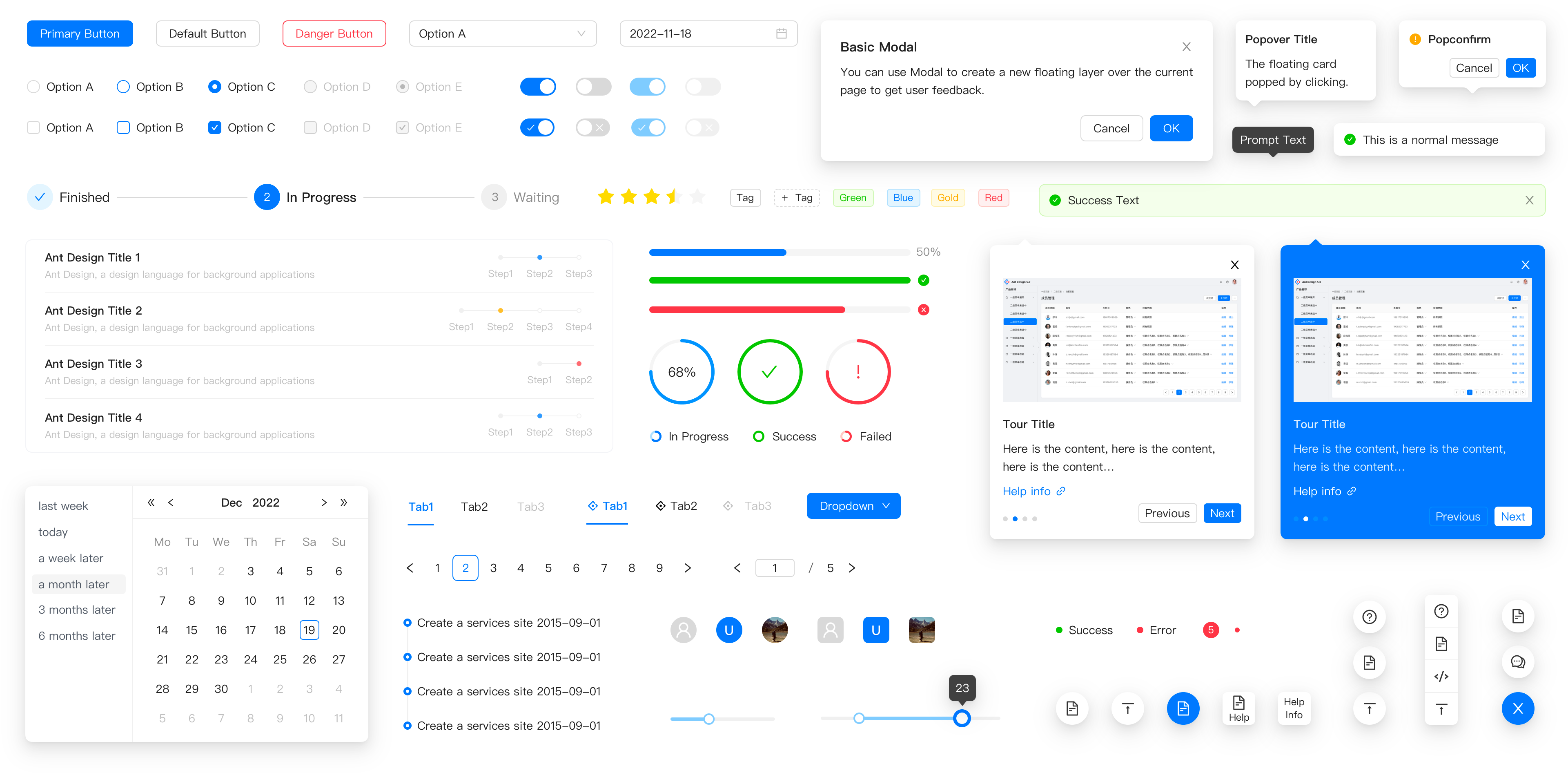
Design Principles
- antd:
Ant Design follows a design language that emphasizes consistency, clarity, and user-centric design. It provides a comprehensive set of design guidelines and components that ensure a cohesive user experience across applications.
- material-ui:
Material-UI is built on Google's Material Design principles, which focus on creating a visual language that synthesizes classic design principles with the innovation of technology and science. It emphasizes usability and aesthetic appeal, providing a modern look and feel.
- react-bootstrap:
React-Bootstrap adheres to Bootstrap's design principles, which prioritize responsive and mobile-first design. It allows developers to leverage Bootstrap's grid system and components while ensuring they work seamlessly with React.
- rsuite:
RSuite is designed with a focus on simplicity and usability, providing a clean interface that enhances user experience. It emphasizes performance and responsiveness, making it suitable for data-heavy applications.
Customization
- antd:
Ant Design offers extensive customization options through its theming capabilities. Developers can easily override default styles and create custom themes to match their brand identity, ensuring flexibility in design.
- material-ui:
Material-UI provides a powerful theming system that allows for deep customization of components. Developers can create custom themes and styles using a CSS-in-JS approach, making it easy to adapt the library to specific design requirements.
- react-bootstrap:
React-Bootstrap allows for customization through Bootstrap's utility classes and custom styles. While it provides a solid foundation, developers may need to write additional CSS to achieve specific design goals, which can be a limitation for some.
- rsuite:
RSuite offers straightforward customization options, allowing developers to modify component styles easily. It supports custom themes and styles, enabling a balance between default designs and personalized branding.
Component Variety
- antd:
Ant Design boasts a vast library of components, including complex data visualization tools, forms, and navigation elements, making it suitable for building feature-rich applications.
- material-ui:
Material-UI provides a comprehensive set of components that cover a wide range of use cases, from basic UI elements to advanced components like date pickers and sliders, ensuring versatility in application development.
- react-bootstrap:
React-Bootstrap includes a variety of components that align with Bootstrap's offerings, covering essential UI elements but may lack some advanced components found in other libraries, limiting its use in more complex applications.
- rsuite:
RSuite offers a solid selection of components tailored for data-heavy applications, including tables, forms, and modals, but may not have as extensive a library as Ant Design or Material-UI.
Accessibility
- antd:
Ant Design places a strong emphasis on accessibility, providing components that are designed to be usable for all users, including those with disabilities. It follows best practices for ARIA roles and keyboard navigation.
- material-ui:
Material-UI is designed with accessibility in mind, ensuring that components are usable with screen readers and keyboard navigation. It adheres to WAI-ARIA standards, making it a good choice for inclusive applications.
- react-bootstrap:
React-Bootstrap inherits Bootstrap's accessibility features, providing components that are generally accessible, but developers may need to implement additional ARIA attributes for enhanced accessibility in complex scenarios.
- rsuite:
RSuite focuses on usability and provides components that are accessible by default, ensuring that applications built with it can be used by a wide range of users, including those relying on assistive technologies.
Learning Curve
- antd:
Ant Design has a moderate learning curve, especially for developers unfamiliar with its design principles. However, its comprehensive documentation and examples help ease the onboarding process.
- material-ui:
Material-UI is relatively easy to learn for developers familiar with React and CSS-in-JS. Its clear documentation and examples facilitate quick adoption, making it accessible for beginners.
- react-bootstrap:
React-Bootstrap is straightforward for developers already familiar with Bootstrap. Its integration with React is seamless, making it easy to pick up for those with prior Bootstrap experience.
- rsuite:
RSuite has a gentle learning curve, with clear documentation and examples that help developers quickly understand its components and usage, making it suitable for both beginners and experienced developers.


